
Loew: Inspirations and Conception
Part one of how a typeface unlocks the purpose
for neutrality.
Everyone knows that feeling: the one where you’re so absorbed in something that stepping-back and re-evaluating feels like an unwarranted interference. As self-taught graphic artists, The Northern Block’s designers, at first, naturally adopted an experimental approach towards typeface design. Until Loew was commissioned by a Newcastle-based studio seeking corporate regularity, Jonathan hadn’t considered that neutrality may have a role in his work.
In a true moment of reckoning, he discovered that Loew’s attraction lay in its deliberate conformism – eventually finding correlation in Vauxhall Motors and Hilton Worldwide’s global marketing campaigns. ‘I’d heard it many times before,’ Jonathan tells me, ‘but ‘less is more’ never rang so true.’
“Jonathan hadn’t considered that neutrality may have a role in his work. In a true moment of reckoning, he discovered that Loew’s attraction lay in its deliberate conformism.”

Marketing Campaign - Loew Type Family
Defiantly modest, Jonathan tells me that the idea behind this typeface – basic, functional, corporate, though striking nonetheless – threw him off-balance. ‘I’d never had someone ask for a distinctly regular font before, or really had any intention of designing typefaces like this’, he says, as he recalls the enquiry from Glad Studio in Newcastle. Though this project later folded, the concept stuck with him, commanding attention and craving completion.
Used to experimenting with outlandish music-related typographies while freelancing in Sheffield, this was, at once, both an alien brief and an opportunity to expand The Northern Block’s arsenal. Jonathan was confronted by a pertinent question that he’d never thought to address before: how do you come up with something that is universally liked and universally applicable?
‘Loew’s clean, modernist aesthetic was the product of heavy research’.
He admits that the answer didn’t come to him immediately. Loew’s clean, modernist aesthetic was the product of heavy research. Deciding to take inspiration from the industrial designers of the mid- 20th century, Loew’s name honours Raymond Loewy, also known as the ‘Godfather of Streamlining’. or ‘The Man who Shaped America’. Preceded by the ‘Art Deco’ movement and its popularisation of sleek aerodynamics, Loewy’s design portfolio is expansive: steam locomotives, railroad systems, cars, liveries, commercial household products, juke boxes and Coca-Cola vending machines, His works, though brilliant, weren’t renowned for their grandeur, iconoclasm and non-conformity.
Instead, they indulged standard applications of good industrial convention. His work was efficient and unadorned: his architecture purposeful and inoffensive. His style captured the character of a society in mourning following the Second World War – now desperate for a new kind of understated modernity in its shattering aftermath.

Pure mechanical shapes are carefully adjusted to give the characters the right form, function and usability.
Jonathan’s Loew, then – encompassing geometric simplicity through carefully constructed mechanical shapes – acknowledges each of Loewy’s abiding tenets. But as Jonathan explains, it also embraces that all-important dimension of contemporaneity which innovation always demands. ‘Removing the y’, he says, prevented Loew from being constrained by the past: it became forward rather than backward-looking. ‘I was trying to make something new and fresh, not just paying homage to a single chapter in time.’
Besides becoming widely successful (The Northern Block’s Loew free-weight is the most popular download on their site), Jonathan regards Loew’s conception and development as a catalyst for change. ‘This commission’, he says, ‘was the point where we began interacting with clients as a business – discussing their needs, their preferences and ideas.’ Never hesitant or resistant about feedback, Jonathan stresses that the humility of the Loew typeface – so robust, flexible and affable – mirrors The Northern Block’s own commercial approach. ‘I grew up in the North’, ‘he tells me, ‘where community and mutual understanding were important local values. As a company, I made sure we built on that sense of collaboration.’
‘This commission’, he says, ‘was the point where we began interacting with clients as a business – discussing their needs, their preferences and ideas.’
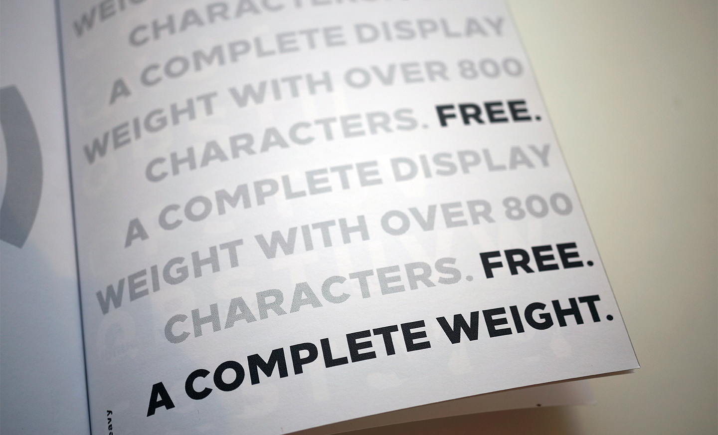
The heavy (free-weight) is the most popular download on the site.
‘With humility at their core, both endeavours understand the need to respond to, and reflect, the rapidly-changing culture that surrounds them’.
In many ways, an understanding of Loewy’s processes has served to redefine The Northern Block as a sustainable, open-minded venture. With humility at their core, both endeavours understand the need to respond to, and reflect, the rapidly-changing culture that surrounds them. This would remain important throughout the entire trajectory of Loew’s commercial development: from inauguration, to expansion worldwide.