More(t) than meets the eye
How a debut typeface named Moret earned it into the industry limelight.
With its stylish retro flare and calligraphic curved lettering, the Moret typeface lends itself perfectly to the art of exhibition. According to the font’s architect and Northern Block collaborator Jamie Chang, the purpose behind it was manifold: to capture the nostalgia present in 20th century continental street signage - but also develop something compact, tenacious and evocative, a typeface fit for commercial modern display on posters, books and websites.
For that reason Moret is richly paradoxical, and commands attention. While embedding itself firmly in the present, its feel is distinctly antique. Northern Block founder Jonathan Hill confesses it reminds him of the inscriptional serif letters on stone and bronze tablets, “tipping its hat to the true origins of letter creation” while offering a fresh personality ideal for the digital age. “With no boasting”, he chuckles, “I knew straight away there’d be a market for this”.
“With no boasting”, he chuckles,
“I knew straight away there’d be
a market for this”.

And he wasn’t wrong. Since Jamie’s debut typeface was released in 2019, it was hugely successful for the company - and a sign of things to come for the Taiwan-born, Canadian-based designer and Type@Cooper graduate whose own typeface development company is now in its infancy. But neither Jonathan nor Jamie could have anticipated the reception 2020 had in store for the Moret project - or how much of its story was yet to be written.
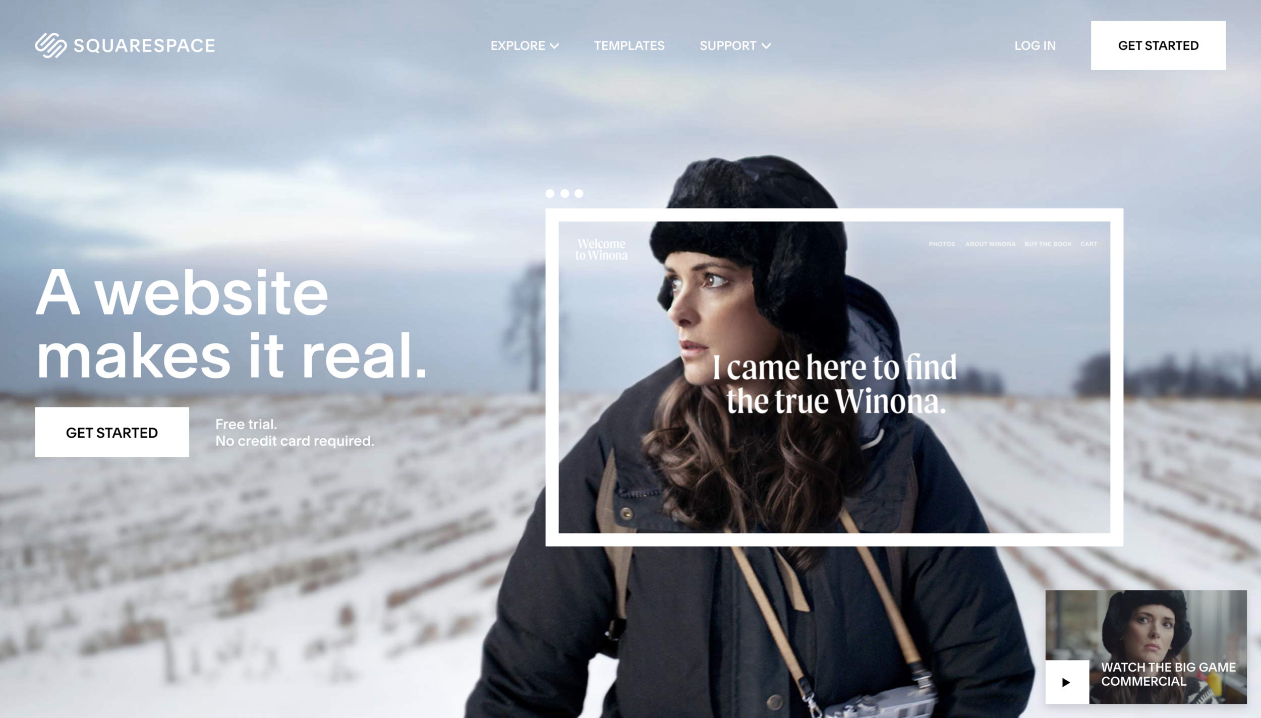
With the beginning of 2020 showing the makings of a tough year as the pandemic gained pace, designers at the Northern Block were dumbfounded to see Moret feature on a Squarespace advert shown during half-time at the US Superbowl final in February last year, with Stranger Things actress Winona Ryder taking the leading role. Completely unaware it was coming, or that his customer was one of the biggest software service providers worldwide, Jonathan admits discovering Moret’s cameo second-hand from a friend hooked on American football.
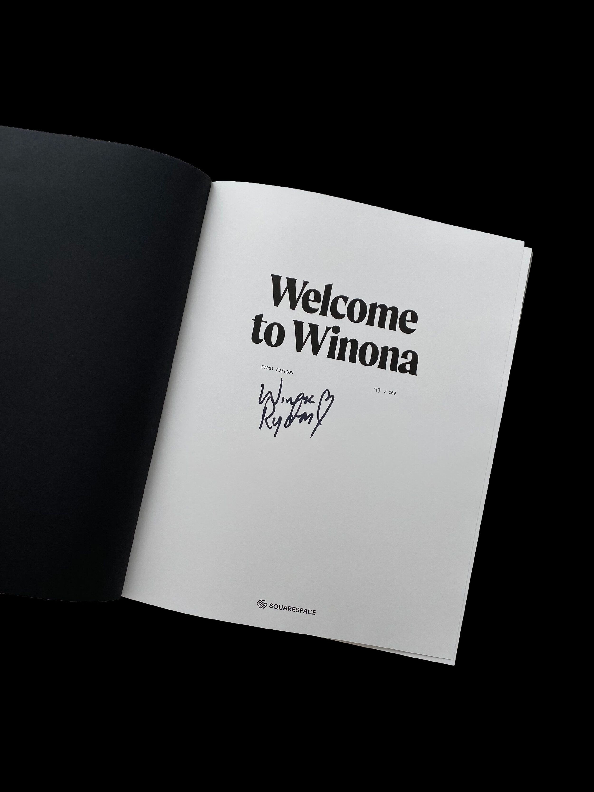
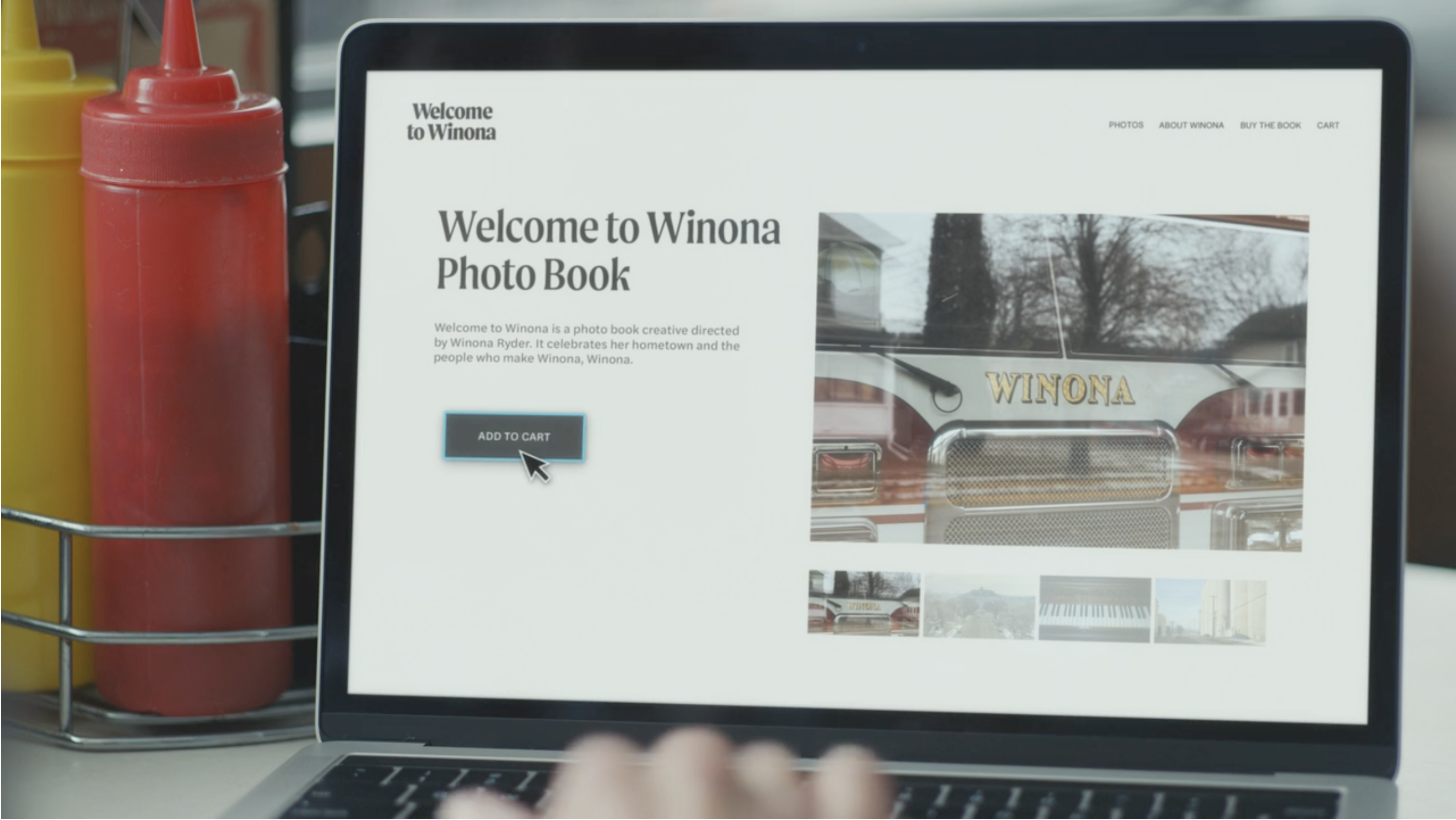
“When I watched it, everything made total sense”, he says. “The premise of the advert was genius. It involved Winona Ryder going back to Winona the Minnesotan city to document life and the people - and to produce a website called welcometowinona.com. Unbelievably, the font she chooses and the one that appears on her website and associated book is Moret.”
Taken aback, Jonathan professes that he never envisaged something of the “magnitude and authenticity of the Squarespace project” - or the immediate traction an advert broadcast to nearly 150 million people would entail. “Typefaces like Moret do make sales”, Jonathan says, “but usually take a year or so to be incorporated into large-scale commercial work.”
Not so this time, then. For a small and ambitious type foundry based in northern England, Jonathan admits seeing Moret on the big screen “felt like a film company had made his novel into a Hollywood blockbuster”. Likewise for Jamie, it was exhilarating to be able to sit back and watch his design “take on a life of its own”. But the best thing about the Northern Block’s feature on the Squarespace advert wasn’t its commercial potential: it was the fact Moret had become effortlessly immersed within the exact world for which it was designed.
“Typefaces like Moret do make sales”, Jonathan says, “but usually take a year or so to be incorporated into large-scale commercial work.”
It blends several calligraphic concepts to create a unique, dynamic and emphatic typeface.
The Squarespace advert is shot in Fargo-esque style, against a quiet, snowy backdrop of empty American diners, over-the-top fur hats and old knitted jumpers. Everything about it is vintage: a nondescript plot in a vast, ever-bleak landscape. But at the same time, Ryder’s advert works to reverse cliches about the American midwest. The film empowers small businesses and seemingly forgotten wastelands - and is intended to show that accessible tools such as Squarespace can help anyone make something of themselves. At the Northern Block, Moret’s representation within this narrative had sentimental value. It reminded Jonthan of his own struggles as a floundering designer long ago - and stood akin to the personal development of employees and collaborators at the Northern Block itself.
Speaking about the commercial, Ryder told People.com: “[Winona] is one of those interesting towns that in one way feels like it could be Anywhere, U.S.A, but at the same time it’s completely unique to itself.” Reflecting on Moret’s role in this relatable outplaying of the conflict between aspiration and belonging, Jonathan explains: “I knew the creative directors at Squarespace had understood exactly what we were trying to encapsulate with its style. For us, that was priceless.”
“He would work with a stylus and tablet to carve out natural curves, and working closely with him allowed us to push the design and capture something true to the designer’s DNA signature”.
Appraising Jamie’s creation back in 2019, Jonathan, even then, could clearly see it had David Lynch vibes, and would fit seamlessly on a movie poster for the renowned director’s crime parody Twin Peaks or his surrealist neo-noir mystery Mulholland Drive. That strange, ominous exoticism beholden to off-the-beaten track towns is a consistent trope in his films, and in popular understandings of forgotten America more generally. But it was also the environment in which Moret could thrive.
In fact, the project has led to more than one success story, and has inspired Jonathan moving forward. “2020 was all about the adjustments of working: the whys, the hows and the when”, he says. “But in 2021, I’ve been able to get back to typeface design and look forward to creating designs that take influence from my early years - ones which are very bold, with bags of retro ‘60s, ‘70s and 80s, and with less fuss about being perfect. Sort of Escape From New York meets The Planet of the Apes.”
Not only that, but the street credibility and professionalism Jamie brought to the company has set a “benchmark” for Jonathan and colleagues when hiring new talent. “For his debut font, what Jamie achieved was pretty remarkable”, he recalls. “He would work with a stylus and tablet to carve out natural curves, and working closely with him allowed us to push the design and capture something true to the designer’s DNA signature. Now when someone applies to work with us, we think: if you’re anything like Jamie, you’re on your way.”