How a 1970s film poster for The Battle for the Planet of the Apes inspired the design of Waldo.
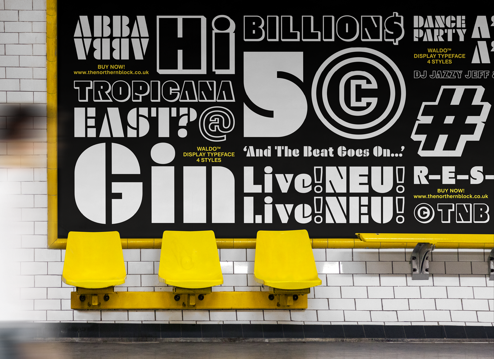
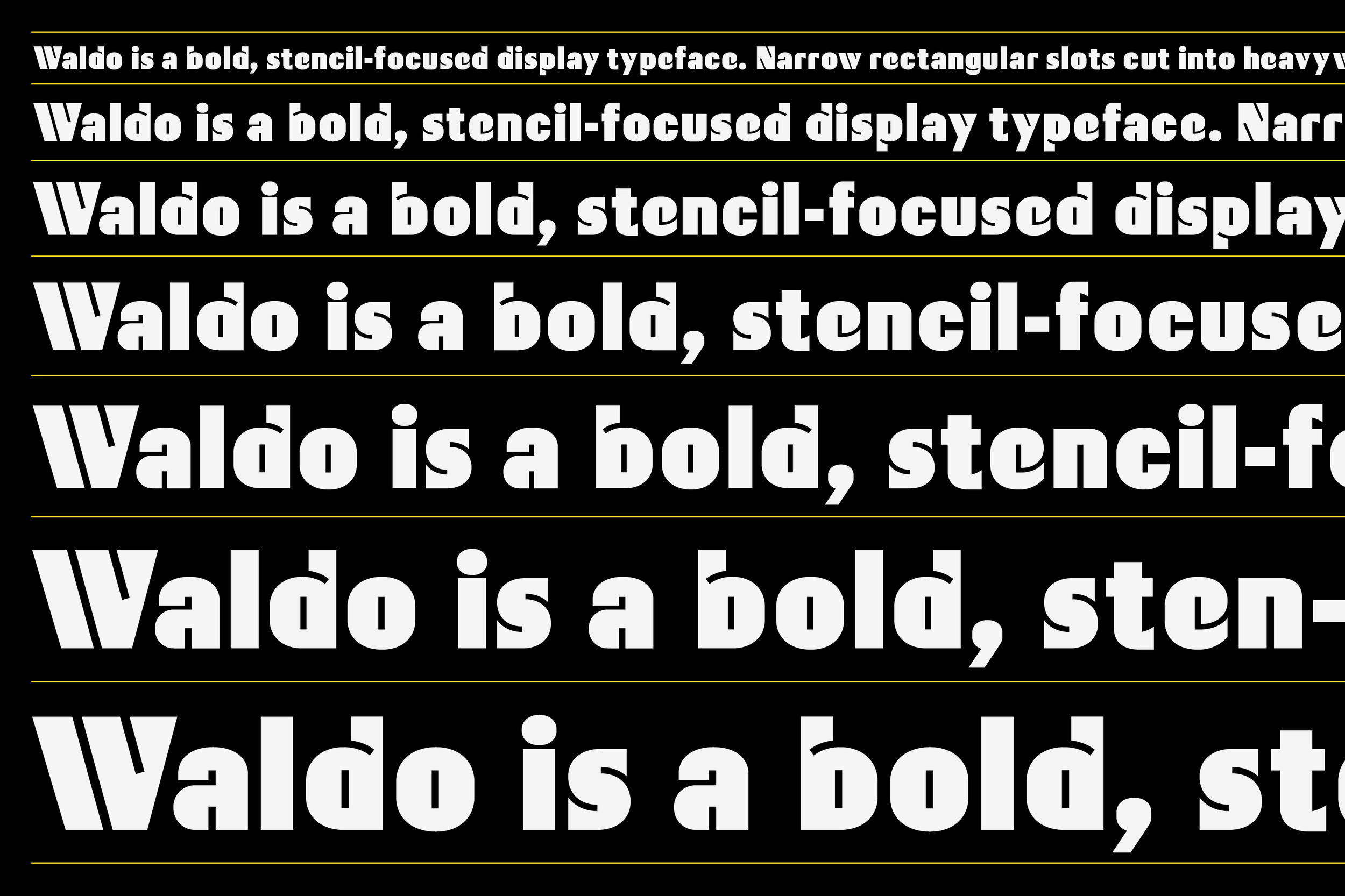
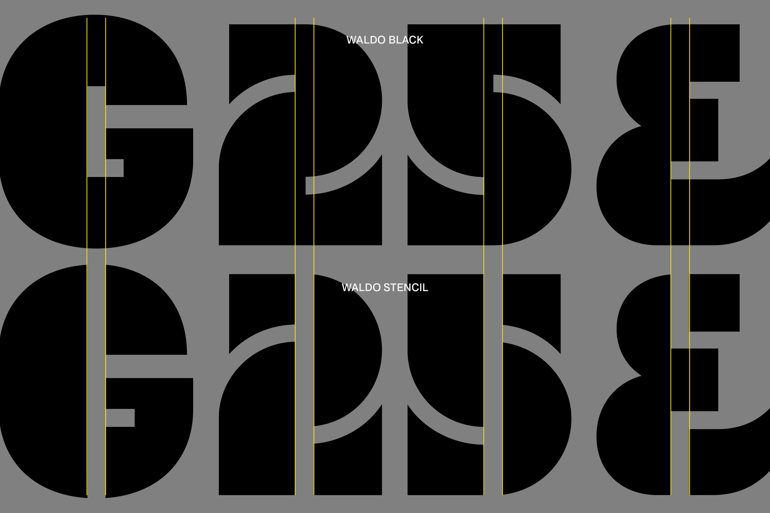
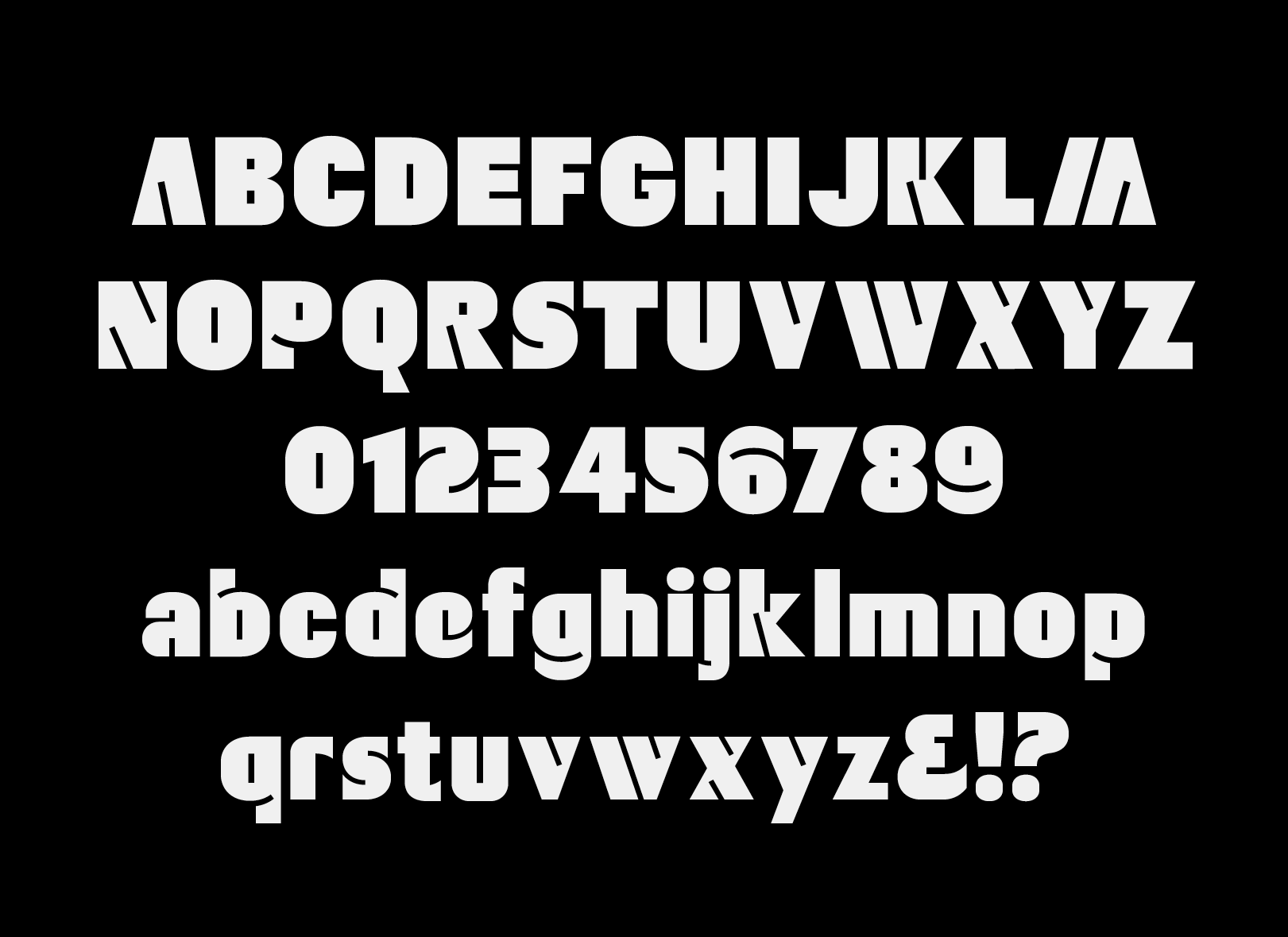
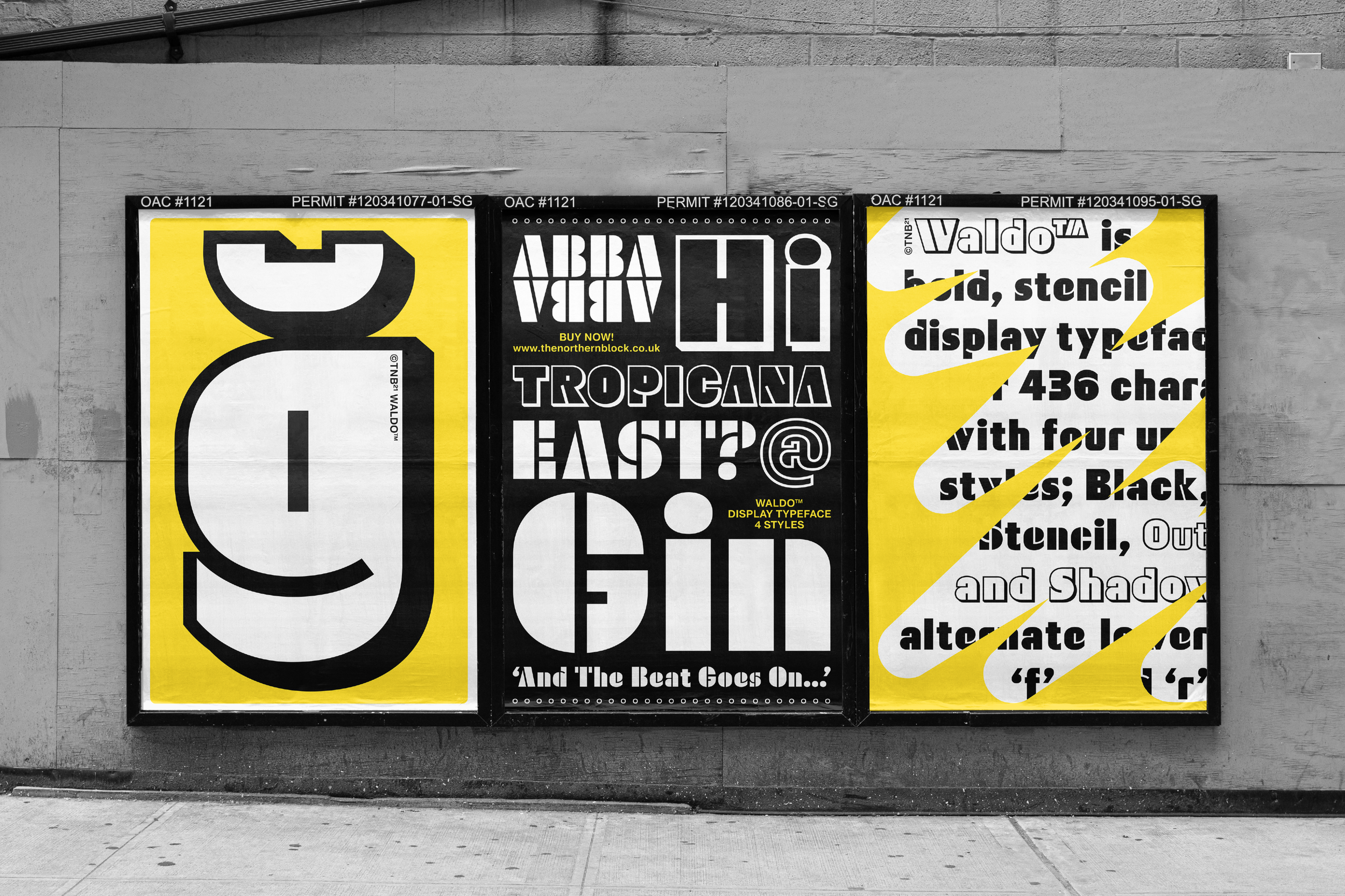
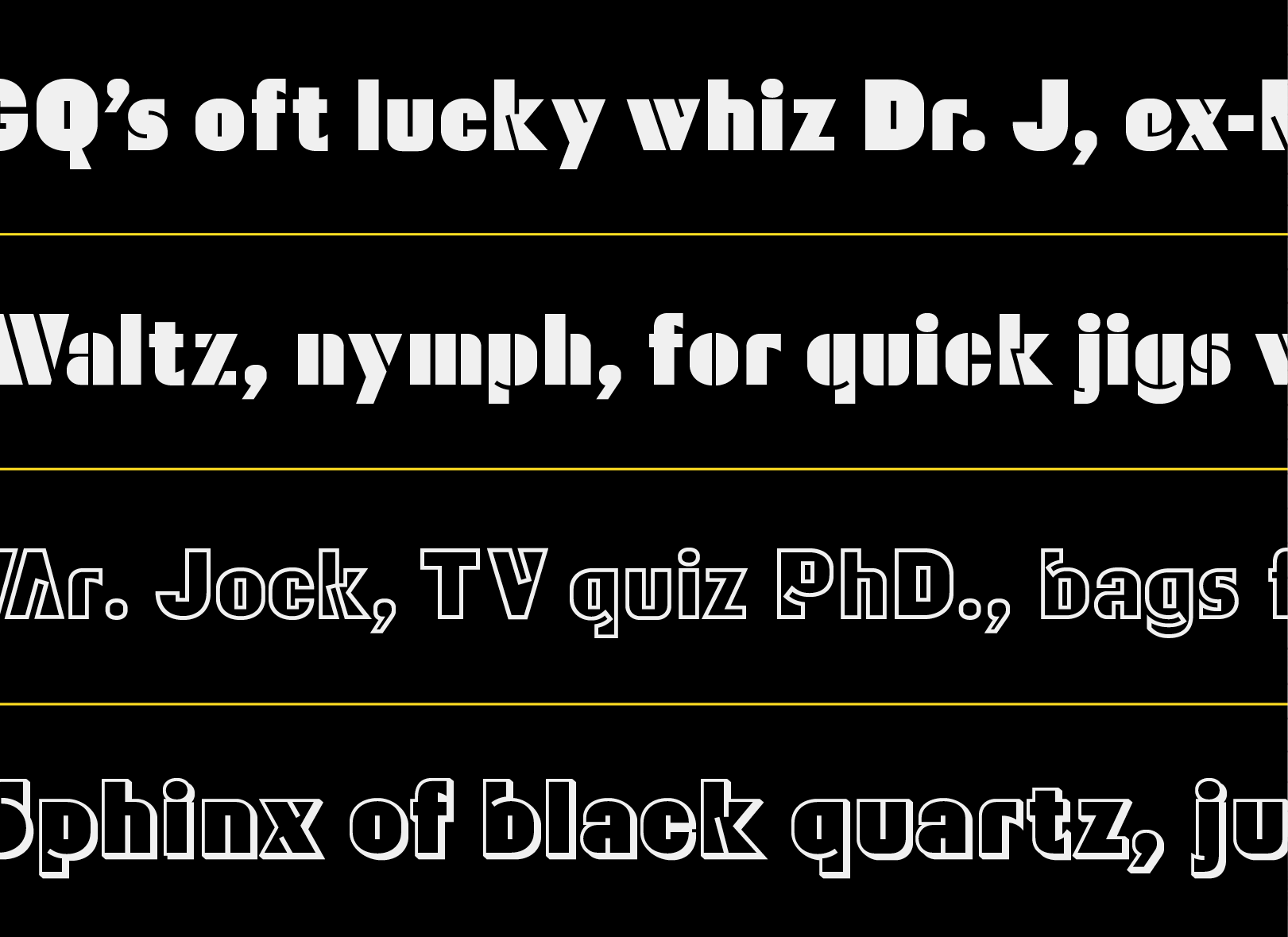
The Northern Block’s Waldo, is a heavyweight display face with a dose of stencil effect, was initially released under Aldo back in 2009. Inspiration for the design came from a 1970’s film poster for The Battle for the Planet of the Apes. In the film, the ant-hero, a gorilla leader named ‘Aldo’, is where the name derives. It's no coincidence that Jonathan met ‘Aldo’, not the original actor, but some guy in costume making money selling photos on the beach at Great Yarmouth in the summer of 1979. It left a significant impression on him that would help to open a gateway into his creative ideas.
The Aldo typeface made no impact on the original release, dubbed as over-styled and just plane retro with no sales potential. The company received a letter from another designer saying they already own Aldo’s name to rub salt into the wounds. Could you please take it off the market? The Northern Block amiably removed the typeface from the market on the principles of first font name published first. It seems that the whole concept was a non-starter, but setting up a type foundry also had the same roadblocks, so what can this teach us. A typeface, no matter how misunderstood or out of luck can find a way out.
Forward to 2014 in downtown Toyko, Roppongi Hills, to be precise. Jonathan came across a posse of in crowds wearing Bathing Ape clobber; that was it, the inspiration for Aldo to rise again under a new guise but with nearly six more years of type design expertise under the hood. Hello Waldo, a patient and more meticulous display typeface looking for a new set of users.