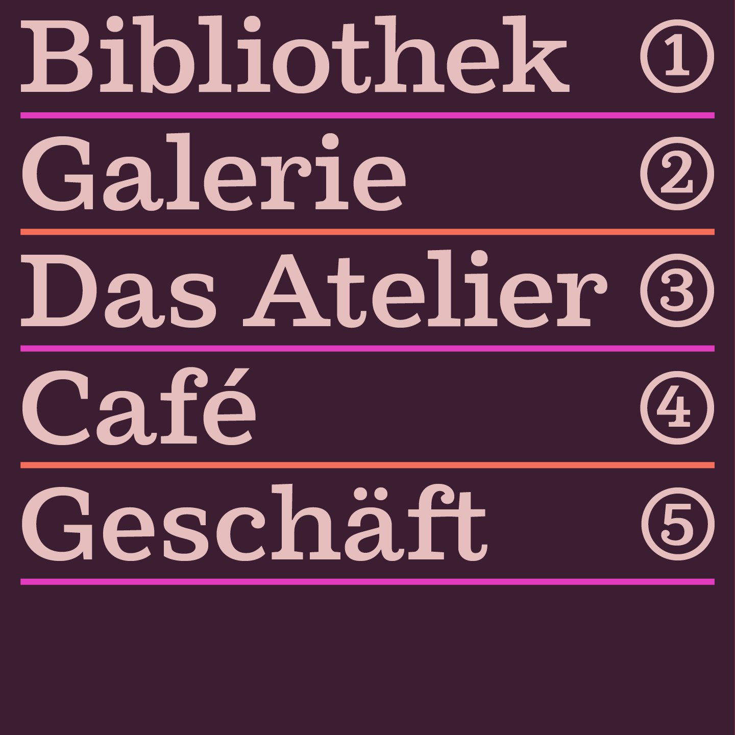
The Northern Block releases Cagney—A typeface that smacks of prohibition Americana, dipped in psychedelia.
Pretty and gritty. Steely but cheeky. A dancing gangster, delivering a solid and energetic performance. That’ll be Cagney. The latest font release from The Northern Block delivers a kaleidoscope of fun, that’s often lost in a modern-day slab serif. Cagney is a modern grotesque slab with humanist touches; bringing a bit of artbox warmth into digital design.
‘I was first looking to design a typeface with bags of character, but I needed to figure out where I was heading. Nothing was hitting the spot. It was either too far out, or classic grotesque.’ — Jonathan Hill, Type Designer.
The inspiration comes from the Egyptian style of the 19th century. Outsized ball terminals and off-track angles, mix with heavy and light strokes, to give an unexpected dynamic. Applying deep cuts and ink traps makes an impactful and legible typeface, compatible with modern-day scenarios. Cagney combines past imperfections and human subtleties with technology, to create a typeface full of life.
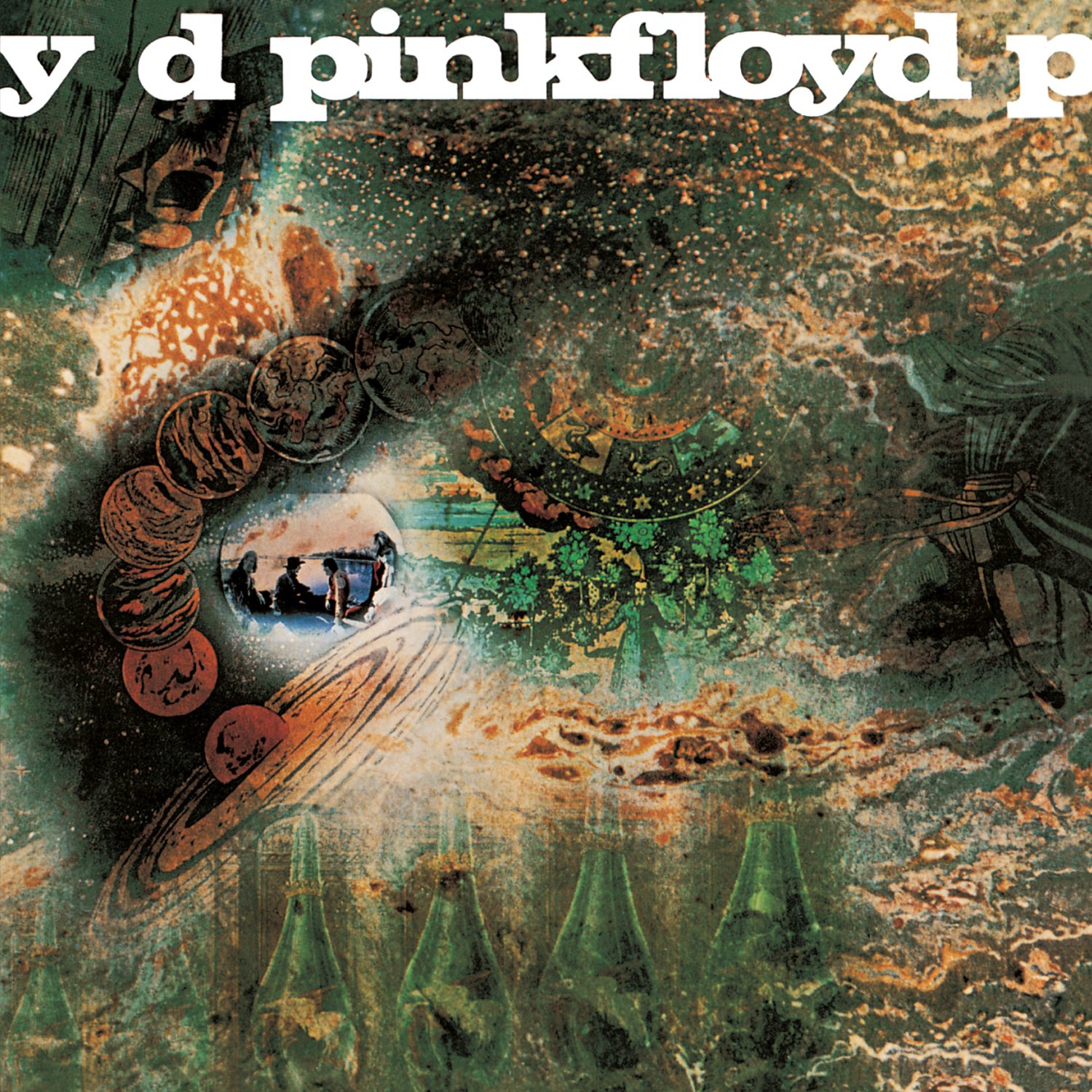
‘Then it just hit me. A cover by Hipgnosis, for Pink Floyd. They ran a bold Egyptian-style typeface across the top of the cover, with tight spacing that cropped out letters on the left and right sides. The typography was straightforward, but the typeface was complex, and that’s what I was after.’
Pink Floyd’s ‘A Saucerful of Secrets’ album cover, designed by Hipgnosis. Image source: Wikipedia
Egyptian slab on a psychedelic cover. If it can be there, it can probably be anywhere. Cagney punches with its weight for a place amongst typefaces inspired by the Egyptian style, but is very much setting itself apart from the competition. Just like its acting namesake; Cagney is an original. An identity brought to life in the unconventional.
‘I’ve approached this very differently from the orthodox process. The status quo is to take the Egyptian style and overhaul it. I wanted to retain many of the design details of the English slab, but apply lots of tiny changes and nuances that’ll help separate it from the competition. It’s more about celebrating imperfections and incompatibility.’
Cagney is a mash-up of worlds, with a solid outcome.
Think crumbling governments and prohibition bootleggers. Boxed up crate labels, and Babe Ruth batting for the Yankees. Duke Ellington and swing dancing. Hemmingway and Orson Wells. The spinning headlines of American tabloids. Citizen Kane.
Now mix in the psychedelia. Notes of warmth, and human character. Huxley’s Doors of Perception. The headlines of Hunter S. Thompson. A naked lunch with William Burroughs. Splash it with colour, get trippy and smile. Then drop it into the digital age.
The Cagney contradiction? It’s a typeface that will perform with elegant energy, in surprising places. Just like James, the Cagney typeface could be a decorative classic.
‘The connection is close to the concept because James Cagney was a strikingly handsome man with a pretty boy image. Yet his acting performances were steely and gritty. The typeface aesthetically will look attractive, yet underneath will have a solid functional quality.’
Cagney is expressive, and delivers a dose of eccentricity. Brought to life with intense spacing and kerning, and lots of manual adjustments at the hand and eye of Jonathan. The result is a versatile and dynamic typeface, as unique as James Cagney himself.
But where will Cagney dance?
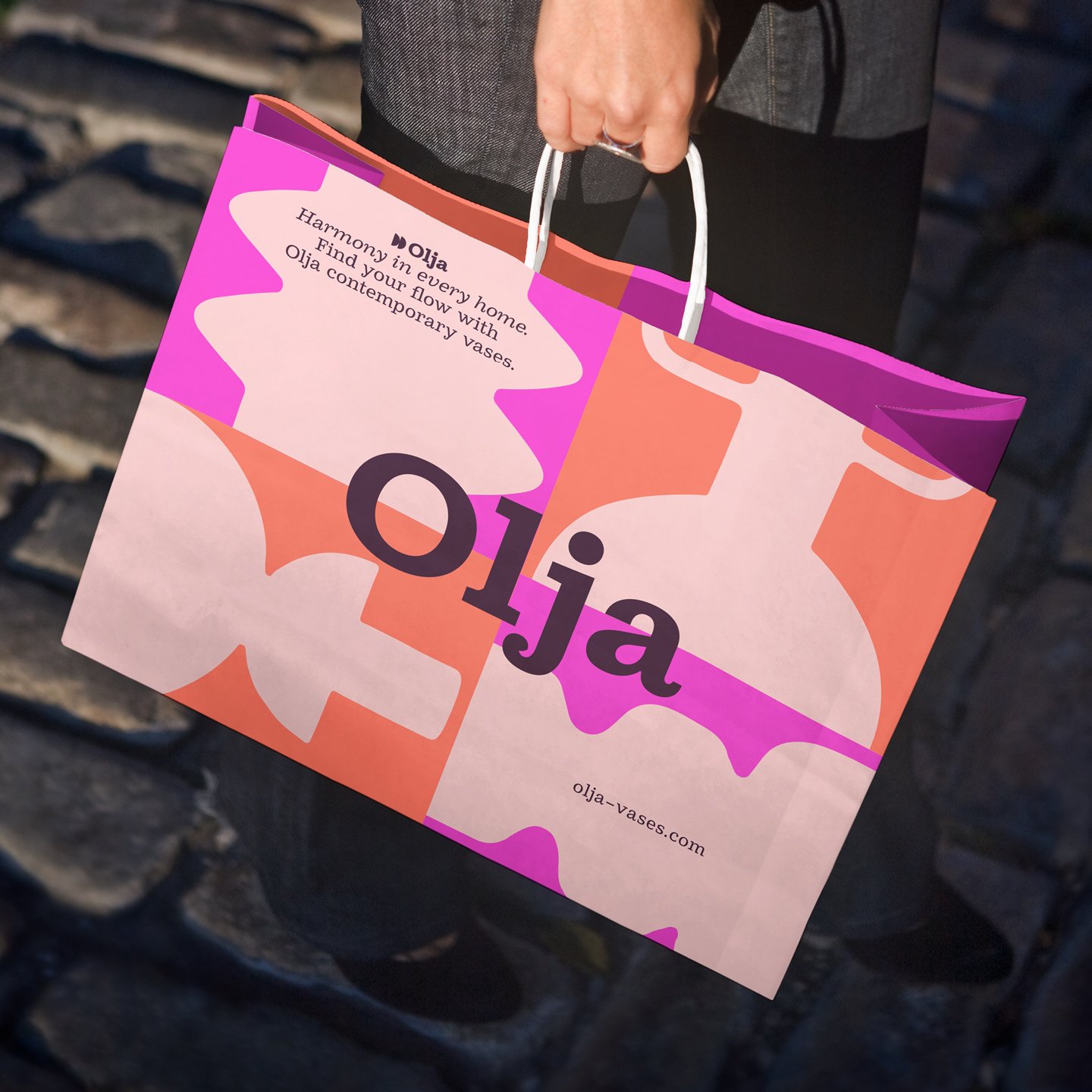
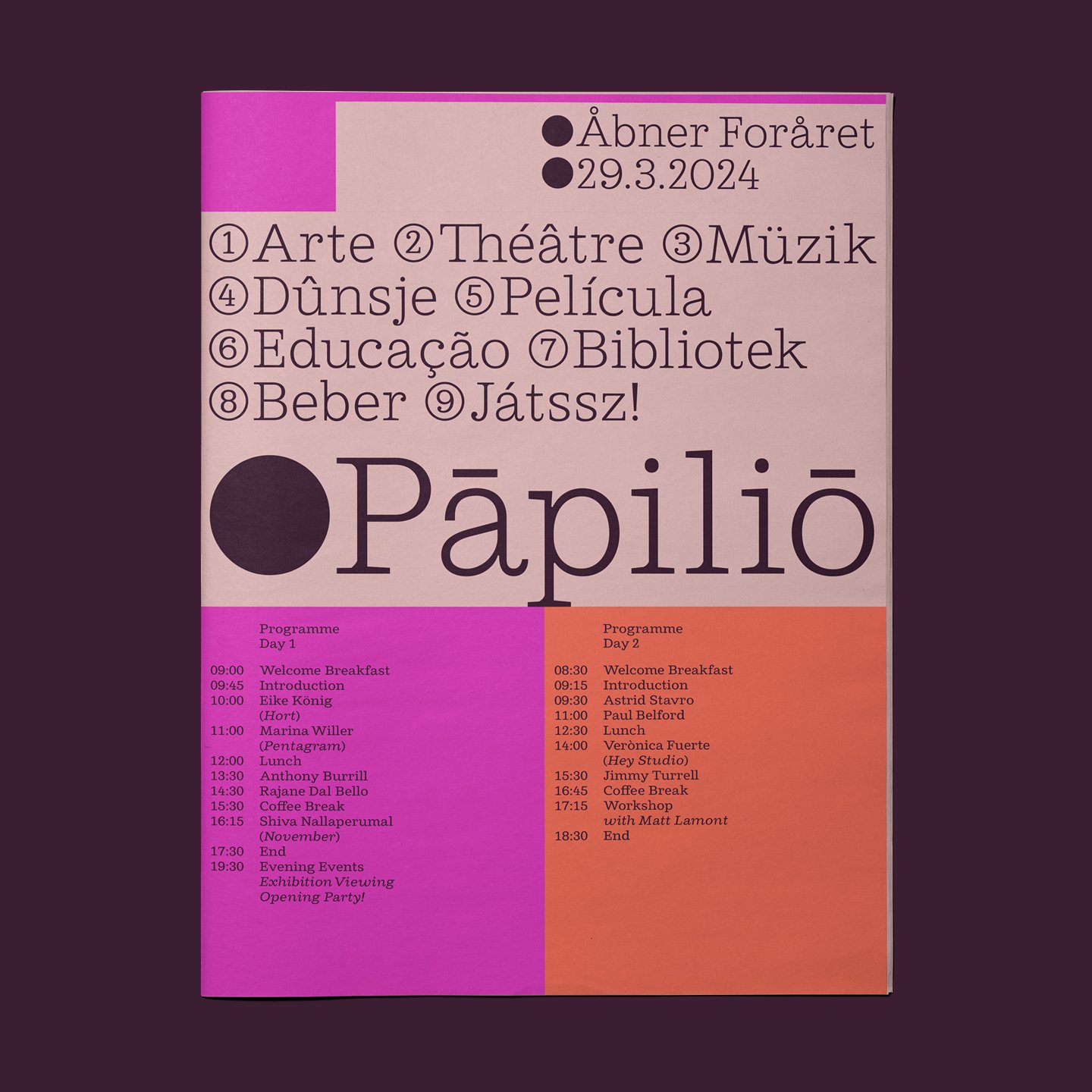
The Northern Block can see Cagney acting out in advertising, with text that tickles. Or infusing antique charm into anything timeless, and worth looking at. It will add bounce to a book cover, or bring playfulness to publishing in a magazine or newspaper. As food branding and snack packaging continue to explode with big personality, we might see more from a typeface like Cagney. Describing fun fusions in a world of hybrid food cultures, making light work of heavy flavours. Cagney’s licking its lips at you from a chocolate bar wrapper, saying ‘Bite Me, Sweetie.’
Talking technical
Cagney includes seven weights with matching true italics, and over 900 characters per style. OpenType features consist of fourteen number variations, including inferiors, superiors, nut fractions, tabular, lining, circled, and oldstyle. It also has alternate uppercase E and F, lowercase a, e, g, and y, small caps, and language support covering Western, Southern and Central Europe.


