The Northern Block re-releases Dekal—Bringing a revival typeface out to play, in a retro future near you.

It was a typeface made by hand and brought to life in a world of Letraset catalogues and dry transfer film. The name Dekal, is a play on Decal; the same process as dry transfer, but precisely onto glass or porcelain.
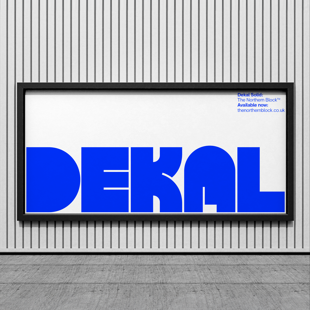
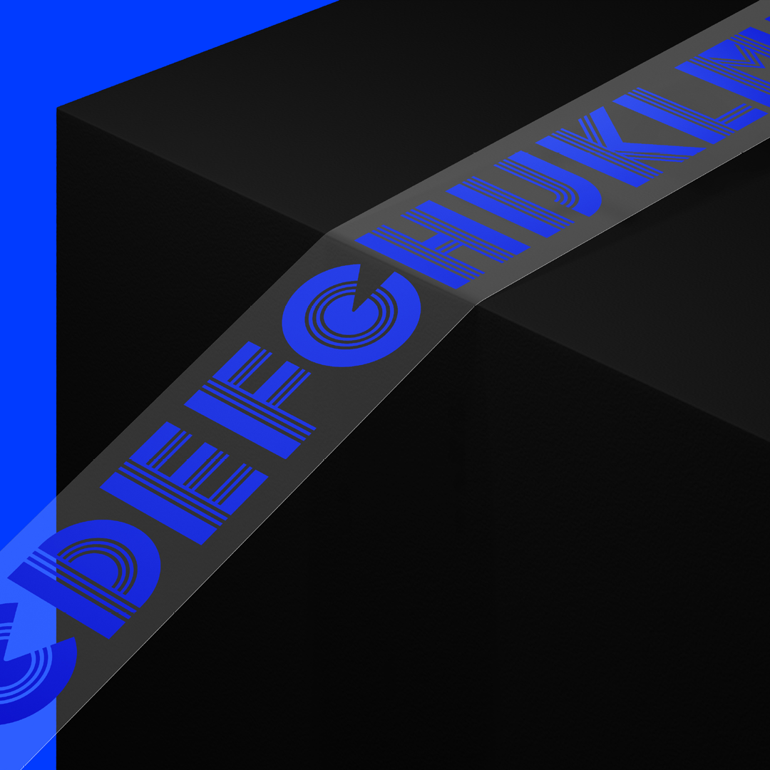
Dekal is a revival typeface of Blackline, designed initially by Wolf Magin in 1969. The contrast between thick and thin parallel lines creates a unique visual identity familiar in the late 1960s and early 1970s dry transfer era.
‘Before I became a typeface designer, I’d always been interested in typefaces. Dry transfer letters were my introduction point to connecting the design of a typeface, with its name.’ — Jonathan Hill, Type Designer.
For the early part of the noughties, right up to the rental boom, retro typefaces from the 60s have been ignored. Now though, with increased access to fonts and improved ways of displaying fonts on technology devices, retro faces like Dekal are back in the game.
But what makes Blackline worth resurrecting at all?
It’s a typeface embossed in its era. Crafted by hand, and imagination. There’s a romance to that, and a genius to the typeface design itself. It challenges the artform. Cutting through convention, and leaving a lasting impression.
The style comprises of multiple lines, both thick and thin, in parallel. It shouldn’t work, but it does. Like the trick of typoglycemia; misspelling a word by jumbling around the letters. There is legibility where there shouldn’t be. That’s fun.

FI YUO CNA RAED TIHS. IMAINGE YUOR FUTRUE.
In the digital era, Blackline can no longer cut it. The original was created in one style with only uppercase, punctuation, limited symbols and numbers. It only existed as a dry transfer. In this digital interpretation; lines and spacing are more expansive to help construct lowercase characters and improve screen effects.
Version 1.0 of Dekal was released in 2011 and was described as a liberal interpretation of Blackline by the industry. It was also released at a time when revival, retro display typefaces were off the menu.
‘With over a decade of type design experience and more advanced font development tools, it was time to revive the revival.’
Dekal version 2.0 started in January 2023, over a decade after the original design. Spurred by the rise of the subscription market, and an appetite for fonts not found on computer system software.
For Jonathan, it came with the technical challenge of reducing lines and opening up spacing to nail legibility. This version sees the introduction of lowercase letters that work harmoniously with the uppercase, by a further reduction in parallel lines.
The best digital revivals of Blackline run very close to the original and don’t meet modern application criteria. The Northern Block’s Dekal is here to bridge those worlds.
It includes two other interchangeable styles, featuring only a single line and no line. The concept is to interchange the styles in the exact words or sentences without interrupting the letter or line spacing.

Where will Dekal come to life, and what will it offer?
Dekal will bring beauty to signage, apparel, books and posters. It will make for stand-out packaging. It would be impossible to ignore on a billboard, and bounce out of badges and stickers. It also leaves the door wide open for bigger adventures. It has the romance of a retro-future aesthetic, invoking the imagined sci-fi futures of the 60s, 70s and 80s. On the web, that retro vibe is convincing enough to make the internet feel like it predates the Atari.
Dekal could comfortably find a place in the myth-worlds of Rollerball, Tron, or Judge Dredd’s Mega City One. It can live on the side of a cereal box in a floating city, as easily as it can exist in the here and now, on a Netflix subscription, or a baseball cap. Dekal can bring a fictional future to life, and it can make our real world far more fun to look at.
What’s exciting about Dekal, is where it can take your imagination. It’s what others might do with it. We will see how it plays out, once it leaves the mothership.
Talking technical
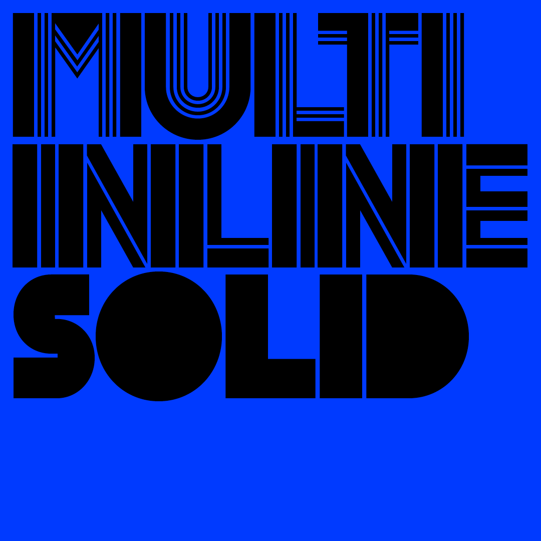
Dekal comes in three individual display styles: Multi, Inline, and Solid. Multi is the revival, and the other two are the supporting styles. Each style contains over 500 glyphs.
OpenType features consist of digital numerals, lining figures, fractions and thirteen uppercase stylistic alternates. Language support covers Western, Southern and Central Europe.