Better known for modernist geometric sans, our first serif typeface in years is due for release—meet Leida.

Making a new serif typeface is no mean feat, especially when historically our type foundry is better known for modernist geometric sans. Having expressed an interest in serif typefaces for years, we now have one in the pipeline that will add new energy to designer’s heavy typesetting scenarios.
Leida is the given name to our serif typeface, which is inspired by the southern Dutch town of Leiden. Type designer and founder of The Northern Block, Jonathan Hill, who is no stranger to serif typefaces, wanted to tip his hat to the Dutch masters, specifically Bram de Does and the typeface Lexicon, regarded as one of the best designs in history.
But this isn’t about making a reinterpretation of the Lexicon. This is about taking inspiration from Bram’s process and how he utilised the most up-to-date techniques of his era to create a serif with a new purpose. Leida’s aesthetics come from Jonathan’s past experiences of making a serif. It’s an evolution of recent successes such as Modum and Scharf.
In simple terms, Leida’s typeface alchemy takes rich documented ingredients and applies new skills and technology to create something far greater and more in-tune with future type design practices. Bram made a typeface that changed the direction of the dictionary; Jonathan is looking more towards influencing the use of serifs across user-interface applications.

Jonathan’s initial sketches for Leida’s basic character set
The starting point for Leida isn’t as simple as working over the bones of a past project. Jonathan begins the process by drafting out some primary characters by hand, on tracing film, to get a feel of the design. But that is where tradition finishes. The typeface is then re-drawn again directly within the software application. Jonathan insists this ensures we exploit the technology to its full potential.
Lexicon may not be the vehicle for Leida’s styling. Still, fundamentally, it follows the basic principles of readability of small text by utilising a more condensed letterform and having shorter ascenders and descenders. Combined with open counters and lower stroke contrast, the typeface has a robust and sturdy feel across long lines of text.

Jonathan’s initial sketches for Leida’s italics
The hardest yards for this typeface lie with the italics. Jonathan doesn’t benefit from being taught by a past master at Reading University. His learning is humble and comes from past mistakes, experiences and well-researched material.
Jonathan gets a lot of inspiration from reading articles about how Bram de Does didn’t set out as a type designer. It gives you the confidence that knowledge outside of type design specifics can give you the edge. Here we delve into Jonathan’s mind for the making of Leida.
What influenced the style and design of your typeface?
Given our reputation is better known for making modernist geometric sans, it was vital that designing a future serif typeface was done for the right reasons. In beginning this project, I decided to look at the process behind the Lexicon typeface design by Bram de Does. Bram was predominantly a typographer and only designed two typefaces during his career, however what he created is regarded as excellent as any typefaces created in the twenty-first century.
Rather than producing just another typeface, Bram studied and identified in detail what was missing from the market. He concluded that no one appeared to be exploiting technology to create a typeface suitable for printing dictionaries onto the latest papers at small point sizes. Rather than the design driven by technology, he was using technology to drive innovation. Our critical decisions for the design of Leida will align with Lexicon, such as being subtly condensed with short descenders and ascenders. But in terms of style, it’ll come mainly from the experience of drawing serif forms and trying to make them work in small point sizes in confined spaces.
What influenced the name of your typeface?
I was looking for something that would feel Dutch without being a Dutch word, which is not easy. So I adapted the word Leiden, a small town in South Holland, to ‘Leida’.
What makes your typeface design different to other competitors/typefaces?
I feel that utilising technology to advance design will produce something quite different than someone who looks in detail at historical typefaces. Lexicon’s inspiration comes from looking historically at Granjon’s Gaillarde in 1568. So, looking back as far as Lexicon, 1989 is where the book stops for Leida. There is strong competition in this field, if I can produce something at a similar level of design quality but with more advanced features, I’ll be thrilled!
What features can we expect to see in Leida?
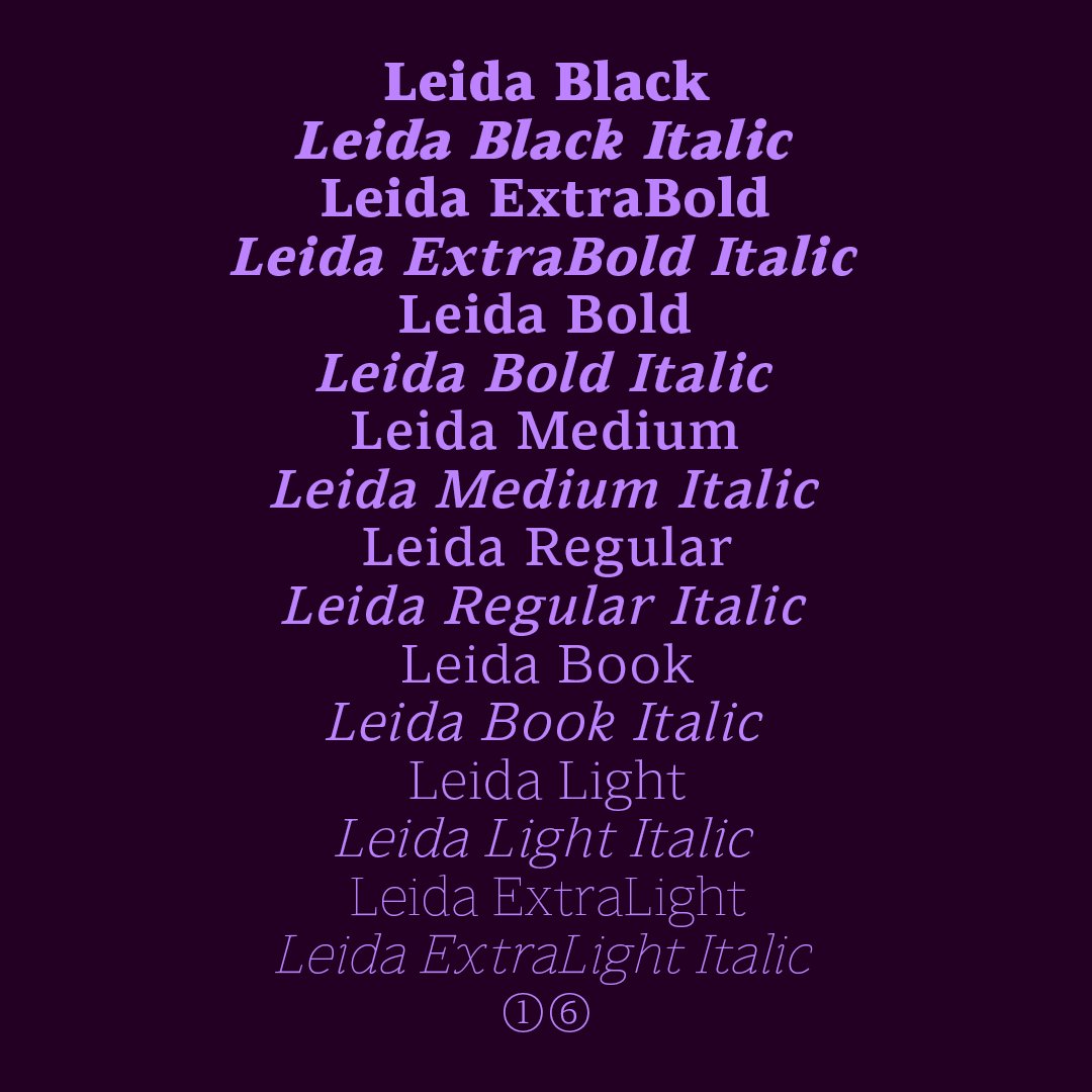
Leida includes eight weights with true italics and over 900 characters per style. OpenType features consist of fourteen number variations, including inferiors, superiors, fractions, tabular, lining, circled, and oldstyle. It also has alternate lowercase a, e, g and y, small caps and language support covering Western, Southern, and Central Europe.