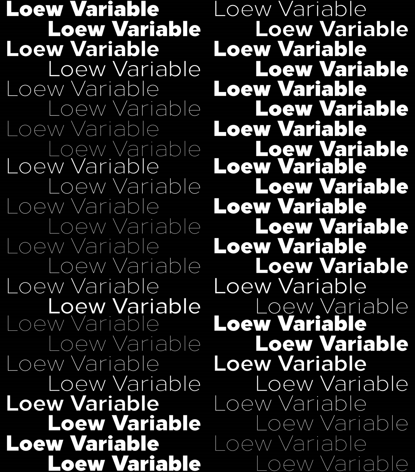
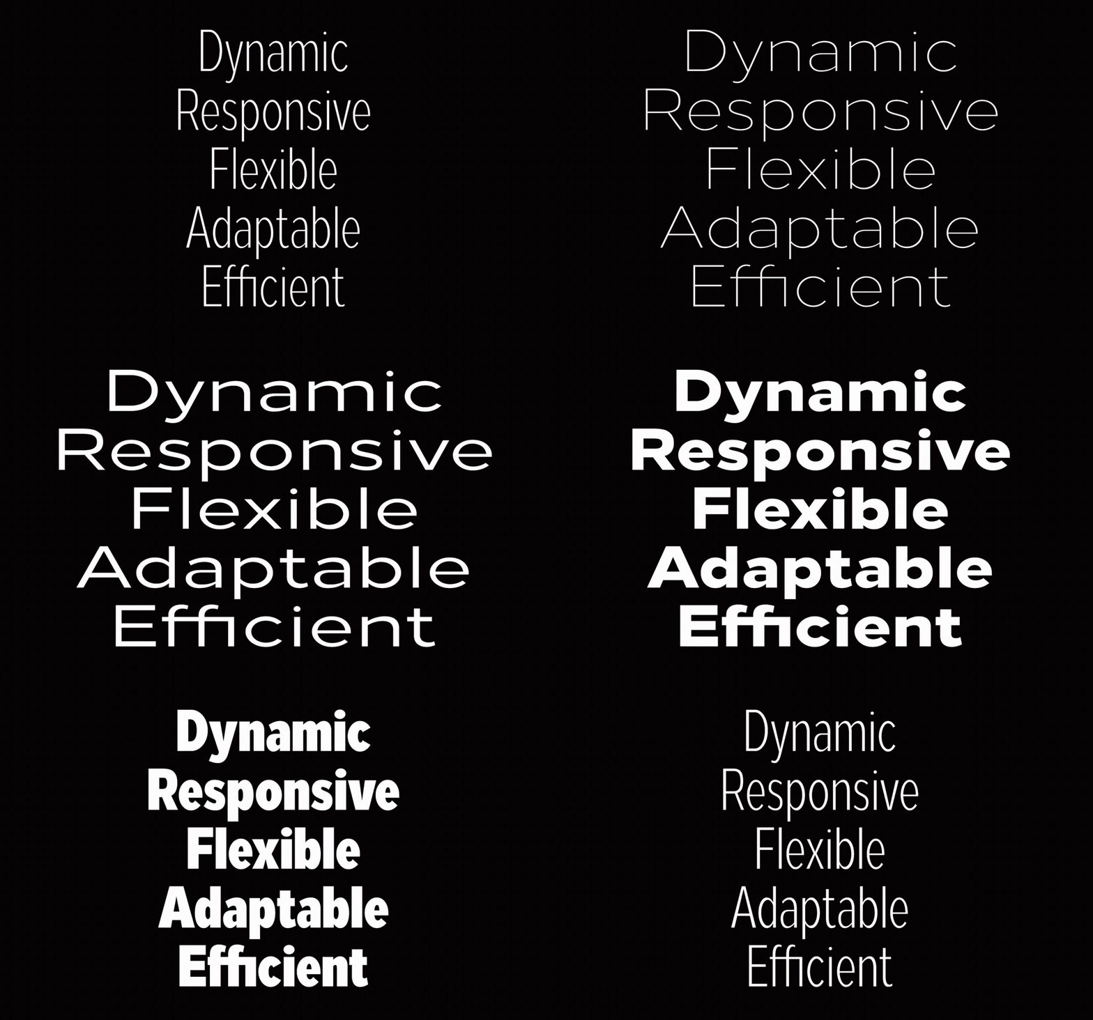
Loew Variable blends fresh with familiar and draws on inspiration from mid-century industrial designers.
Jonathan Hill, founder of The Northern Block, talks of Raymond Loewy’s influence on the design of Loew Variable—a geometric sans-serif font.
Charmed by industrial design and the attractiveness of form and function, Jonathan developed the variable version of his typeface, Loew, encompassing a strong connection with the father of industrial design—Raymond Loewy.
A geometric sans-serif font, Loew draws inspiration from mid-century industrial designers. Blending fresh with familiar, the development of Loew Variable responds to how creatives have interpreted the use of Loew since its original release in 2014. Working in collaboration with world-leading brands using Loew, The Northern Block came to understand its evolving place in the market; to offer greater flexibility to creative professionals through a brilliant variable option.
Jonathan shares industrialist Raymond Loewy’s passion for making the everyday object fit for purpose. That attraction steered him towards future-proofing Loew into a variable typeface—one that juxtaposes efficiency, unadornment and purpose.
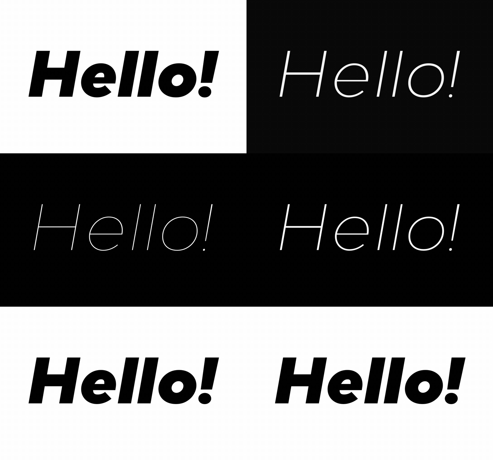
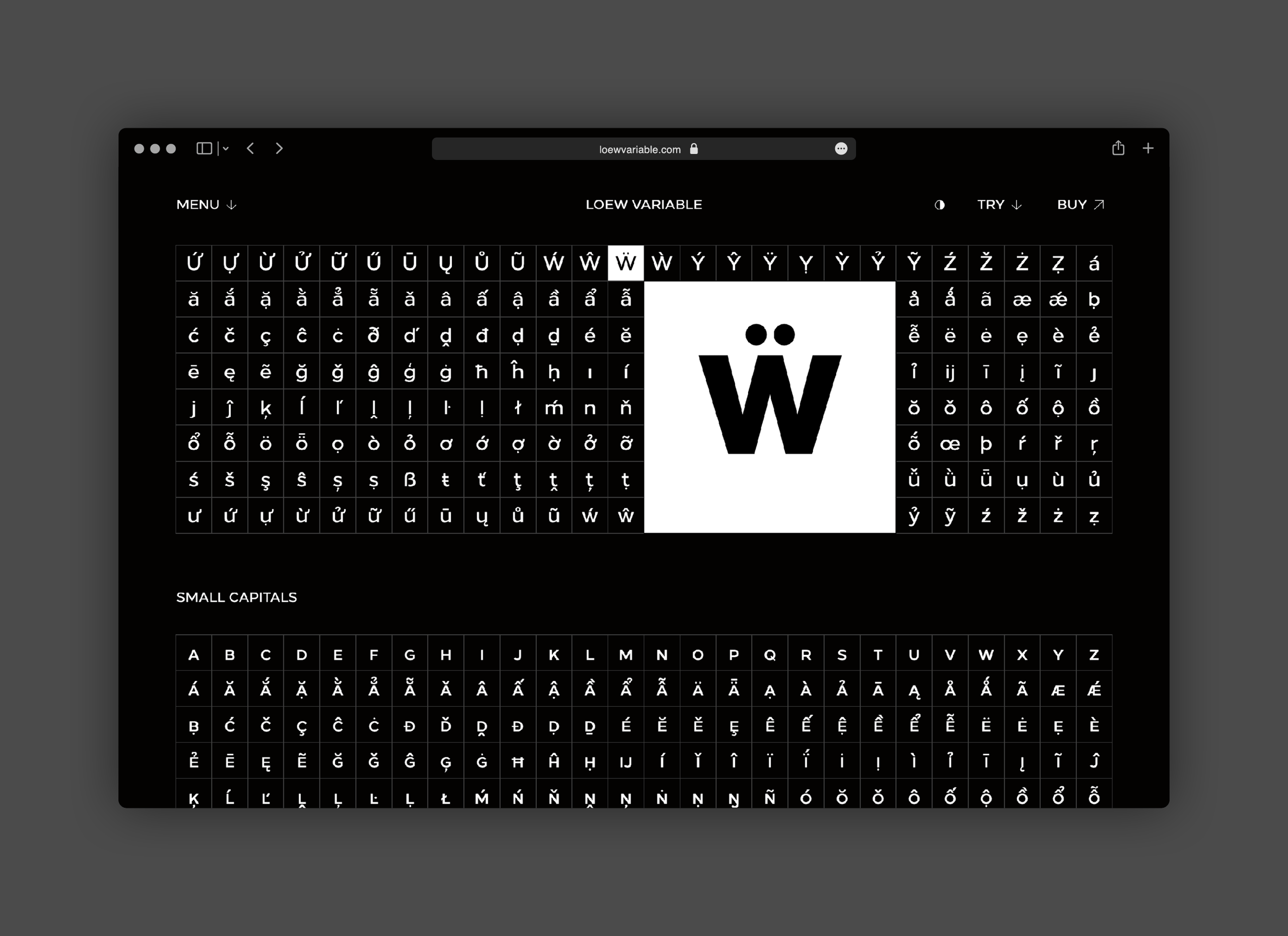
The font’s variable capabilities shine under the limelight of its microsite, where users can experiment with Loew’s potential through multiple type testers. This functionality invites users to select custom variations through size, weight, width, and italic, as well as being able to adjust alignment and change languages. Additionally, the font’s complete character set can be viewed in variable format, with individual glyphs auto-animating to demonstrate the extensive style variations available within a single font file.
Here we delve into the details of why there is a place for Loew Variable in every creative’s toolkit.
How do you know when a typeface needs to evolve?
I design through experimentation, but always with a purpose in mind. This means creating typefaces that complement the characteristics of a creative’s toolkit. During the design phase, I find it important to outline unique environments that can filter diverse styles and preferences with advanced capabilities. This process gives new life to existing typefaces and with Loew Variable, offers both sophisticated and delicate extensions of a creative’s toolkit.
The goal with Loew Variable is to prevent Loew from being constrained by the past. It needed to become forward rather than backwards-looking, and this is reflected in the name. Raymond Loewy embraces that all-important dimension of contemporaneity, which innovation always demands. Removing the ‘y’ from his name signified my approach to making something new and fresh, not just paying homage to a single chapter in time.
What makes a good typeface?
One of the most important qualities of a good typeface is making it enjoyable to use, so creatives can express exactly what they want to convey through the power of type. A good typeface reflects the designer, their ideas, and their interests in the most beautiful yet functional ways possible, while finding a rhythm to go with the purpose for which it is being used.
Supporting motion graphics by Luke Dryden
How does Loew Variable combine form with function?
With Loew Variable, I like to think of this as a tool that gives creative professionals endless possibilities to design for visual impact within their space. Loew Variable presents the freedom for creatives to discover new ways to use the typeface determined by their own style that can be elevated to new levels.
We achieve this by making Loew a little narrower, wider, and somewhere in-between. Loew Variable can quickly adapt to its environment. Its design is optimised and targeted, the text is dynamic and adjusts to context. And the best part—variable font capabilities are packed into a tiny sized font file.
How did Loew’s design begin?
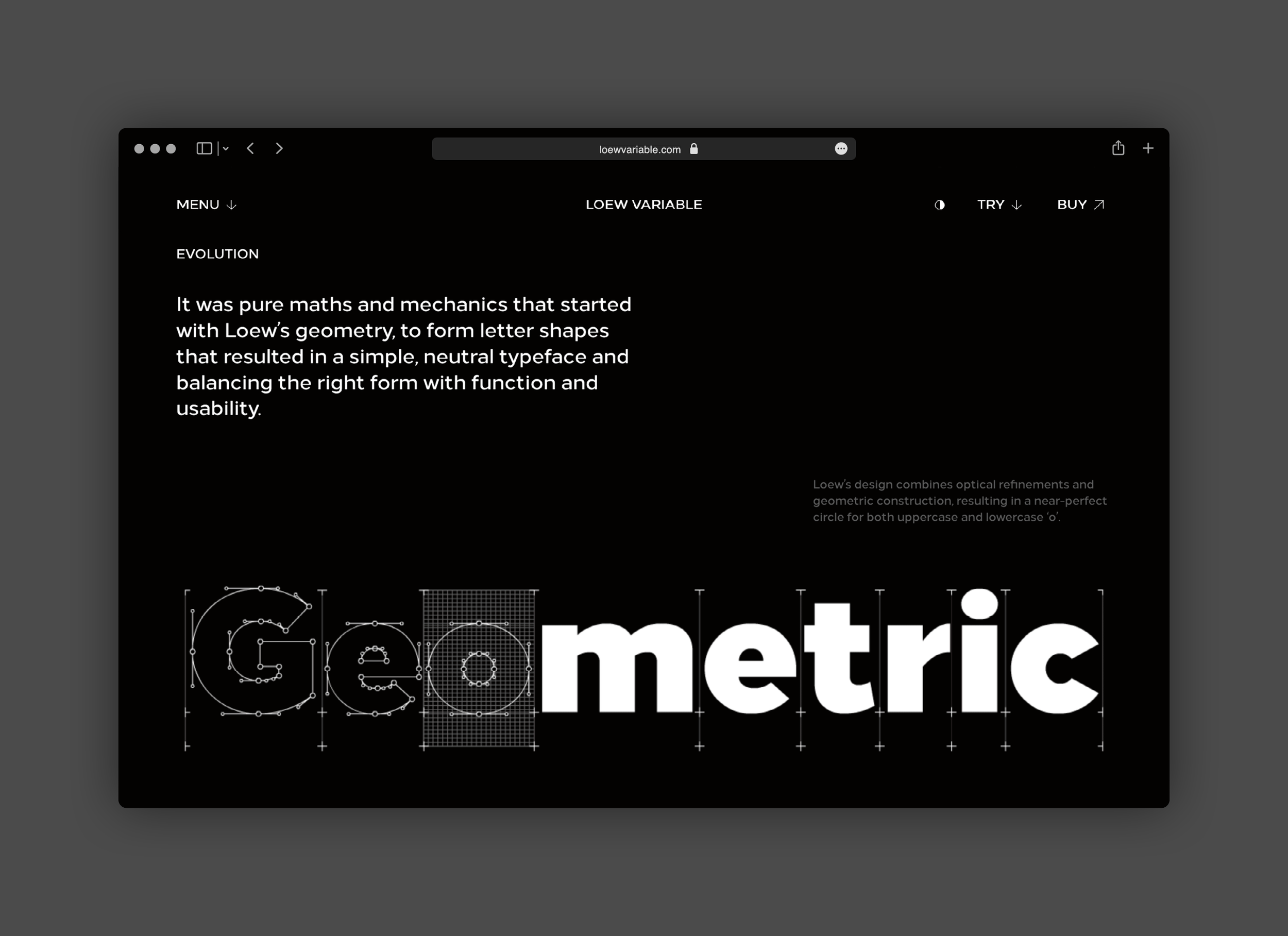
Loew’s design began with pure maths and mechanics to form letter shapes that resulted in a simple, neutral typeface that balances form with function and usability.
In a true moment of reckoning, I discovered that Loew’s attraction lay in its deliberate conformism. First came Vauxhall Neue, a custom typeface created for Vauxhall Motors, and then came Hilton Worldwide.
These relationships opened a whole new level of inquiry that went beyond design and into the realms of science and engineering. We questioned whether the shapes could be sturdier, less mechanical and whether we could match complex writing systems such as Arabic, Chinese, Japanese and Korean. I realised Loew had the potential to offer all these things and more, and along came Loew Variable.
What features does Loew Variable have?
Loew’s pure mechanical shapes are carefully adjusted to give the characters the right form, function, and usability. These subtle human touches combine with technical detail for great readability at both large and small point sizes.
Loew is a versatile, geometric sans-serif font with simple and honest geometry aimed at a wide range of modern applications. Details include over 800 characters with alternate lowercase a, e, and g. Seven variations of numerals, true small caps with accents, manually edited kerning and OpenType features.

