The Northern Block produces Fagun, a versatile type family with Victorian roots available in 14 styles plus variable.

Fagun—a highly readable, humanist sans-serif typeface with calligraphic roots premiered in mid-2022 and brought an entirely new spin on the Dickens’ novel and the 1968 musical version of Oliver!
The complete family of 14 fonts takes significant inspiration from 19th-century type styles by including small caps and alternate lowercase, a type trend commonly seen in the Victorian era.
One of the most delightful aspects of the font itself, is its influence by several typefaces, making its group tough to define.

We chat to designer Jonathan Hill about his work on Fagun, and he opens up about invoking originality with the typeface, whilst throwing in some fun Oliver! themes into its marketing campaign (designed by Donna Wearmouth) without losing track of Fagun’s main goal—to create an accessible and inclusive type family.
Getting into the psychology behind Fagun, where did the idea come from, and how did it get here?
First and foremost, we wanted to design a typeface that was accessible. One that would be used for making long lines of text easy to read. Behind the scenes, this involved combining broad nib pen-style strokes with straight-line geometry.
We had a style in mind, but as innovation demands, we wanted to create alternatives that would give the design a different flavour and reinforce the functionality in readable text.
For Fagun, I was drawn towards type design from the Victorian era, a period when many type styles influenced a single piece of work. One type trend that was common during that era was type styles that included small caps and alternate lowercase, and we wanted to bring this into our new typeface.
The 19th century heavily influenced Fagun’s direction. Alongside sparking inspiration for those alternative cases, popular Victorian art also inspired another key element of the typeface: its name. Fagun is an intentional misspelling of Fagin, the infamous leader of a band of pickpockets in Charles Dickens' 19th-century novel, Oliver Twist. This inevitably led to the design of its accompanying promotional material.
It was a lot of fun making Fagun because we set out to create the all-important dimension of inclusivity and contemporaneity, but in a way that differs from similar typefaces. Its design doesn’t commit entirely to true calligraphic principles.
And here we are! We released Fagun in mid-2022, so it’s very much in its infancy. There’s always a level of conservativism when you release a new font, from scouting competition to those levels of anticipation leading up to when, what and who will make it take off!

Did your process for designing Fagun differ from your other fonts because of its newness?
I tend to design through experimentation, which worked well for Fagun. Throughout the whole process, our team wanted to ensure the typeface had a proficient level of modernity, so this experimentation combined both hand-drawn lines with pure straight mathematical lines that didn’t entirely commit to true calligraphic principles.
The main area of difference with the way we designed Fagun was to ensure we created some alternative characters (that are not offered by similar typefaces) that would give the design a different flavour and reinforce the functionality in readable text.
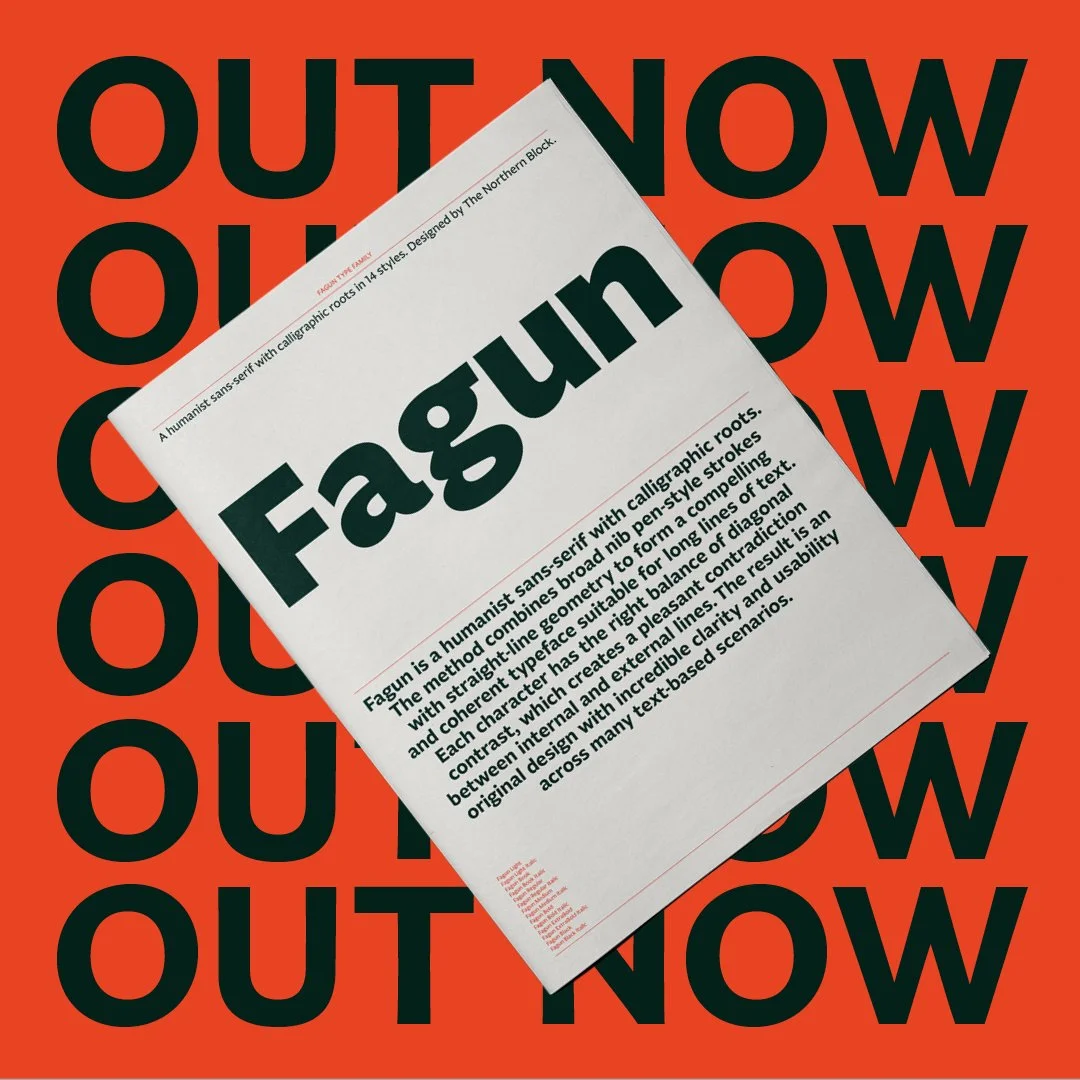
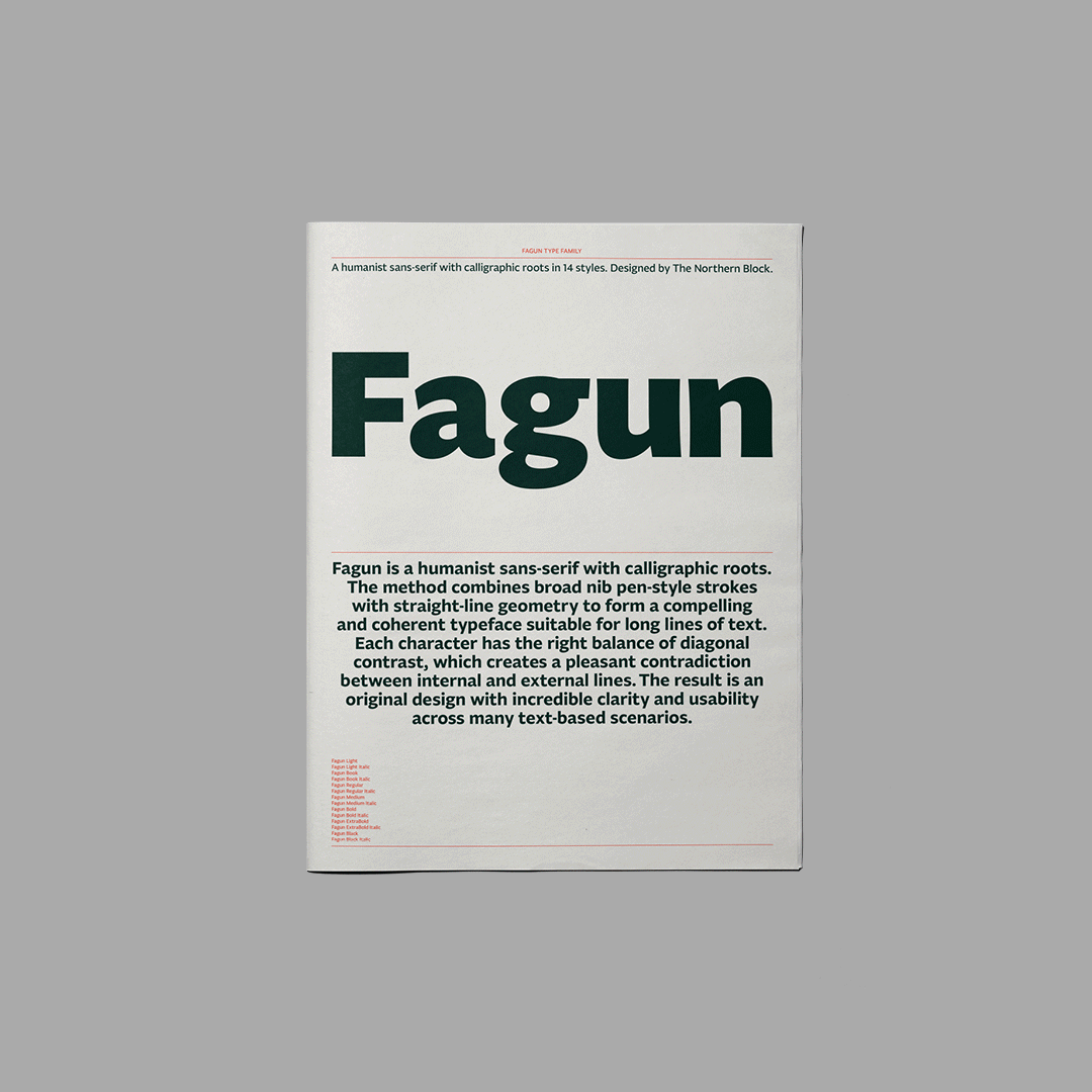
The method combined broad nib pen-style strokes with straight-line geometry to form a compelling yet coherent typeface suitable for long lines of text. Fagun’s sharp legibility is down to the drawing technique of ensuring each character has the right balance of stroke contrast, particularly on diagonals, which creates a pleasant contradiction between internal and external lines.

How did you invoke references to the Oliver! characters in Fagun’s promotional material?
The overall concept was driven by Charles Dickens’ novels and characters, with the font’s name inspired by the mastermind villain, Fagin, from Oliver Twist.
Dickens' novel, and the 1968 musical version, inspired our designer’s clever promotional imagery for Fagun. Donna Wearmouth put the type into action by creating marketing assets featuring lyrics from the musical and mocked up a performance poster for Oliver Twist to demonstrate the flexibility and function of the font, which is fully explored in a 44-page printed newspaper specimen, in which she infused with Dickensian references.

How do you see Fagun being interpreted by typographers?
Seeing one of our fonts in use fascinates me every day. It’s the interpretation of our work by a creative professional into a real-life situation that propels the power of type.
For Fagun, I’m satisfied that we have successfully created a highly versatile font that's as functional to use as it is lovely to look at. The result is an original design with incredible clarity and usability across many text-based scenarios; however, I imagine the typeface becoming a house font for magazines and newspapers. But there's also plenty of potential for broader design use. Its unique but legible style also makes Fagun a prime contender for word marks, and its editorial perks could easily translate into OOH advertising possibilities.
I may end up eating my words, but I will happily watch this space and see where the creatives take Fagun!

Fagun is a visually appealing typeface with a distinct calligraphic style. Its robust and sturdy feel makes it easy and clear to read at any size.
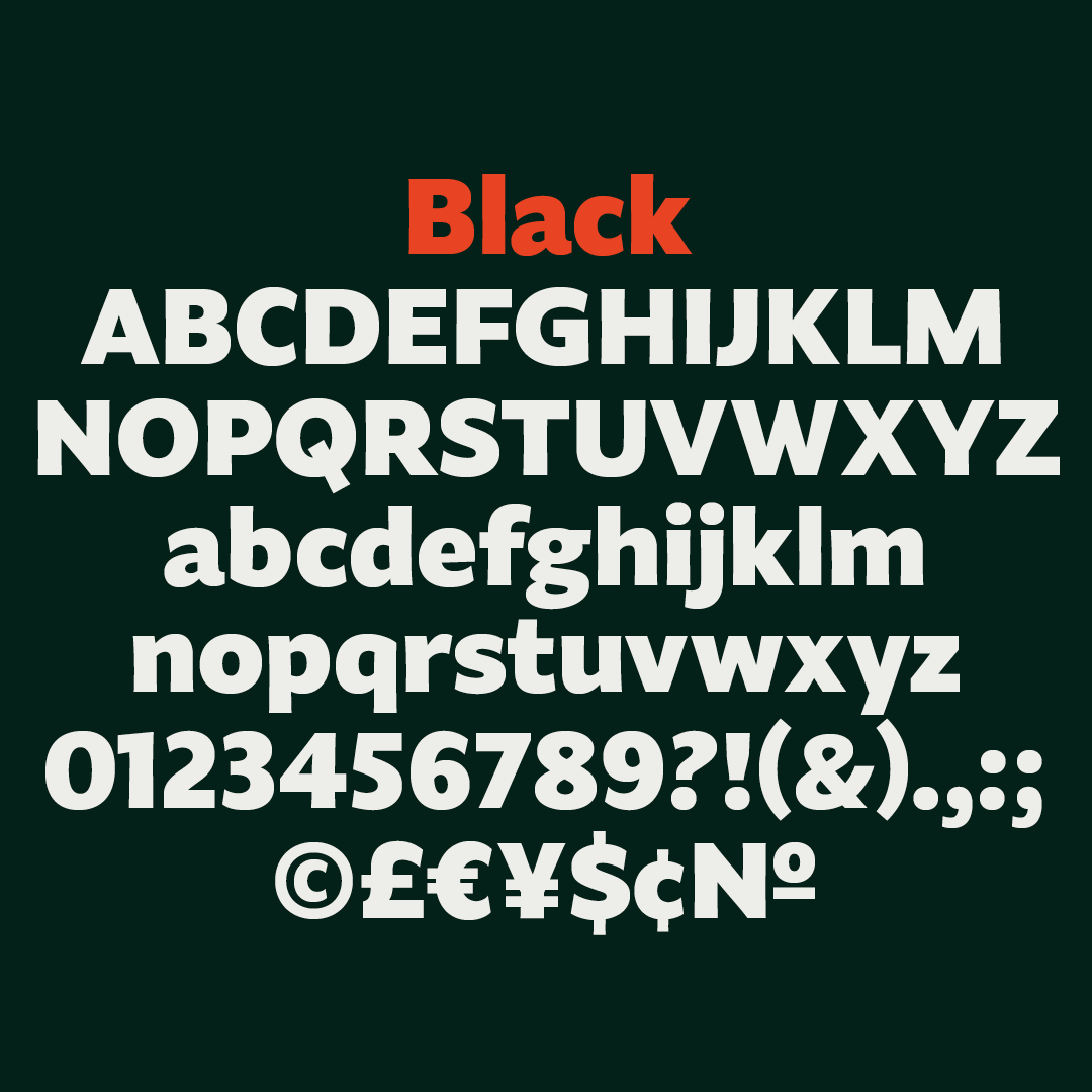
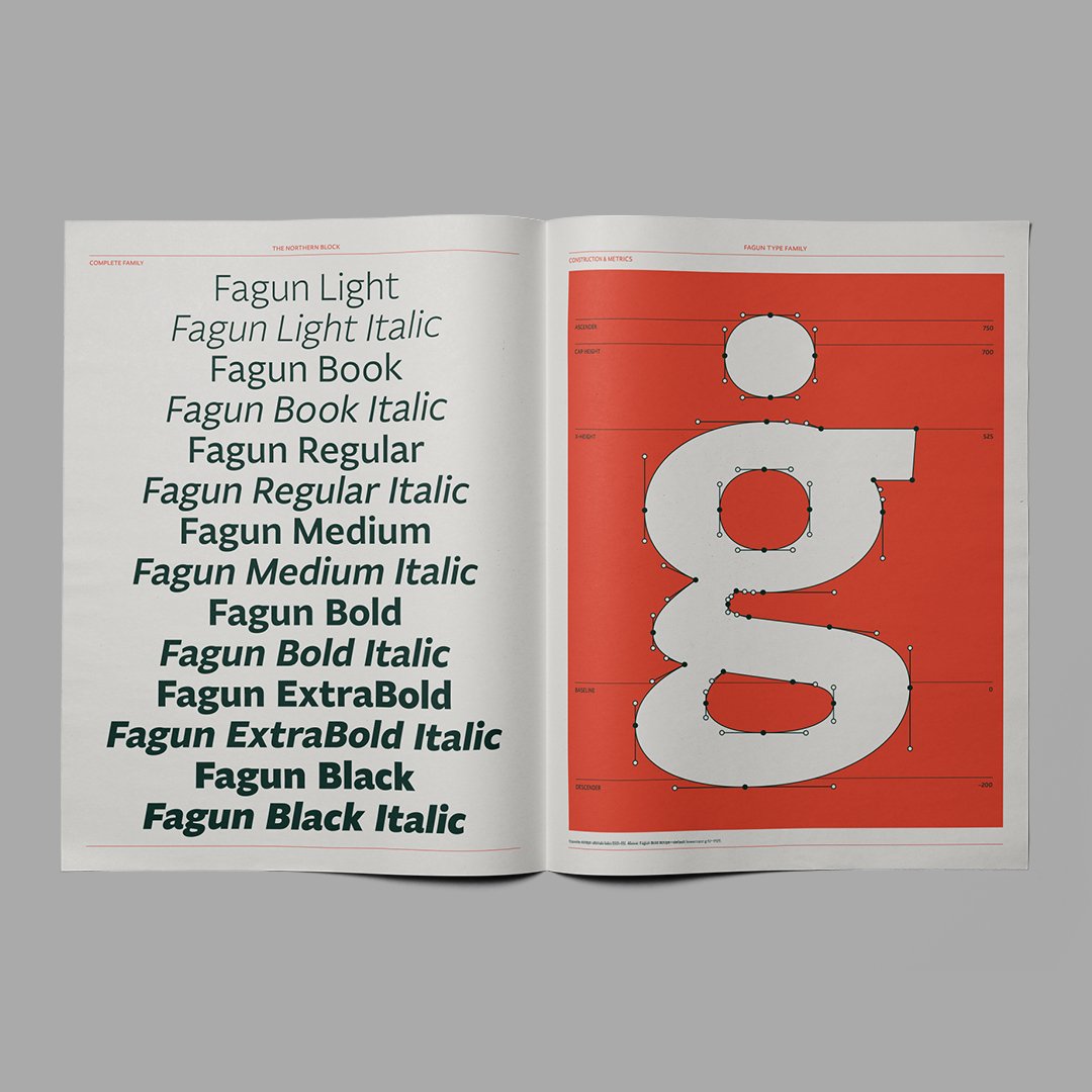
Fagun is available in 14 styles, seven weights with matching italics and includes over 700 characters per style. OpenType features consist of nine number variations inferiors, superiors, fractions, tabular, lining, circled, and oldstyle. It also has alternate lowercase a, e, g, l, y, small caps, and language support covering Western, Southern, and Central Europe. Variable fonts are included on Full Family purchases.