Uniquely Destroyed and Boldly Re-made: Mynor-B, The Latest Typeface from The Northern Block.
When The Northern Block challenged themselves to push the boundaries of an existing typeface, you wouldn’t imagine that work would involve ripping a 1950s-inspired geometric typeface to literal pieces, and then applying Japanese-Jazz-inspired repair surgery. But that’s exactly what happened. The diversity and individuality found within the Mynor-B typeface, as a result, is no surprise.
There are several threads of influence at play here. From the collieries of the Great Northern Coalfield, to Japanese craft art, and the edges of the cosmos. The name itself makes you think of some distant exoplanet, or a small moon spinning amongst the rings of Saturn. The story of Mynor-B has explored and inhabited all of these worlds, on its journey to the here and now.
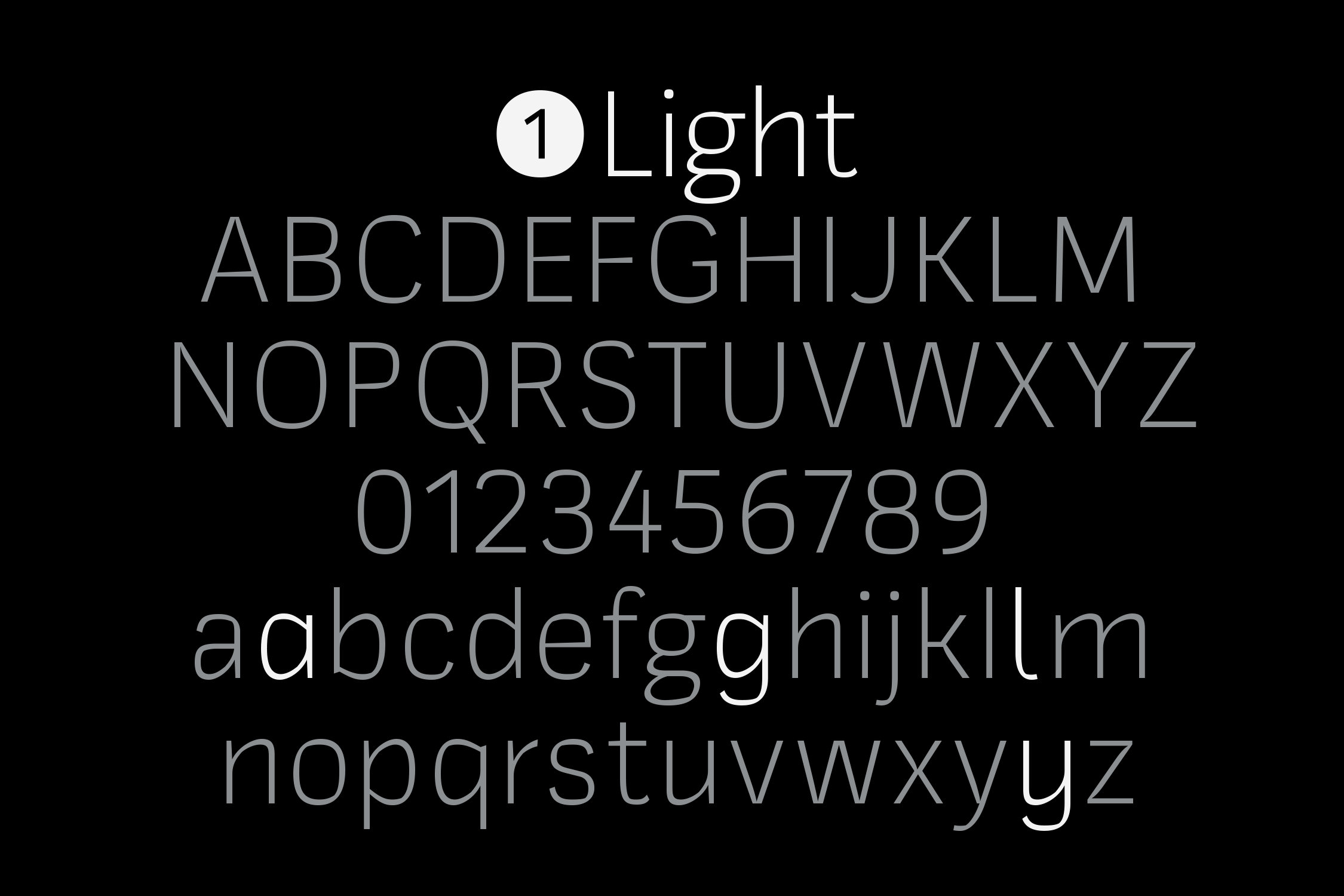
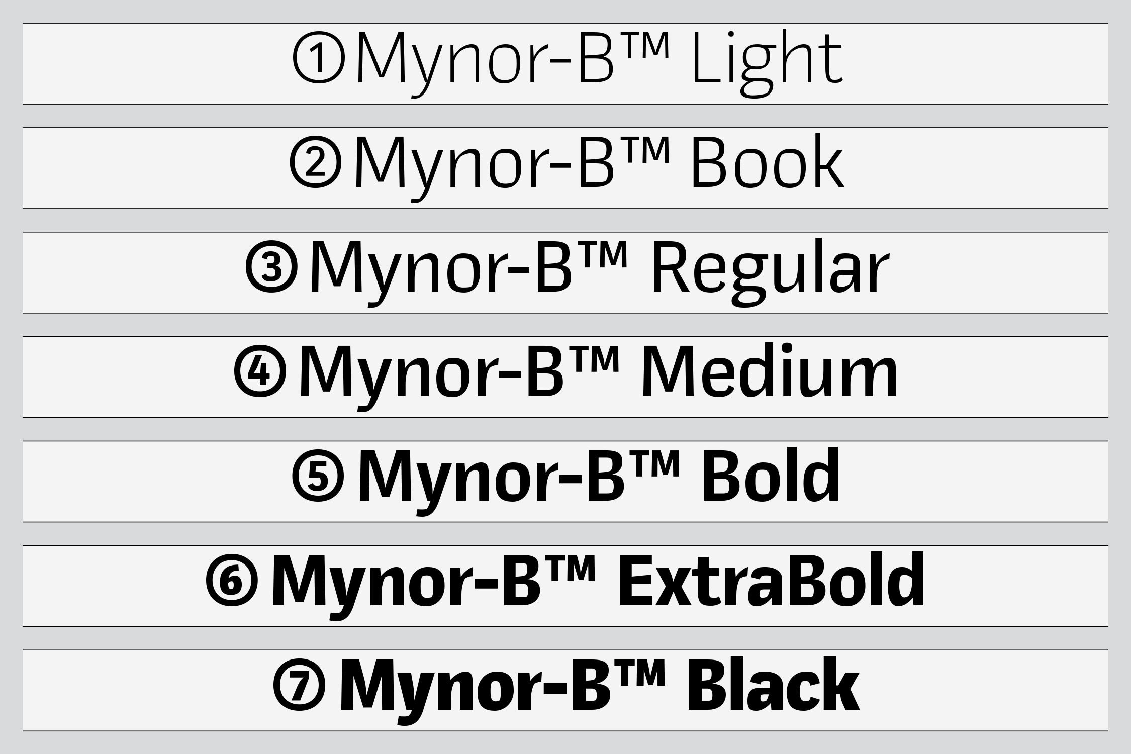
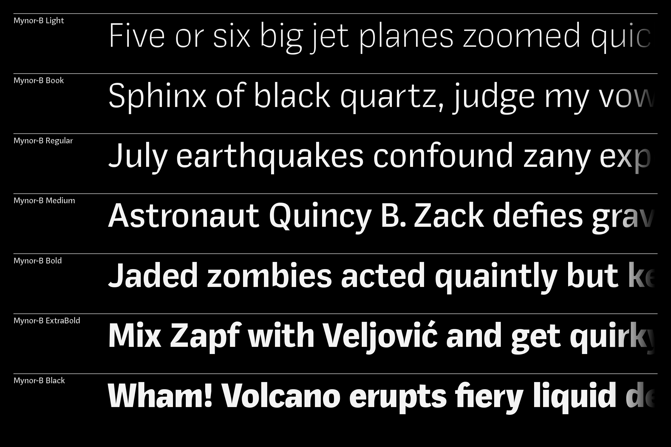
Mynor-B includes seven weights and obliques, with over 950 characters per style.
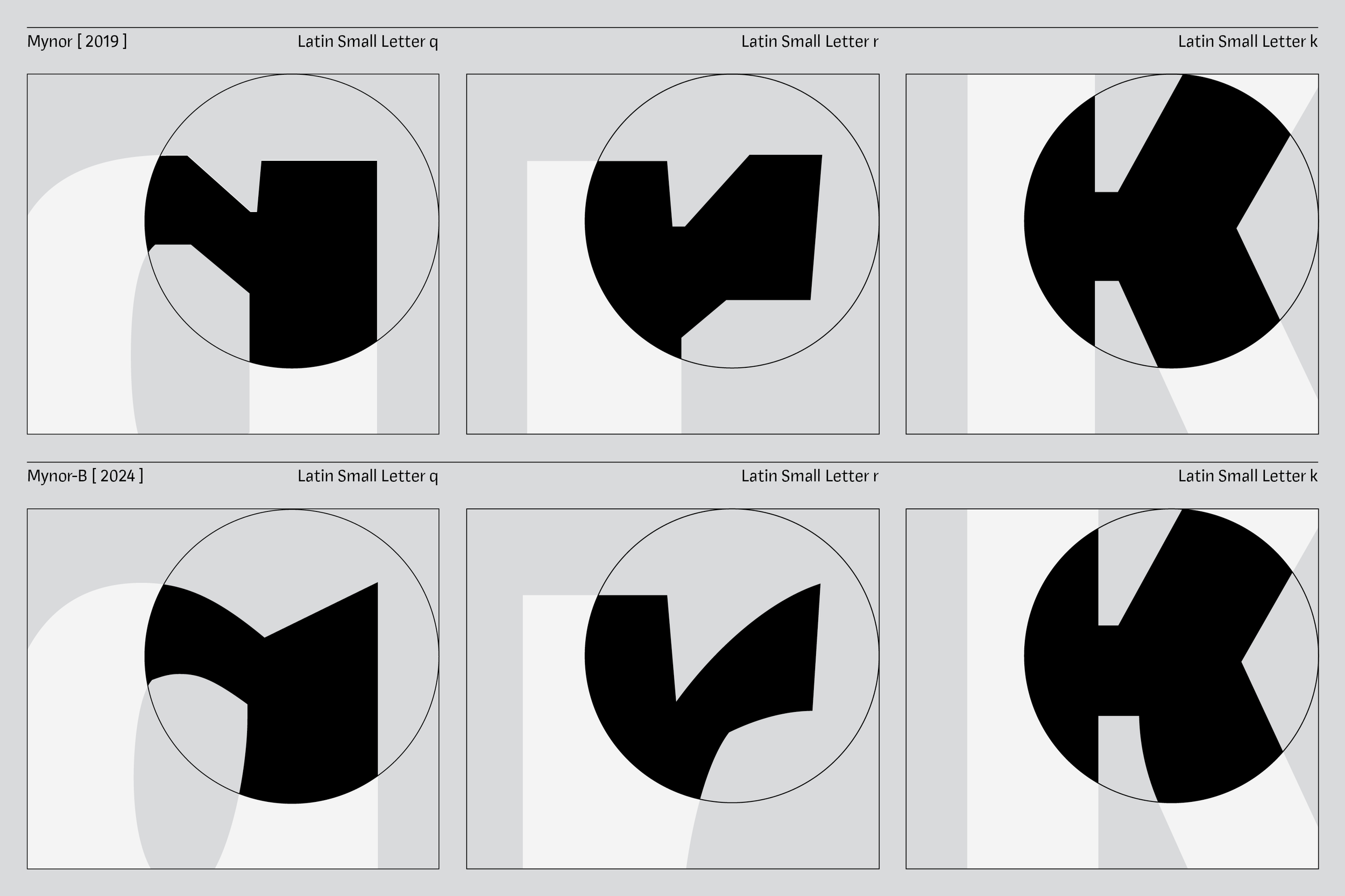
The original Mynor typeface, by The Northern Block, was cast in hard-line geometry, and pushed the boundaries in 2019. Just before a pandemic redefined a lot of what a boundary looks like, and how we cross it. Mynor was an exercise in playing with the inside counters, and contradicting the pattern. Which now seems to be a practice that’s finding its moment in the sun.
‘We were never sure why we liked Mynor, but with Mynor-B, we wanted to push that challenge even more.’ — Jonathan Hill, Type Designer
What germinated as a result of that instinct to push the challenge, is a totally different way of putting a typeface together. A radicalisation of concept. A freestyle system. This is not the craft process, it’s flow. A Type-Jam.
Mynor was assembled, then broken down. Its letterforms torn like paper. With the engine of its geometry dismantled, it was then reforged, with an intention to echo the artistry of whatever imperfections had arrived.

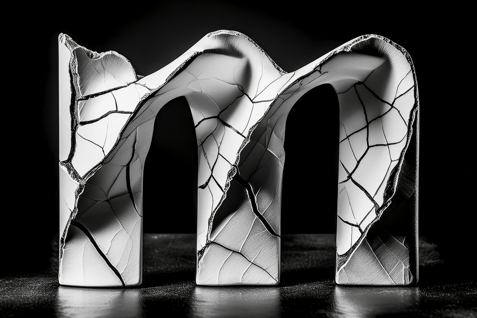
3D rendering created using Adobe Firefly, inspired by the Japanese art of Kintsugi.
Once the letterforms had been broken down with deliberate irrationality, what came next in Jonathan’s process was something akin to the Japanese art of Kintsugi, which involves repairing broken pottery with precious metals like gold.
‘The intention was to celebrate imperfections and introduce expressive elements into the letterforms, echoing the beauty found in repaired pottery.’ — Jonathan Hill, Type Designer
This philosophy inspired Mynor-B’s departure from the strict geometric style of its predecessor, towards a more organic and imperfect design approach. Additionally, a desire to create a more humanist, expressive, and readable typeface, particularly in longer text passages, guided the development of Mynor-B.


See more of Mynor-B in action on Behance
In order to resist the temptation of reforming the typeface with the discipline that comes with experience, Jonathan had to embrace a younger self. One that was just setting out, and burning to create an impact with his work. All that fire, all that lack of awareness, all that learning ahead.
What that looked like at the desk, was subtle refinement. Breaking a rule, then reapplying it like golden thread to mend the fractures that have been torn into letter shapes and geometry. Working purely within the Mynor-B lineage, solving this typeface within its own means.
Jonathan moved digital lines into place without a gridline, and with gradual adjustment to ensure that Mynor-B sits somewhere between distortion and perfection. Jonathan tried to achieve distortion as an end goal, without losing legibility. Celebrating and platforming imperfection, without losing function. That function is clear, even when Mynor-B is applied to long-form text.


Follow The Northern Block on Instagram: @northernblock
What has emerged has been guided by what feels right, instead of what tends to be considered as the right thing, or wrong thing to do. The temptation to pick up the books, look back into typographic history to solve the puzzle of building Mynor-B from the shards of Mynor, has been resisted. In that sense, there was no scaffolding erected around the process. It’s a free-solo climb of experimental sans.
Mynor-B carves out a unique identity in type design. To make this typeface what it is, the rules around typeface creation that have been cast here on Earth, have been set aside. Instead, experimentation and exploration have been pursued. If type designers continue to embrace a lot more of this kind of thinking, we might well have the letterforms to be understood once we finally colonise Mars, and reach beyond.