The Northern Block’s New Romanesque Typeface Markus Low—As Mythical as it is Modern.

Northumberland was the final frontier of ancient Rome. It’s fitting then, that The Northern Block, from its stronghold in the Roman-established settlement of Corbridge—historically the most northerly town in the Empire—have brought the chiselled details of a European Romanesque serif, into being.
Based on Swiss designer Markus Low’s award-winning 1965 serif typeface, Basilea—The Northern Block’s Markus Low typeface pays respect to the classical Romanesque forms, without being overwhelmed by history. Instead, it steers toward a contemporary aesthetic with a great stroke contrast, producing graceful, fluid lines. The outcome is a modern display serif with subtle chisel-like details, that feel best-suited for a dramatic impact.
Basilea itself carved out its place in history in the pre-digital world of 1965, and the era of dry transfer. The original typeface was created in one lightweight, with an elementary character set. When The Northern Block designer, Jonathan Hill, found it on the classic Captain Beefheart album ‘Trout Mask Replica’, he began to see how it could go to work in places where the avant-garde plays with history. Beefheart’s Magic Band marry it with the medieval aesthetic that became synonymous with their work.
Basilea was doing its part—bringing contemporary modernism into something historic, and classical. The creation of The Northern Block’s Markus Low typeface is an exploration in exactly that. Looking back, and absorbing inspiration from past histories and mythologies, to move forward. This is a re-interpretation, not a revival.
‘The personality of the style will change through the weights so that the thinner styles will feel classical and sculptural, but the bolder weights will be more contemporary and energetic.’ — Jonathan Hill, Type Designer.

Captain Beefheart’s ‘Trout Mask Replica’ album cover, designed by Cal Schenkel. Image source: Fonts in Use
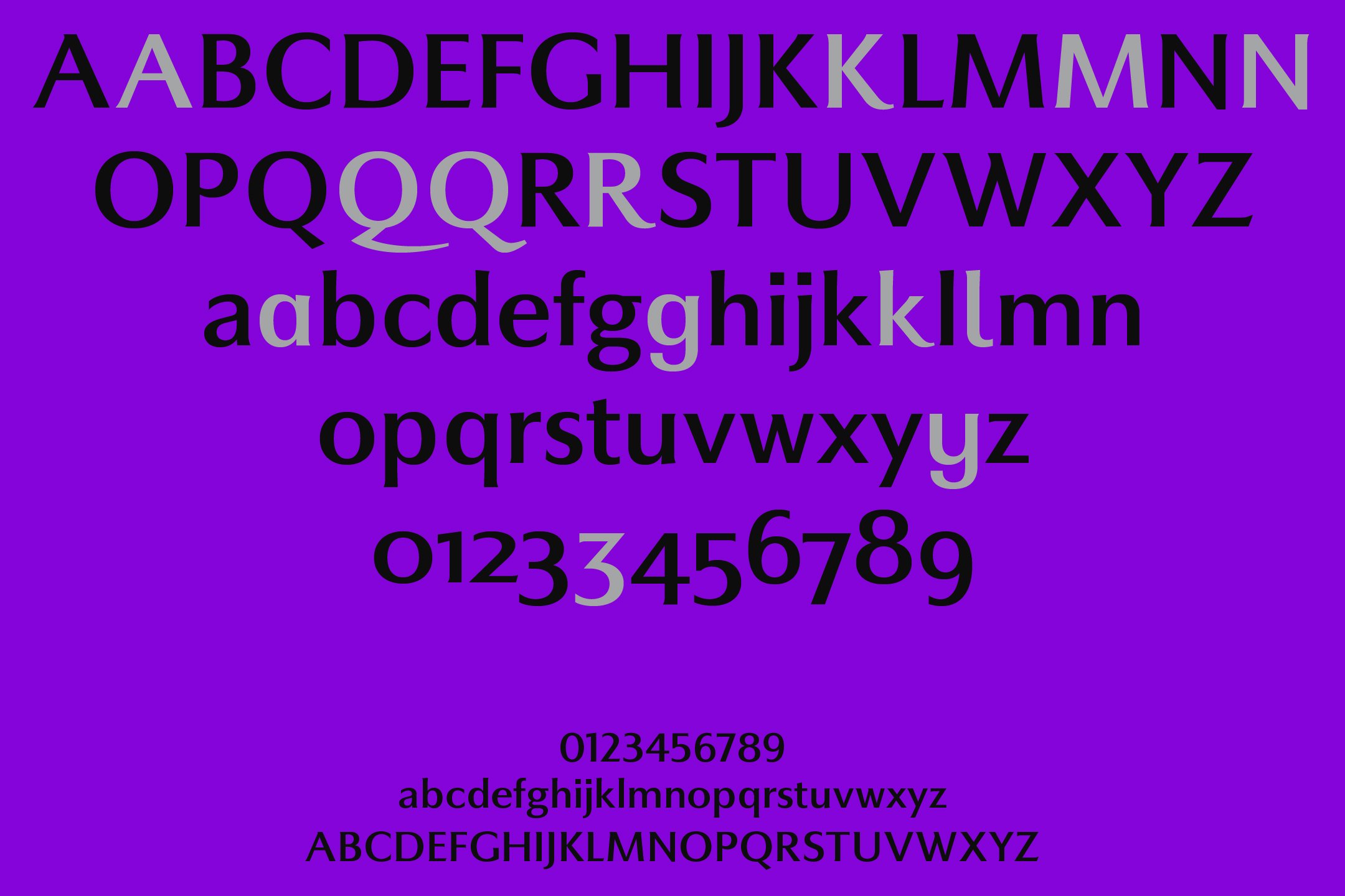
Markus Low began as a single weight, but Jonathan instinctively felt it could inhabit multiple worlds, and has now given it full gradiation. This will allow the user to embark on far more adventure, and find new frontiers of feeling. Like anything with its own personality, as it grows, this typeface evolves.
Those lighter weights speak directly of its historic origins, while the typeface shifts subtly into modernity as it becomes heavier. The result is that each weight has its own idiosyncrasies, allowing Markus Low to speak to different audiences, offer different experiences, and evoke diverse responses—while still honouring the DNA of its classical Romanesque forms.
The weights flex, becoming a Rorschach test on the eye and brain. What can you see between the light and the bold? Look closely at those heavier weights. What begins as classical inscribed mythical scripture, can fast become a modern incantation, even a warning.
Markus Low morphs from the mythical and fantastical, into a typeface teetering on the edge of horror, signposting the uncanny valley. It can take you from escapism, to something else entirely. Imagine transporting your audience from Lord of the Rings, to Lord of the Flies, in a single typeface family.
Whether you’re dealing in books, cosmetics, menus or movies, Markus Low will allow you to offer your audience variety, while protecting the integrity of your own visual language and brand experience.
‘The lighter weights command authority, yet the heavier weights are less formal but have an unexpected complexity.’ — Jonathan Hill, Type Designer
Original and classic products can get the regal or baroque treatment, while the contemporary end of a product range will deliver the message it needs to, where something more expressive and modern is king.
If you’re looking to spearhead a sophisticated, graceful renaissance, launch a psychological thriller, or conjure an air of elegant modernity—The Northern Block’s Markus Low might well be a worthy chariot.
Talking technical
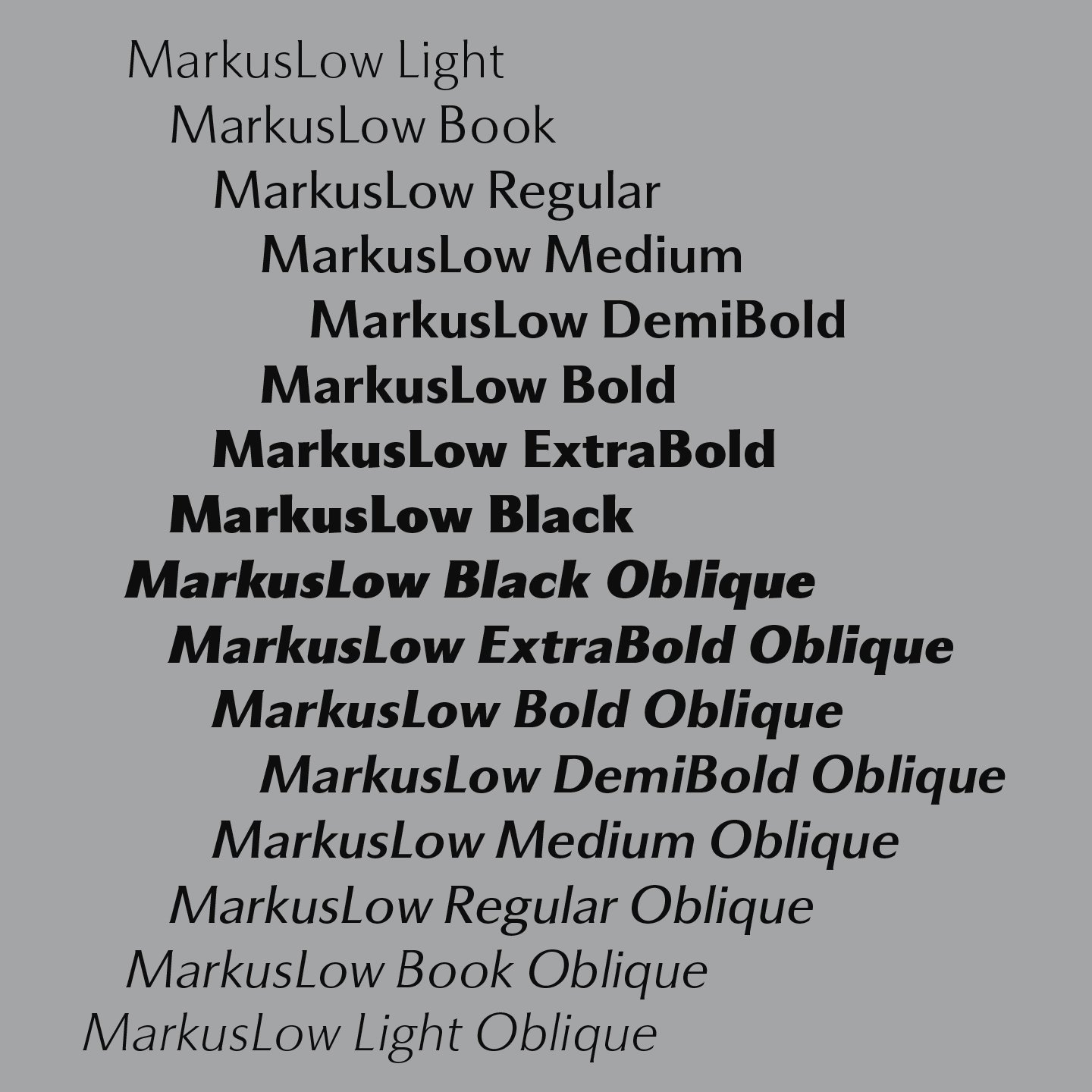
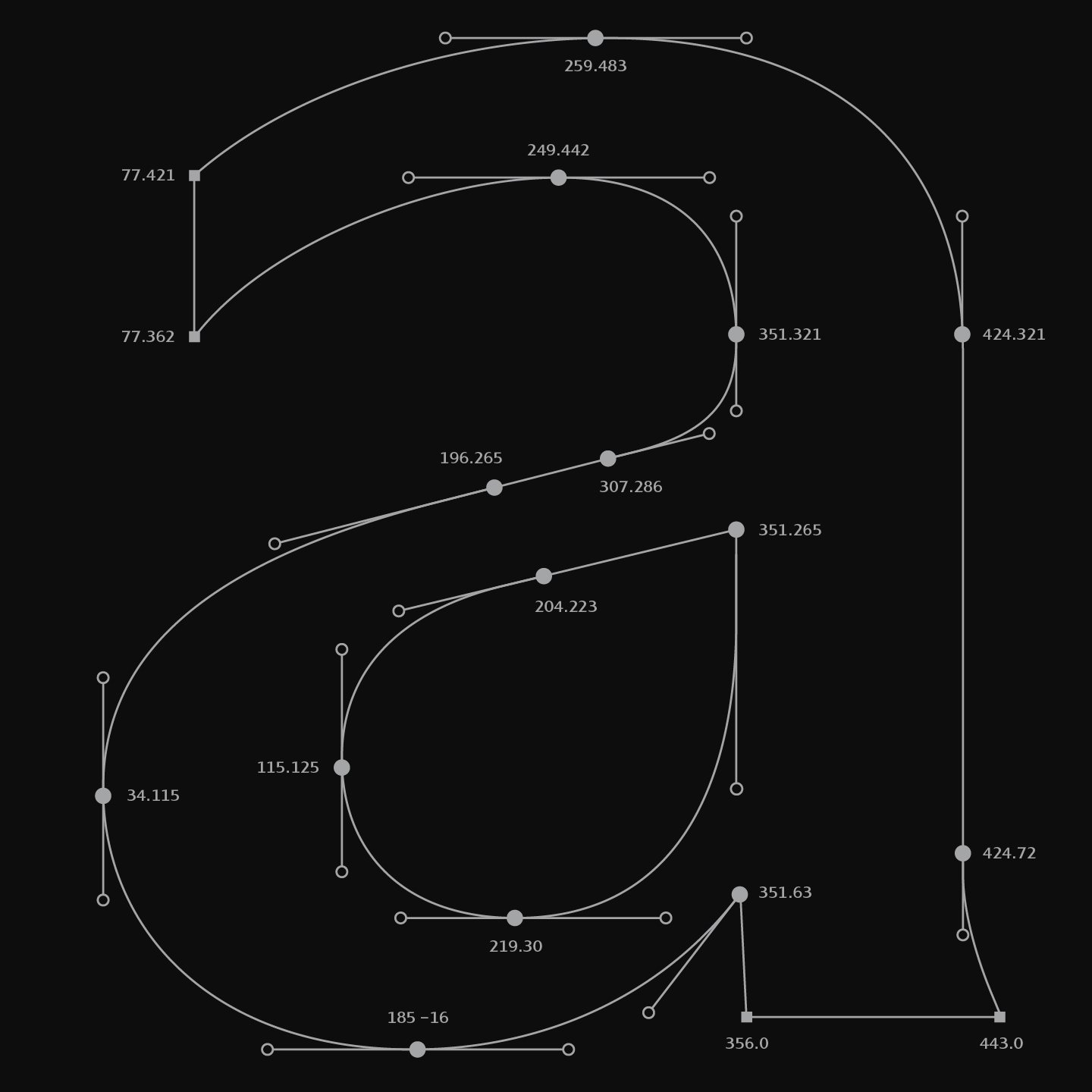
Version 2.0 of Markus Low includes eight weights with obliques and over 780 characters per style. OpenType features support inferiors, superiors, fractions, tabular, lining, case-sensitive, and oldstyle figures, small caps, and language support covering Western, Southern, and Central Europe. Along with 14 alternative characters, it’s got the makings of an excellent presentation.