Perfectly Imperfect; it’s time to play with Zabawa—The Northern Block’s newest handwritten typeface.

Joanna Angulska sat down to draw. The Northern Block were trusting the Polish designer with a dream typeface project, with her hand free to make design decisions, and the space to explore her own process.
A handwritten typeface, using only a pointed brush.
The brief was straightforward, but the journey ahead would not be. The brush chose the direction. It would sketch without thought, and move intuitively, expressing something different at every sitting. Joanna was discovering something with its own life. With its own story. Feeling shapes form and warp through analogue sketching. The way of holding the tool, and how and where the letters naturally connect, played an important role. Single words were the testing ground, and over time, a mantra formed. With the help of Joanna, the pointed brush would chant on paper.
You break to stretch yourself out, to eat, to absorb something outside of the typeface. But each day, you go back to it. Each day, the mantra appears. Testing you, rhythmically refining the shapes of letters written in a way they never have been. Until eventually, they take final form. Until every day, those careful nuances are the replica of the day before. That’s when the breakthrough came and where Zabawa began to spring to life.
Paper. Pointed brush. Ink.
For twelve months, seven hours per day.
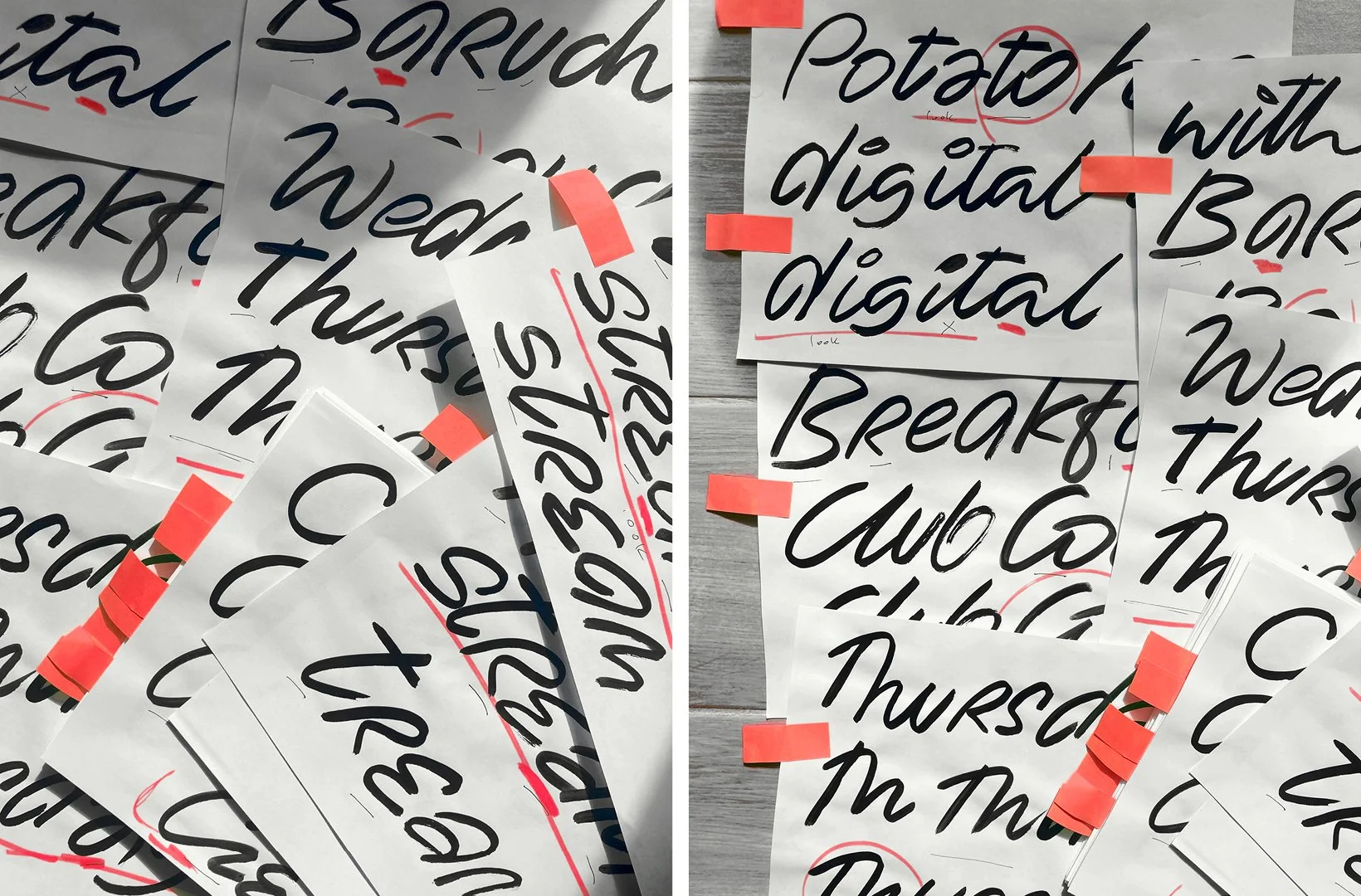

Joanna Angulska’s early sketch work for Zabawa
Zabawa is a labour of love—the definition of diligence and a living record of resilience. The distinctive ligatures alone took four weeks to refine. This handwritten typeface is an effort to find a golden balance between something unique, and something universally familiar. As diverse as each of us, while still delivering the integrity of a complete typeface system. An attempt to bring the perfectly imperfect, to life.
‘The pointed brush determined the style of the typeface. Initially, the way the brush was held and the pressure applied, influenced the high contrast in the letters. Over time, they became more dynamic and with less contrast. It felt impactful and direct.’ — Joanna Angulska, Type Designer.
The style was supposed to demonstrate not only the efficient use of the tool, but also to give an injection of intimacy that can be found on scraps of paper, those notes-to-self stuck to fridges, etched into calendars, or scribbles in the margins. Joanna was looking to design a typeface that echoed personal handwriting, but as well as achieving that personal feel, it had to be modern and functional.
‘While working on the style, every now and then, I’d ask the questions:
Is it accessible?
Does the style feel natural?
How to achieve an authentic expression?’

The Northern Block and Joanna Angulska are a great fit, and that teamwork has delivered a precious project with genuine handwritten aesthetic value. Zabawa is a unique typeface, born out of Joanna’s passion for the work, and the technical knowledge of The Northern Block team.
‘Since most handwritten typefaces are about creating an illusion of being handwritten, Zabawa puts an emphasis on feelings that the writing style evokes. Human, authentic and very personal, with some letterforms drawn on the writing style of a specific person. It moves Zabawa’s handwriting from feeling like anybody’s to personal.’
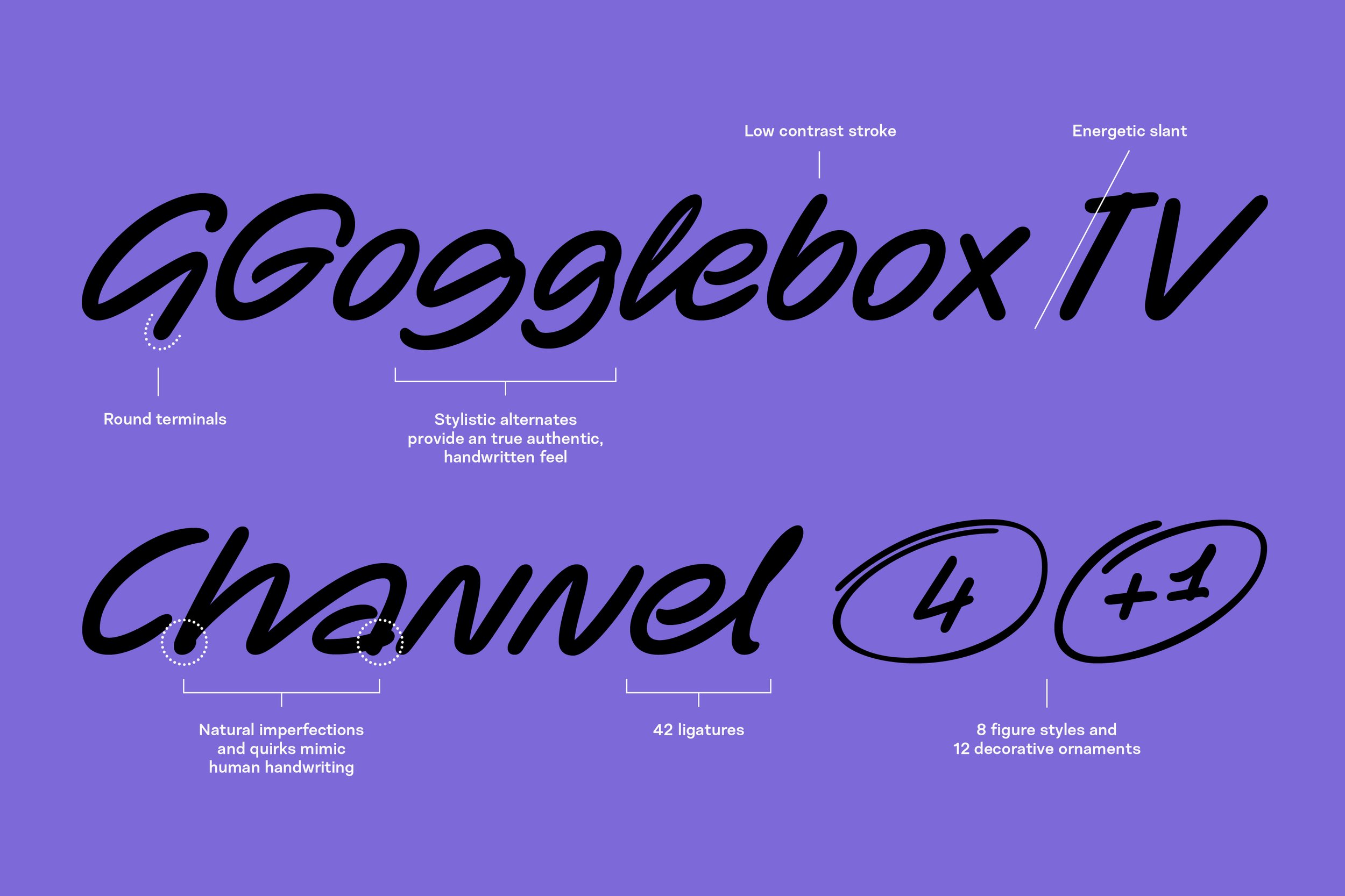
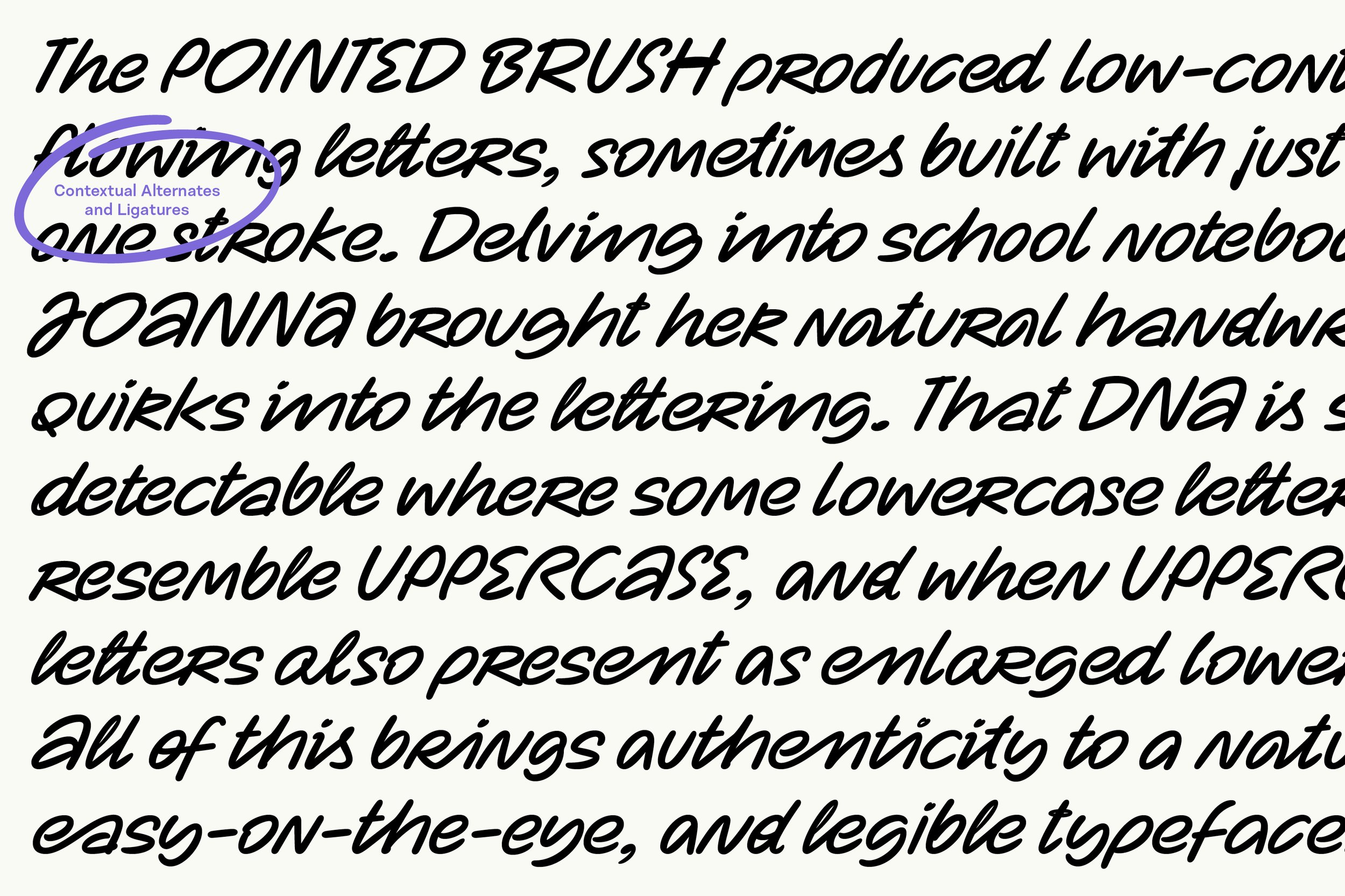
The pointed brush produced low-contrast, flowing letters, sometimes built with just one stroke. Joanna learned to go with the flow, allowing for spontaneous type design. She searched her past, delving into school notebooks to bring her natural handwritten quirks into the lettering. That DNA is still detectable where some lowercase letters resemble uppercase, and when uppercase letters also present as enlarged lowercase. All of this brings authenticity to a natural, easy-on-the-eye, and legible typeface.
The result of Joanna’s commitment to her craft, is a playful handwritten typeface packed with life. In fact, Zabawa has so much personality, it interacts with you. It smiles at you. It offers sincerity. It chides you. It thanks you. It invites you in, and it invites you out to play.
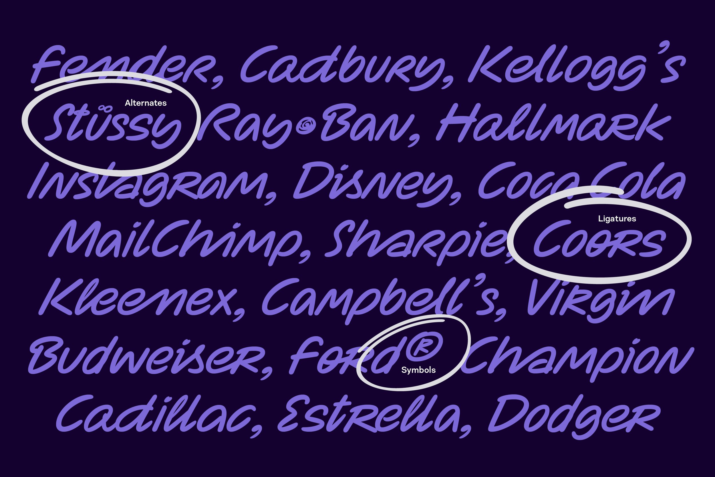
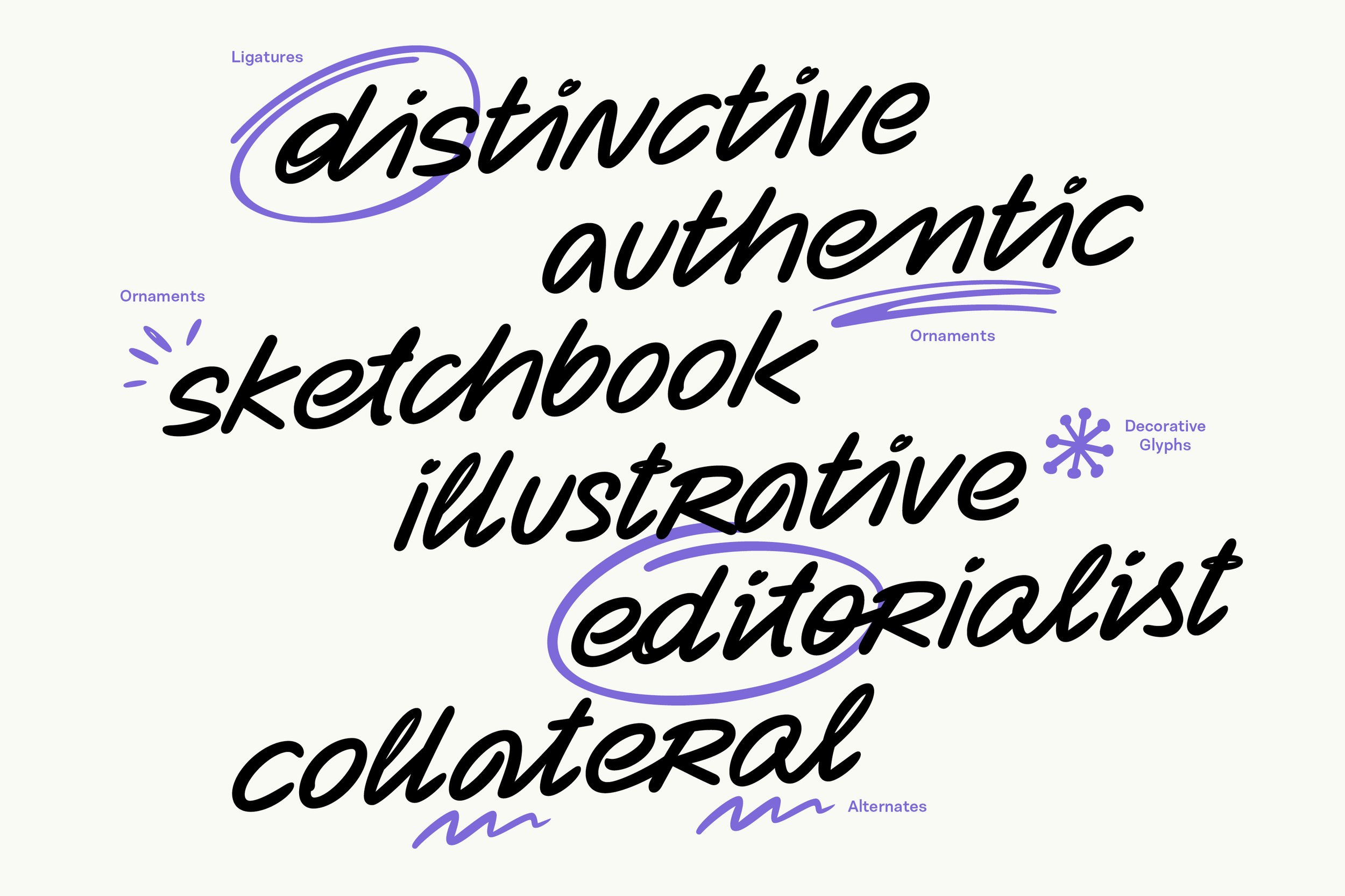
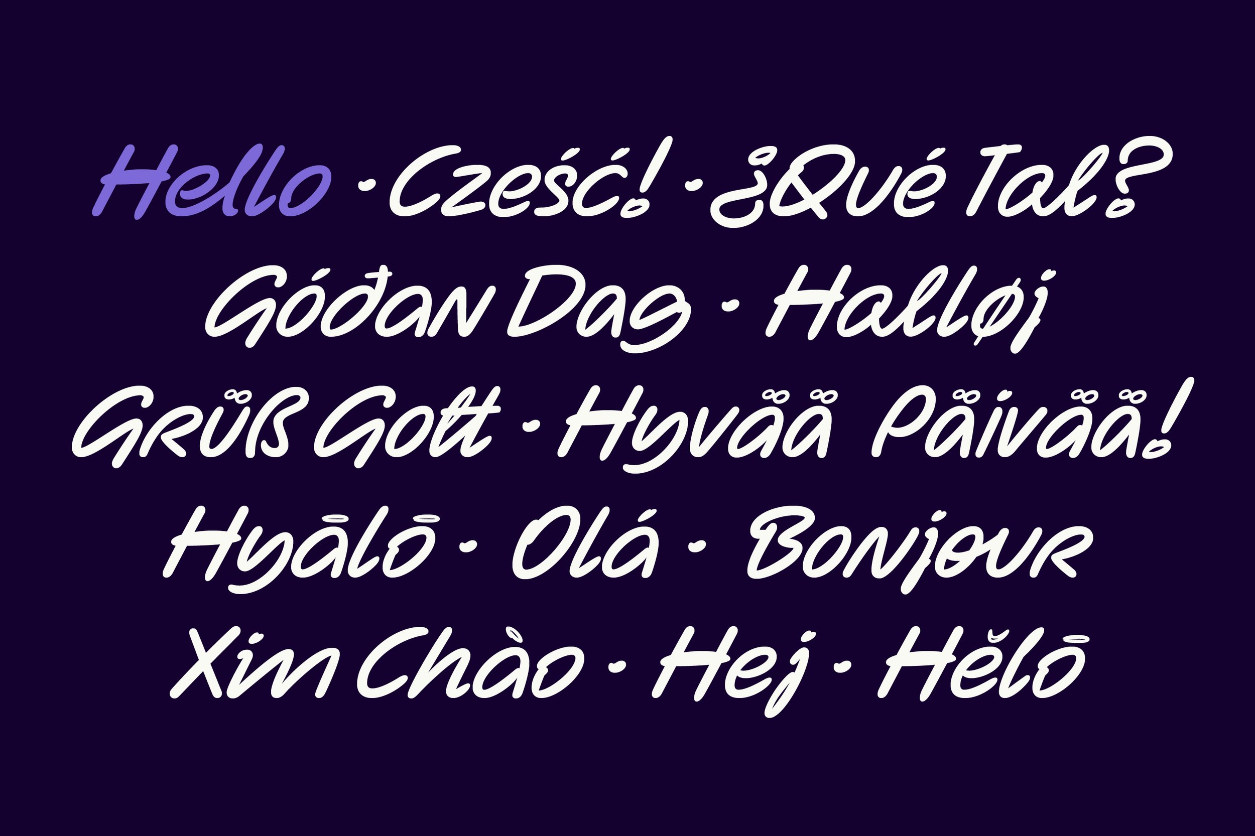
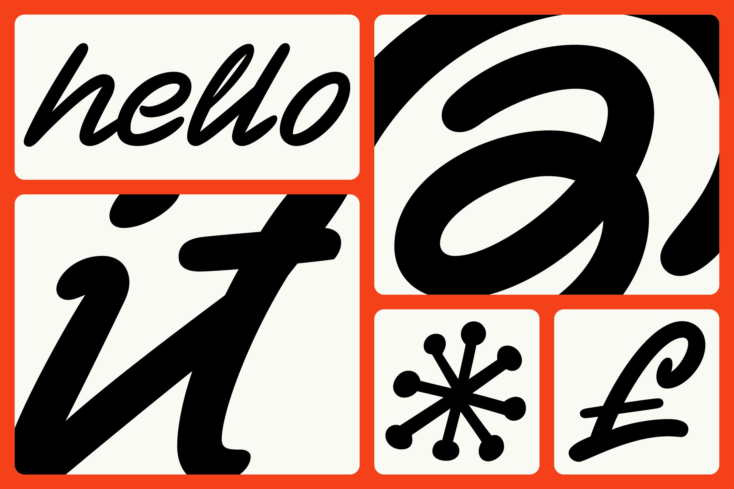
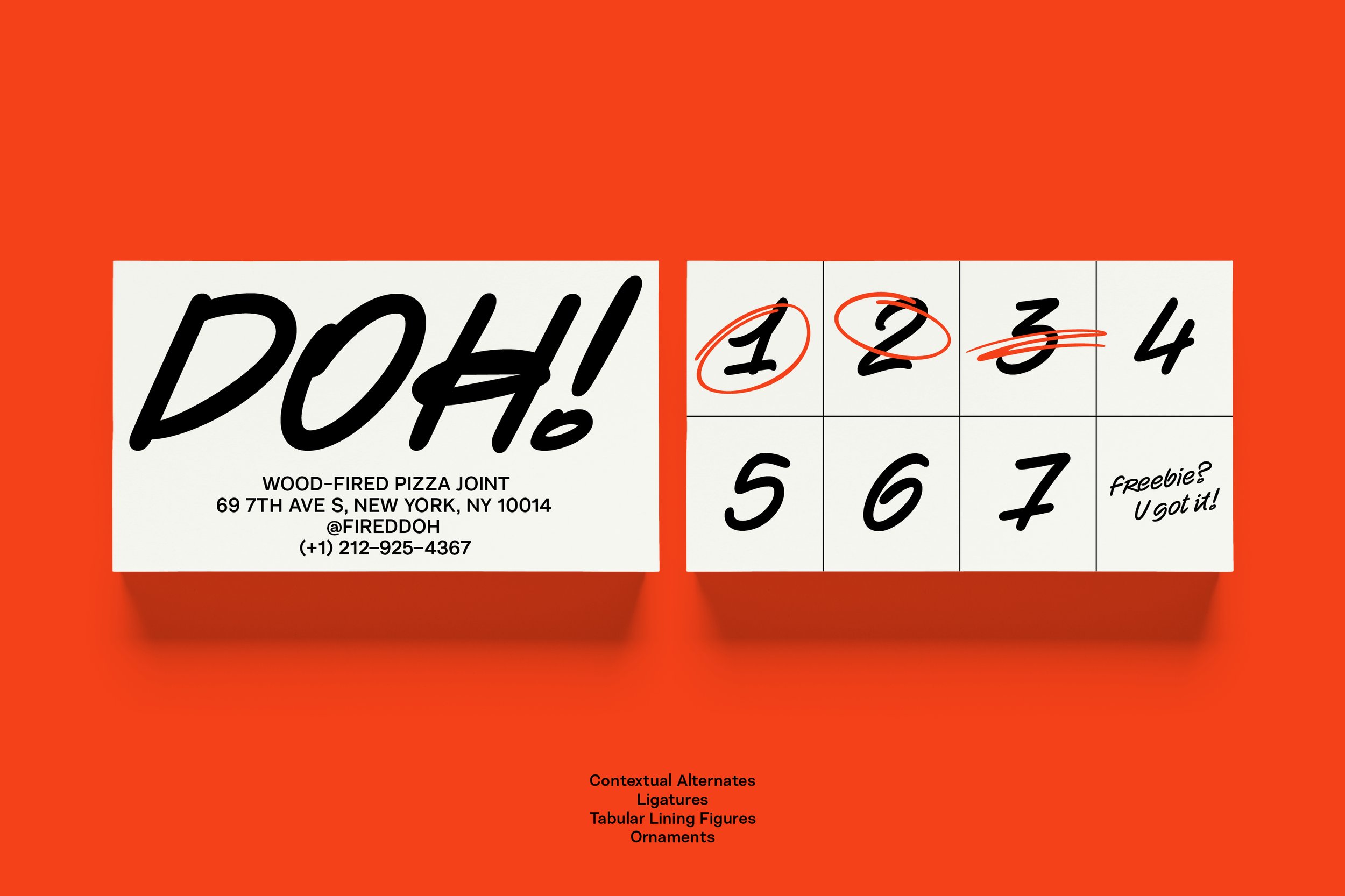
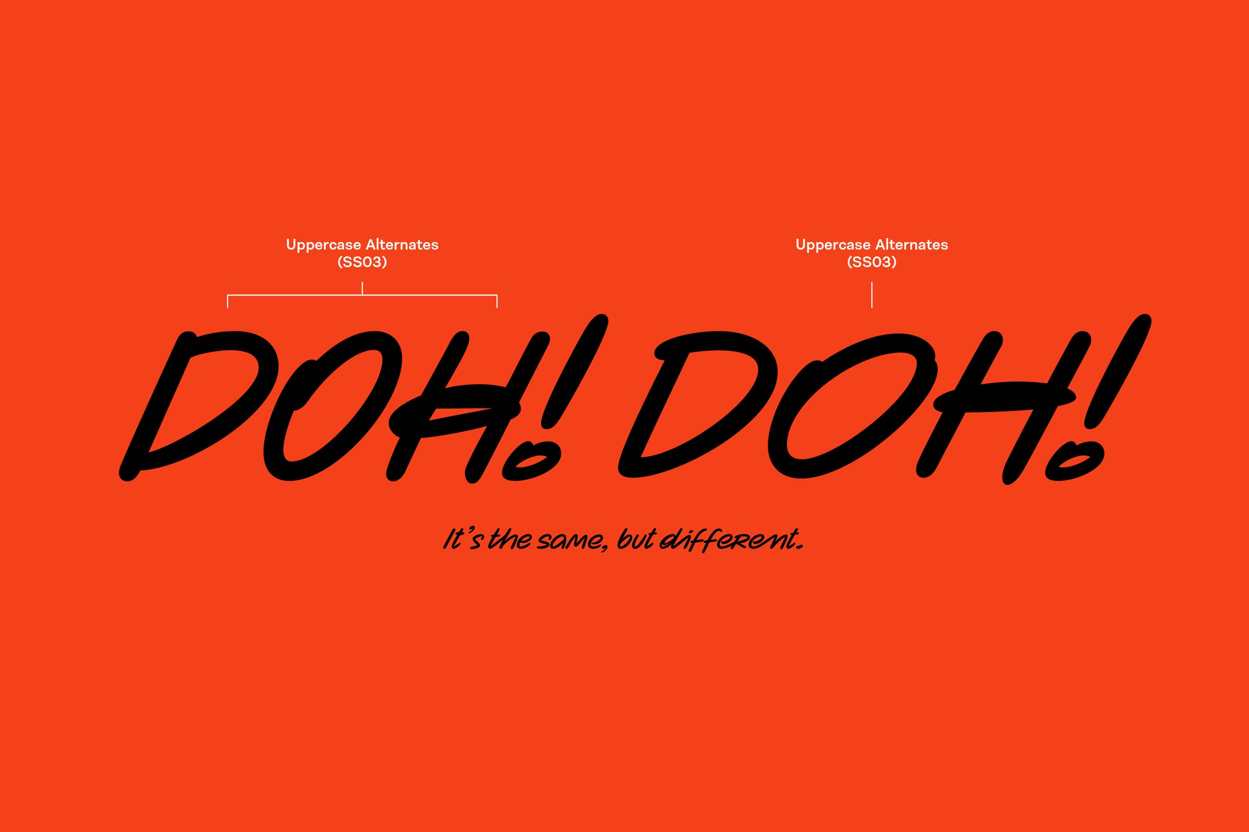
‘Zabawa’ itself, is a Polish phrase for ‘Fun’ or ‘Play’, and those 936 glyphs can make playtime really fun. They give you choice, flexibility and possibility. The 42 ligatures and three stylistic sets really add to the typeface’s unique appearance. They give the user the opportunity to change individual characters, offering you a sense of freedom to create an identity unique to your project, and inject a splash of fun into your venture.
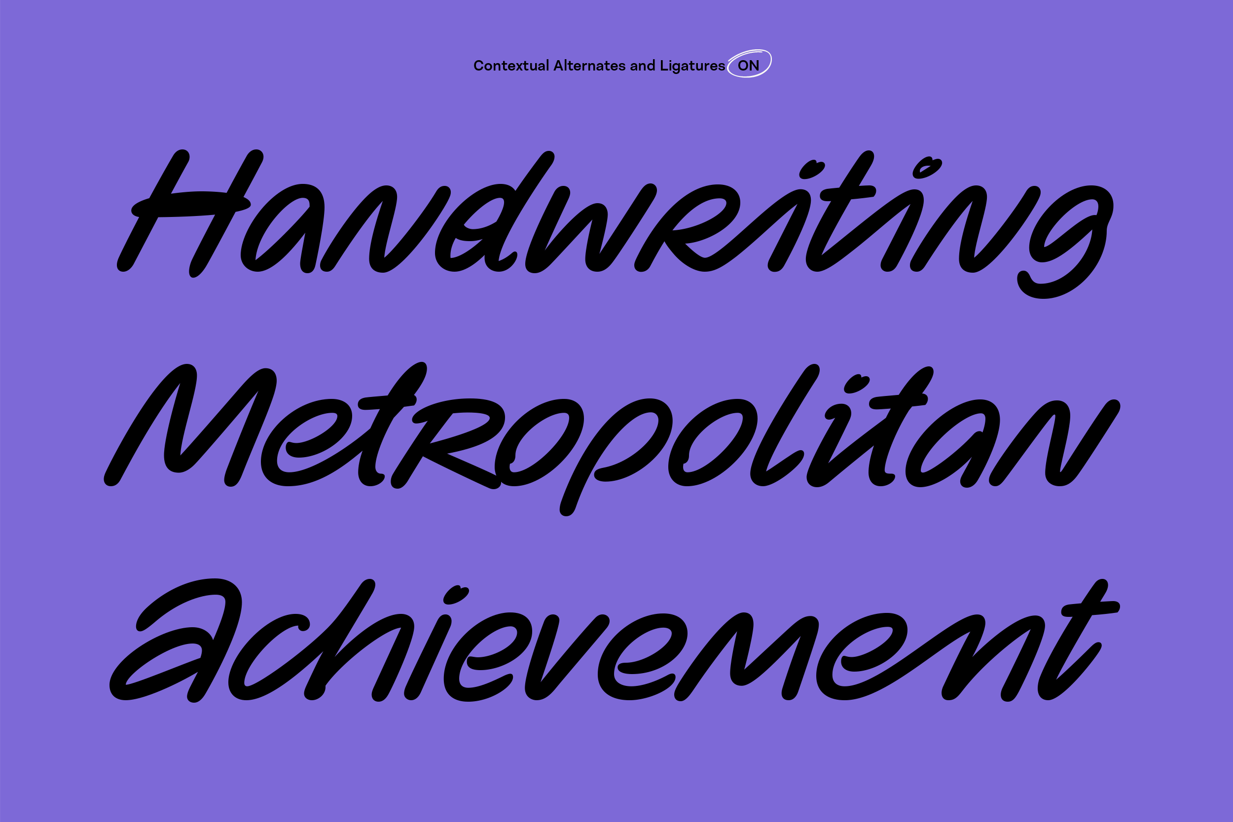
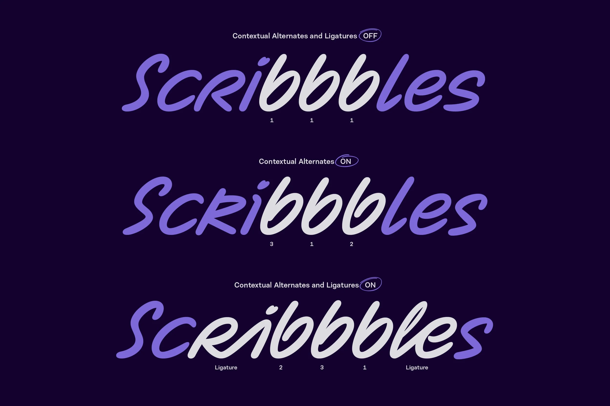
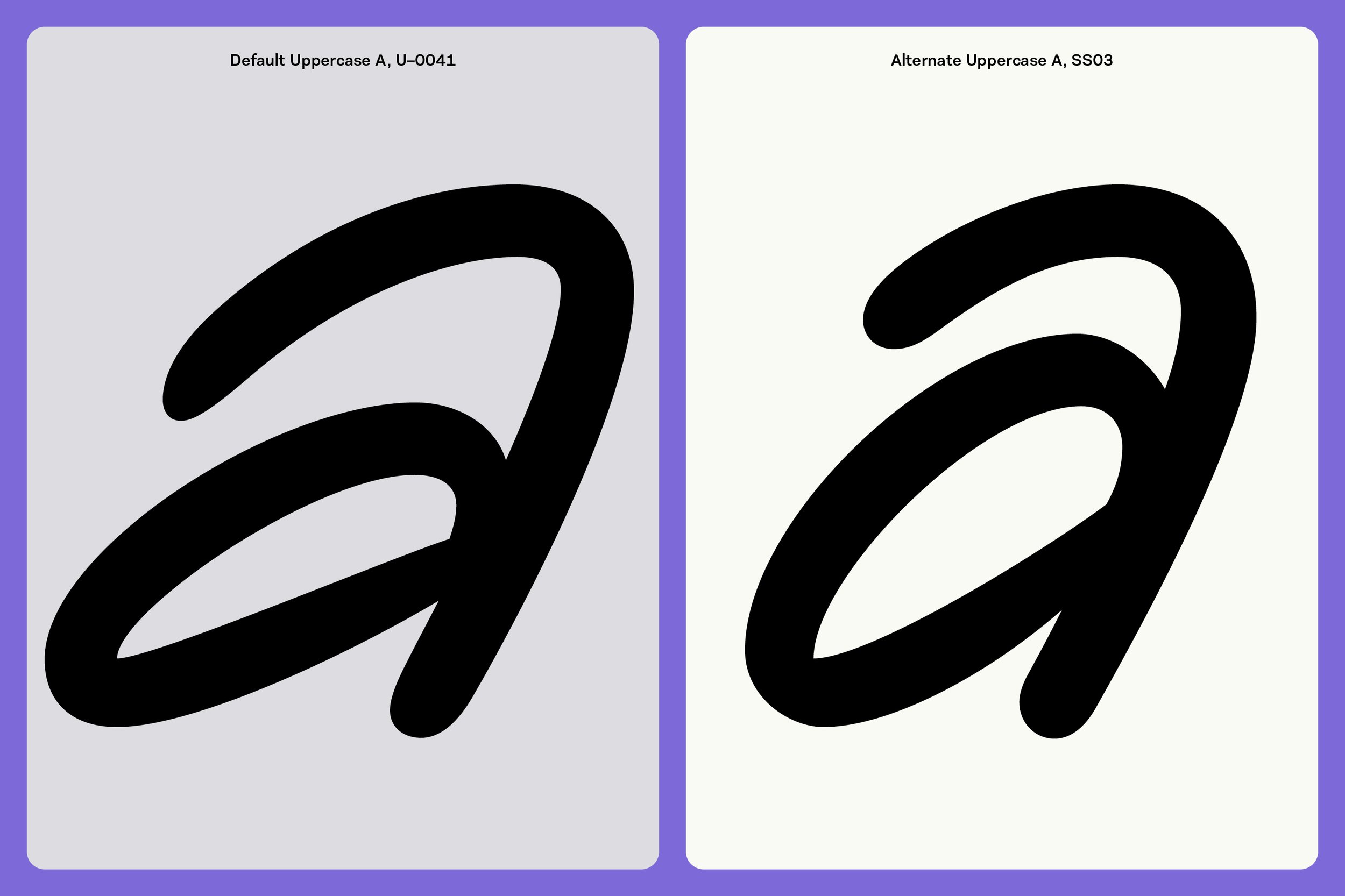
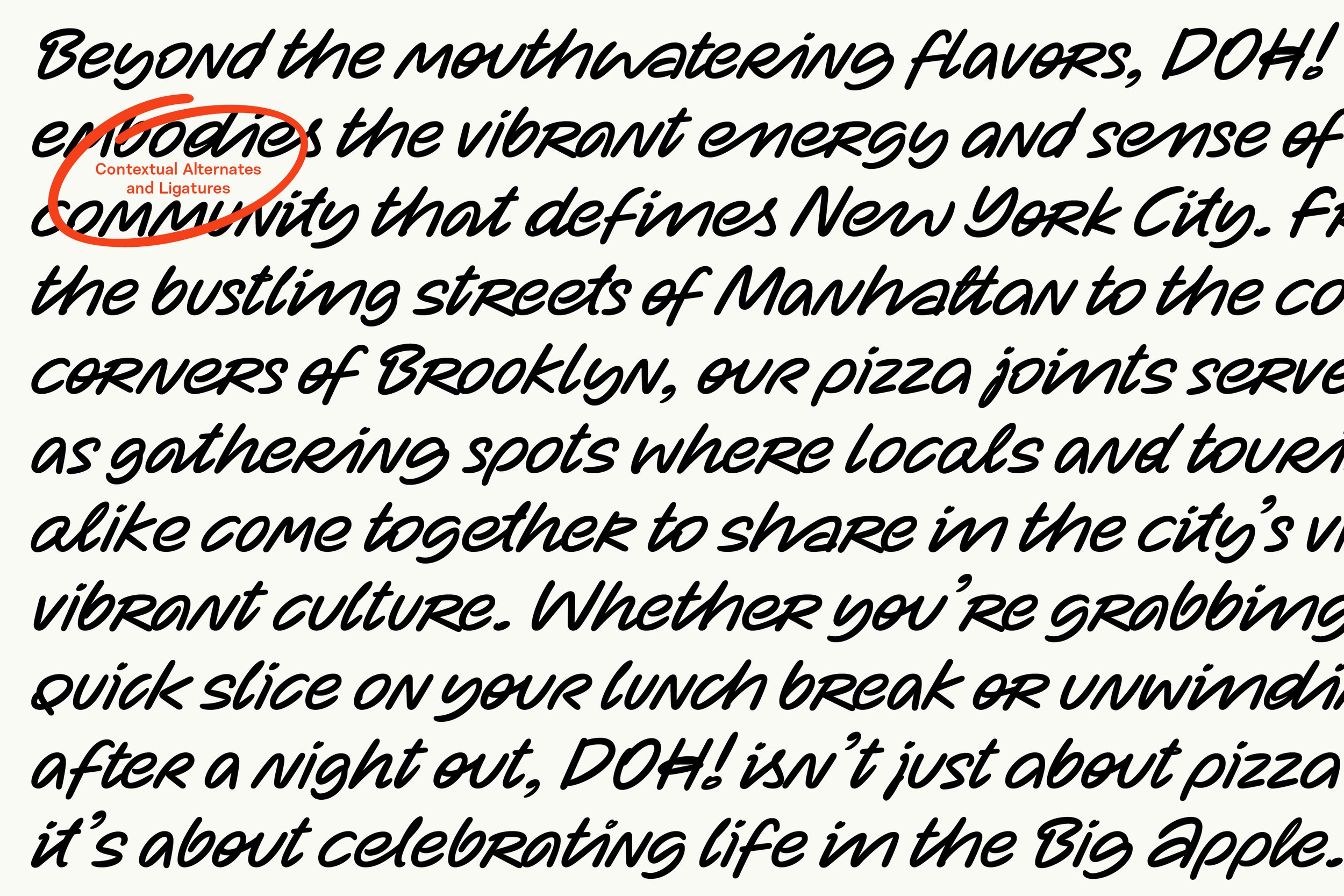
Echoing Joanna’s early analogue sketches, the font also supports contextual alternates. This feature automatically substitutes multiple occurrences of the same character, so no single shape is repeated in close proximity. By mimicking the variability and natural imperfections found in human handwriting, it offers you the chance to keep surprising your audience and keep things personal. Zabawa’s cleverly coded OpenType features prevent the typeface from appearing too rigid, and intentionally deliver the abstract nature of handwritten text.
Adding to the typeface’s distinctive aesthetic, the font includes twelve decorative ornaments. Zabawa is a typeface brought to life to complement illustration, just as it can stand alone. Without being obtrusive or overwhelming, its texture is lively and organic, with a dynamic and energetic vibe that promises to leave a lasting impression.
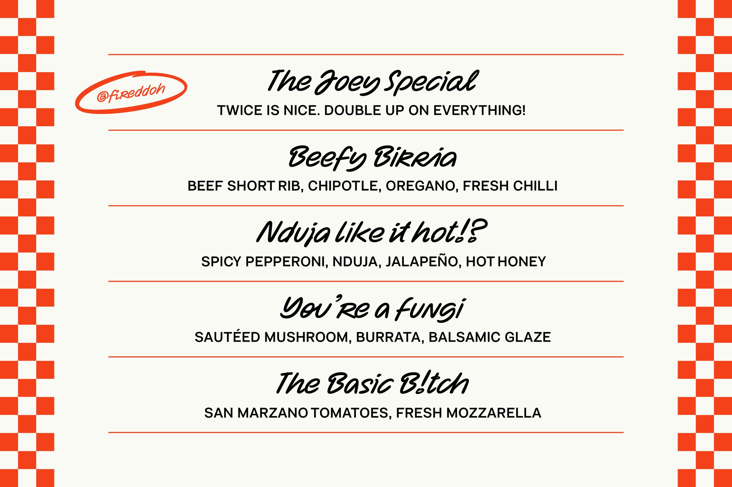
So much life. So much variety. Zabawa refuses to sit still; with bouncy baselines and an energetic slant, it delivers visual pace and energy. Light and rhythmic forms give a sense of freshness and natural flow, with each stroke telling a story reminiscent of playful doodles on a napkin, or spontaneous scribbles on a shopping list.
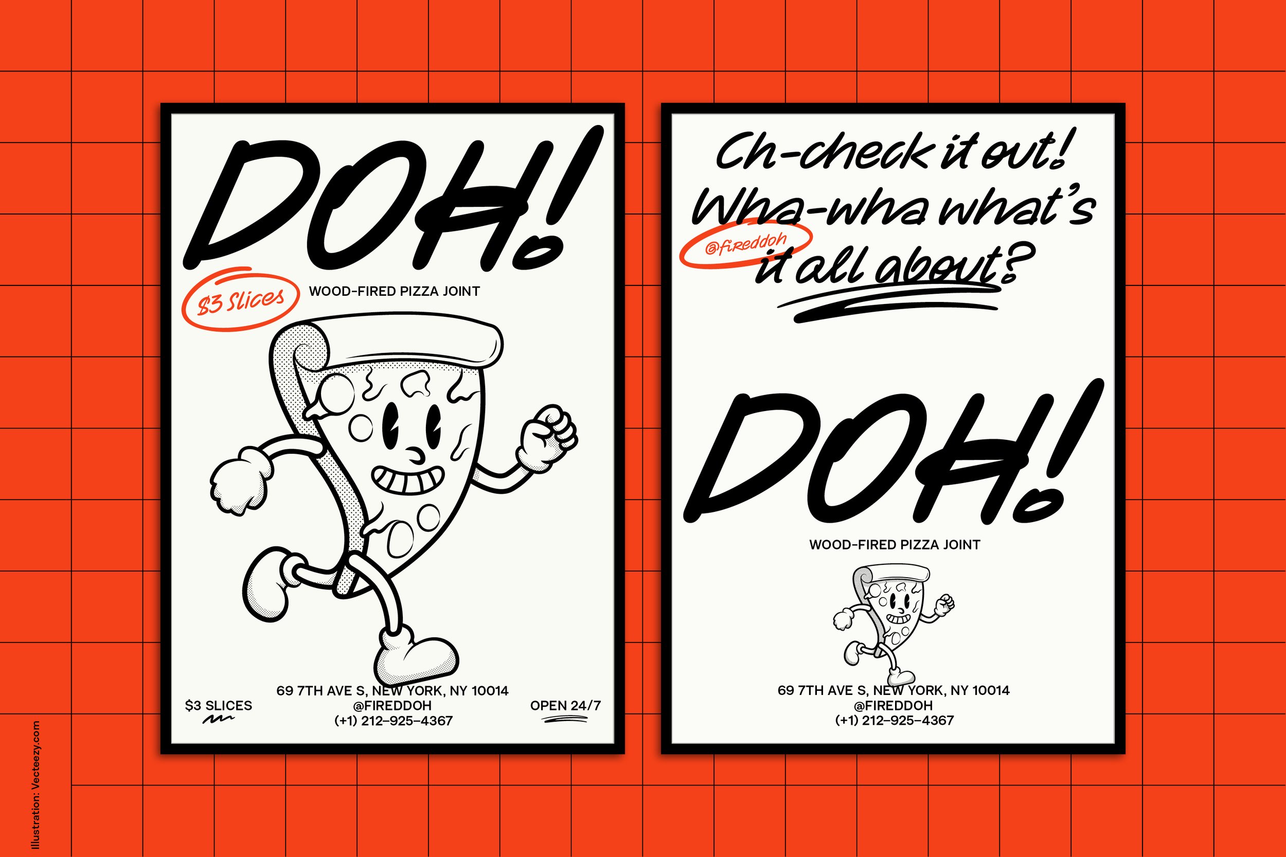
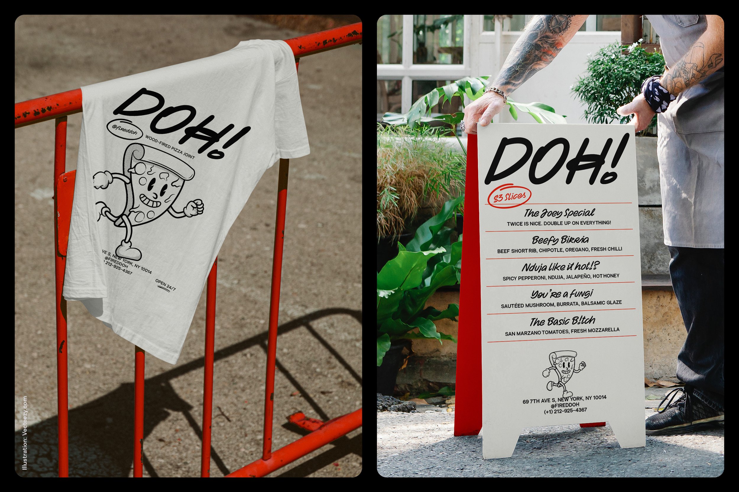
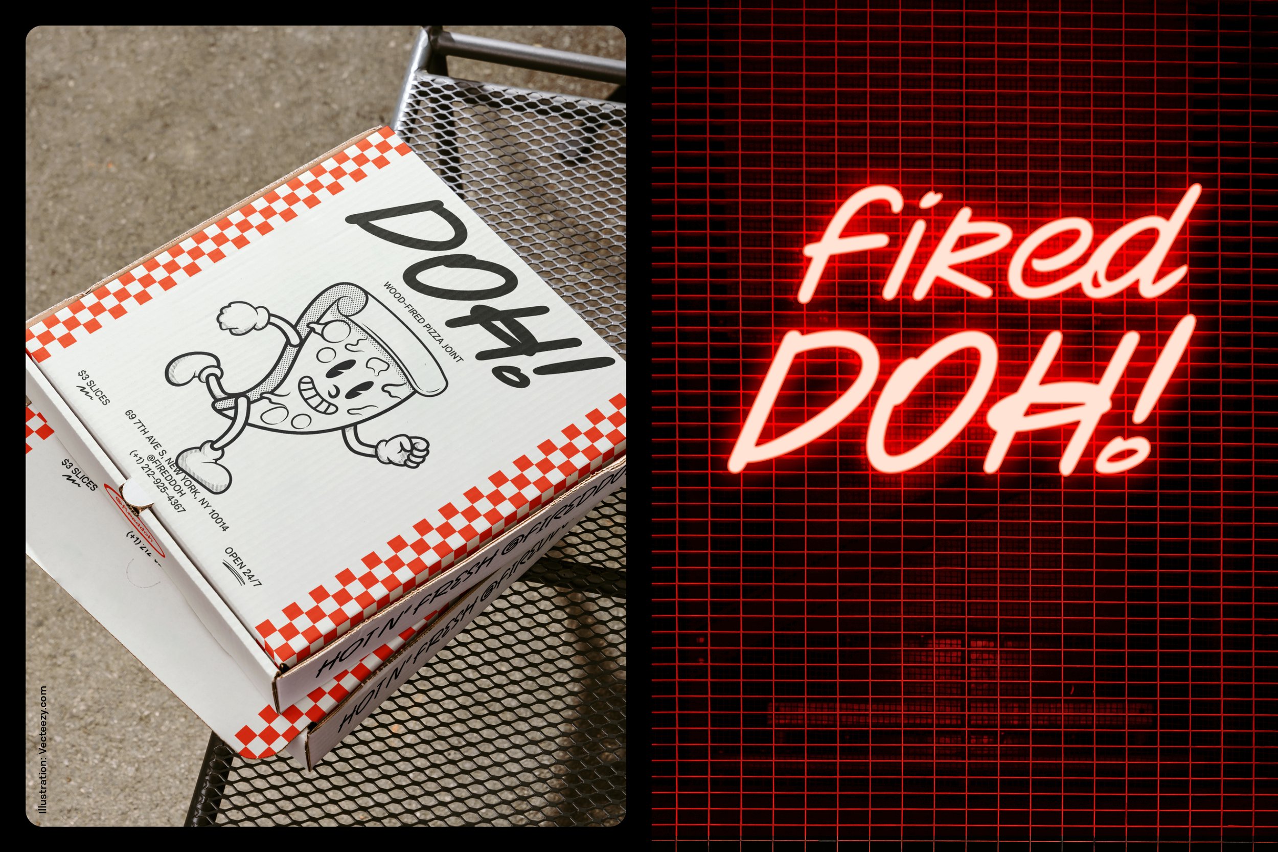
Pizza Mascot Illustration by Vecteezy.com
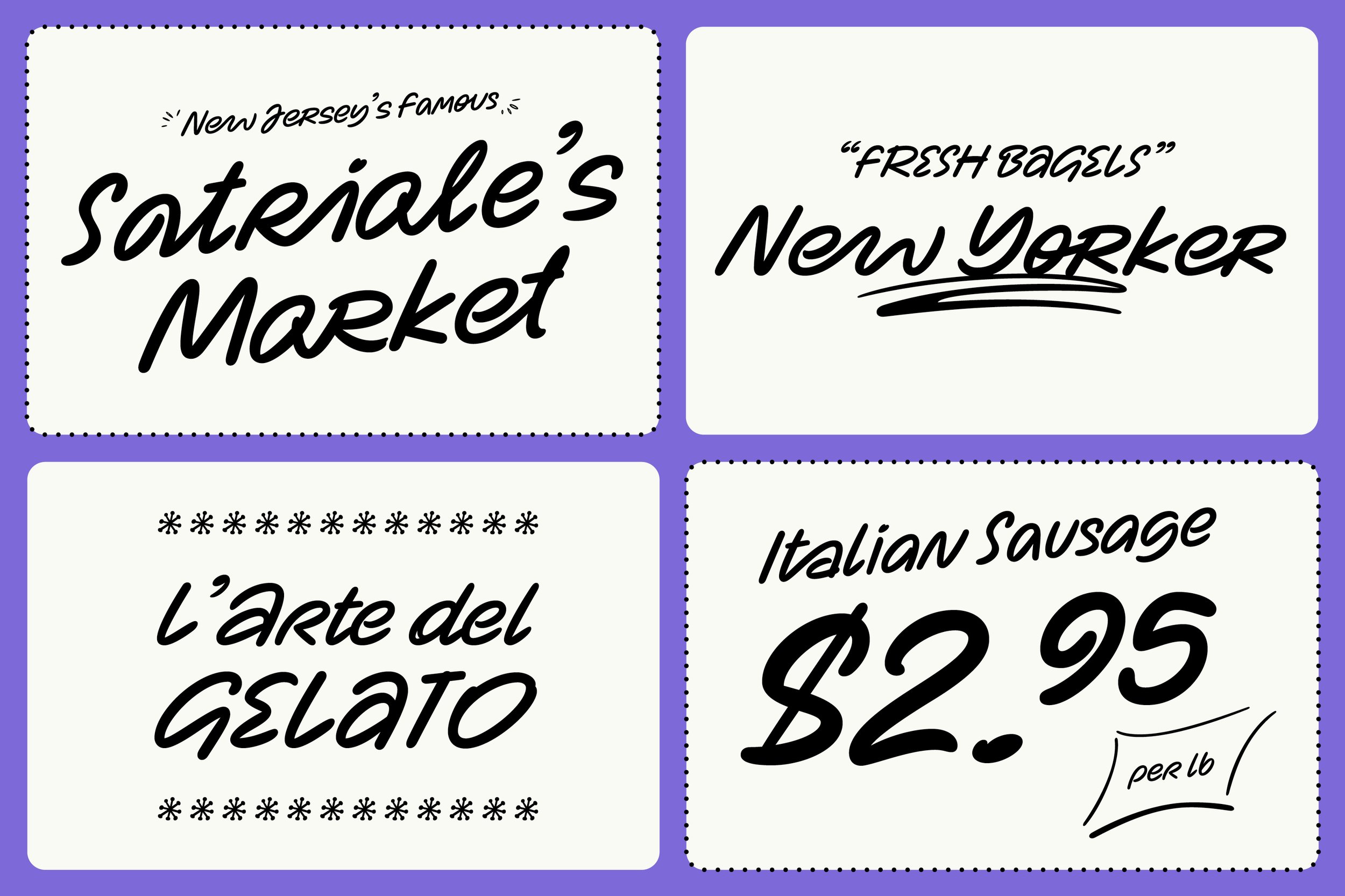
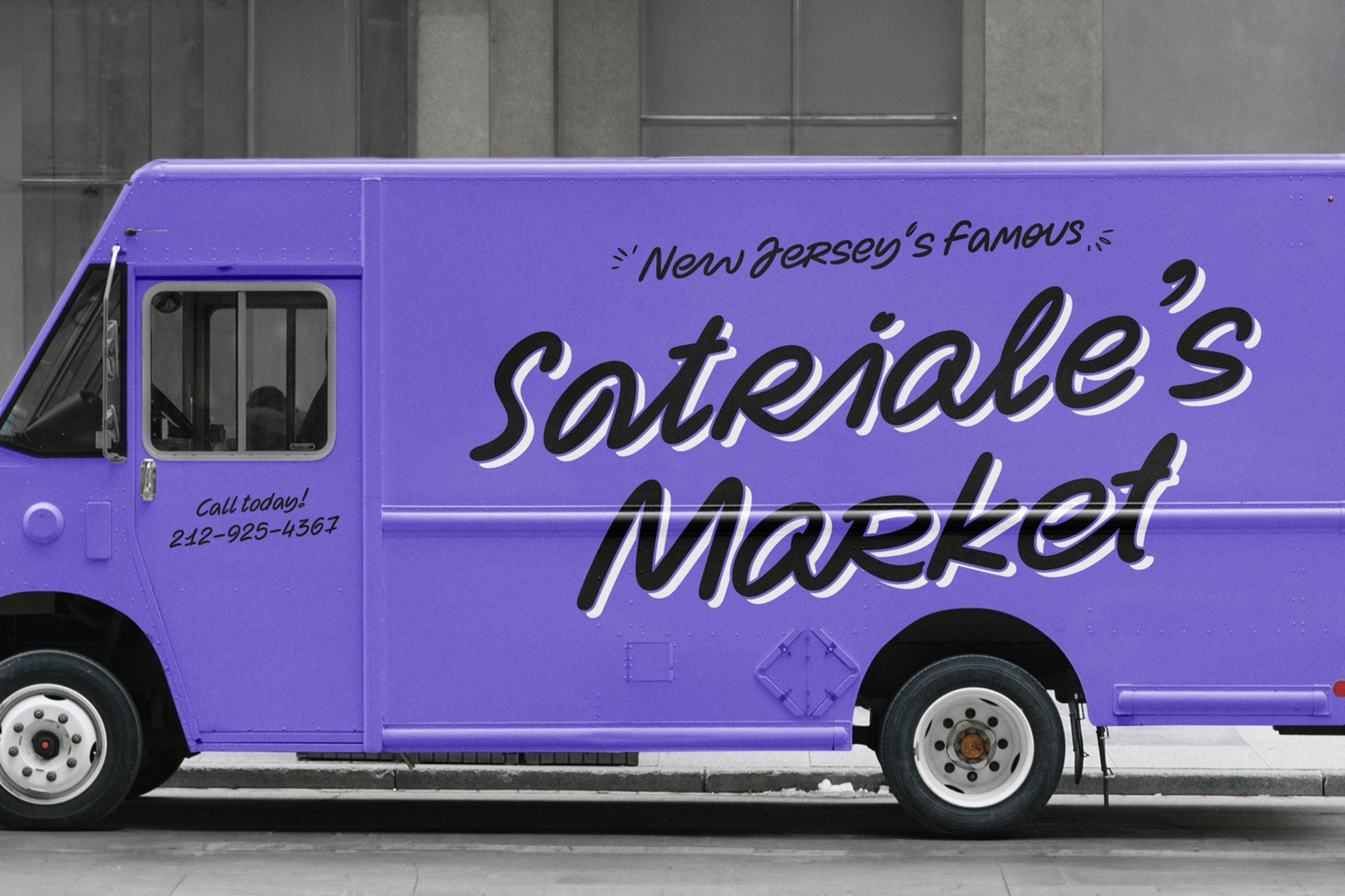
Zabawa encourages you to play with your food and savour it, from handmade food packaging found in a boujee deli, to trendy pizza joints in Downtown New York. It’s a sign painter’s delight, splashed over the windows and walls of indie tattoo parlours, or lit up in neon, glowing with electric life. In the digital universe, this is a typeface made for those Instagrammable slogans, animating and amplifying the voice of influencers.
When it speaks, Zabawa talks from the heart. When it shouts, everyone in the room wants to hear the message. If it’s a bar, it’s the one you have the most fun in. It will make hospitality more hospitable. It can beam like the sun for a surf brand. It can bring fun to fashion, or the warmth of human touch to ad campaigns. Zabawa is a personal message and a lively moment. Whatever it speaks for, is made with love, is memorable, and matters.
After twelve months of honing its game, the perfectly imperfect Zabawa is out to play. And play it shall.