Letters from The Northern Block: June 2025 Round-up
As we hit the halfway point of 2025, we’re reflecting on what has been a busy and rewarding six months at the foundry. It’s been a period of growth, experimentation, and creative momentum—from typeface releases exploring new script design, to legacy font revivals, and charitable fundraising through typography. Scriber was published in Victionary’s ‘Stencil In Use’ book and featured in Print Magazine’s ‘Type Tuesday’ spotlight in April. On the education front, our Head of Brand, Donna Wearmouth, has continued sharing her expertise as an Associate Lecturer at Northumbria University—something we’re always proud to support.
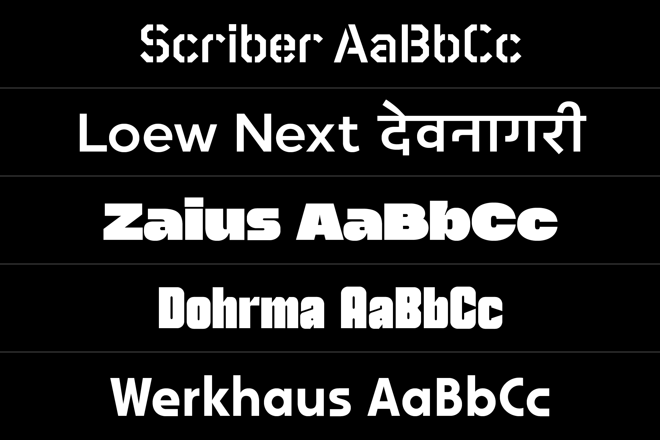
Since January, we’ve released five type families: Scriber, Loew Next Devanagari, Zaius, Dohrma, and Werkhaus—each with a unique story and design evolution. Loew Next Devanagari also marks an exciting milestone as our first typeface to support the Devanagari script. Our upcoming release, Lintel Next, is shaping up to be our biggest yet: a 96-style superfamily inspired by the architectural principles of Alvar Aalto, due out this summer. And thanks to the continued support of our customers, our charity typeface, Maggy, has now raised £440 for Maggie’s Cancer Centre in Newcastle upon Tyne.
Here’s a look back at what we’ve been up to, and a preview of what’s to come over the next six months.
Scriber
A geometric stencil typeface that blends structure with creativity
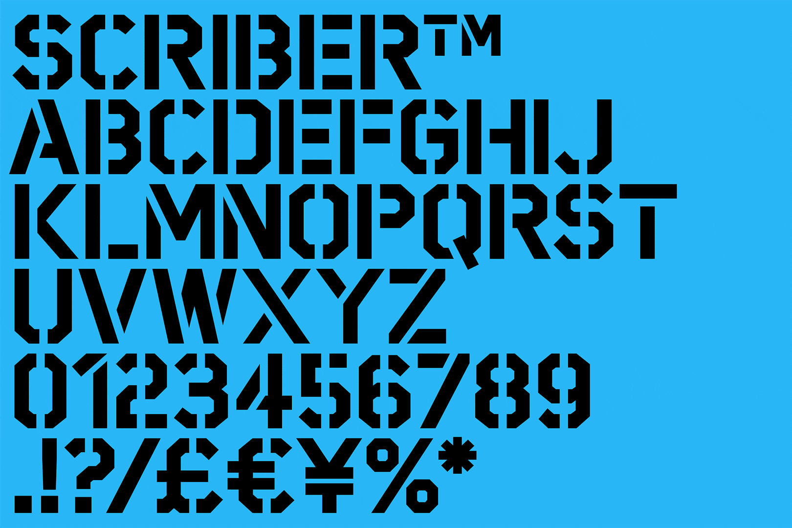
The Northern Block first released Scriber in December 2009, with modern architecture and computer-aided design inspiring the typeface’s technical, square-edged appearance. Initially, it featured nine styles, including a single stencil weight, and offered a basic character set with limited OpenType features.
In 2024, Scriber underwent a significant upgrade, expanding the stencil design across six weights and doubling its character set, which now exceeds 500 glyphs per style. This expansion includes a broader range of OpenType features and improves language support for Western, Southern, and Central European scripts.
Loew Next Devanagari
An evocative global typeface for the rising global superpower that is India
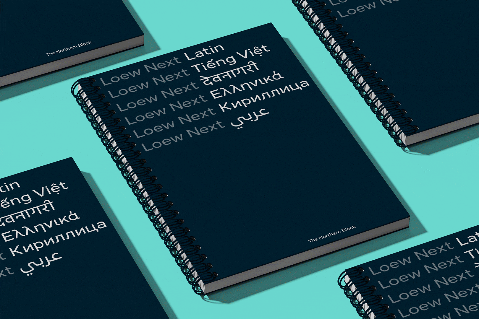
Evocative, groundbreaking design will always find its opportunity to step across the threshold into Devanagari. For the Loew typeface, that opportunity would come a whole decade from its original launch. A refinement into Loew Next has allowed the typeface to be more compatible, and support a more diverse reach of languages.
Loew is a project that continues to grow in magnitude, and keeps surprising. Hilton showed what could happen to a typeface as it makes its way emblazoned across the world. Font development and brand managers who are part of Loew’s history have been able to make it a globally expansive language system beyond its intent. Loew has become a visual language that speaks in many places, and now India, too.
Zaius
A bold typeface inspired by the iconic lettering of Planet of the Apes
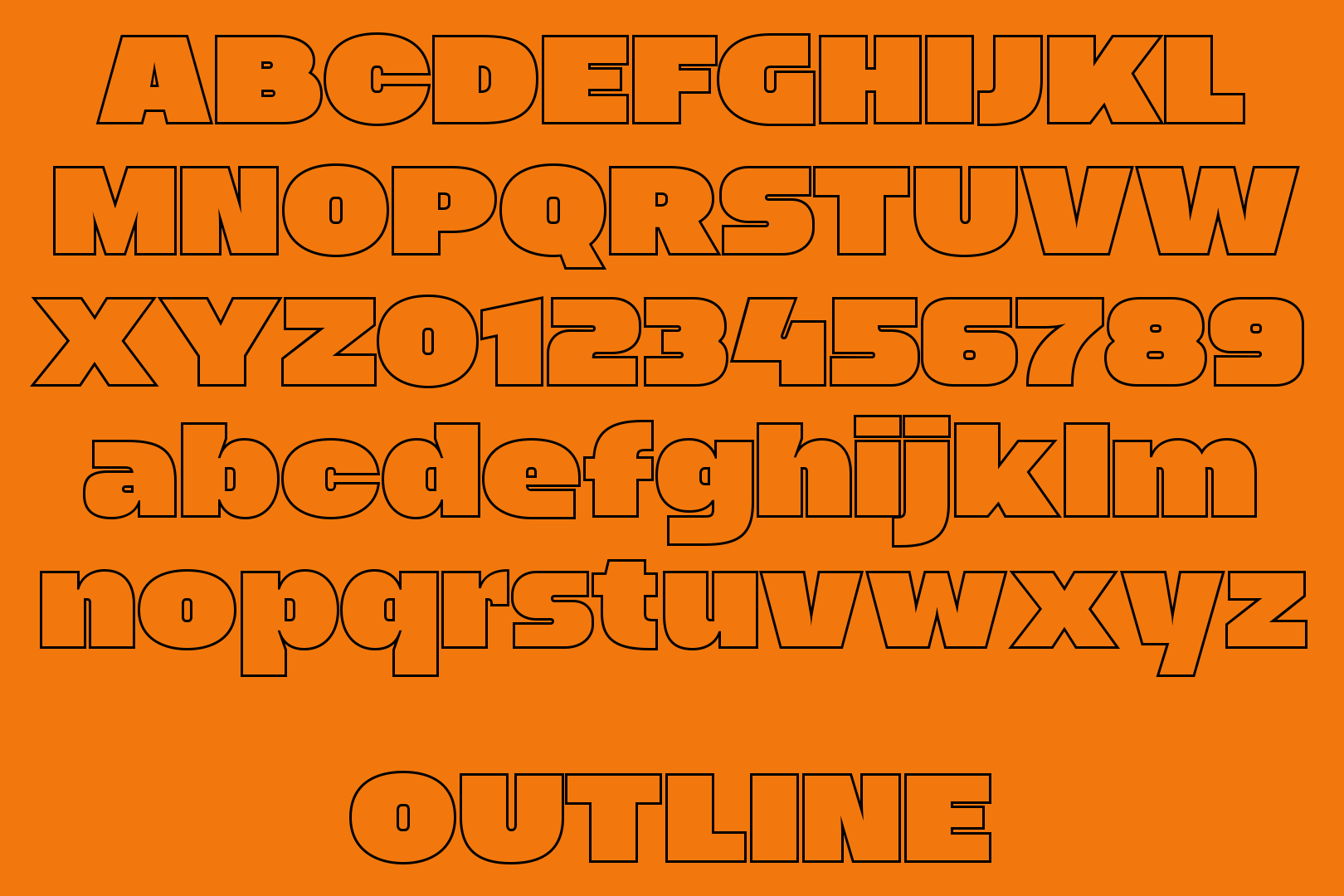
Zaius is a bold, display sans-serif typeface inspired by the iconic lettering of Planet of the Apes (1968), originally crafted by legendary typographer Ed Benguiat. The latest update refines its bold, impactful aesthetic with technical enhancements, an expanded character set, and new stylistic variations, including Ultra, Fill, Stencil, and Outline.
First released in March 2009, the recently updated version of Zaius features over 500 glyphs per style and comprehensive language support for Western, Southern, and Central Europe.
Dohrma
A distinctive interpretation of Morris Fuller Benton’s classic Othello typeface
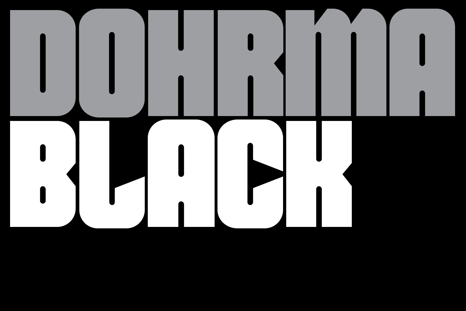
Dohrma is a modernised rendition of the classic Othello typeface, originally designed by Morris Fuller Benton in 1964. Jonathan Hill first released Dohrma in 2010, following a visit to The National Videogame Museum in his hometown of Sheffield. There, he spotted original packaging for the Nintendo Famicom Disk System, which featured an outline version of Othello.
While Dohrma retains the character of Othello, Jonathan’s updated interpretation brings a fresh, contemporary feel suited to today’s wide-ranging design needs. With four distinctive styles—Black, Soft, Grit, and Outline—Dohrma offers impressive versatility. This range makes it adaptable across a variety of design contexts, from bold headlines (Black) to elegant outlines (Outline) and softer, more subtle text (Soft).
Werkhaus
A bold display typeface that blends Bauhaus simplicity with retro gaming spirit
Inspired by Bauhaus 93 and the bold aesthetics of Atari 2600’s game cartridge packaging, Werkhaus combines geometric simplicity with dynamic retro influences. Known for its vibrant colours and striking typography, Atari’s packaging played a key role in shaping the typeface’s visual language.
Werkhaus is a robust type family featuring over 500 characters, spanning seven weights with matching obliques. It includes twenty interchangeable stylistic alternates that introduce a softer, rounded aesthetic for added versatility. The typeface also offers extensive language support, covering Southern, Eastern, and Western Europe.
Lintel Next
Inspired by Finnish design, delivering seamless performance on any scale
Lintel Next is the next-generation evolution of the original Lintel typeface, first released in 2012. Inspired by Alvar Aalto’s architectural principles, this geometric sans-serif balances structural precision with a natural, flowing aesthetic. Its distinctive pill-shaped curves and carefully proportioned letterforms create a typeface that is both precise and approachable.
Expanded for greater versatility, Lintel Next now offers five new widths—Compressed, ExtraCondensed, Condensed, Expanded, and Extended—along with broader language support covering Western, Southern, and Central Europe, as well as Cyrillic, Greek, and Vietnamese.
We’re getting close to launching Lintel Next. Subscribe to our newsletter for release updates and exclusive discounts.
In The Works
Celestic
Celestic is a high-contrast display serif typeface that combines the fluid elegance of calligraphy with the sharp precision of engraved typography. With refined ball terminals, delicate serifs, and graceful stroke modulation, it perfectly balances expressive craftsmanship and contemporary sophistication. Celestic is well-suited for editorial design, luxury branding, and high-end packaging.
Bulletin Script
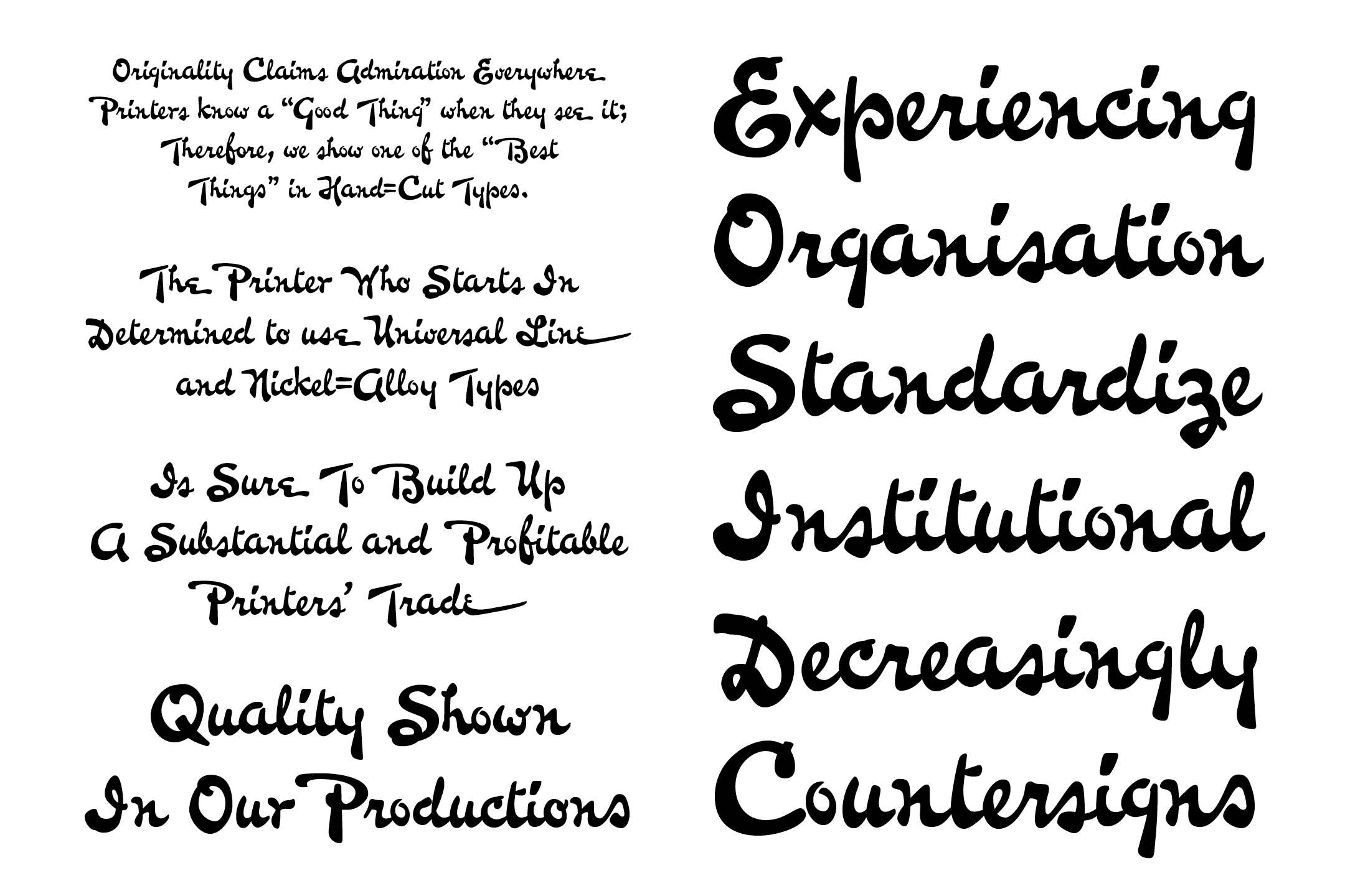
Bulletin Script is a digitised revival of Bulletin, first cast in 1899 by Keystone Type Foundry of Philadelphia. This semi-connected script features a lively, brush-inspired design that bridges historical authenticity with modern functionality. Reflecting the craftsmanship of early 20th-century American lettering, it captures the warmth of hand-drawn script while honouring Keystone’s legacy.
In Other News
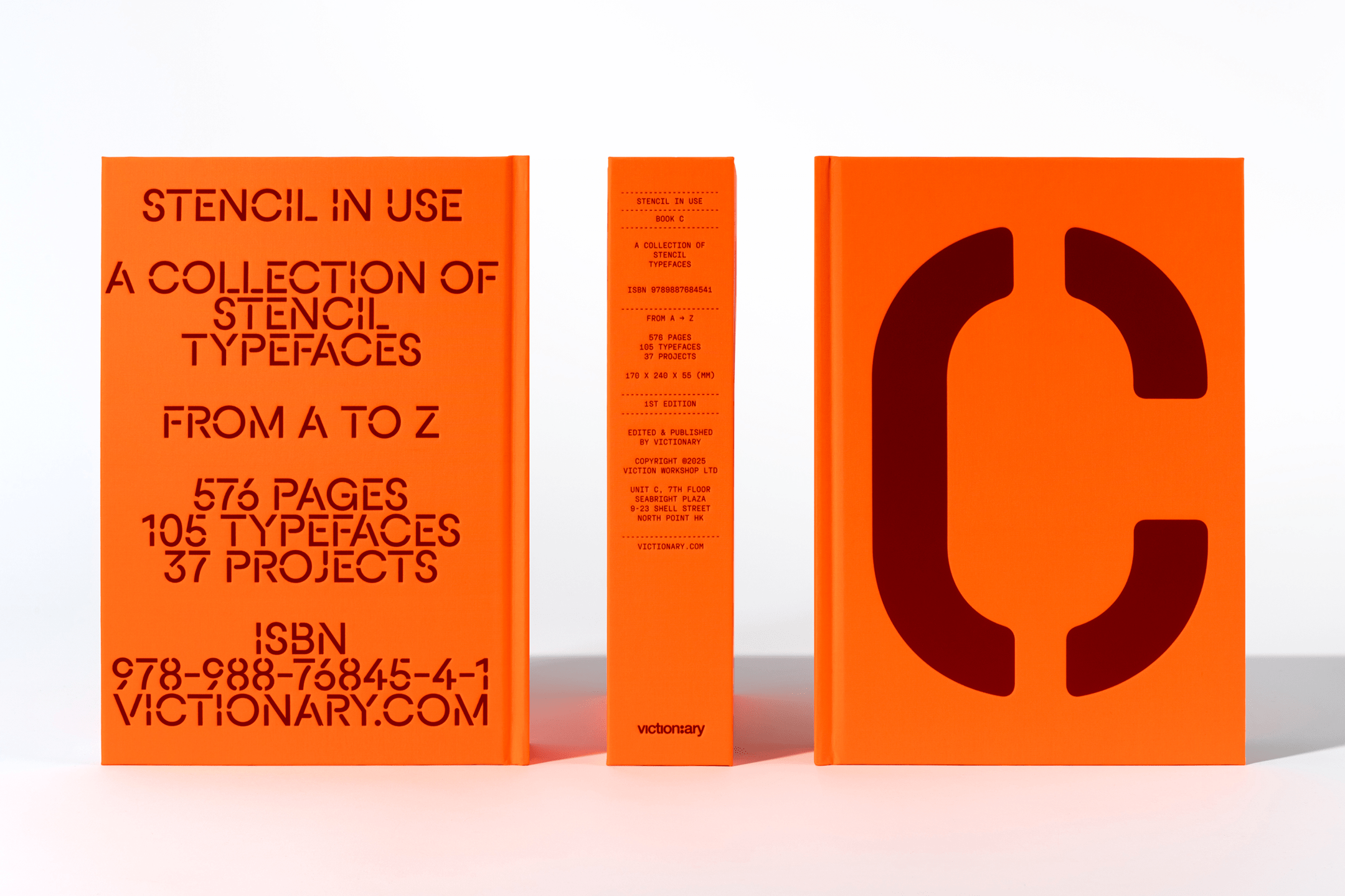
Scriber featured in Stencil in Use
Victionary’s newest publication, Stencil In Use, features Scriber in its curated selection of stencil type specimens. Following the success of the ‘Sans/Sans Serif In Use’ book series, the latest publication collates the best typefaces for inspiration-seeking designers and typographers.

Maggy raises £440 for charity
We’re immensely proud that Maggy has now raised £440 for Maggie’s Centre in Newcastle upon Tyne. 100% of sales from the Maggy typeface are donated, and your generosity will help provide free support for families dealing with cancer. Thank you for making a difference. Donate and download!