The Northern Block’s Lintel Next: Inspired by Finnish design, delivering seamless performance on any scale.

The Northern Block love to set themselves a challenge. Their latest—a project to develop their Lintel typeface as part of its ‘Next’ series—has been self-described as their biggest yet.
‘How are we going to make this work?’—Tasos Varipatis, Senior Type Designer at The Northern Block, talking to himself on day one of the Lintel Next project.
The predecessor of Lintel Next was influenced by the principles of geometric sans-serifs, and inspired by the work of Finnish architect Alvar Aalto—a design icon who made Scandi sensibilities recognisable all over the world in buildings, textiles, furniture and glassware. His approach to design blended modernist principles of stability, balance and clarity, with organic forms. These elements were reflected in Lintel’s structured yet fluid aesthetic, where geometric precision met a more natural, human touch.
On the surface, delivering Lintel Next seemed straightforward: extend the Lintel typeface by revisiting and reworking the Cyrillic, adding the Greek, and expanding to support six further widths. Yet, with progression came complexity.
Lintel Next is a story of truly testing work—a deep-level custom modification to build seamless performance into a typeface that had arguably already set its own standard for adaptability. Tasos had to operate with the foresight to envision how the software would interpret the typeface and seek to adapt it, creating layers that ensured those adaptations could be seamless.
‘We had to move the masters far more than usual. We decided to create and apply twelve intermediate layers.’—Tasos Varipatis
When moving a typeface from condensed to wide, the architecture of curves can become very different. The curvatures of Lintel Next have been conserved, because time has been taken to ensure transitions are as sleek as possible, making terminals, characteristics, and performance work together as seamlessly as possible across a number of widths.
‘There were integration issues because of the unique design of the terminals. Lintel has a natural progression between terminals. With Lintel Next, we wanted to introduce horizontal terminals as a stylistic alternate, adding elements of geometry, and that meant more detailed layers to make sure those natural progressions could be unified with the geometrics that users craved.’—Tasos Varipatis
This was painstaking work to ensure Lintel Next evolved to increase adaptivity, while keeping its Scandi heart.

And the result of that deep work?
You know how hard work goes. What you put in, tends to be what you get back. The making of Lintel Next was eighteen months of hard work, while allowing the right breathing space that this kind of project needs to re-energise that search and push for more functionality, flexibility and scalability. It’s those three characteristics that can really set this typeface apart from others that may appear stylistically similar.
The Northern Block have put themselves through pain to make sure you don’t experience any. Lintel Next is a user-shaped typeface because of how it can be put into action. It’s a commercial workhorse with a bone structure that has had deep, macro-level work. To keep things running smoothly across the width axis, Tasos identified key points in the design space where extra control was needed. These intermediate layers act as anchors, ensuring that transitions between styles remain clean and consistent. Where a curve and a straight line meet, it always works with Lintel Next. It doesn’t struggle or disappear in narrow spaces.
‘You can see the distortion when a typeface is squashed or clipped out of its own functional space. Lintel Next just adapts.’—Jonathan Hill, Founder of The Northern Block, and Designer of Lintel.


Lintel Next has beautiful proportions that can adapt to any scale within a layout. From the narrow system of a mobile device, to the silver screen at movie level, it can make the same seamless impression. It’s as crisp on the side of a space shuttle, as it would be on a crisp packet. It could perform on the head of a pill, and it looks like one, too.
The hand-drawn approach of Tasos gives the typeface a unique warmth that is rare in geometric sans-serifs. Every character has been redrawn by hand to improve consistency, readability and performance. There were 600 characters in Lintel, and Lintel Next communicates with 1222 in each of its 96 individual styles. No matter how big, small or wide, there will be a Lintel Next for you.
‘We’re a small company of designers, but we communicate with global products, bridge digital landscapes, and touch international lives. Our work comes with a responsibility, and Lintel Next has the technical ability and political capacity to be noticed.’—Jonathan Hill
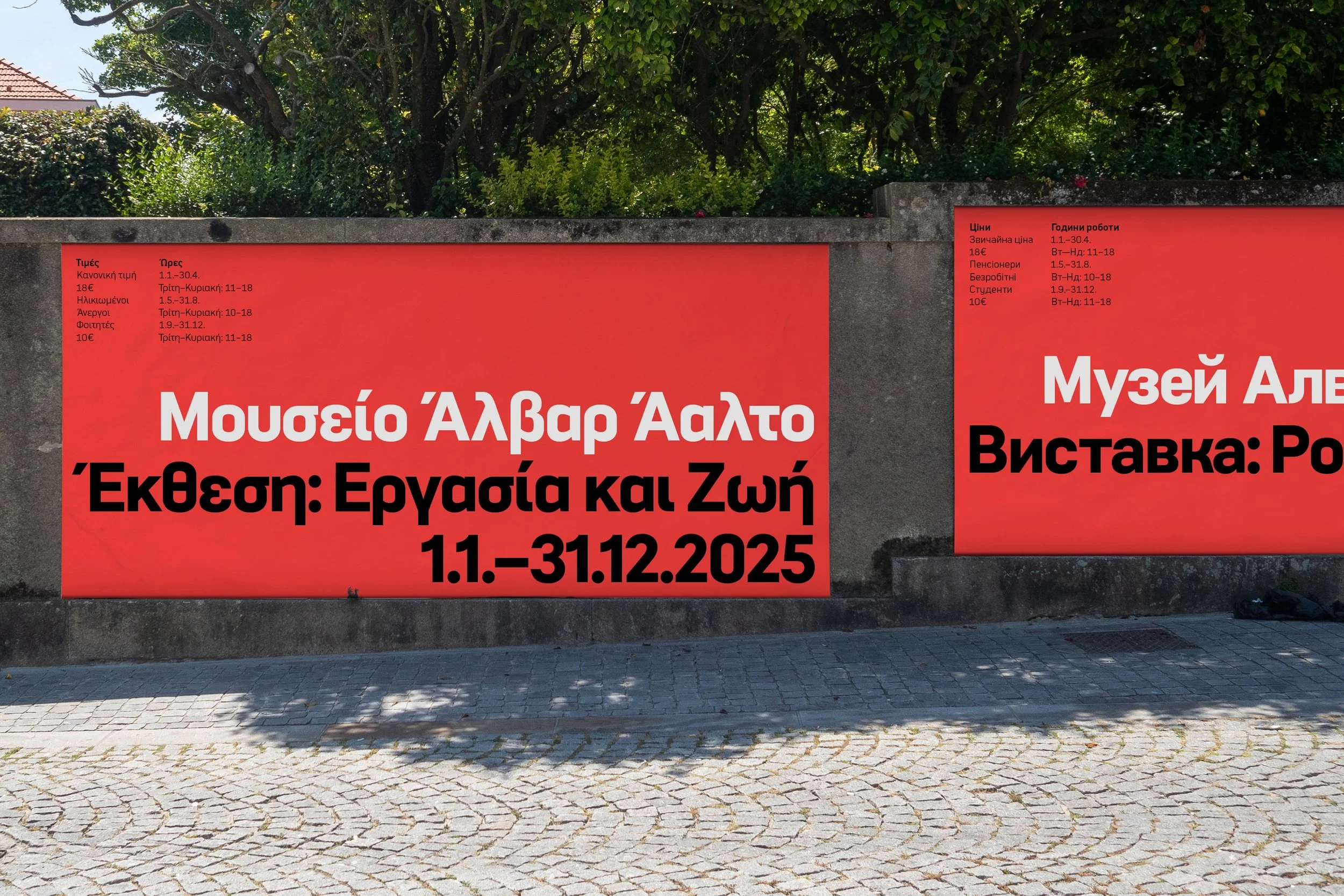
Lintel Next steps up with its ability to harmonise language and culture without losing itself. Pre- and post-Soviet cultures have a chapter in the story of Lintel, and Lintel Next. Finland itself is famous for Soviet resistance, and the spirit of this even seems to have found a footing in the marketing of the typeface, which showcases a Ukrainian Cyrillic.


The original Lintel Cyrillic was designed by Georgian type designer Alexander Sukiasov. During the development of the original typeface, it was sent out to several designers with a few missing characters. Each designer was challenged to offer a personal response to what was missing, and bring their own interpretation to Lintel Cyrillic. The Northern Block didn’t see it coming, but the contribution of Alexander Sukiasov brought Lintel together as a whole. With the work of Tasos Varipatis, Lintel Next expands its own characterful communication into Vietnamese and Greek, and continues that tradition, making this typeface more complete, and universal. More relevant and adaptable.
‘Lintel Next is your perfect Tetris tool. It helps you see spaces and opportunities that you haven’t seen before.’—Jonathan Hill
Lintel Next is geometric with modernity, but it’s not rigid. It can set quite a serious and dramatic tone, while also somehow feeling light and almost playful, possessing a subtle liveliness. It has the dynamic to appeal to our human side. With the ability to meld these characteristics, it has obvious potential to communicate storytelling moments seamlessly across mediums and scales, and communicate serious human subject matter with clarity and heart.
The original Lintel found fame when it was featured in the video game Mafia III, and seemed a pragmatic choice because of how well it fulfilled the need to adapt from a monitor, to a tablet or smartphone. Lintel has been used and celebrated for its flexible quality. Lintel Next takes this versatility and performance to a new level of seamless adaptability. Lintel was a strong performer at video game level. Its ancestor can operate at server level, where complex user systems require lots of information, on a number of scales. However complex the technology is, Lintel Next can handle it.
‘This has been the most challenging in what it has demanded of technique, in order to achieve its scalability. We’ll have to raise our game to get past Lintel Next. We deserve a rest.’—Jonathan Hill
The Northern Block’s Lintel Next is what hard work, smart thinking, and deep-precision design look and feel like. This is a typeface that stays true to itself, whatever you might ask of it. It can handle human drama, and express our range of emotions, on any medium or scale. Culturally and technologically fluent, it will allow its users to adapt seamlessly and communicate with clarity. The level and quality of technique and work that has gone into making all of that possible, is staggering. If you have a story to tell, Lintel Next will help you tell it truly and memorably, at any given opportunity.
Project Team
Type Designers: Jonathan Hill and Tasos Varipatis
Graphic Designer: Donna Wearmouth
Motion Graphics: Tasos Varipatis
Ukrainian Translator: Kateryna Korolevtseva
Copywriter: Daniel Clark (The Word Garden)