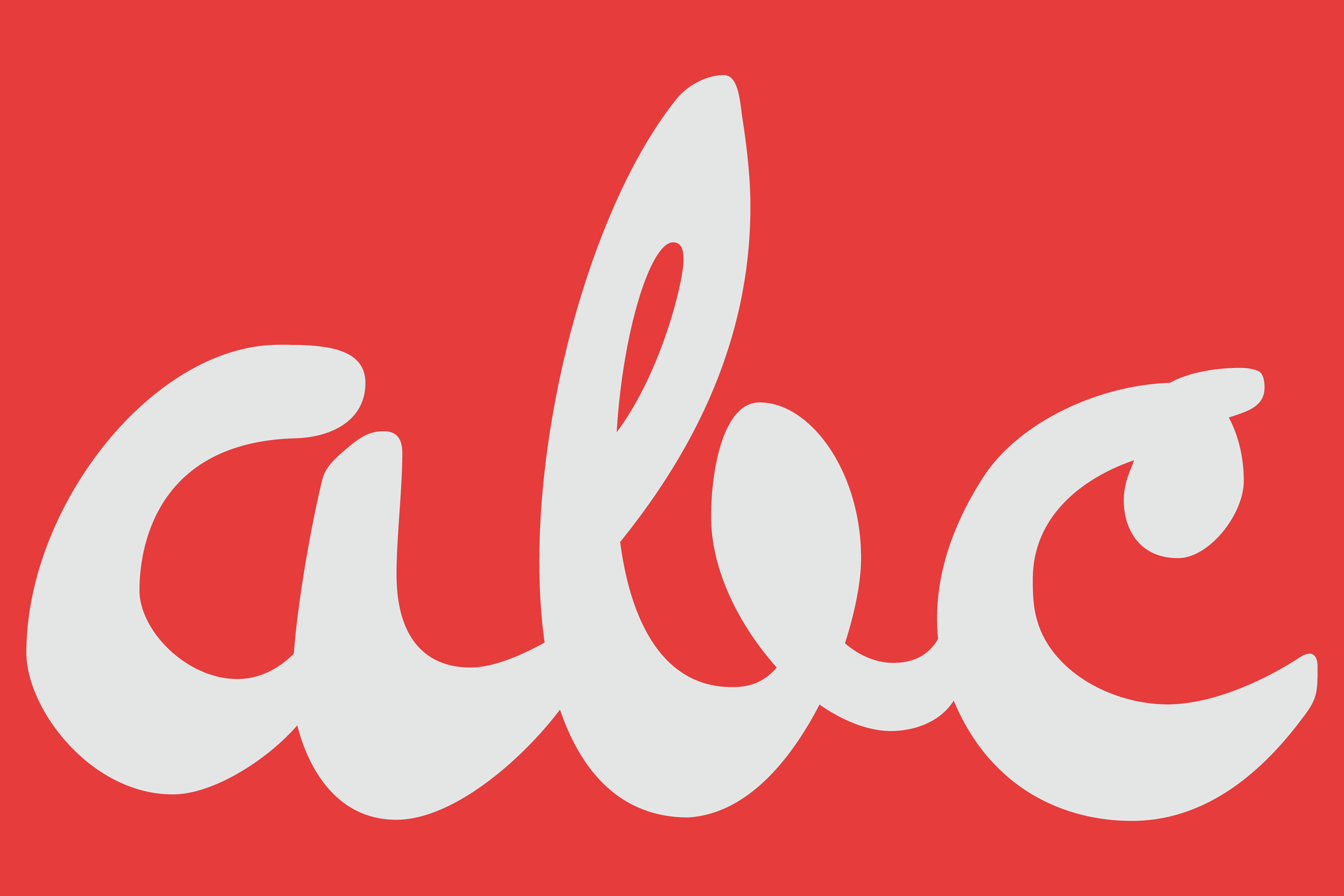
The Northern Block’s Pennline Script—A 126-year-old typeface resurrection, pulsing with early Americana.
In 1899, Philadelphia was one of the most international cities on the planet. A century of mass immigration helped to turn it into a thriving global industrial leader of shipbuilding, steam locomotives and textiles. A free library system had been launched, and new theatres were opening on the city streets, where newspapers in multiple languages were sold. Philadelphia’s printing and publishing industry was also a catalyst in the city’s evolution, and a boom in large department stores and advertising streams made fertile ground for Philadelphia’s Keystone Type Foundry to produce revolutionary work, casting typefaces in nickel alloy.
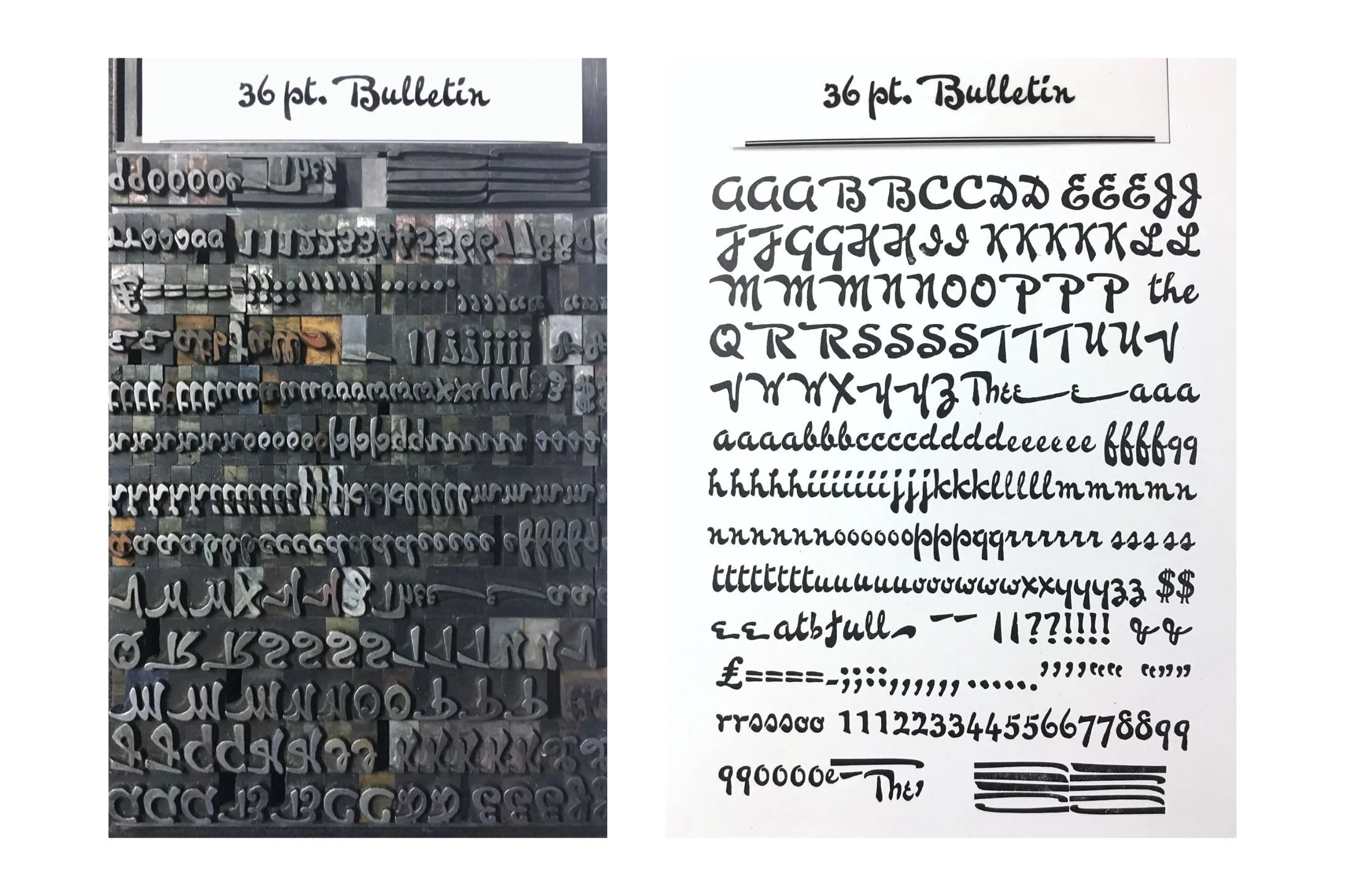
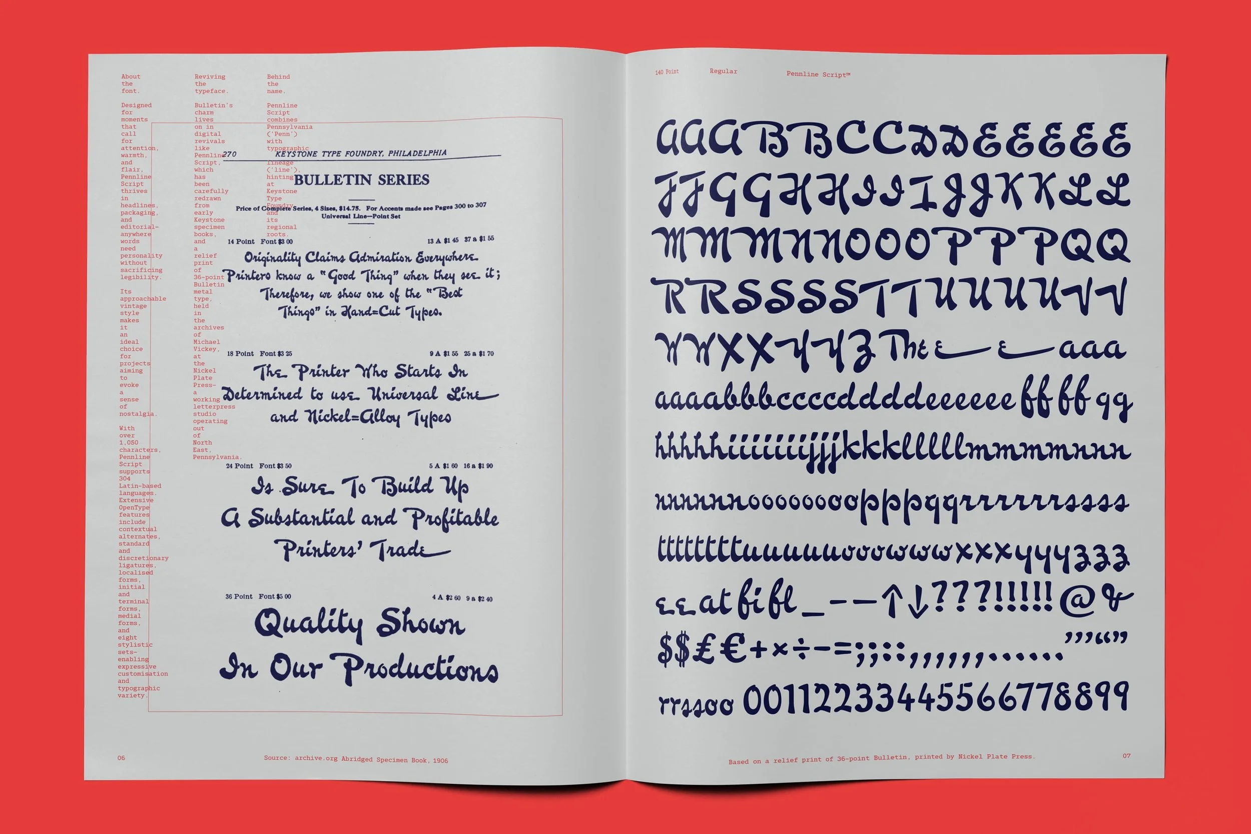
Fast-forward to 2024, where Tasos Varipatis, Senior Type Designer at The Northern Block, is meandering through Facebook. On a page called Type and Typography, the algorithm gods are about to be kind to his search for inspiration. A post on Keystone’s Bulletin typeface, with original casts and a printed specimen, comes to his attention. It’s a relief print of 36-point Bulletin metal type, held in the archives of Michael Vickey, at the Nickel Plate Press—a working letterpress studio operating out of Lake Erie Vineyard Country, Northwestern Pennsylvania.
36-point Bulletin, held in the archives at the Nickel Plate Press. Image source: Facebook.
It turns out to be a typeface that has drawn a lot of admiration, but appears to have never been digitised. Tasos was compelled to commit himself to the challenge of being the first to capture the expressive freehand qualities of the original Bulletin, and adapt it to modern typographical standards.
‘I’ve always been fascinated by the expressive power of American hand lettering. Bulletin immediately stood out. It has very human rhythms and imperfections.’ — Tasos Varipatis, Senior Type Designer, The Northern Block
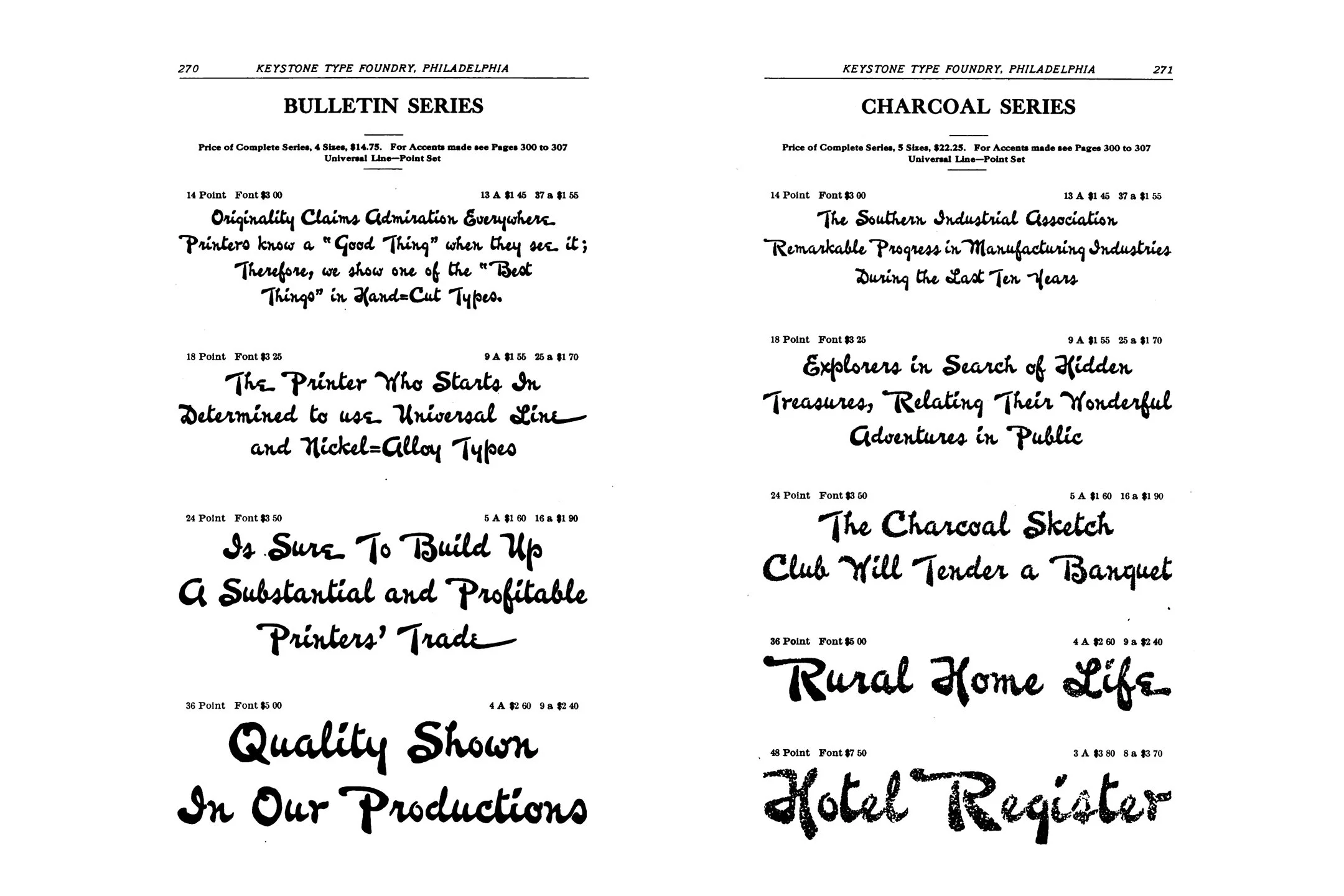
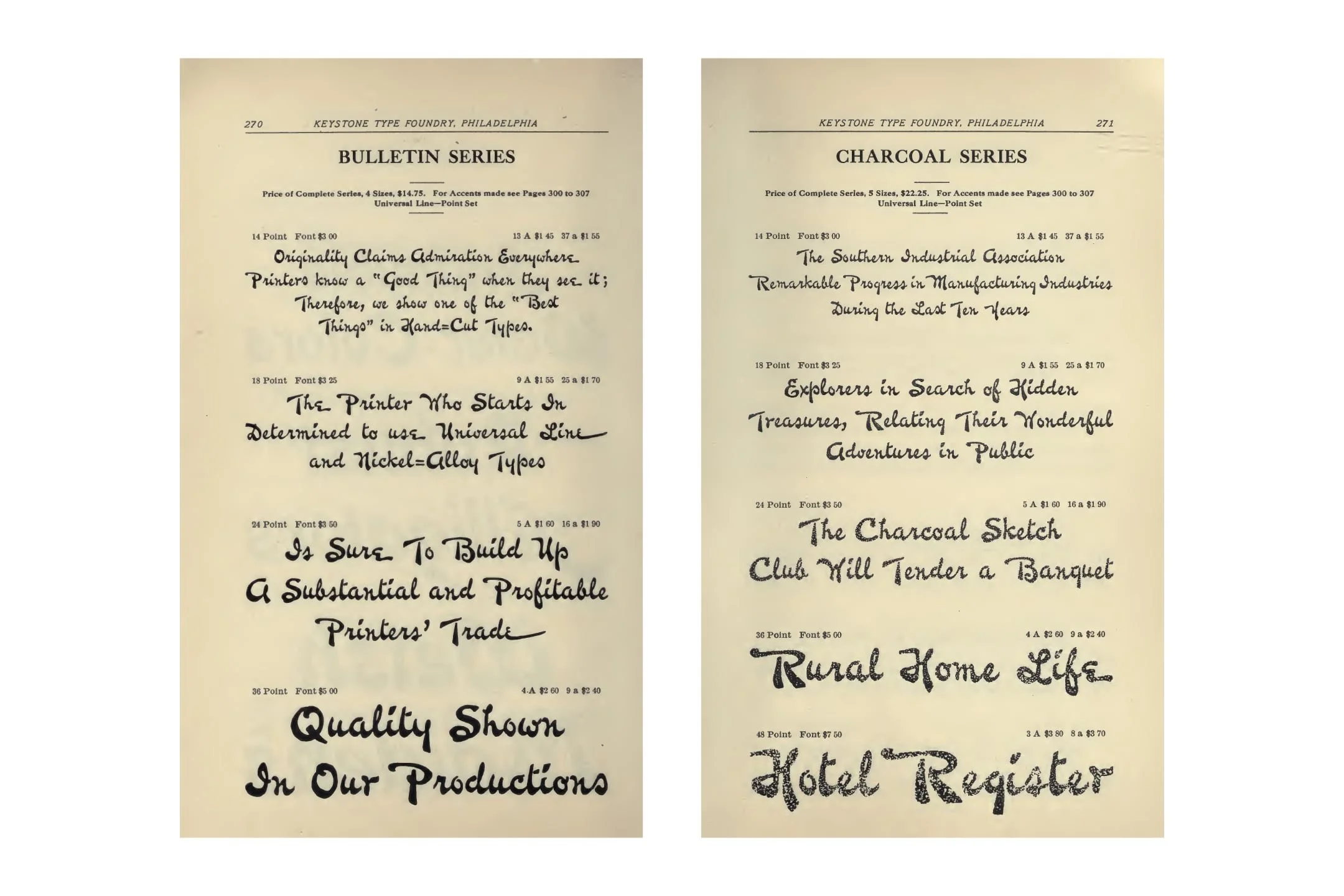
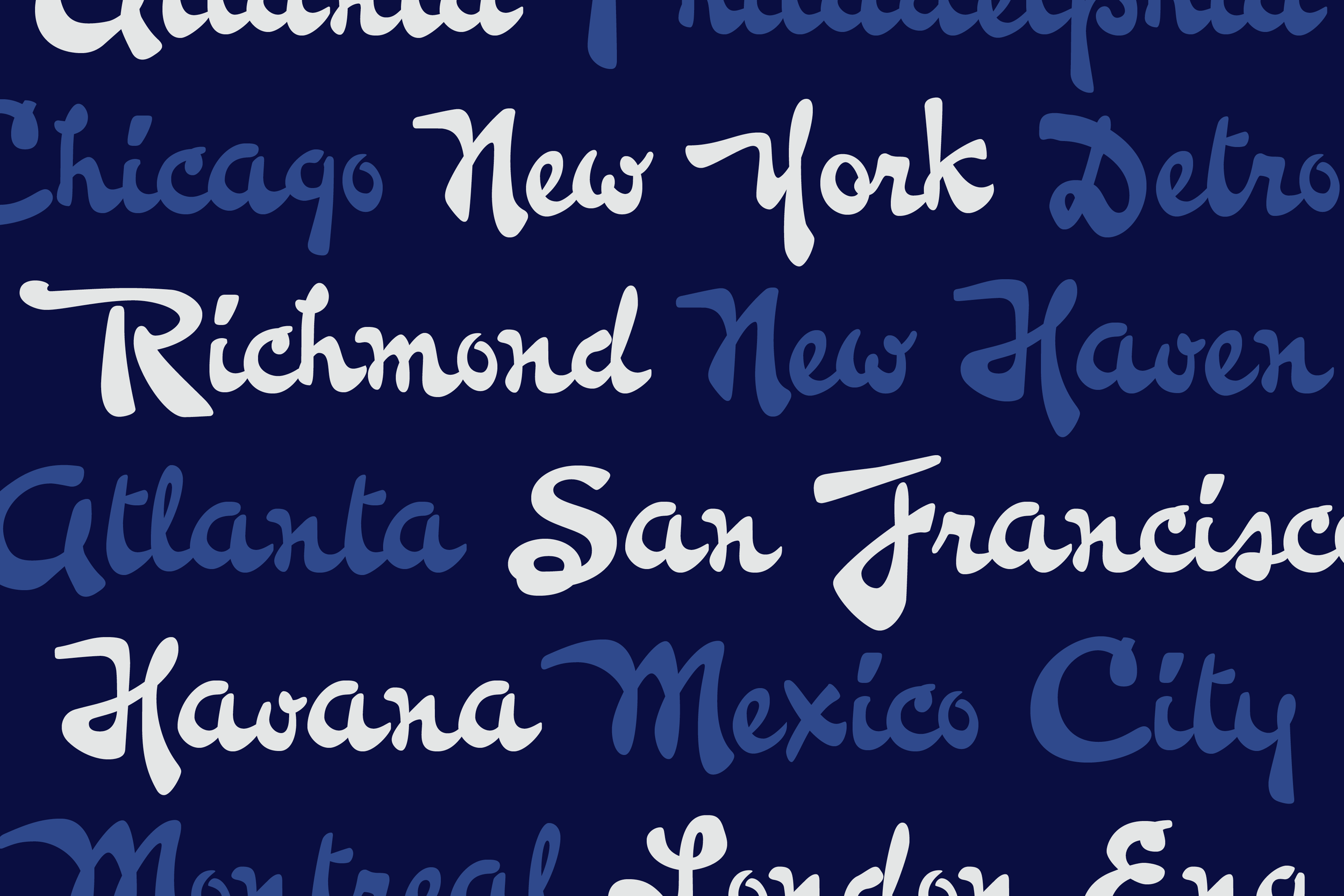
The Keystone Type Foundry’s 1906 Abridged Specimen Book is a captivating artefact that reveals they had a sales presence as far and wide as Mexico City, London, England, and Havana, Cuba. There is no record of whether the original Bulletin typeface was made by one hand or many, when it was first cast in 1899. Often, metal cast type was carried out by a number of skilled hands, and it was likely that Bulletin was the work of in-house punch cutters and draftsmen. Part of the magic of this typeface is that it feels like the hand of one person; it radiates individuality.
Above: Keystone Type Foundry’s Abridged Specimen Book, 1906, and Catalogue and Specimen Book, 1910.
When a designer like Tasos undertakes a revival and homage to a typeface that’s 126 years old, you know that work will make an impact, and be carried out in a way that’s meaningful and exacting. To begin with, there is a depth of significance to be found in its naming. The revival typeface has been titled ‘Pennline Script’, combining Pennsylvania (‘Penn’) to reference its origin point, with its typographic lineage (‘line’). A fitting ode to its legacy and roots, from that first casting in 1899, to its preservation by the Nickel Plate Press, and the inspiration and craft that it continues to represent.
The organic and free-flowing character of Pennline Script wasn’t casually achieved. The surviving record of Keystone’s Bulletin is scarce. That scarcity was the attraction, but updating it for modern applications involved a lot of creativity and commitment. It represents six months of rigour and resourcefulness, to create digital life from the memory of a ghost.
‘I could only work on the limited specimens I had, and with no typographic rules to work with. There was no reference point for spacing or kerning, because there was only a metal cast. The refinement took real consideration. The overall spacing had to be reimagined.’ — Tasos
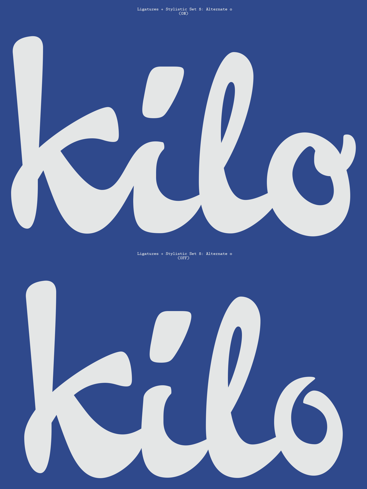
That meant spending a lot of time creating type specimens in large and small sizes to see how it worked in context. Tasos tested it across various online platforms to perfect its functionality and ensure Pennline Script’s OpenType features, ligatures, and paths were correct and able to respond.
‘Seeing it come to life digitally, the moment when the letterforms connect beautifully and hold together in modern layouts. I have to admit a little bit of pride, to feel myself bridging over 100 years of design history.’ — Tasos
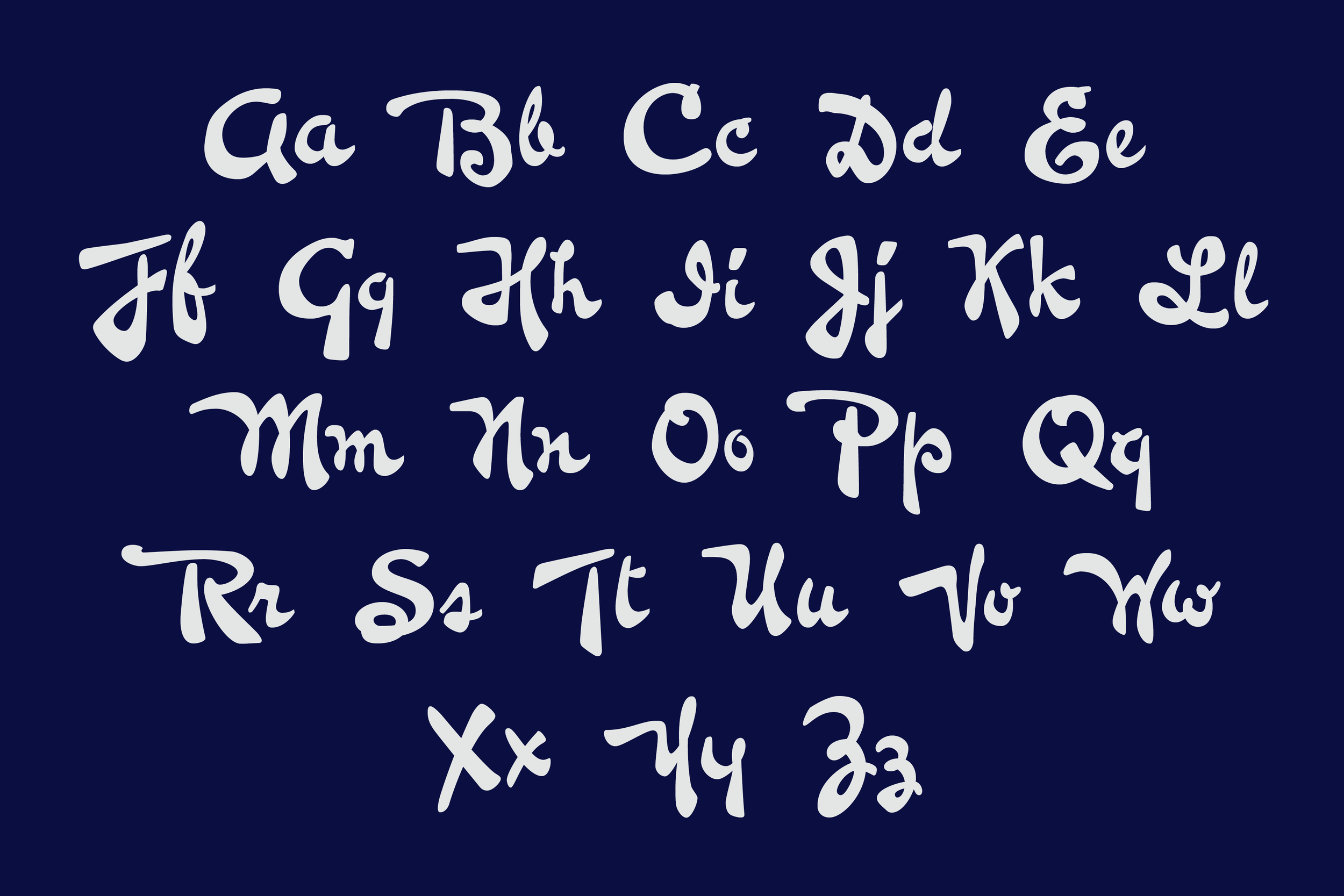
There was joy and beauty to be found in the creation of Pennline Script. It’s not a surprise, though. Look at the letterforms, and you can feel the pulse of its positivity. Pennline Script captures the same logic and contrasting rhythms as Keystone’s Bulletin original, balancing authenticity with full usability. Tasos’ commitment has taken a limited character set and delivered a curated suite of stylistic sets, including contextual alternates and ligatures. It’s highly customisable, depending on how expressive or refined a design needs to be.
‘Reinterpreting this spirit digitally was both thrilling and challenging. In translating the original brushwork to the digital format, I worked meticulously to design missing glyphs that matched the script’s original flow, structure and character.’ — Tasos
As a result of this methodical approach, Tasos’ presence can inevitably be felt and experienced in the script. His deep focus on preserving the expressive irregularity of the original design is obvious. It’s a triumph of restoration. There’s a work of imagination at play that makes this personal, unique, and one-of-a-kind.
‘The metal-cast brush style of Bulletin also presented challenges in letter connections—the Keystone craftsmen had cleverly linked letters despite type-setting limitations, yet gaps in the script could sometimes break its flow. To meet modern standards, I blended these historic solutions with contemporary techniques.’ — Tasos
These modern limitations were once fingerprints of innovation. Philadelphia’s printers were early pioneers of steam-powered printing presses as a way to quadruple print speeds, which integrated the metal plates cast from moulds of set type, like that of Keystone’s Bulletin. Plates were stored and used to print additional copies, or cloned and sold to other publishers for the later publication of licensed editions. The economics of this printing system birthed the rise of magazines, monthly periodicals and specialist publications. Philadelphia was one of the first cities in America to boast a penny paper (The Cent, 1830).
Take a closer look at Pennline Script on Behance.
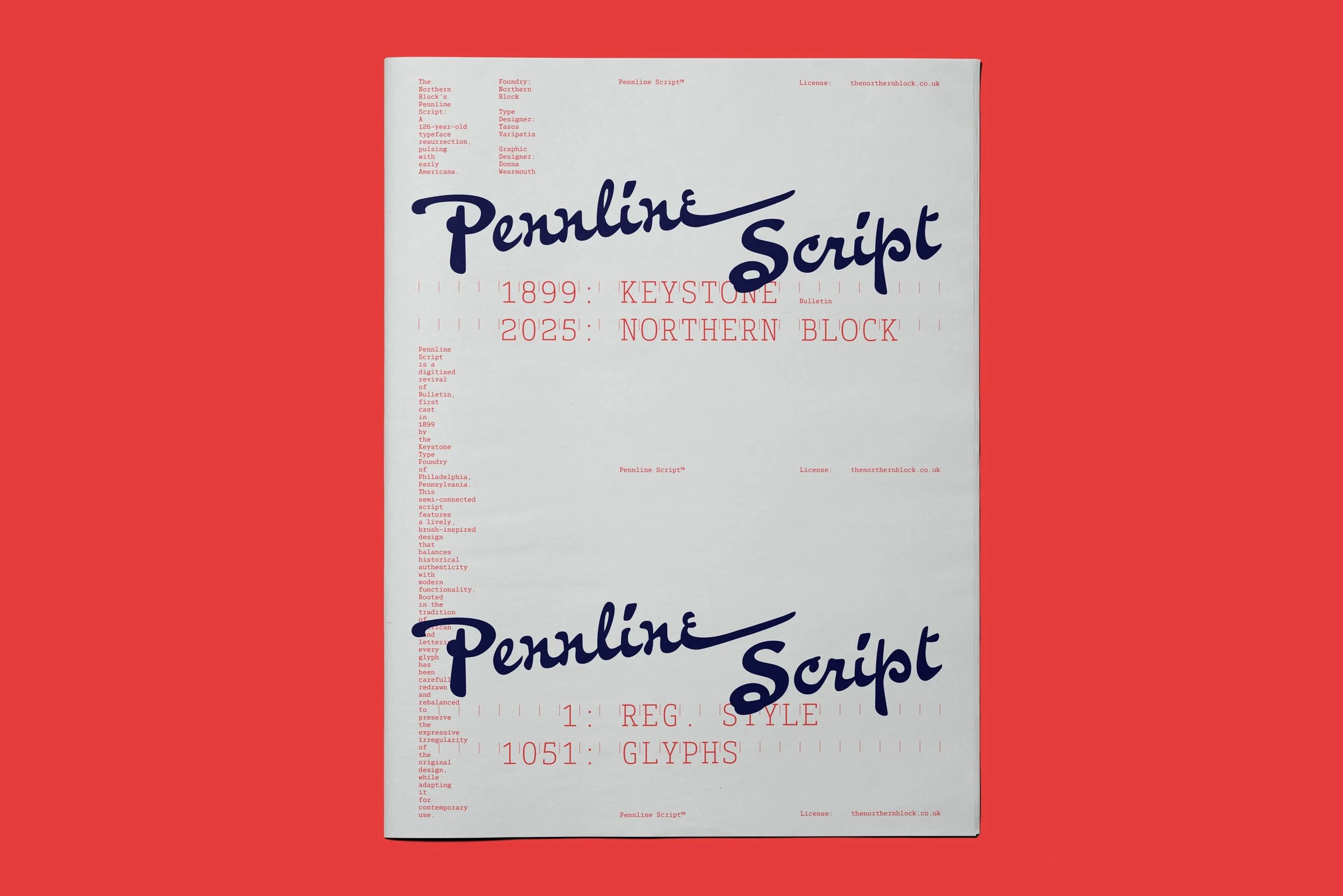
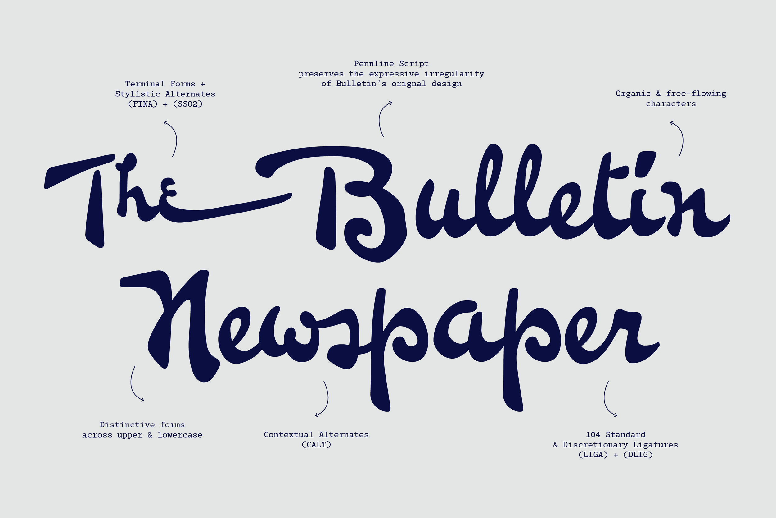
Keystone’s Bulletin was given greater reach by the innovations of its time. As its digital descendant, The Northern Block’s Pennline Script is able to extend this tradition. With over 1,050 characters, the typeface supports 304 Latin-based languages, and extensive OpenType features include contextual alternates, standard and discretionary ligatures, localised forms, initial and terminal forms, medial forms and eight stylistic sets. Pennline Script feels warm, expressive and a little raw. Like it was written by someone passionate, with a fluidity and energy that makes it stand out. There’s an obvious dash of magic, of energy and soul.
Turn-of-the-century typefaces based on the script of a human hand aren’t rare, but Pennline Script feels it. It holds a real complexity, with outlines that aren’t cleanly straight or curved where you would expect them to be. It’s more jagged. It doesn’t flow the way you would anticipate a handwritten typeface to, either. Pooling in a way that calligraphy inked from an old fountain pen can, and possessing a true and timeless elegance that has almost been lost to modernity.
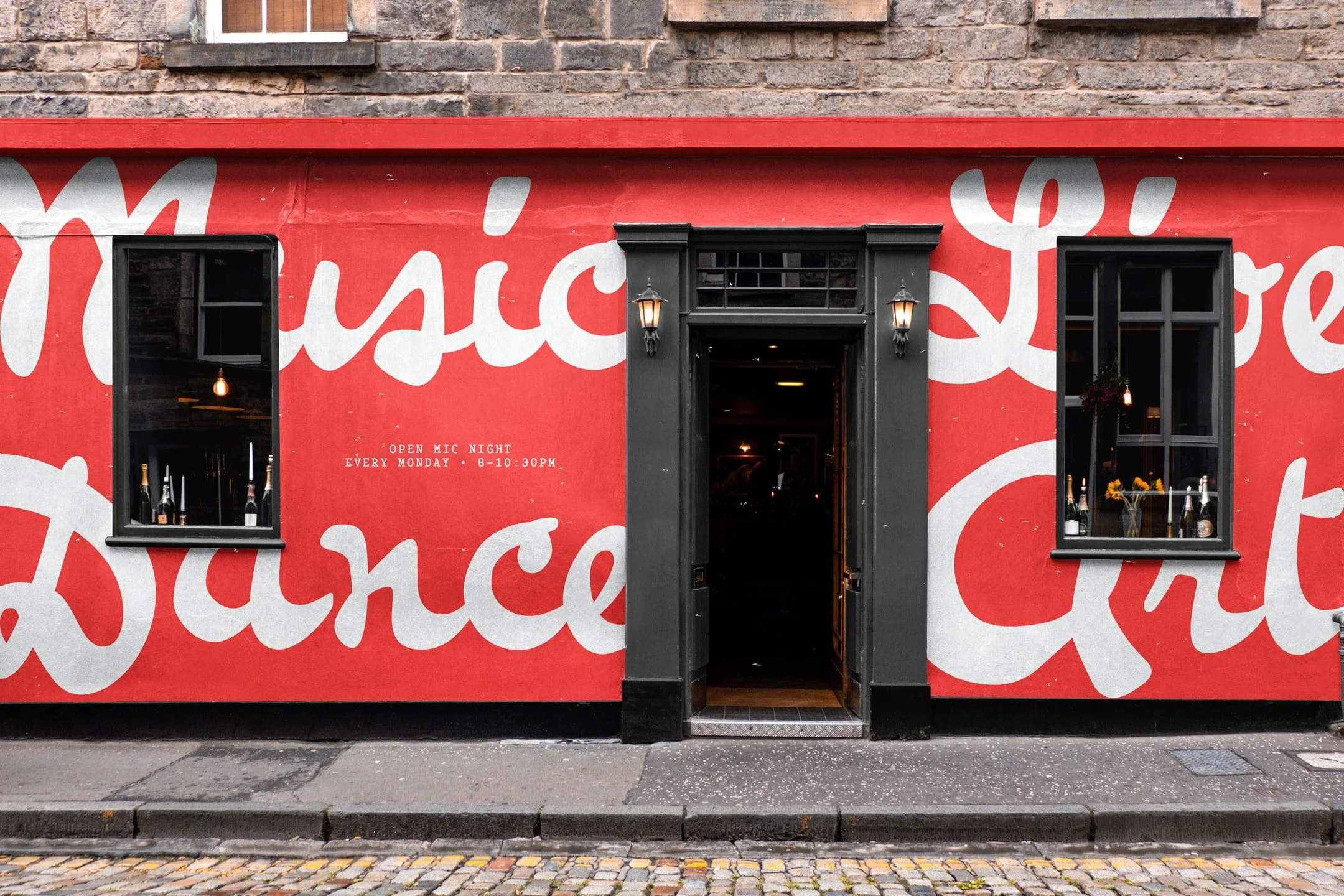
Pennline Script preserves the expressive irregularity of Bulletin’s original design.
When you work with Pennline Script, you feel the spirit of time in history that’s on the cusp of disappearing forever. It glows so strong with nostalgia, that it feels calming, charming and inspiring to read. There’s something about the effect of its capitalisations working with lowercases, that’s evocative of a very human conversation or presence. With Pennline Script, even at the high end of products, branding and user experience, there’s an opportunity to make a memorable impact with personal contrast.
‘The whole project was an incredibly rewarding process. So intensive in comparison to other scripts. A real exercise in the history, the personality, and the imagination.’ — Tasos
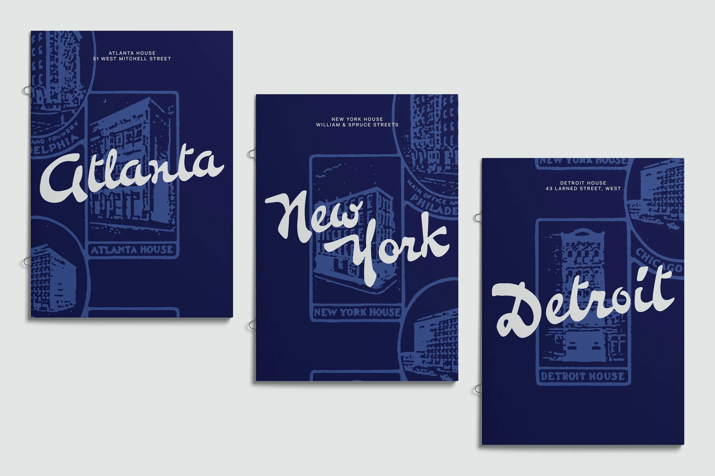
The context for Bulletin’s use is not easy to imagine outside its era. It may have been applied to American life in packaging, book covers, editorial titles, and branding. One can imagine human hands painstakingly shaping straplines that mirror the forms found in Pennline Script. With fluid ligatures, freehand brush strokes, and that unique, semi-connected structure announcing products and services that fed aspirations, articulating promises to make life better for the diverse diaspora of Philadelphia.
The Northern Block’s Pennline Script harnesses that legacy, enshrining a special history. Tasos’ rigour has made for a respectful resurrection of its essence, distilled all of that personality, and brought new life to old emotions. You can’t look at this script without feeling something from its past. It provokes a personal response. Like finding a message in a bottle that’s been circulating with the Gulf Stream for more than a century.
Almost 126 years after it was first cast in nickel with the ingenuity that built modern Philadelphia, it has become a rare thing in modern type design; a brush-inspired heritage script that, until now, seems never to have been revived and digitised. It’s a nostalgic force come to life in our modern ether space of the digital world, that no person casting typefaces in 1899 could ever have imagined. Whatever your ambitions for Pennline Script, you’ll gain a typeface that is unique, distinctive, and rich in history. One that can communicate a personal experience, channel nostalgia, and charm modern audiences across digital realms.
