Artistry and elegance, elevated by imagination and precision—Selestin is a typographic triumph of harmony.
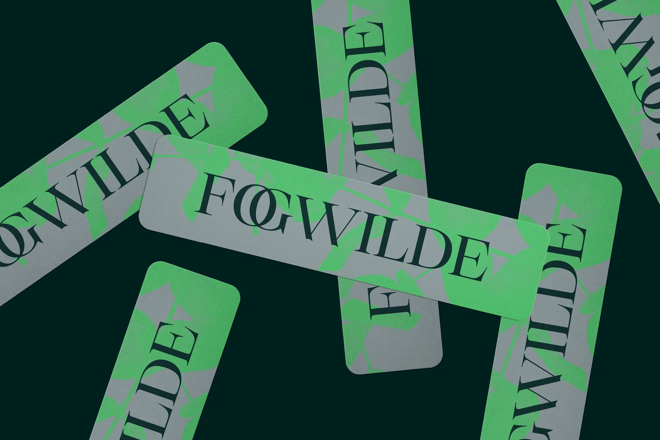
In early 2023, a creative challenge set by 36 Days of Type sparked Tasos Varipatis into an act of experimentation, inspiring the genesis of what has now evolved into a fully developed type family that exists within its own constellation of elegance, refinement, and warmth. What began as an exercise in production, and an exploration of contrast, ornament and expressive form, became Selestin; the latest typeface by The Northern Block. A handcrafted and refined serif with calligraphic qualities, and a wealth of expressive details that are often lost in the digital age, making it stand out in a crowded galaxy of high-contrast serifs.
Reflecting on those first experimental forms, Senior Type Designer Tasos Varipatis noted:
‘This feels interesting. It doesn’t feel familiar, but it might work.’
The typeface started on paper; an origin point detectable in the calligraphic elements that can be seen in the finished typeface. Quick, simple sketches were done with experiments on a lowercase ‘n’. Then Tasos explored ways to shape an ‘h’, then an ‘m’. It felt disconnected. An instinct surfaced within him to bring a circular element into the design. An act of connection and legibility materialised from this, which radically shaped the personality and presence of Selestin. The characters themselves felt pretty enigmatic and deserved to be brought to life. Between 2023 and 2024, Selestin began to shape its presence, and its universe started to take form.
‘Early designs could have seen this typeface look and behave very differently. It’s transformed from those early sketches. Selestin has an elasticity. Its development process felt more like sculpture than type design. It felt like working with clay, shaping up curves and engraves.’ — Tasos

It’s no surprise that Selestin developed in a creative process that was something between a technical drawing and freedom of experimentation. It’s palpable. When you study the features of the typeface closely, you can almost feel the flow, the experimentation, and invention that’s gone into it. You can see that it is refined, but you can also sense that it has been refined to harmonise a unique experience.
‘Selestin is a synthesis of experimental drawing, graffiti, and Art Nouveau. Of personal and collective experiences with calligraphy, and explorations of form, contrast, and rhythm. My knowledge and experience are integrated—it’s a bridge of all these things.’ — Tasos
Tasos studied elements of 18th-century engraved type, and Art Nouveau artists such as Mucha, Gaudí, and Beardsley. In Selestin, visual art has been redrawn with modern flexibility; it looks very contemporary, but Art Nouveau’s flowing rhythms have subtly shaped its curves, infusing the typeface with an effortless elegance that feels natural yet intentional. The sensibilities of artists like Beardsley have made their mark here, in a typeface that honours their instincts to create beauty and impression, where Selestin’s fine detailing, curves, and inked features interact with the white space. Art Nouveau feels both honoured and modernised by Tasos’ interpretation of the influence, with the typeface’s daring combination of structure and embellishment.


The influence of engraved metal type is evident in the crisp serifs, which achieve an alchemy of feeling that is both classical and contemporary. If you discovered Selestin on a brass plate, you’d be drawn by the structured beauty of its engraved type, to visit whatever was behind that door. You’d expect to find yourself somewhere exclusive and luxurious, experiencing the best-kept secret in town.
Art Nouveau grew as a movement in response to the rigorous symmetry of Neoclassical design, and in opposition to the stylised automation of mass manufacturing. It’s an apt influence for a hand-made, deeply creative, and beautifully detailed typeface like Selestin. In context, it feels like a triumphant example of what the human mind and hands can deliver in the face of the advancing mono-identities characterising visual identity across disciplines, where off-the-shelf leaves very little room for individuality, intricate detail, and expressive form. As much as any typeface can, this is a beautiful rebellion against the era of advancing AI, design by data, and production via algorithm.

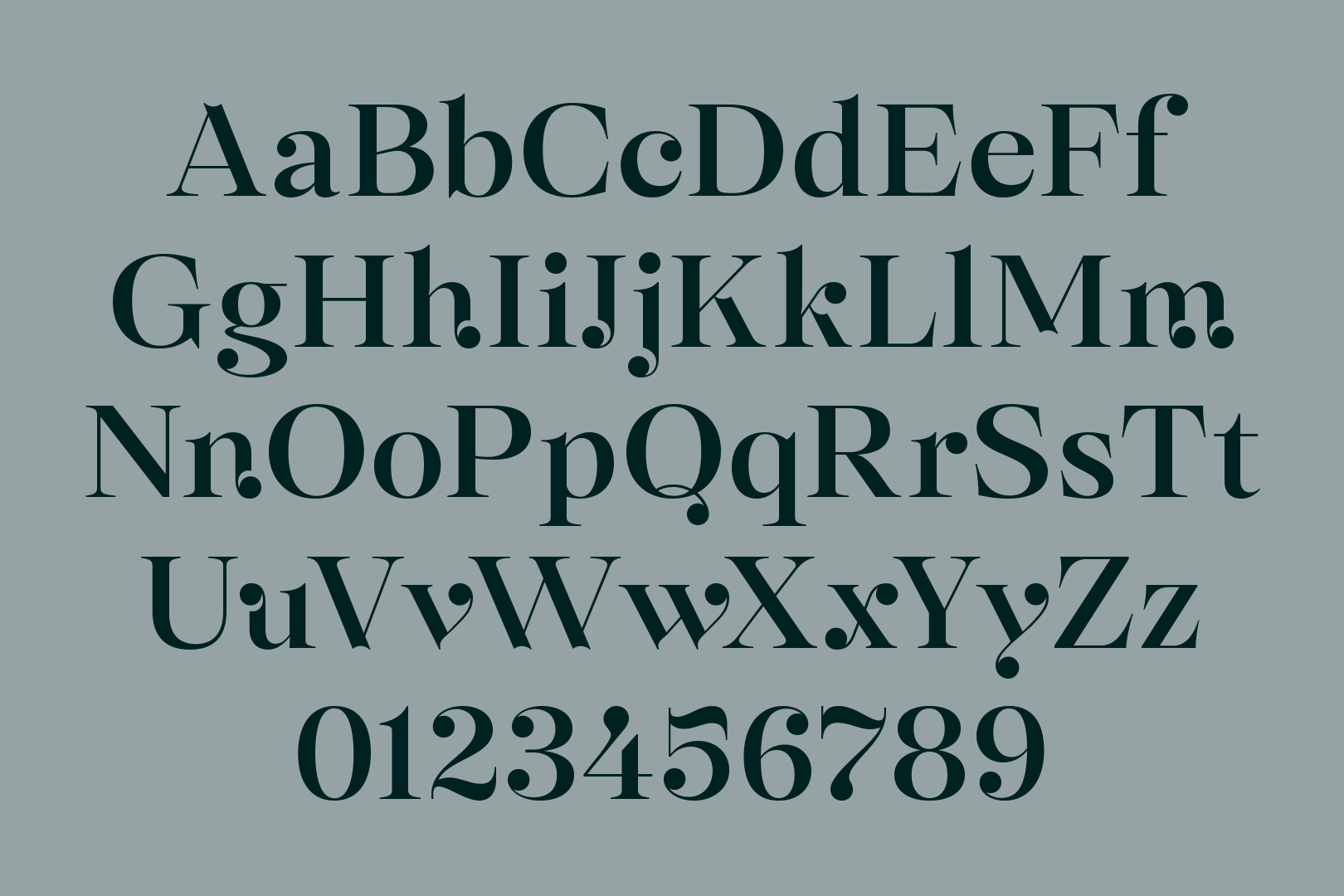
Selestin re-interprets the structural elements that make a typeface. It’s hard to categorise beyond calling it a serif, and that has to be a sign that it possesses a unique identity. That identity has been discovered and shaped through a genuine process of experimentation, and exploration of structure and form, and it’s there to be seen within the characters. The distinctive ball terminals truly set Selestin apart. Inspired by the natural pooling of ink at the end of a stroke, this organic detail is a defining characteristic that bridges fluidity with precision, transforming the typeface into something remarkable.
When set as text, those signature ball terminals come alive and feel like revolving planets. The sharp yet graceful serifs emphasise Selestin’s precision and polished aesthetics. Those things shouldn’t blend, but to experience this typeface, is to experience harmony. It feels rhythmic and has behaviour. It’s musical. Selestin can simultaneously transport you into a swirling cosmos, a soaring aria in an opera, or a calm, refined wayfinding system at a contemporary art gallery. The dreamlike essence we associate with Art Nouveau can be traced here. It’s elegant and expressive. A serif that has presence without shouting.

It makes the typeface an incredible example of just how much shape and detail can provoke an emotion, tone, or action. You can’t help but look at words and messages when they are communicated in this way. The ball terminals aren’t simply ornamental; they have a function. They draw and move the eye, compelling the reader to follow the orbit of whatever idea, message, or story has your attention. Not mere embellishments, but structural elements that guide the reader’s eye, control the flow of text, and almost bring a melody to the page. Custom ligatures and stylistic alternates enhance that sense of rhythm and sophistication. Selestin really speaks for itself with elegant form and function.
‘For every project, when it is typeset, the design will tell you if it works or not. As soon as it was typed, it worked.’ — Tasos


Selestin has ensured digital quality to maintain its performance and retain its shape, ensuring legibility across all digital spaces and scales. It offers editorial versatility, performing well in magazine layouts, branding, signage, and high-end packaging design. Beyond its technical craftsmanship, it’s great to play with, to contrast, to mix and match the font sizes, italics, and cases. While incorporating alternates and ligatures can help shape a truly distinctive and rich experience, sculpting something beautiful that makes this typeface a joy to work with. Selestin is a brand experience waiting to happen.
Designed for luxury, indulgent detail, and opulence, Selestin radiates a contemporary, elegant influence. It can beautify publications and signage with personality and classiness, carrying the refined poise of fashion magazines, the opulence of perfume packaging, and the authority of luxury branding. It can be the voice of a headline, and act as a landscape in concrete poetry. It’s a typeface capable of holding visual dialogue, with letterforms that not only communicate but also captivate.
‘Selestin draws inspiration from the world of high-end editorial design, where typography is both an identity and an experience. It has purpose and meaning—not knowing where it will be used, to seeing it come to life and proving itself in real-world use. That’s the most enjoyable feeling when designing type.’ — Tasos


Take a closer look at Selestin on Behance.
The moment you experience Selestin, it feels like a success. When it is typed, it instantly feels like a visual asset. Like an idea, a product, or an experience has sprung to life fully-formed. This is a typeface that thrives in juxtaposition. Between discipline and expression, sharpness and softness, tradition and innovation. It offers beauty and a subtle ornamental touch, with clarity, cleanness, and precision.
Selestin strikes a perfect balance between the organic variety of pen-based forms and the sharp precision of engraved typography. The strong contrast between thick and thin strokes adds depth and complexity. It feels like the work of an engraver and a calligrapher combined. The precision of a scalpel and the freedom of a brush brought together with a miraculous level of harmony. The result is a typeface that doesn’t just stand out—it moves, and will move its audiences.