The Northern Block’s 2025 in Review: New Scripts, Historic Revivals, and a Year of Creative Collaboration.
This year, The Northern Block has strengthened both our creative output and our industry presence. We released eleven typefaces and expanded our script coverage, adding Devanagari to our library. Following the success of Nurom Next in 2024—our first typeface with Hebrew support—Loew Next Devanagari reinforces our commitment to the Next Series, which has become a true test-bed for collaboration, shaped by global perspectives and shared experiences.
The Next Series typefaces demonstrate how our work embraces cultural and creative diversity. Lintel Next showcases this beautifully: 96 styles engineered for seamless performance, all while preserving its Scandinavian character across four scripts. Beyond the Next Series, we brought new life to a 126-year-old typeface. Pennline Script is a digitised revival of Bulletin, which was first cast by the Keystone Type Foundry in 1899.
This year has been marked by several milestones and collaborative achievements. Our industry profile grew through a new partnership with Type Network. Planer appeared in ITV’s ‘I Fought the Law: The Ann Ming Story’, reaching national audiences. We also updated six type families and earned recognition from various creative blogs and publications. These moments reflect a year of steady growth, collaboration, and continued exploration across our library.
Font Releases


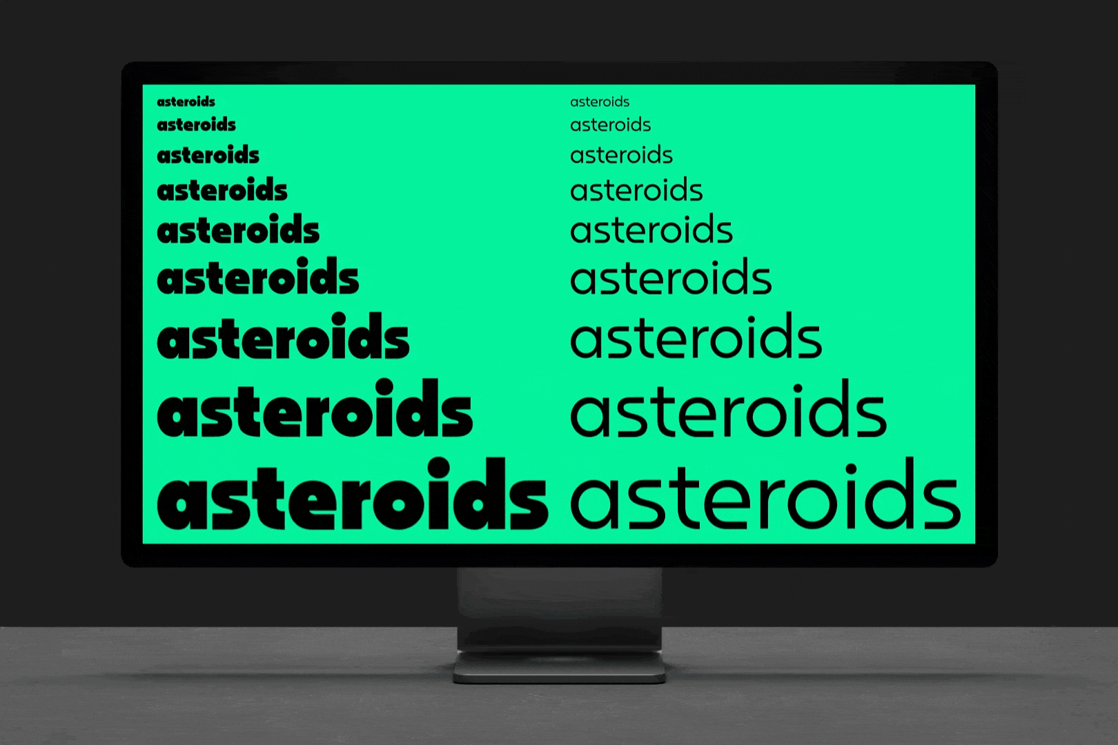

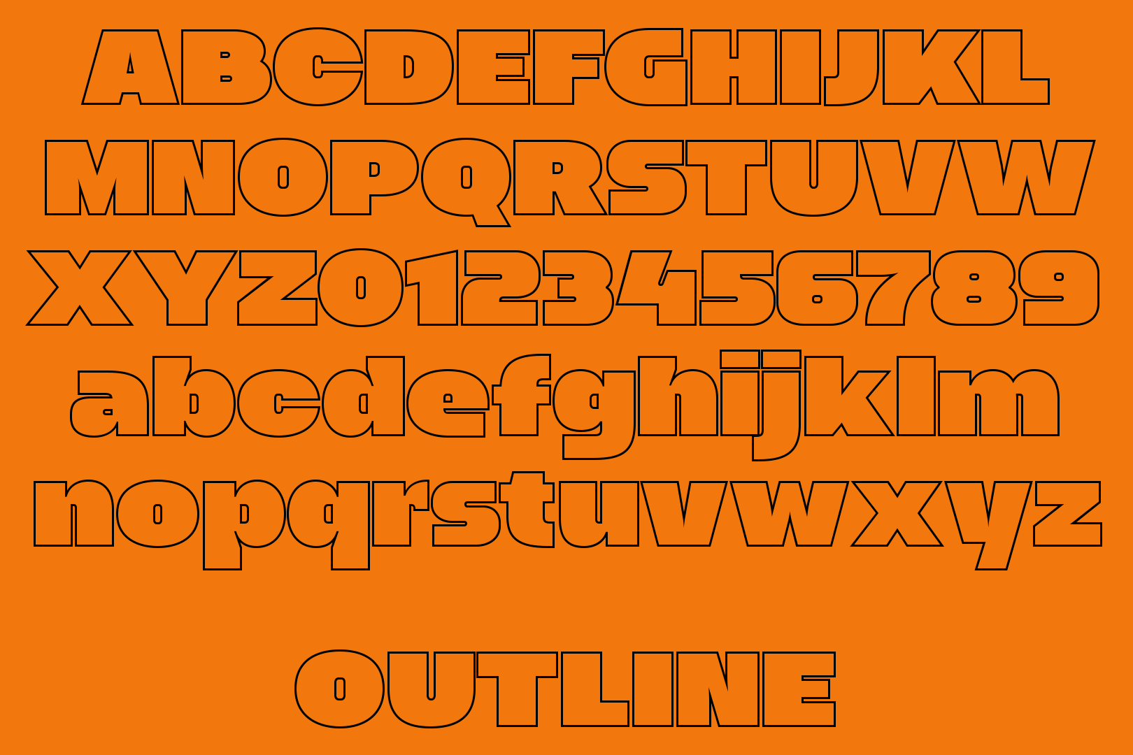

Over the first six months of 2025, we made key updates to the Scriber, Zaius, Dohrma, and Werkhaus type families. We were thrilled to see Scriber featured in Victionary’s ‘Stencil In Use’ book in February, and later featured in Print Magazine’s ‘Type Tuesday’ column.
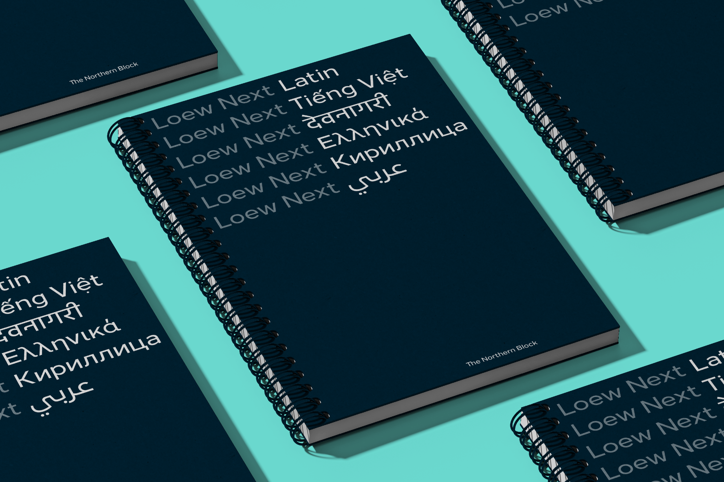
In March, we published our first Devanagari typeface, created in collaboration with Amélie Bonet, with contributions from Erin McLaughlin and Pooja Saxena. Loew Next Devanagari is a major addition to the ever-growing Loew Next Collection, which already supports Extended Latin, Arabic, Cyrillic, Greek, and Vietnamese.
Following that momentum, we launched our 96-style superfamily, Lintel Next, in July, and we were delighted by the enthusiastic response from the creative press, including features in Creative Boom’s ‘Best New Typefaces for October’ and recognition from Slanted and Print Magazine.
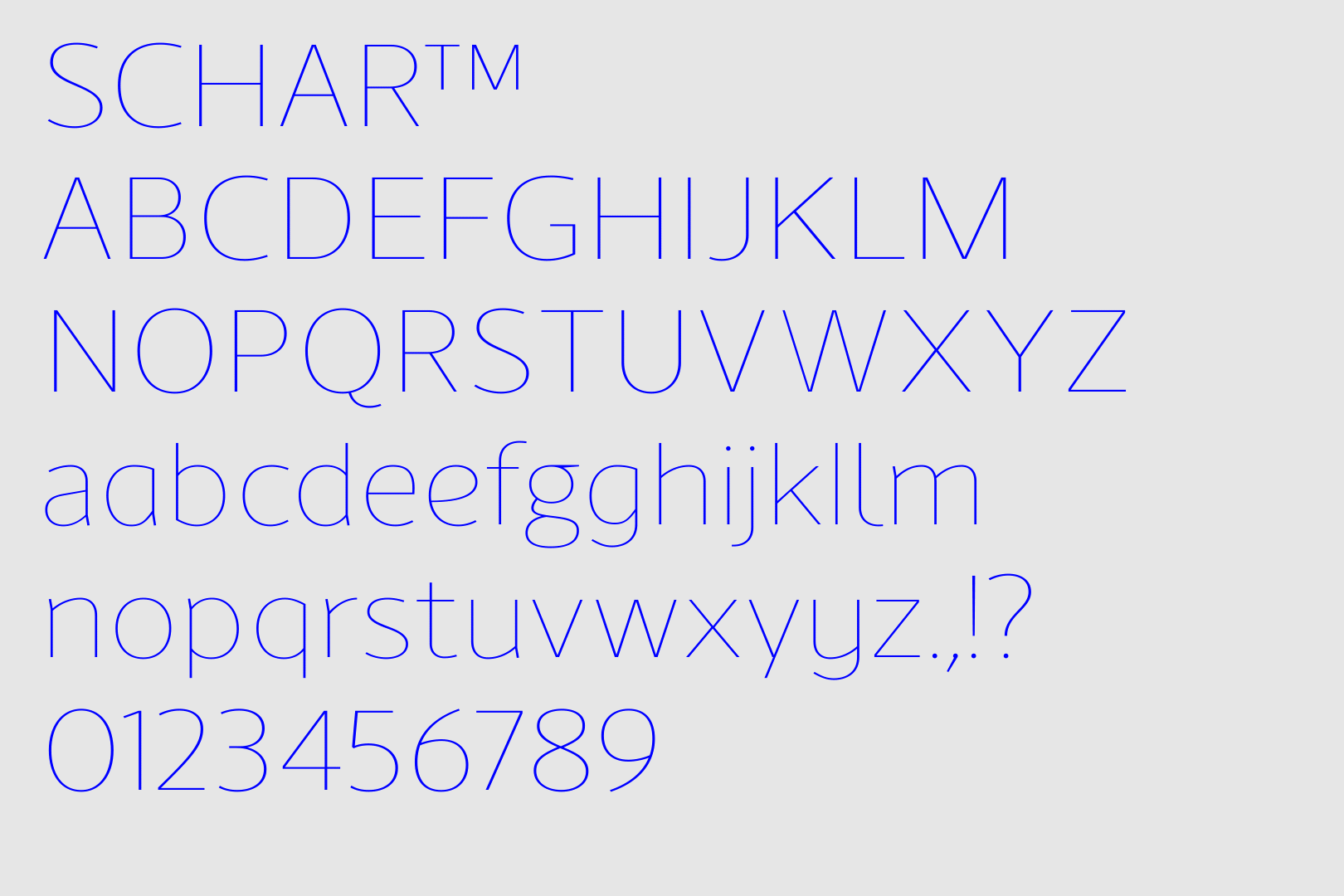
Autumn brought updates to Jonathan Hill’s Schar and Celdum. With Schar, we focused on creating a humanist sans-serif that balances the rhythm of a serif, but with a modern, versatile feel. For Celdum, we preserved its distinctive rectangular-grid structure, softening the corners just enough to keep it approachable, while maintaining a clear mechanical tone.
Tasos Varipatis’ Pennline Script arrived in October—a semi-connected script with a lively, brush-inspired design. Rooted in the tradition of American hand lettering, every glyph was carefully redrawn, rebalanced, and refined to honour the expressive irregularities of the original Bulletin design. Despite its historic roots, we made no compromises—this project was a labour of passion and precision.
In November, we introduced Selestin, a high-contrast display serif inspired by broad-nib calligraphy, 18th-century engraved typography, and Art Nouveau ornamentation. Selestin’s distinctive ball terminals and delicate serifs make it a striking choice for editorial design, luxury branding, and high-end packaging.
Our final release of the year followed shortly after with Corbert Text—the latest expansion of the Corbert Collection. For this optical variant, we scaled and refined the entire typeface to enhance legibility at text sizes 9pt and below, while preserving Corbert’s geometric charm.
Looking ahead, our work will continue into the new year with the arrival of Syke Mono Slab Rounded. The newest addition to the Syke Collection features a contemporary monospaced typeface in ten styles, combining the discipline of slab serifs with a soft, rounded appearance.
The Northern Block joins Type Network with 27 families.

Last month, we joined Type Network as its newest foundry partner. Through this partnership, our customers can now license 27 of our families, including the popular Moret type family and our Next Series typefaces, such as Lintel Next, the Loew Next Collection, Nuber Next, and Nurom Next, further strengthening our industry presence and customer reach.
Type Network brings together over 100 leading foundries across 15 countries. Its enterprise plans make font licensing simple—offering clear, transparent pricing with no hidden fees—whether you’re a small business or a large corporation. Flexible trial options also allow you to test fonts in your projects before committing to a license.
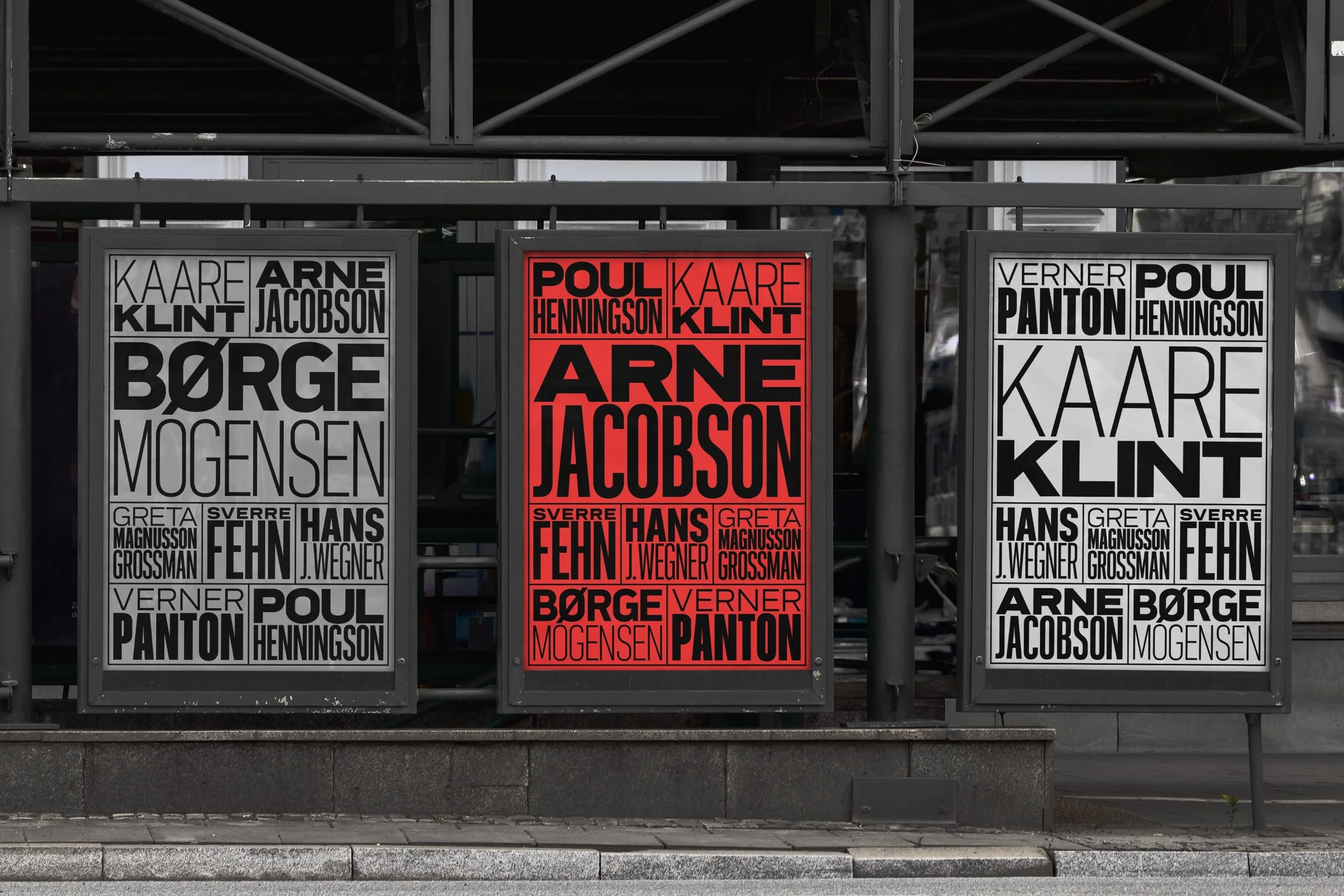
Five typefaces selected for Typodarium 2026 desk calendar.
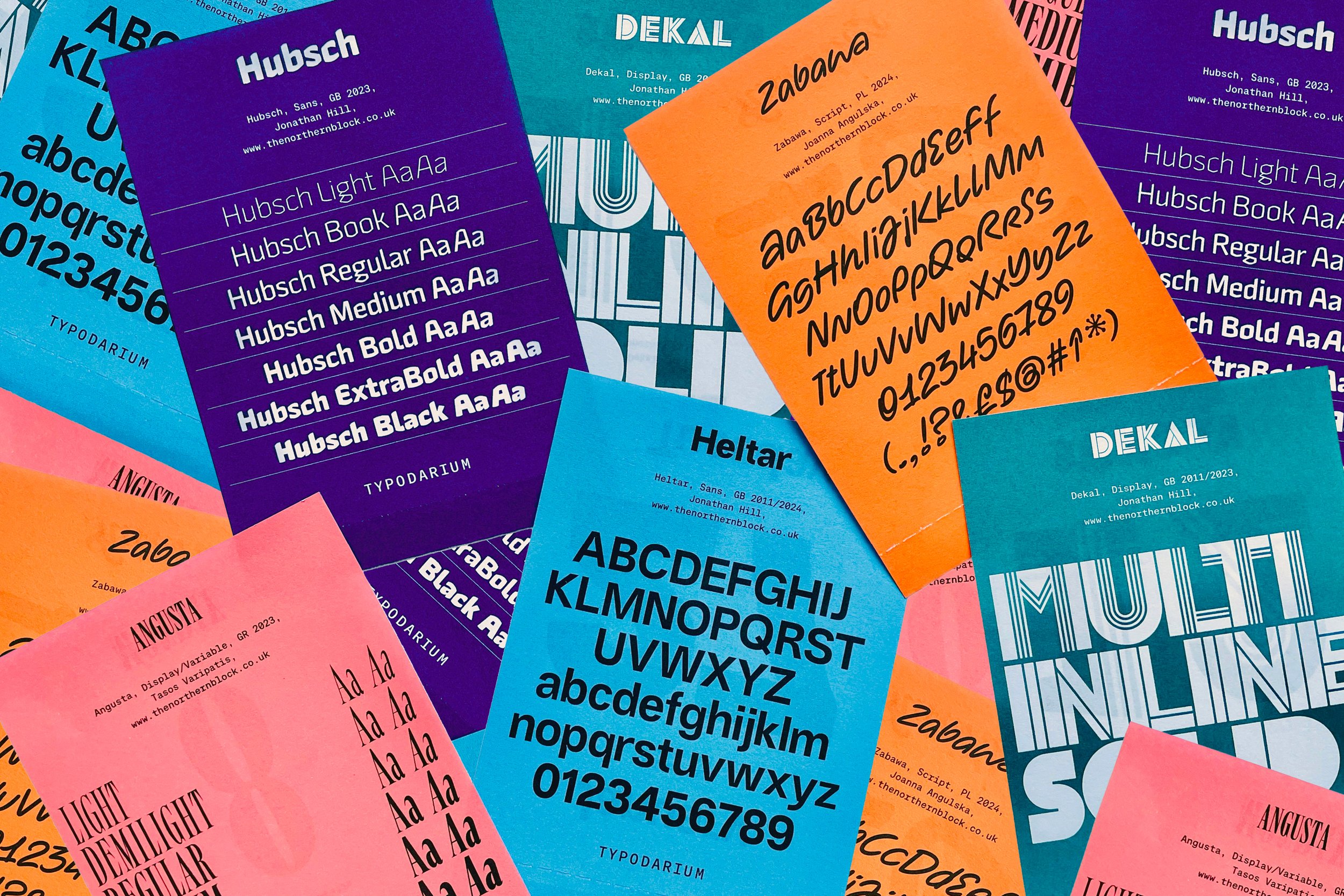


In other exciting news, our typefaces are set to be featured in Typodarium 2026. Over the next twelve months, you’ll find five of our typefaces in the influential annual publication.
Heltar will appear first on Tuesday 27 January, followed by Dekal on Sunday 12 April, Angusta on Monday 8 June, Zabawa on Friday 16 October, and lastly, Hubsch on Thursday 3 December.
With a fresh new font each day, the calendar showcases 330 type designers from 40 nations, offering daily typographic inspiration. Typodarium is published by Verlag Hermann Schmidt, and copies are available through Slanted.
Victionary’s Stencil in Use book showcases Scriber.
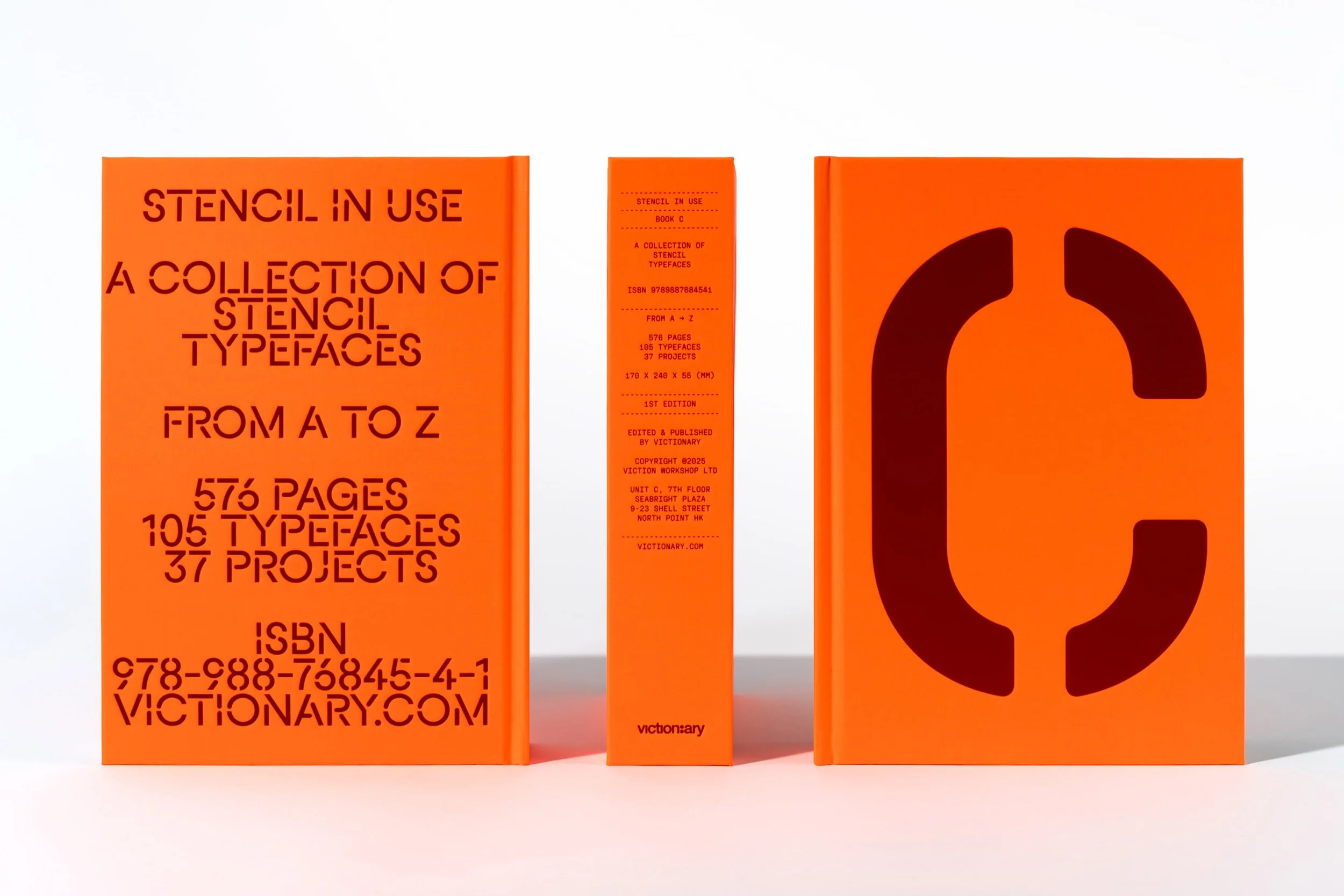


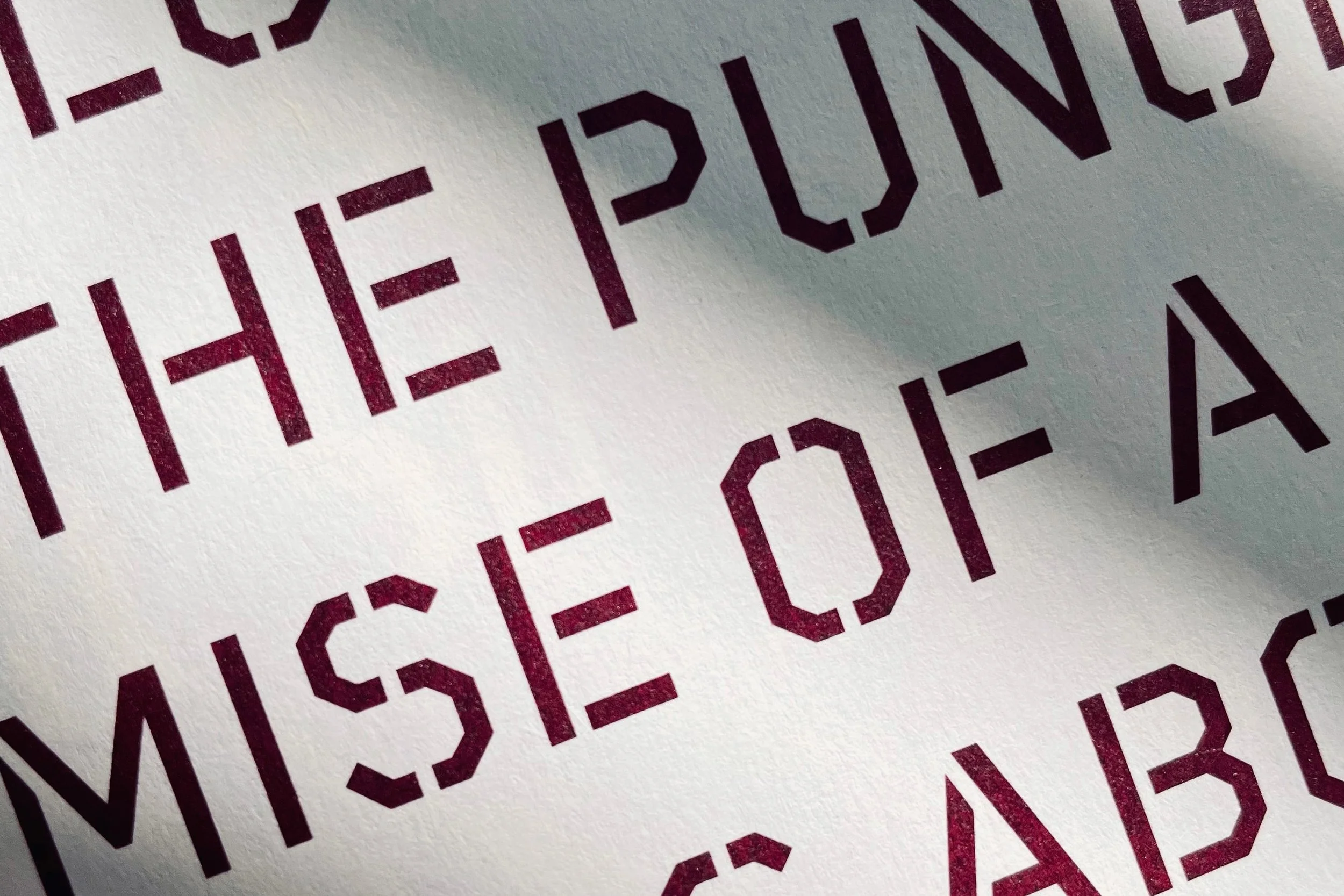
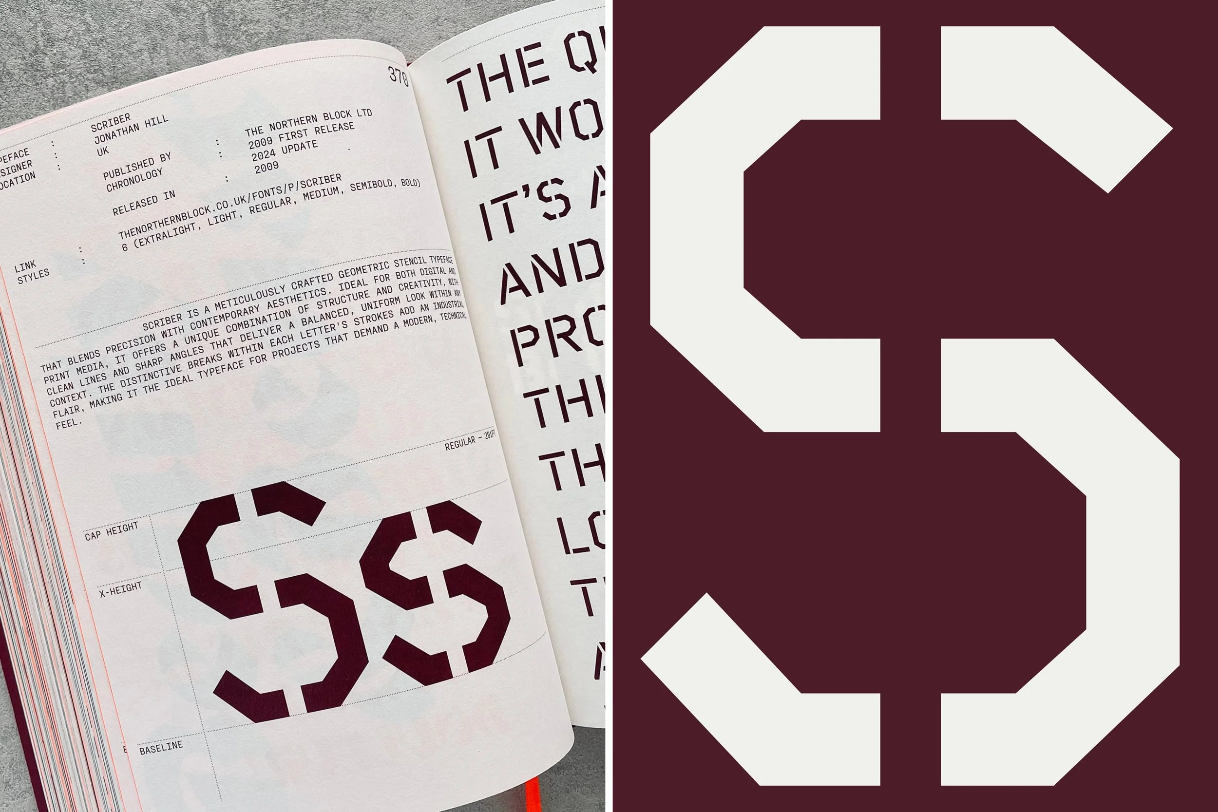

In February, our Scriber typeface was featured in Stencil In Use—A Collection of Stencil Typefaces, published by Victionary. The book presents a beautifully curated collection of stencil type specimens, serving as a valuable source of inspiration for designers and typographers.
Building on the success of Victionary’s Sans/Sans Serif In Use series, this edition brings together 105 stencil typefaces and 37 creative projects across 576 pages, highlighting both type specimens and their real-world applications, along with the design thinking behind them.
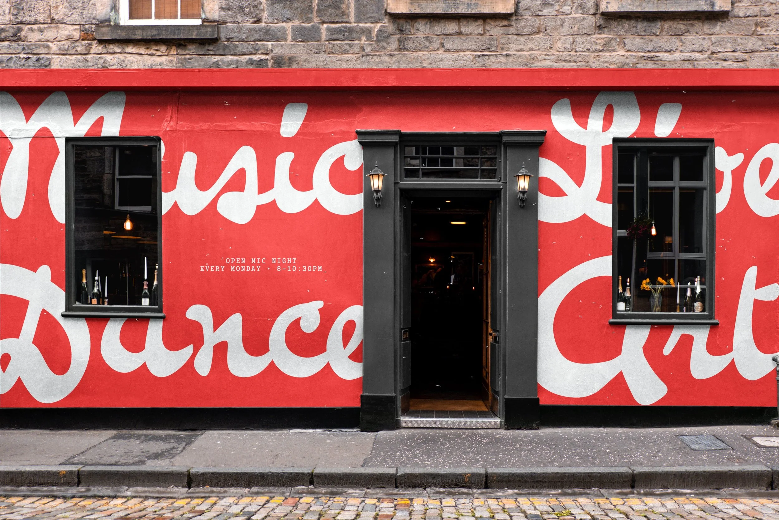
Planer typeface features in a powerful ITV documentary.
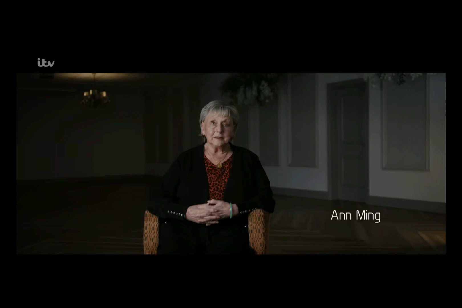
Source: ITV Real Life Stories on YouTube.
Earlier this year, a collaboration with Multistory TV brought our work onto national television. ITV’s series, I Fought the Law, hit the screens across the UK this summer. Following the four-part drama, ITV aired a companion documentary, I Fought the Law: The Ann Ming Story, narrated by Sheridan Smith, who also played the leading role in the drama series. The documentary tells the powerful true story of Ann Ming, a mother who spent 17 years campaigning to overturn the historic ‘double jeopardy’ law after her daughter, Julie, was murdered in 1989.
We were honoured when Production Manager, Joanna Lewis, reached out to discuss typeface options for the documentary. After careful consideration, Planer was chosen as the perfect fit—as our founder, Jonathan Hill, explains:
“They were looking for a typeface with character—something distinct from a standard sans-serif—and a rounded font was the answer. Joanna also liked that the font was made in the North East of England, as it tied in nicely with the documentary being based in Billingham, Teesside.”
Planer was used throughout the documentary, specifically for section titles and on-screen titles that introduced interviewees.
In The Works
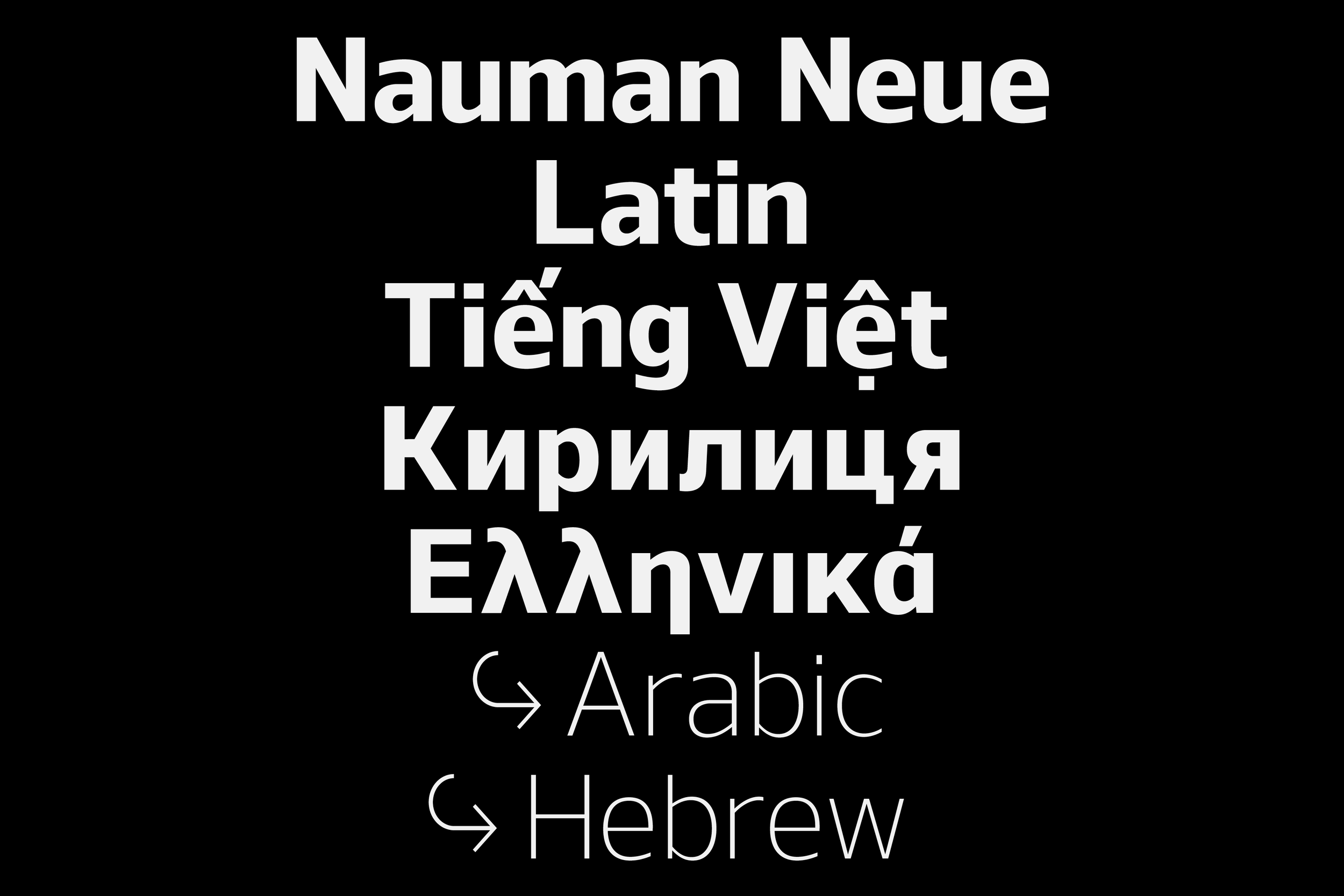
Nauman Neue
Nauman Neue is a modern humanist sans-serif, characterised by broad, open letterforms and precise geometry, ensuring excellent readability. We’re expanding its script coverage to include Arabic, Cyrillic, Greek, and Hebrew, alongside existing support for European languages. Its clarity and versatility make it ideal for digital interfaces and compact layouts.
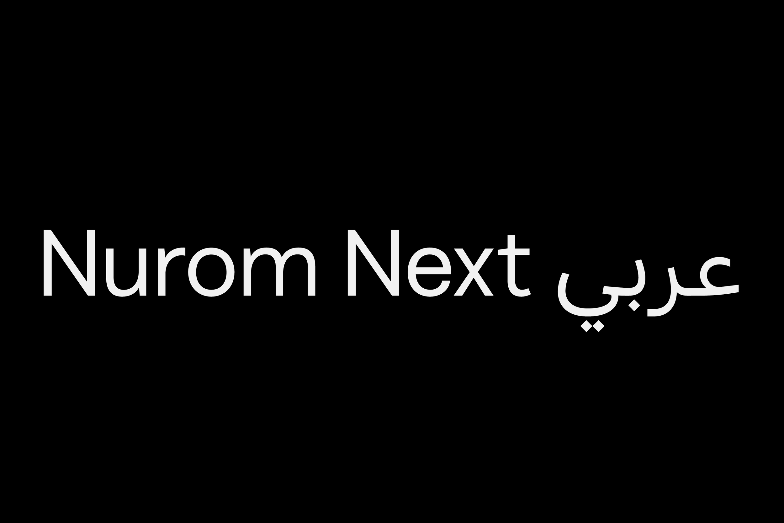
Nurom Next Arabic
Nurom Next Arabic is a contemporary sans-serif with clean lines, balanced proportions, and a fresh personality. Building on Nurom Next, language support will be extended to include Arabic, alongside Cyrillic, Greek, Hebrew, and Vietnamese. With ten weights, Nurom Next Arabic is designed to work seamlessly across digital and print, making it a versatile choice for global design projects.
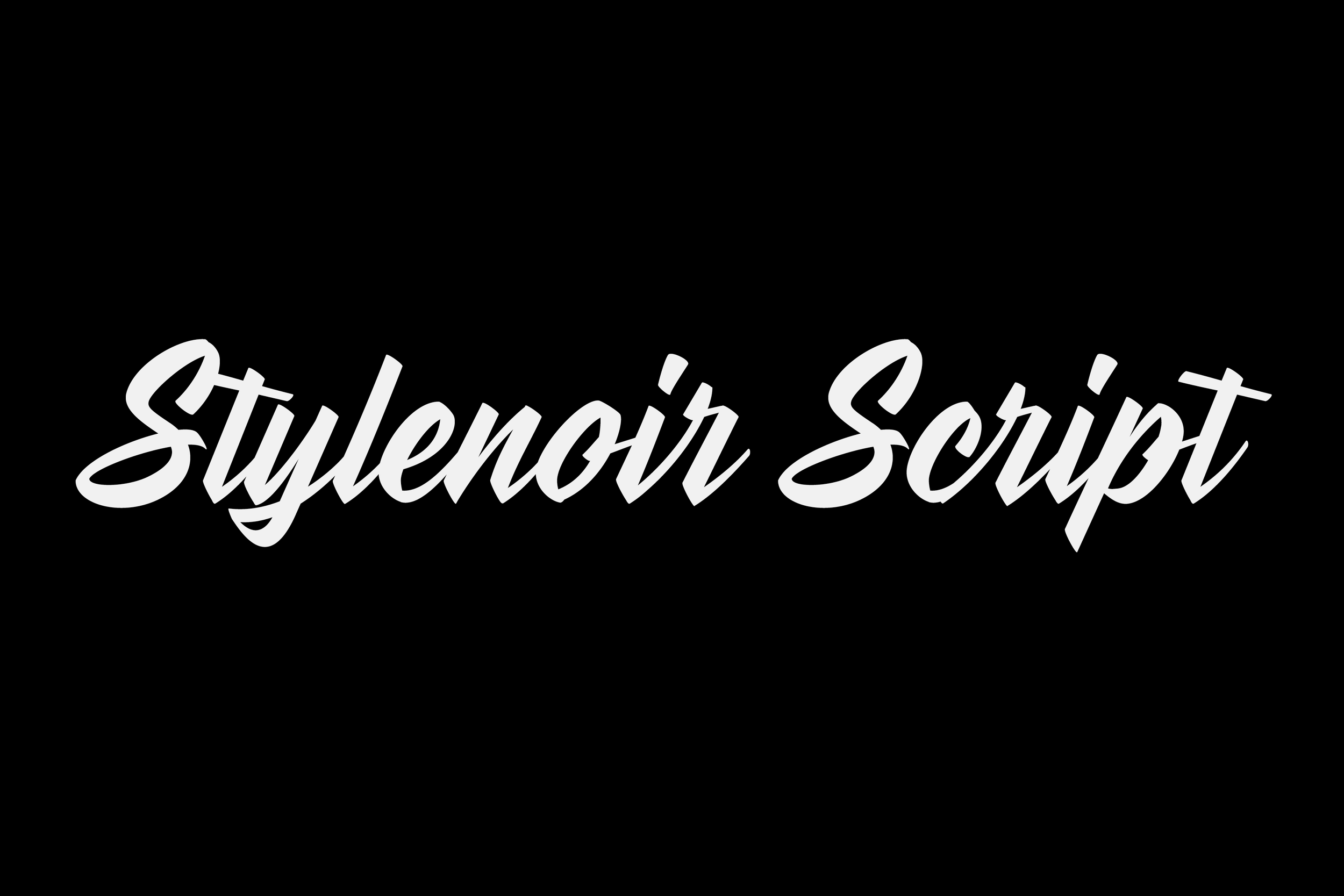
Stylenoir Script
Stylenoir Script is a fluid, contemporary typeface that blends elegance with expressive movement. Its sweeping curves and natural rhythm evoke the charm of hand-inked lettering while retaining clarity. Currently, a work in progress, with a colour font expected to follow, Stylenoir Script is designed to bring warmth and sophistication to branding, packaging, and editorial projects.
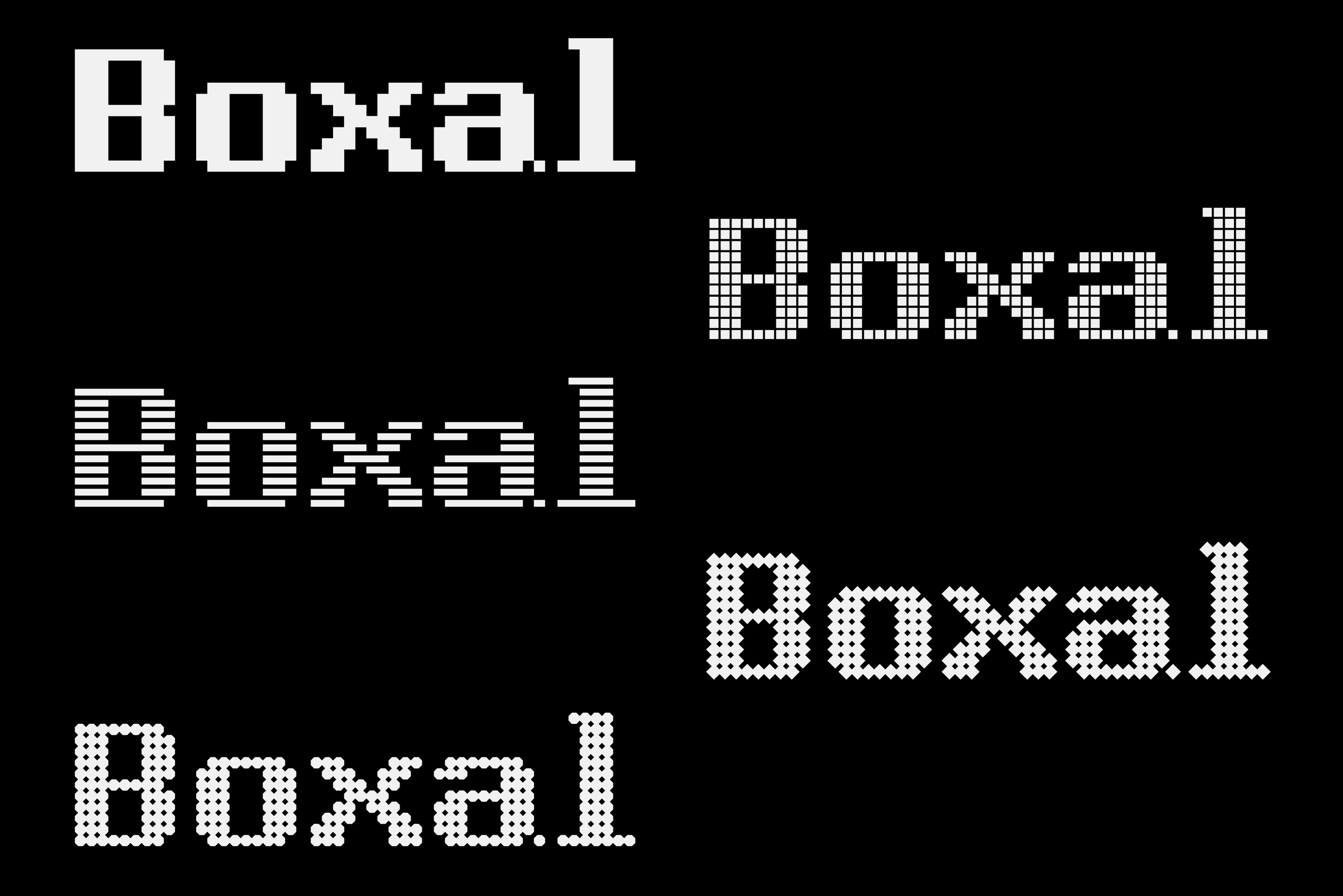
Boxal
Boxal is a pixel font inspired by classic arcade gaming, featuring 15 weights across five styles: Normal, Square, Line, Diamond, and Dot. With features like arrows, emojis, alternate glyphs, and broad European language support, Boxal brings nostalgic pixel charm to any project, inviting designers to rediscover the magic of retro game aesthetics.
As we reflect on another busy year, we’re filled with gratitude for our customers, clients, and partners who make our work possible. With several projects already underway, we look forward to sharing more of our typographic explorations and stories in 2026. Thank you for being part of our journey!