Boxal—The retro typeface with an arcade in its veins. Drop your day job, and come play in a pixelated multiverse.
Every person with a passion for classic arcade gaming, the culture it catalysed, and the pixel artistry that articulated it, will love Boxal. The Northern Block’s newest typeface captures the nostalgic charm of retro gaming, while infusing it with modern precision and versatility. It’s meticulously crafted to reverberate with joy and nostalgia, while delivering adaptability and performance that’s a cut above. Inspired by territory that means a lot to its designer, it’s clear that Boxal’s letterforms have been affectionately shaped to evoke the essence of iconic titles like Cops and Robbers, Zelda, and Shinobi. Boxal is full of the fun, respect, artistry and dexterity, that we’ve come to expect from The Northern Block.
“Boxal has been on the radar longer than The Northern Block. It’s where we came from and made us what we are. It’s part of the culture of the 1980s, and central to our design roots and identity as a company.” — Jonathan Hill, Founder and Type Designer, The Northern Block.
Boxal is a design homecoming, and a cultural homage to where it all began. It’s the origin point for The Northern Block’s legacy of work with contemporary gaming clients. Their typefaces that feature in titles such as Mafia III and Tom Clancy’s The Division series were informed by the design thinking and in-game influence of pixel fonts, which have always held an advantage of simplicity and flexibility, within constraints. There’s something pure about going back to that pixel block, and true to form, Boxal feels as design-pure and universal as a decimal system.
The name ‘Boxal’ reflects the structural, modular nature of pixel typography. It captures the functional beauty of the grid-based logic of early video game graphics. Those shapes that inspired the imaginations of designers and dreamers, creatives and artists in all of us, who waited for 20–50 minutes for a Commodore game to load and bleed into a tube television, one pixel at a time. The name is a nod to those iconic loading stripes that eventually shaped themselves into the face of Rambo, or the game, Grid of Tron. The story of Boxal is one of a typeface that slowly shaped itself in the imagination of its designer, Jonathan, over forty years.
“Sheffield had a number of video game companies in the 80s. The National Videogame Museum isn’t there by accident. I was playing games like Monty on the Run, by Gremlin Graphics, without realising they were created on my doorstep.” JH
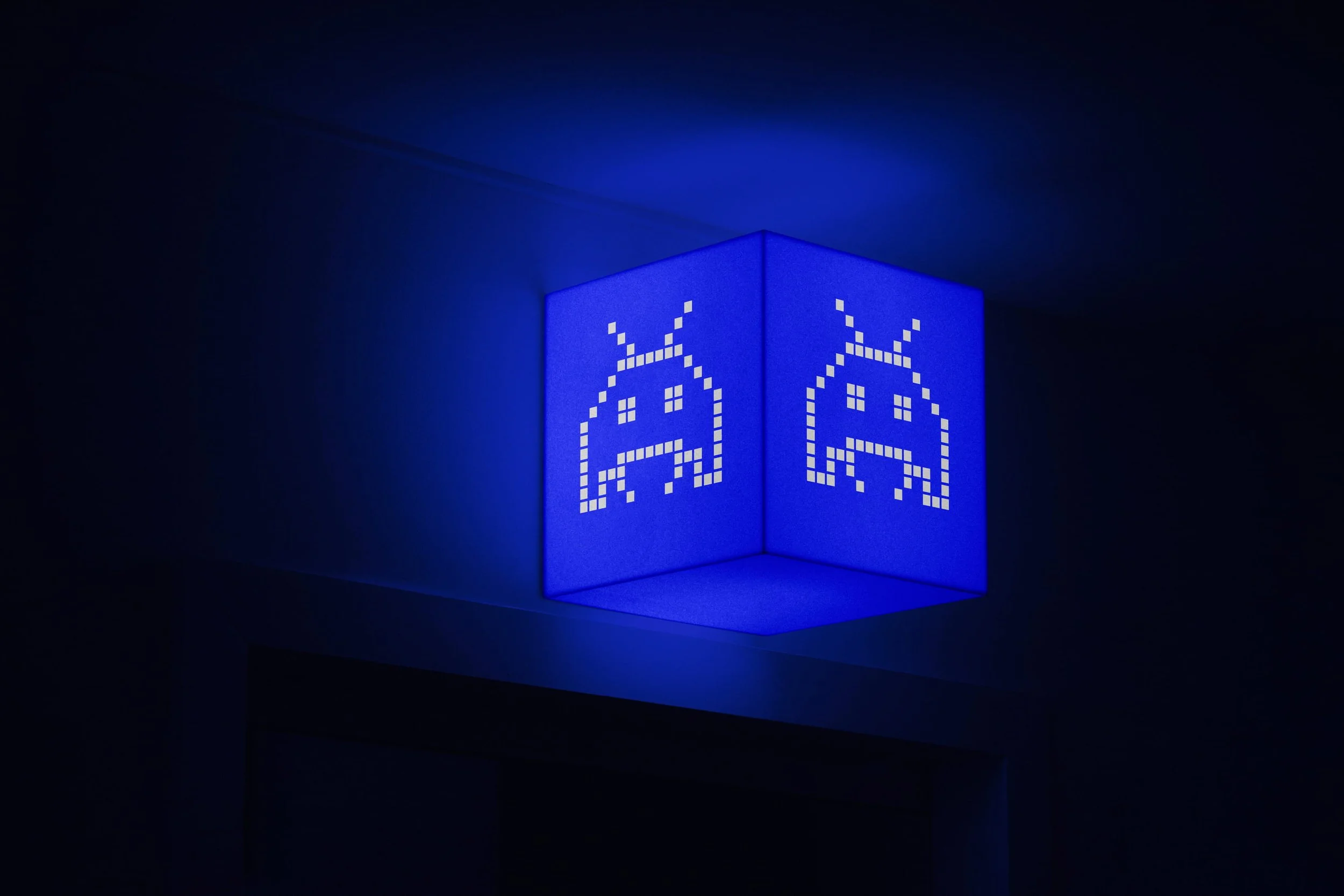
Pixel typography is rarely taken seriously, but its value runs deep for many people. Designers like Jonathan make them out of passion, by embedding themselves into a grid system to test themselves, or to enrich their own knowledge and skillset, by revising old typefaces. When that happens, a pixel font like Boxal emerges and represents a cultural keystone. It can stir deep feelings and transport people to precious places. A pixel typeface of Boxal’s quality is a portal. Interact with it, and the pixelated floodgates of memory are blown wide open, and in washes nostalgia and latent joy. Boxal immediately evokes cultural moments and unlocks personal pasts.
“With Boxal, we want to connect brains to the memories, to the soundscapes of classic arcade games.” JH
Remember those storied intros. All that spent emotion, when the end credits of a clocked game like Streets of Rage begin to scroll down. Hear the synthesiser soundtracks composed by experimental Japanese artists like Yuzo Koshiro, whose influence reaches right through from the early 90s to contemporary artists like Childish Gambino. Do you remember the adrenaline and furious colourscapes of Sonic the Hedgehog? The gasp-out-loud gore of Mortal Kombat? When you experience Boxal, you will. Boxal is one for all of us blessed by being young, alive and immersed in the video games of the late 80s and early 90s.
“Every Saturday, we used to put on a Nike WindRunner, go into town, and try to be cool. Every week, a new arcade game was introduced. All storied by those iconic pixel typefaces that have inspired Boxal.” JH
Boxal has an arcade in its veins, and if you had one in your past, you can’t help but be transported there as soon as you interact with the typeface. You’re there in the darkness, surrounded by the flashing of machines, soaked in the neon lightning. By the sounds of electric gunfire, revving engines, and the frantic smash of palms on plastic buttons.
For all its retro clout, pixel fonts like Boxal don’t have a sunset point. We’ve probably never interacted with pixel typefaces as often as we do now. Go pixel hunting. You will soon realise you can’t stay away from them. In today’s era of smart technology and homes, pixel grids can be found everywhere, from kettles and refrigerators to digital radios, HEPA filters and microwaves. They are such an elementary form of typography that they can appear in the most confined and simplistic spaces. They help us to simplify complex systems and interpret the data. Even in outer space, pixelated displays are used because they can perform universally. One of the smartest things about Boxal, is that it can be applied in modernity. This font is setting out on a journey.
“Toshi Omagari’s book, ‘Arcade Game Typography: The Art of Pixel Type’, played a significant role in sparking my interest in pixel fonts, and exploring their unique aesthetic possibilities.” JH
Omagari documents the explosion of creativity through pixel artistry at the dawn of video gaming. Those early pixel fonts of the 70s and 80s were brought to life on an 8×8 grid, within the limitations of technology, colour and poor screen quality of the times. Boxal is an answer to the question: What is possible for a pixel font created in modern conditions and with modern technologies?
“The work achieved within those limitations is inspiring. But what can we build with the landscape of pixels as they are now? From 32 pixels to 1000s? From 8×8, to 600×600? We can do so much now. We can play with a great deal. Through experimentation with Glyphs 3’s pixel tool, and careful study of pixel art techniques, Boxal emerged.” JH
Take a closer look at Boxal on Behance.
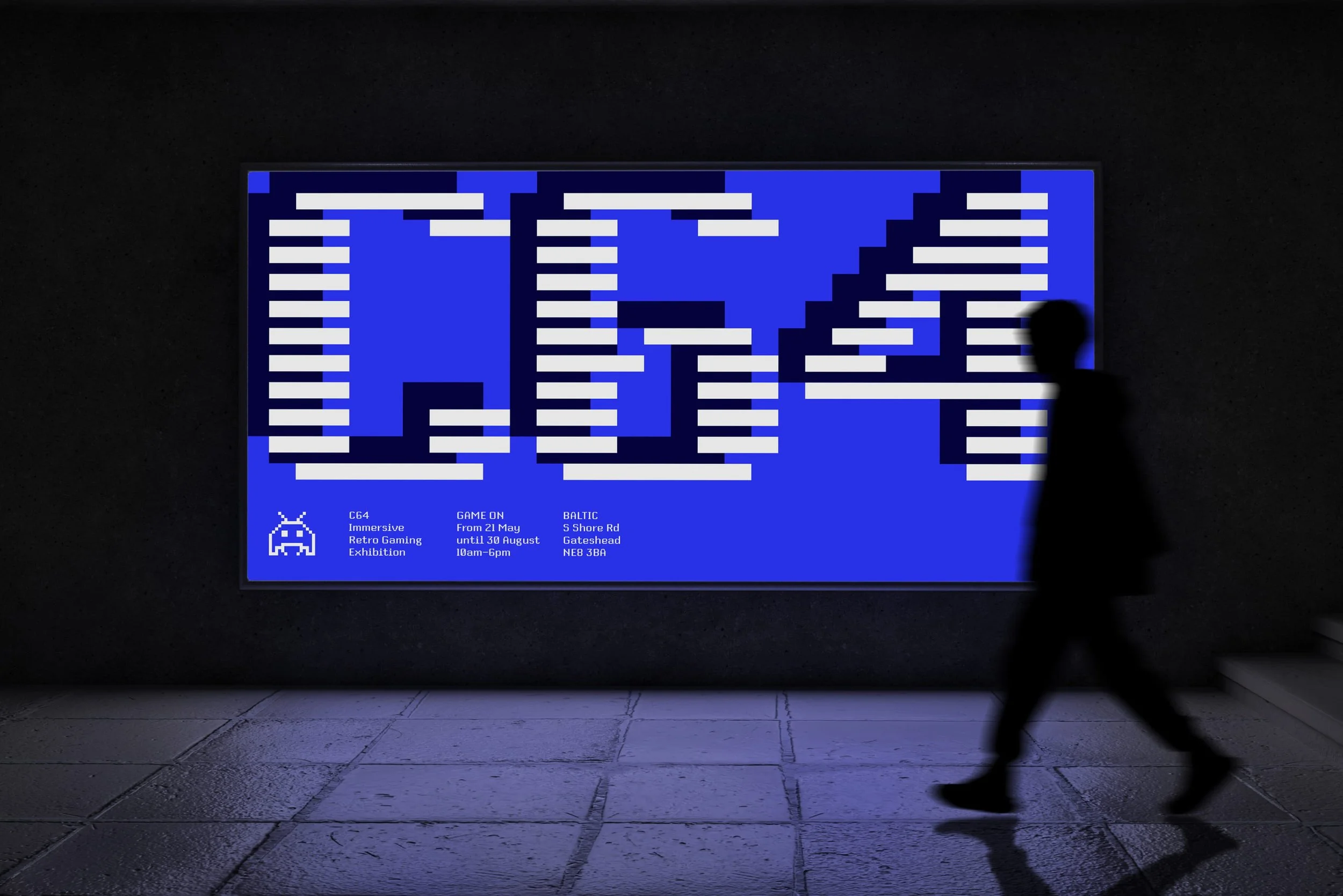
Pixel typography is a legacy of early technological design, but people are using it in modern technology, and, by extension, it retains its place in modern branding and human experience. Boxal is a typeface that encourages play. It’s built for interaction and fun. The likes of Sony Interactive and Nintendo need pixel fonts in experiential environments. We all do. This typeface will function at smartwatch scale, but deserves to be scaled to a seven-story sensory wall, to help bring an interactive experience to life.
“It would be great to see it perform in public spaces, heritage sites, or museums.” JH
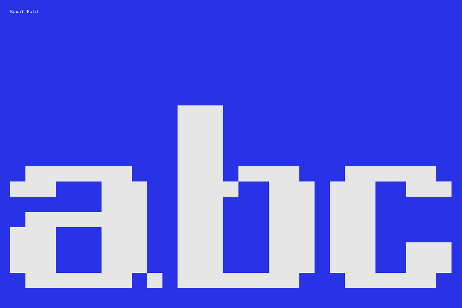
Boxal is about more than the aesthetics of a retro revival. The creation and availability of pixel typefaces is widespread, but Boxal is a distinguished departure from the norm of monospaced pixel fonts. While most pixel fonts adhere to a central grid alignment and monospaced format, Boxal breaks free by offering proportionally spaced characters, akin to traditional non-pixel fonts. This innovative approach enhances readability and expands the creative possibilities for designers, bridging the gap between retro aesthetics and modern design requirements.
“It can be worked with artistically, scientifically, and mathematically. Because you start off with one grid pixel. An origin pixel. And duplicate it to produce letterforms, and a typeface in its image. Even Python scripts can be applied to this font.” JH
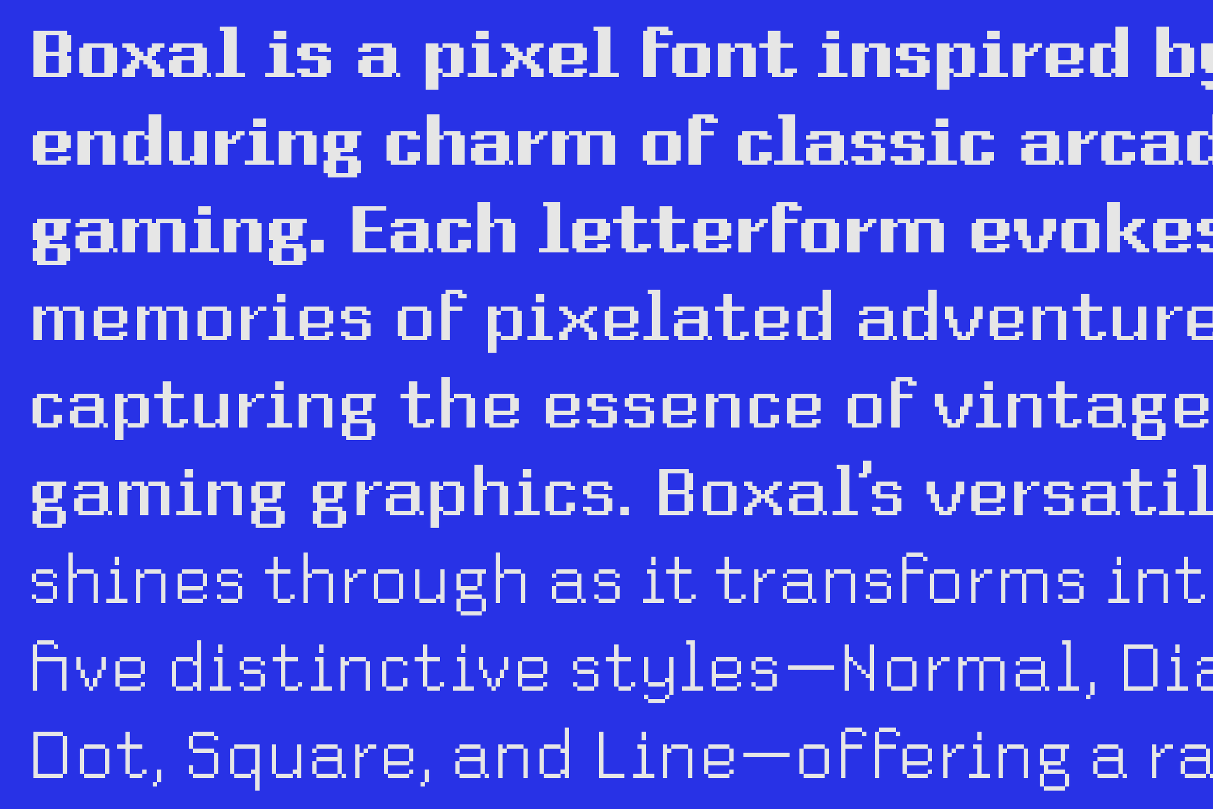
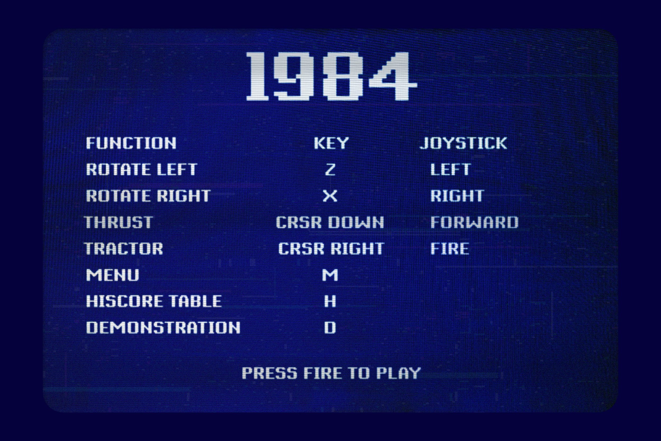
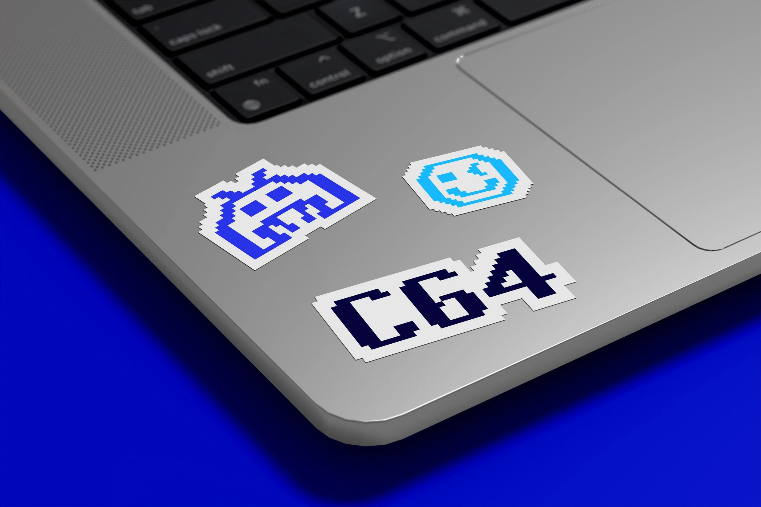
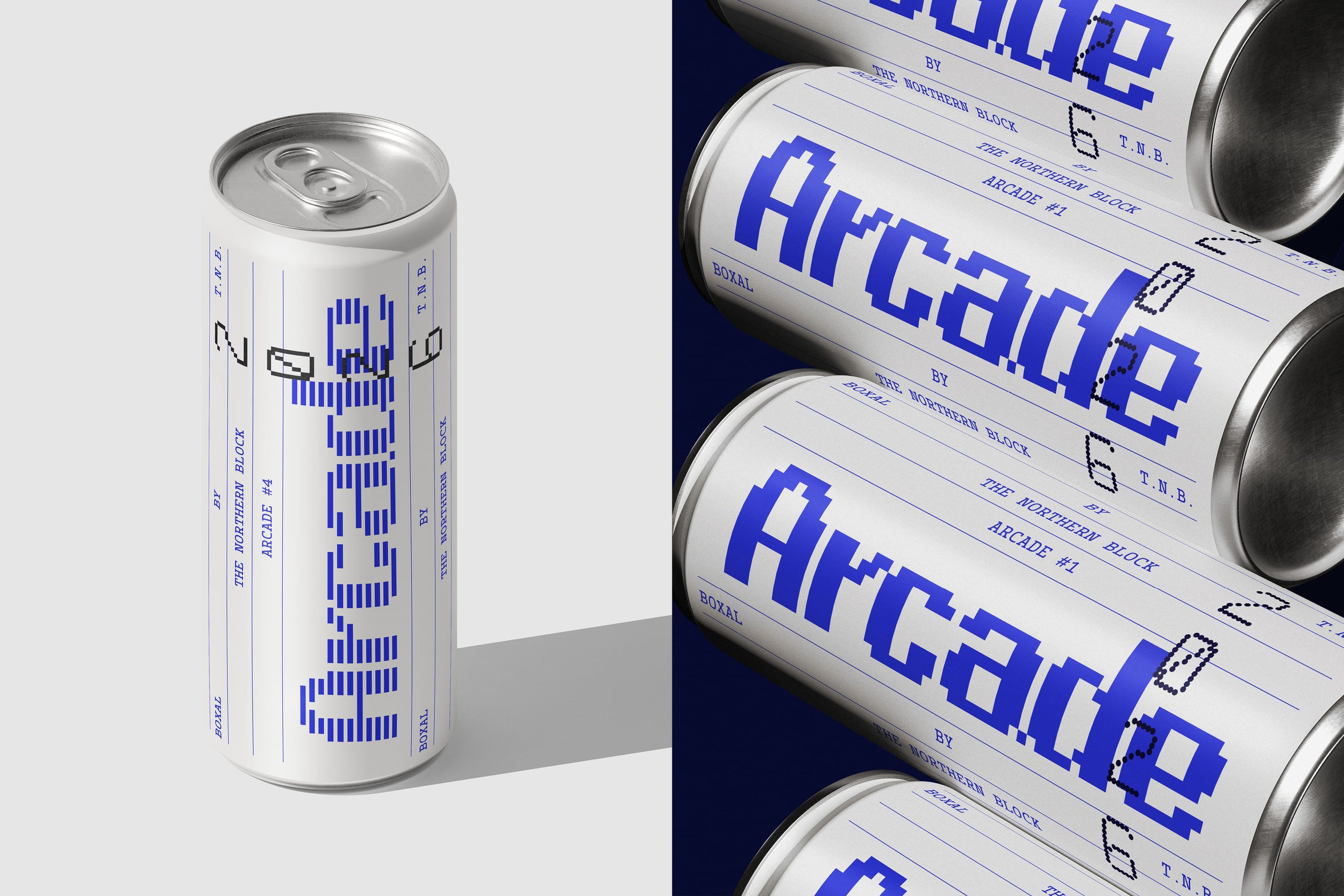
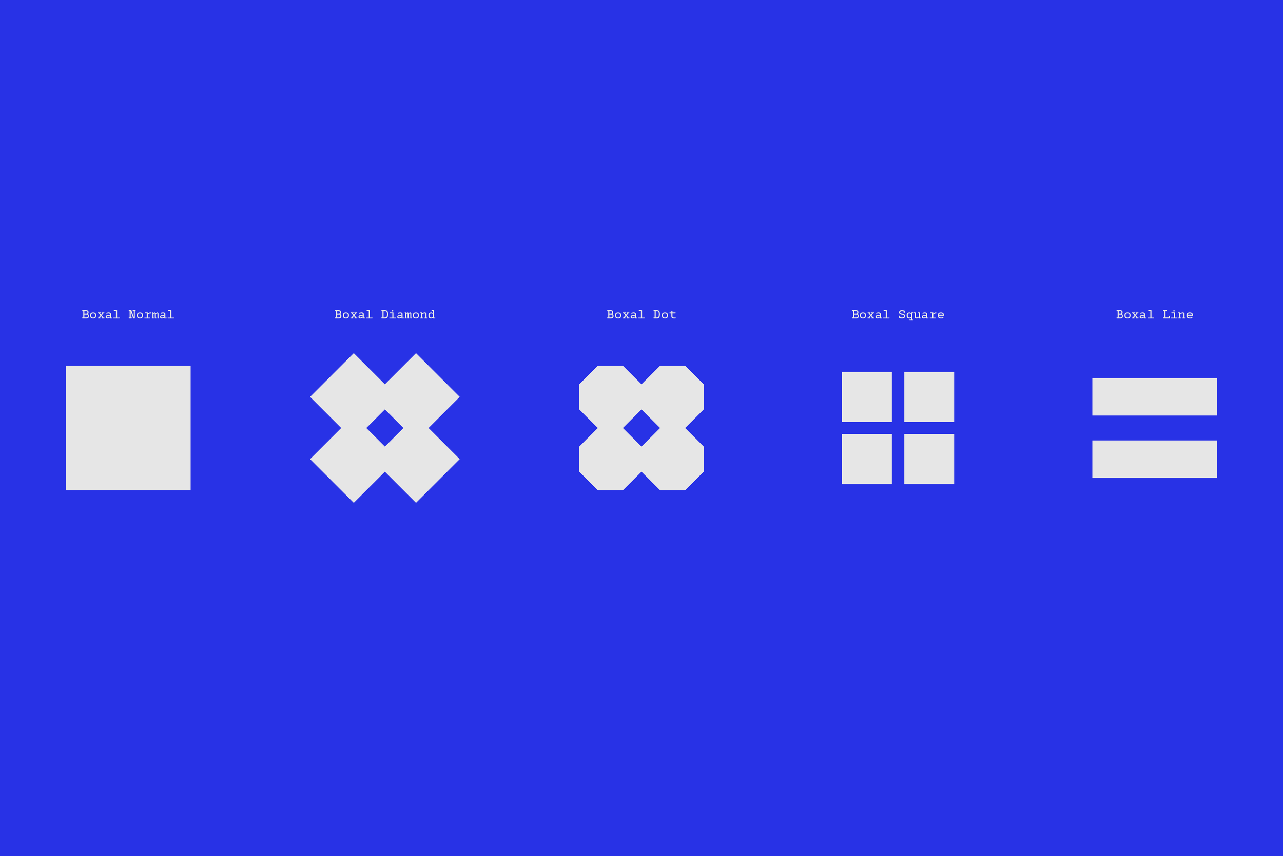
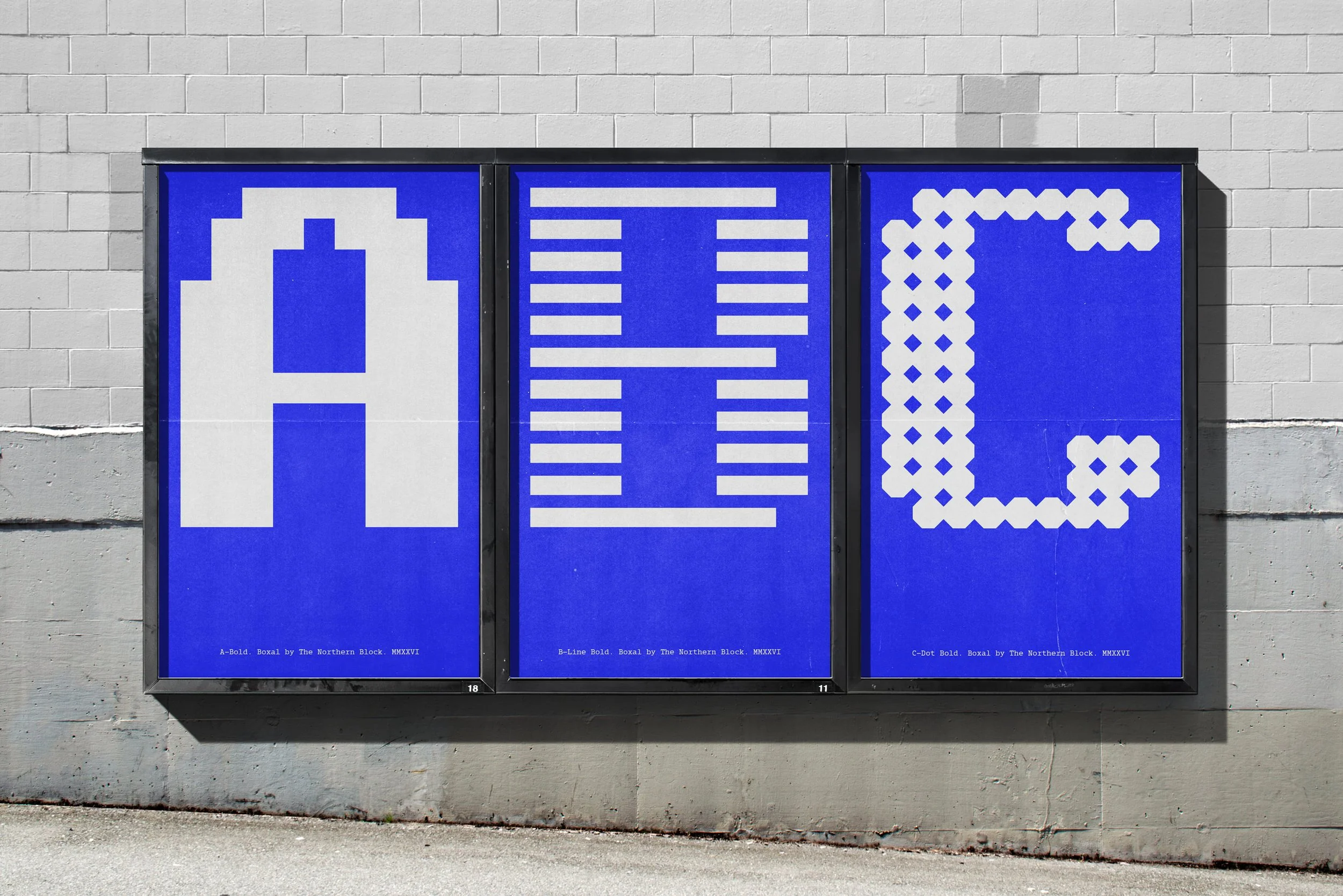
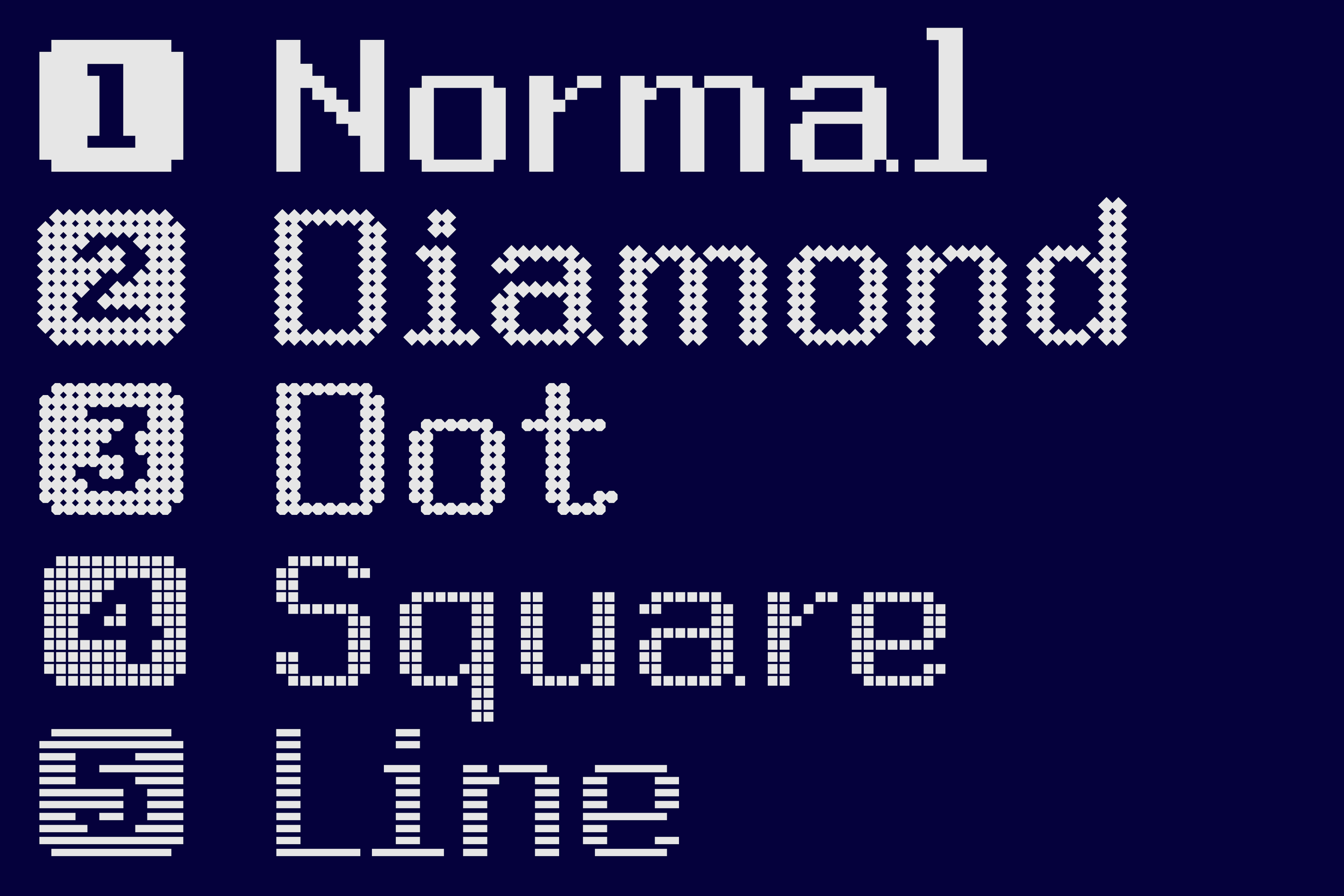
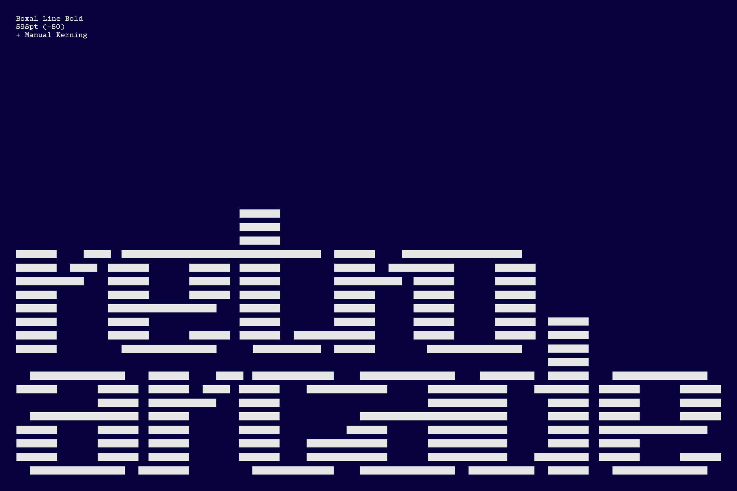
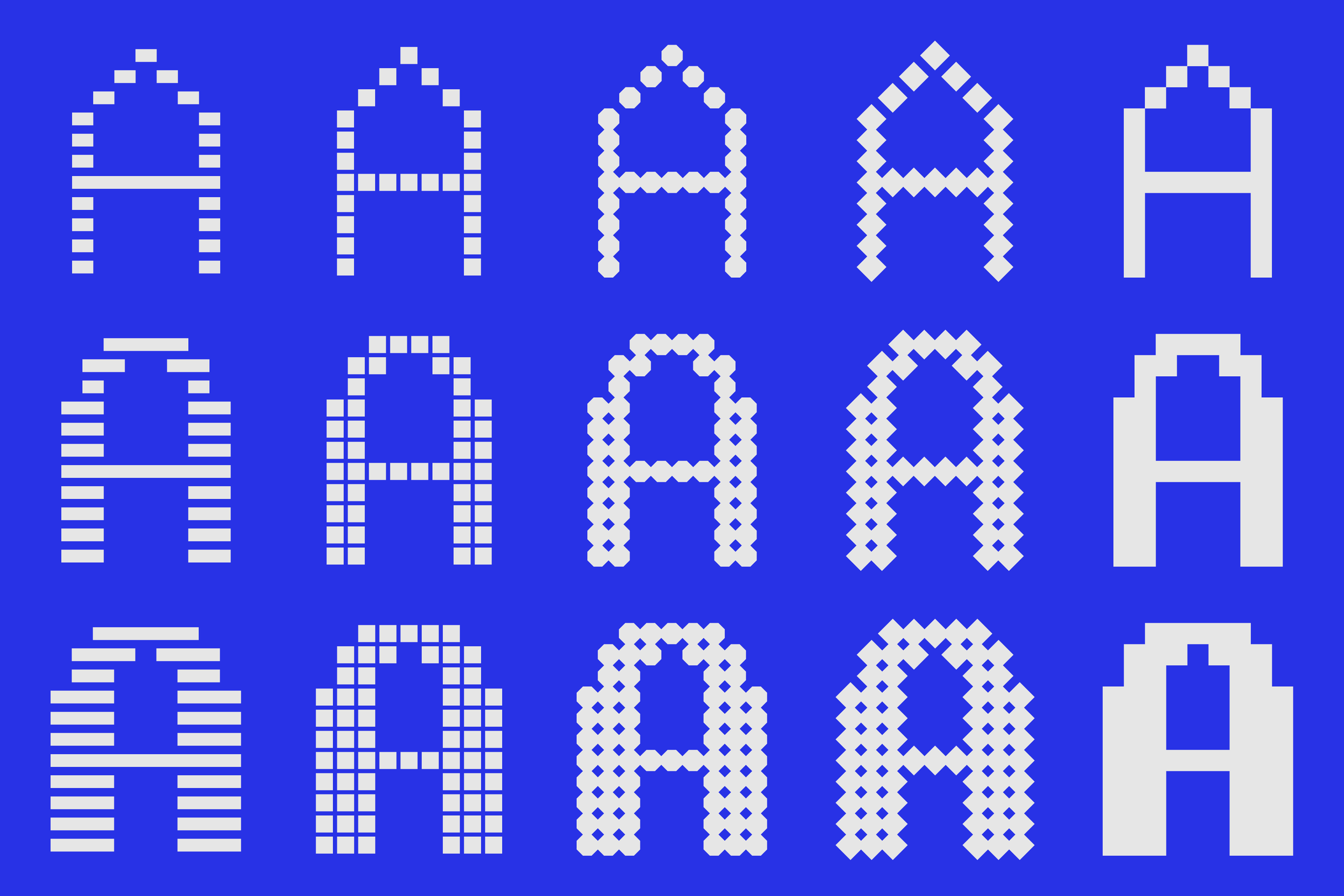
Boxal is also a playscape for designers, creatives and engineers. It inspires expression and experimentation. What makes this font stand out in a pixelated field, is its flexibility. Its craft and versatility shine through as Boxal transforms into five distinctive styles—Normal, Diamond, Dot, Square, and Line—offering a range of interpretations of classic pixel artistry. That original pixel can be alternated, allowing you to change the shape and complexion of the letterforms, and achieve a number of different impacts. Whether you prefer minimalist simplicity, sharp elegance, sleek sophistication, or bold statements, Boxal is an invitation to see how far you can take an idea.
The 80s are back, infusing joy and forgotten worth into everything from fashion and film reboots, to soundtracks, streaming platforms, interiors and aesthetics. In a refined arena, retro elements are powerful. Stranger Things has reminded everyone of the pleasure, beauty and value in the retro. Every genre has felt the cascade of that awakening. Even 80s antiques are in, and you don’t need reminding about the resurgence of the mullet. This is the realm that flashy graphics and titan game titles came from. The sacred space that the original Final Fantasy has carved in the videogaming imagination, comes wrapped in a pixel font. Those legacy stories are rising again, and Boxal is a pixel typeface with stories to tell.
Boxal’s predecessors were there at the beginning of sensory interaction with video game playing, in the pre-Internet world of cultural scarcity and unpretentious fun. It has an innocent and uncomplicated joy attached to it, because those early games really were made of pure joy. Boxal itself is a classy, playful homage to that era in human interaction. It invites designers and gamers alike to rediscover the magic of pixel artistry. Whether on digital screens or in print, this pixel font adds a touch of retro flair, transporting users back to a time when gaming was defined by imagination and brought to life by pixelated wonder.