Diversifying design, enabling evolution and mastering universal communication. — The story of The Northern Block’s ‘Next Series’.
Whether you’re designing a Ferrari, a fighter jet, or an iPhone, the litmus test of any organisation that wants to stay at the top of its game, is the ability to learn from successes and limitations in the past and present, then apply and create something greater from it. Design waits for no-one is a truism that whispers the nightsweats out of any top designer. A timeless piece of work, can and should move on.
Between 2012 and 2017, a number of The Northern Block’s typefaces were beginning to mature and reach their peak in terms of interest, how they had been applied by designers, and the impact they were making.
“They were allowed to mature, but then what? We don’t want the artistry of our type to stand still. How do we make sure that maturity stands the test of time?” —Jonathan Hill, Founder and Director, The Northern Block.
The response to that question was the genesis of the ‘Next Series’, which is now shaping who The Northern Block are, how they think, and how they work. It started a maturing process for typefaces, designers, the foundry, and clients.
“Clients were telling us what they loved and what they needed next. How does that affect the work, and how do we futureproof it? How do we be brave with this? Can we better it? What do we do with our limitations? We raise the bar. Is it high enough?” — Jonathan
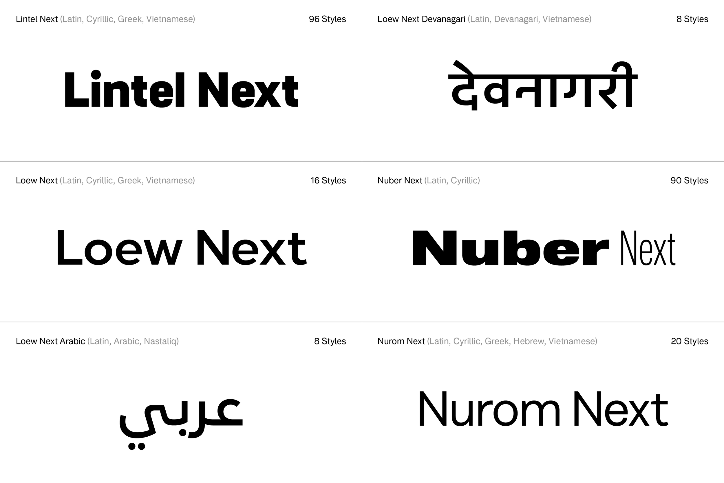
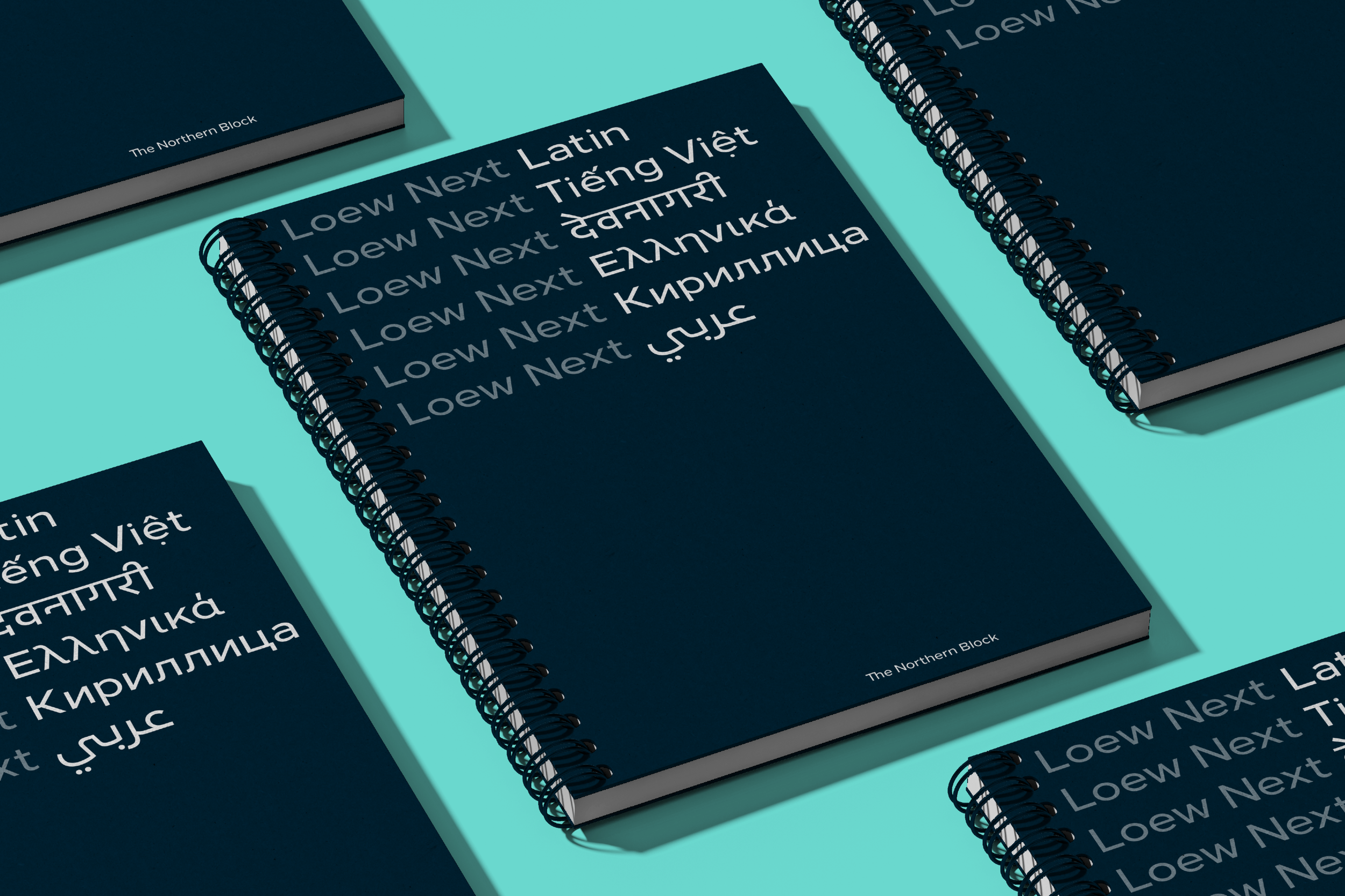
The Next Series includes Lintel Next, Loew Next, Loew Next Arabic, Loew Next Devanagari, Nuber Next, and Nurom Next, with Nurom Next Arabic currently in development.
At The Northern Block, designs are measured and shaped by commercial input, with real listening to how customers have applied fonts, what they need next in terms of usability and technology, and their own commercial strategy. Expanding and responding to those needs has set the roadmap to the release of an incredible set of typefaces, all of which are responses to critical input.
At the elite end of success, better tools will always be needed. New questions from multinational clients have driven major change within the foundry, pushing The Northern Block to elevate the scope, quality, and intensity of its process. This meant looking and moving beyond the race to produce new, accessible, and on-trend designs. It demanded patience to see the right time to allow for the right evolution. It’s the polar opposite of fast fashion.
“We have to make a lot of investment, with finance and intensity. It’s a risk, and a belief in these typefaces.” — Jonathan
Customer passion has been honoured with the release of Nuber Next, Loew Next, Loew Next Arabic, Loew Next Devanagari, Nurom Next, and Lintel Next. These are designs that customers care about, that now behave in ways that allow customers to keep them in their lives.
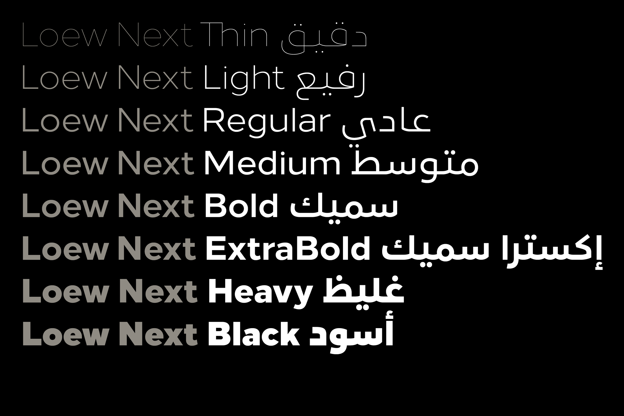
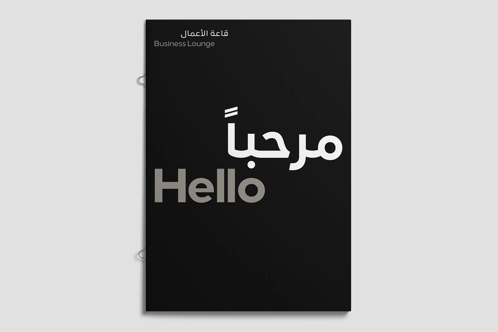
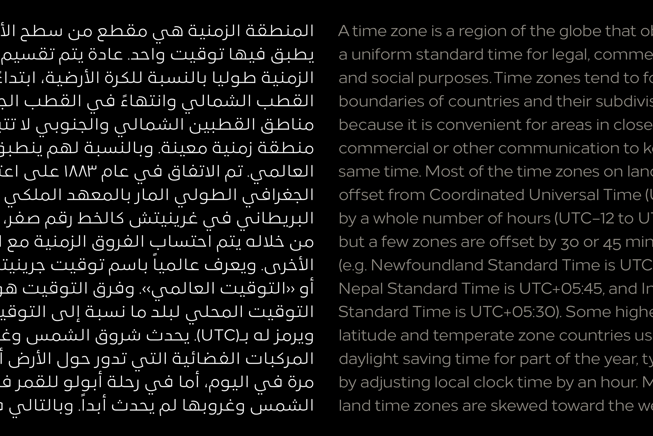
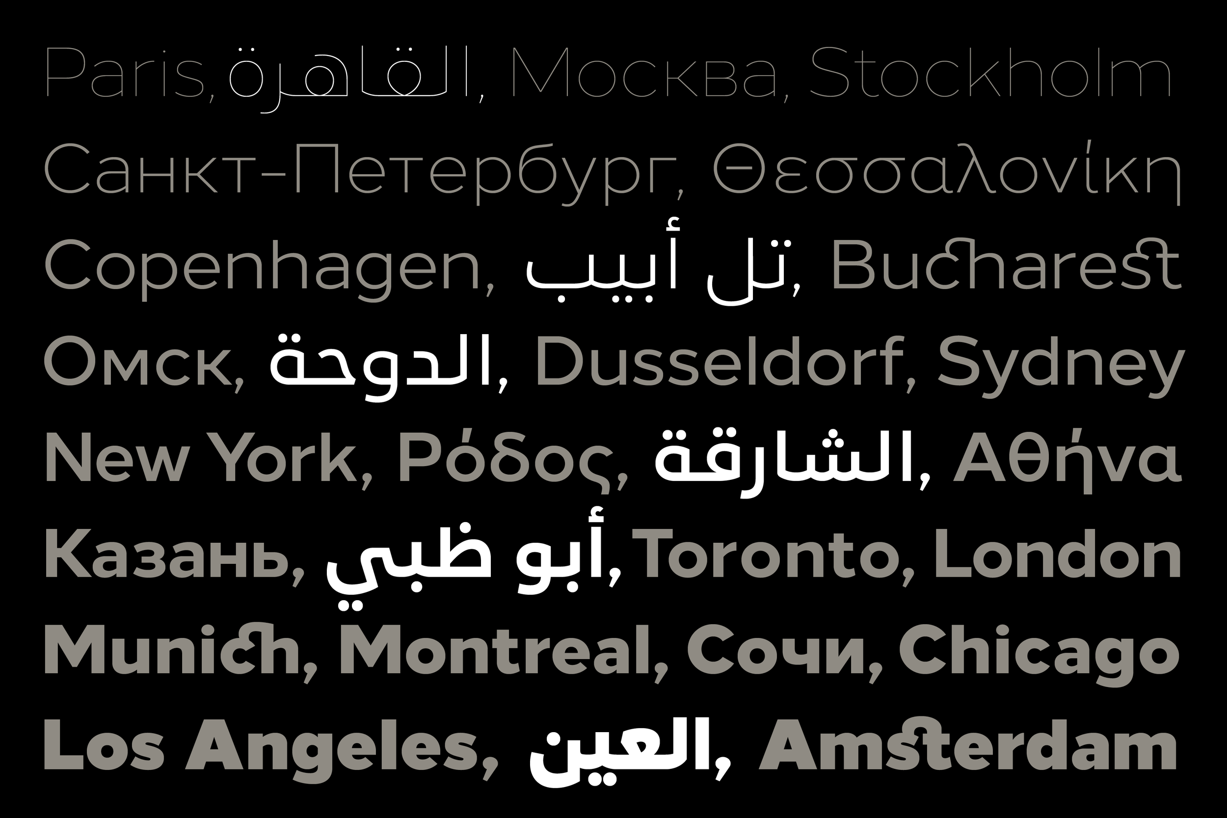
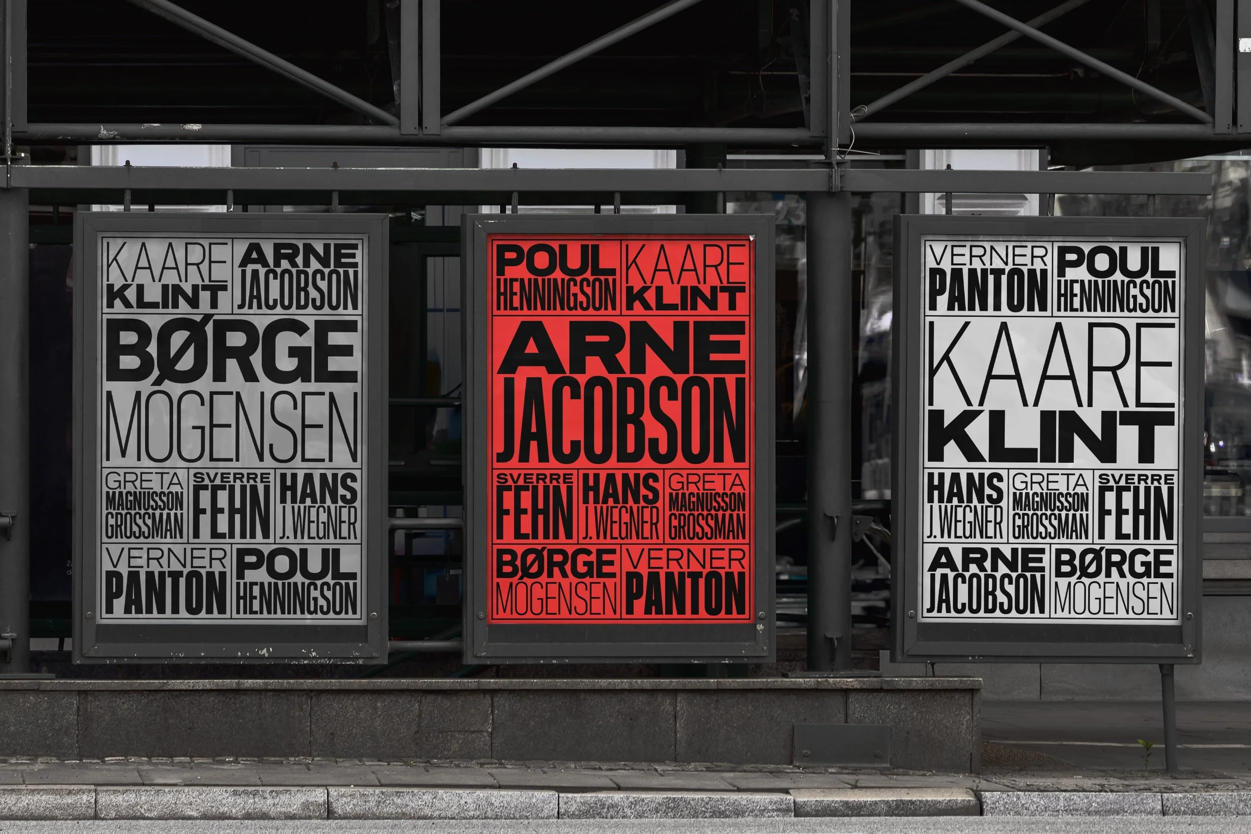
Loew Next is a straightforward sans-serif designed for global communication. With script support spanning Cyrillic, Greek, and Extended Latin, it’s a versatile choice for pan-European and international branding. Loew Next Arabic brings the clarity and modernity of Loew into the Arabic script, while maintaining seamless compatibility with its Latin counterpart.
We know the world of typefaces is diverse and highly specialised—but what sets the Next Series apart? One thing is the journey, and the commitment that’s gone into bringing each typeface to life. All of these typefaces have demanded the right designer and the right team to support them, at the right time, working piece by piece over durations measured not in hours but in months and years.
It’s a formula for properly crafted, imagined and time-honoured designs that blend beauty, function and future. It’s a ritual of tending the flame, not worshipping the ashes, and keeping it relevant and robust. It’s also an assurance that when you’re buying a ‘Next’ typeface from The Northern Block, it’s been through a Formula 1 engineering-level of scrutiny and development. You are buying top-level work.
An act of pure collaboration.
This is not a sales tool cliché. We know how big ‘co-creation’ and ‘co-production’ are these days, even in places where the evidence of it is sparse. Today it’s being typed with integrity, and here is why—
“The Northern Block don’t control experts; we invite them in and respect what they do. We embrace what is brought, and what decisions are made. We have learned a new level of respect for the process, and for cultures.” — Jonathan
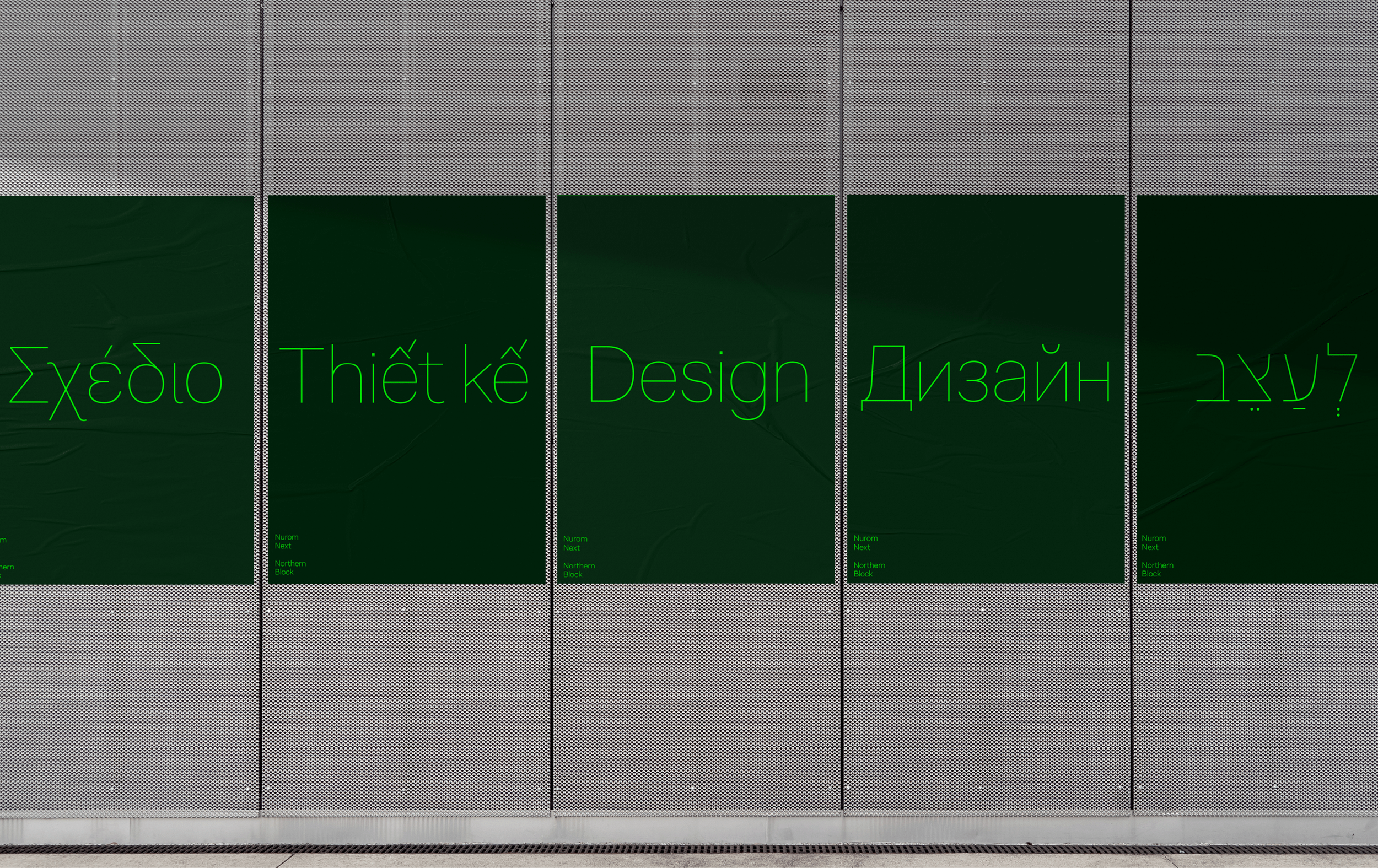
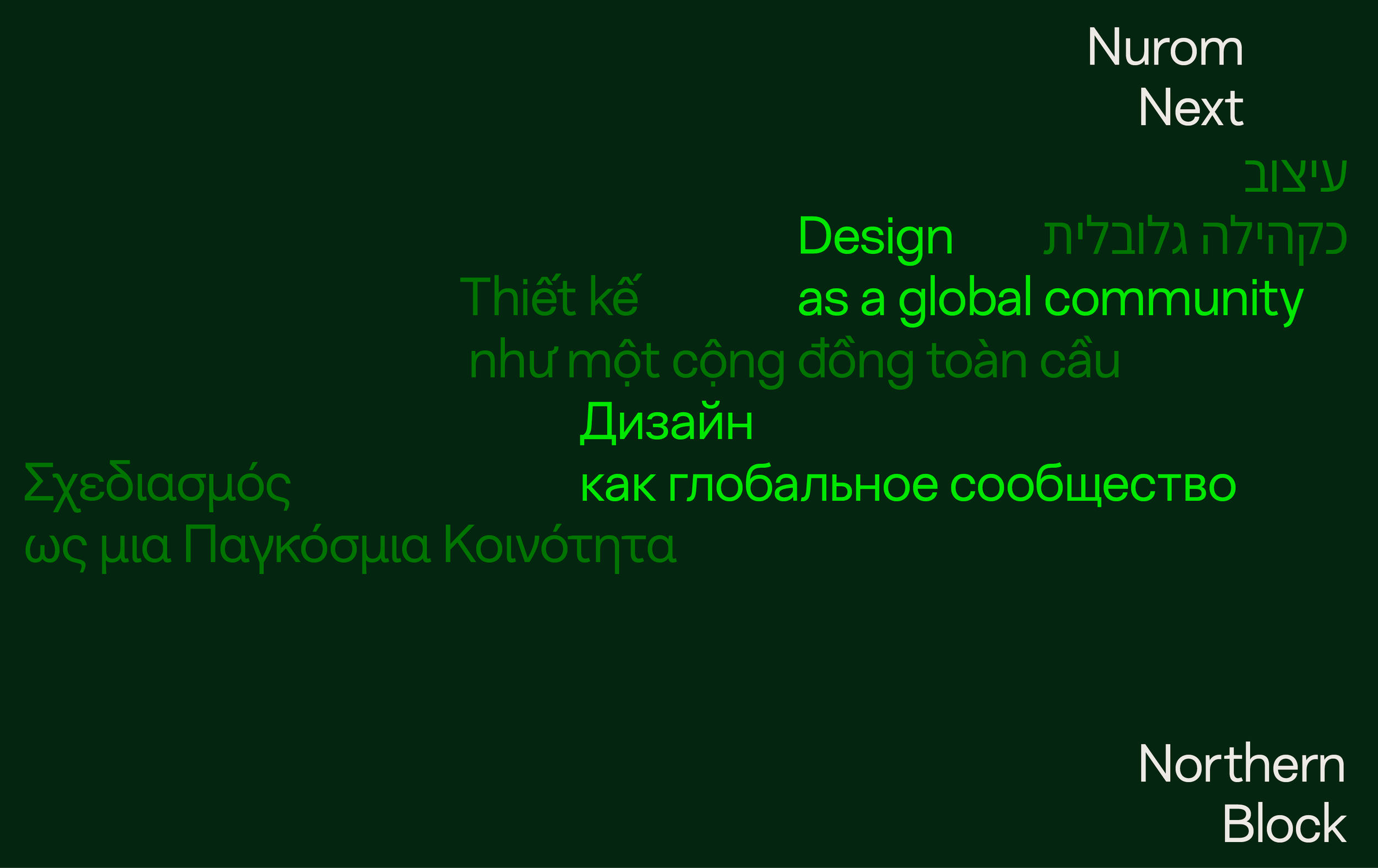
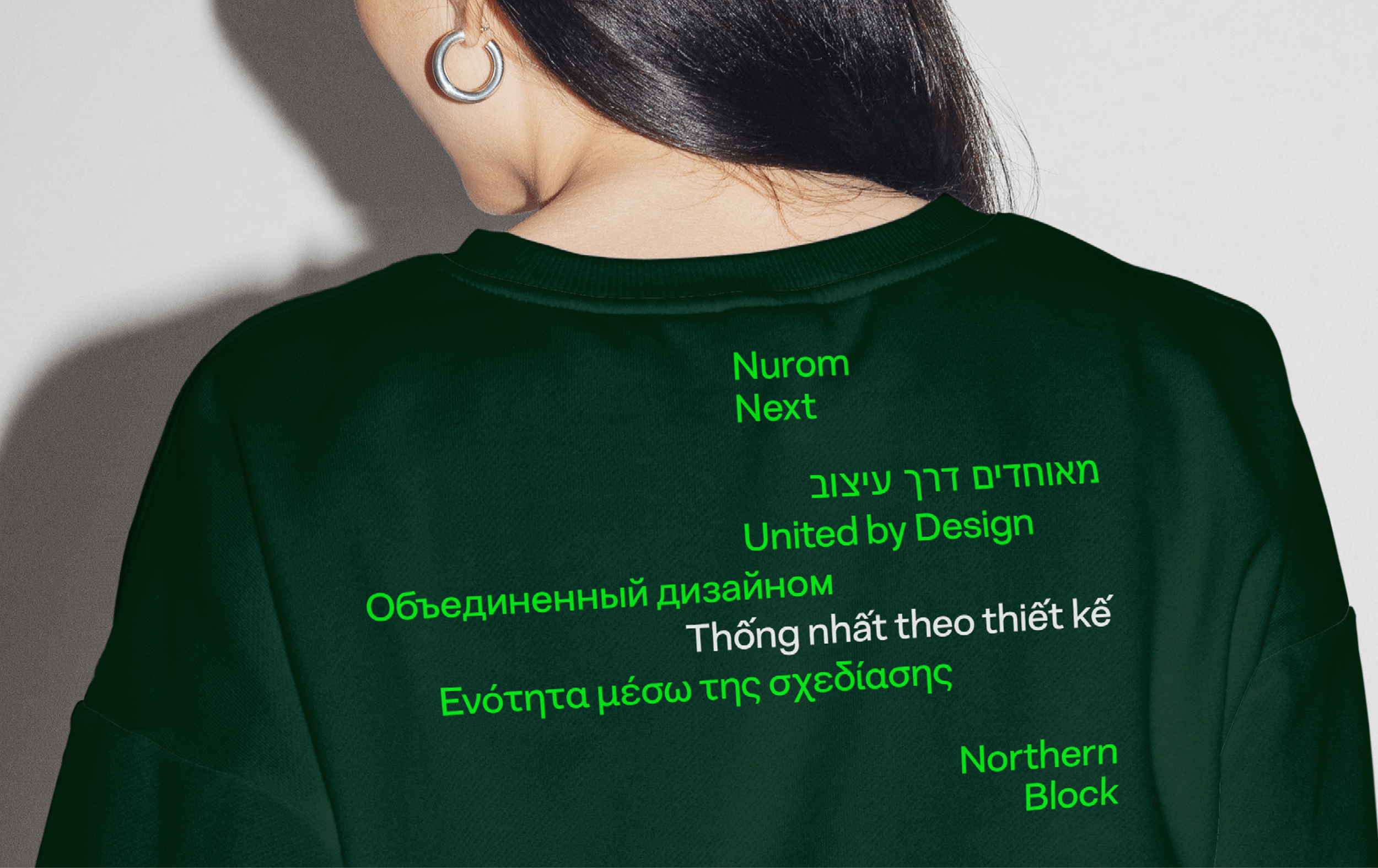
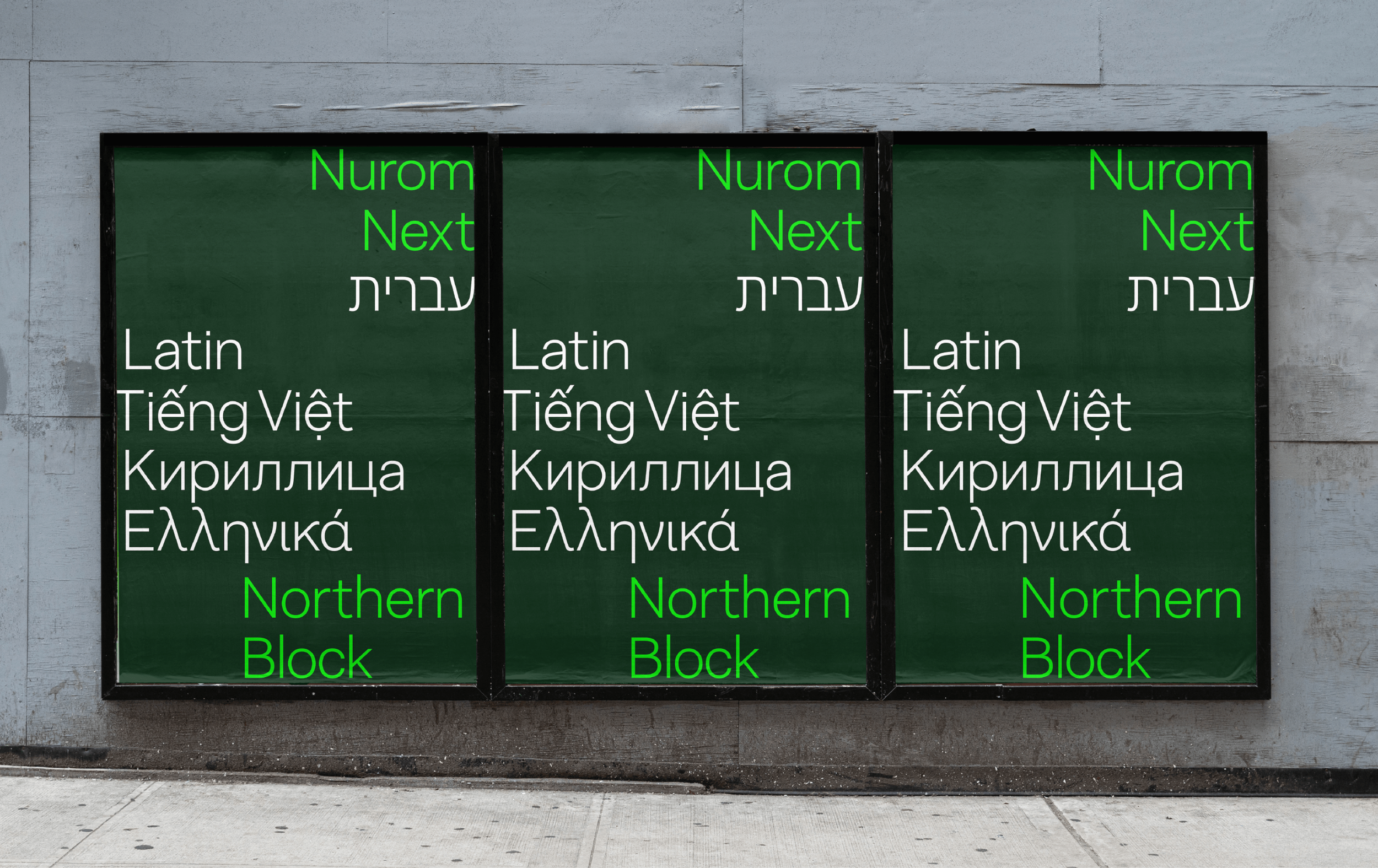
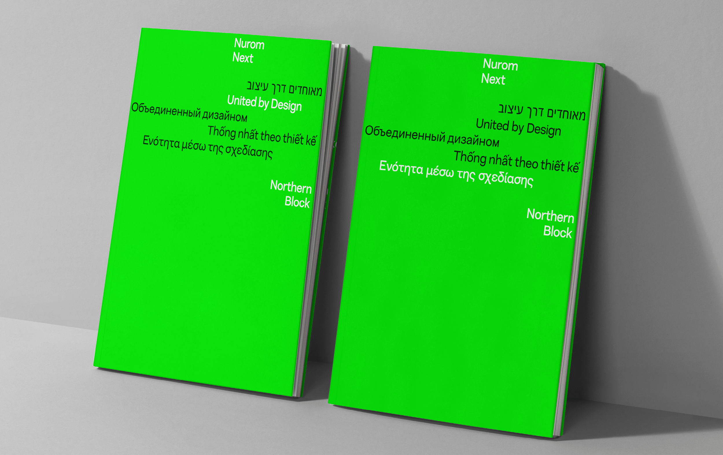
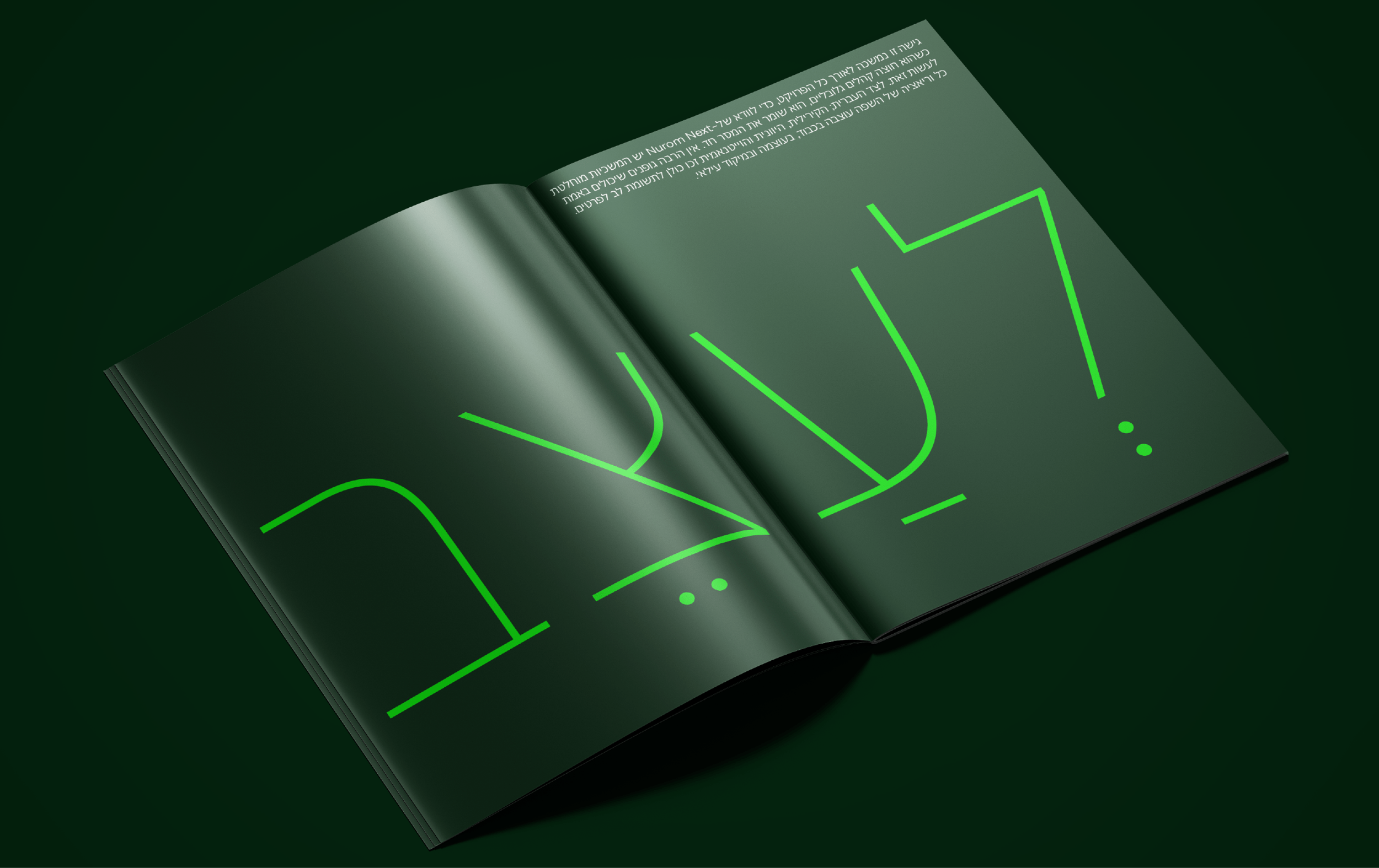
Ten years in the making, Nurom Next is a true collaboration, shaped by an international team. A significant enhancement in the next version, is its extended language support, now accommodating Cyrillic, Greek, Hebrew, and Vietnamese, making the typeface more versatile and globally accessible.
As a project, the Next Series has been a test-bed for true design collaboration, and globally moulded by experience. The Loew Next families, Nurom Next and Lintel Next in particular, stand out as incredible testaments to what can happen when diverse cultural sensibilities, brains and artistic life experiences merge. There’s been a purity in the passing of the torch. Their neo-grotesque Nurom Next alone has journeyed through multiple sets of hands and international borders over the space of a decade. Thanks to the contributions of specialists such as Hebrew consultant Liron Lavi Turkenich, Nurom Next can deliver seamless global communication, supporting over 350 languages, including Cyrillic, Greek, Hebrew, and Vietnamese. With the handing over of the physical elements of Nurom’s process and mechanics for fresh interpretation, someone else has brought something new to each expansion.
“People from different cultures have come together on our Next projects to attune sensibilities, culture, knowledge and background, resulting in authentic translation.” — Tasos Varipatis, Lead Type Designer, The Northern Block.
That ethos has involved respecting Arabic designers, their learning, and their experience living in Arabic-speaking communities. How it lives in and with them, where the rules are, and where they see spaces to inspire. It’s embraced Devanagari type design experts like Amélie Bonet, and Indic script consultants Erin McLaughlin and Pooja Saxena, to shape Loew Next Devanagari with real integrity and respect for its place in history, and in contemporary Indian life.
“We offer the freedom to work on a project based on your culture, and encourage you to bring that in. We don’t condition or control. This is what true evolution means.” — Tasos
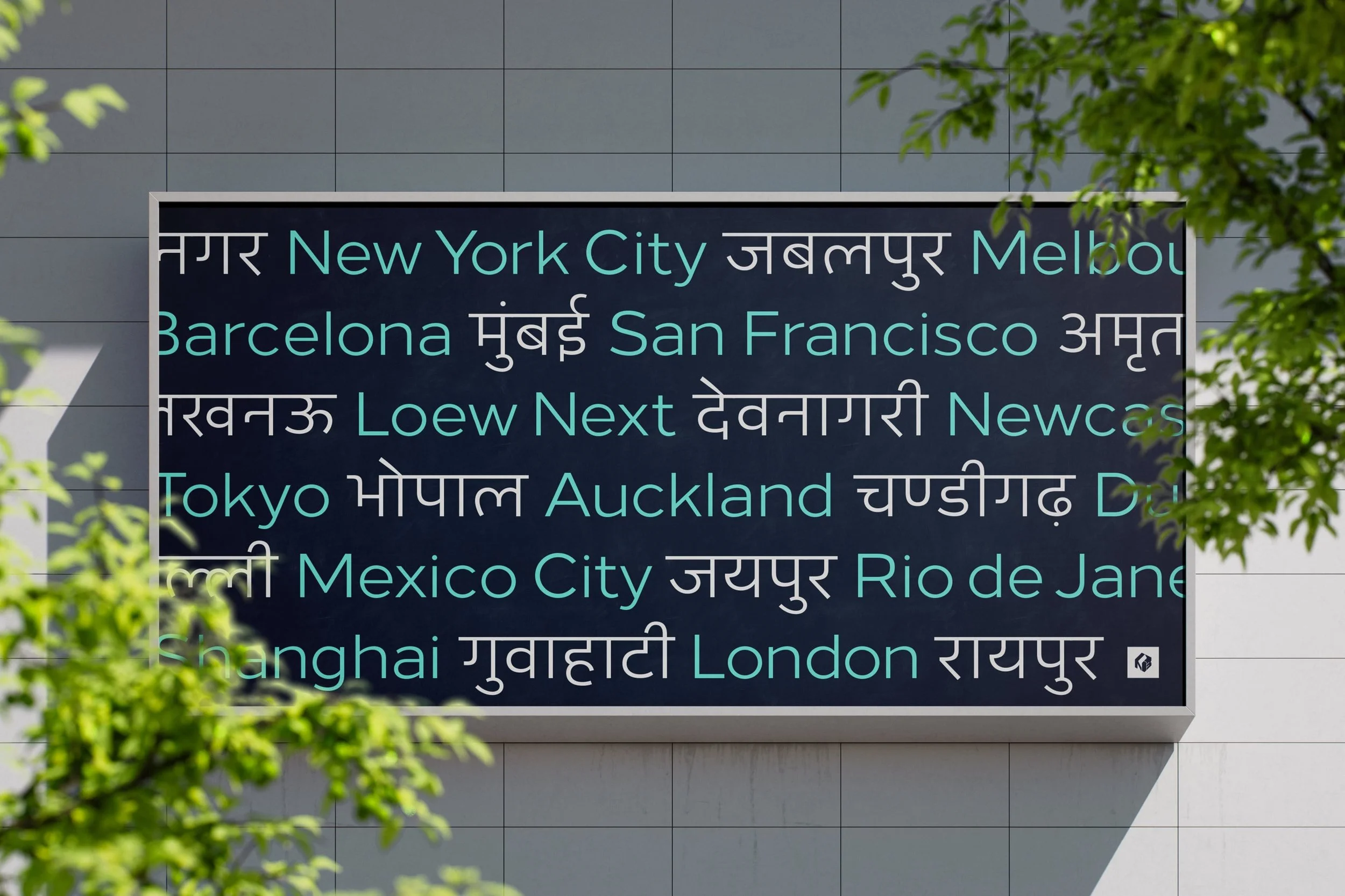
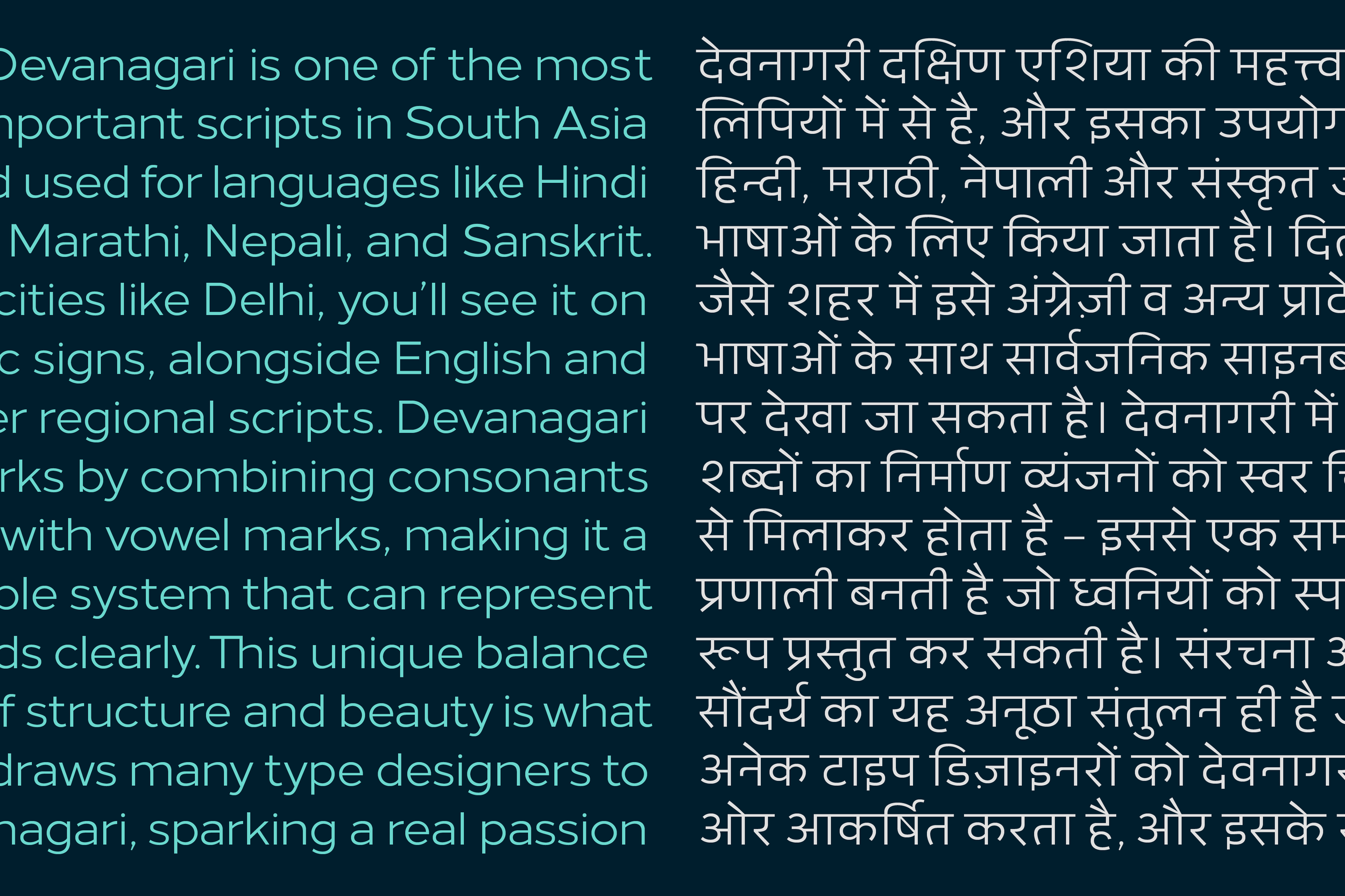
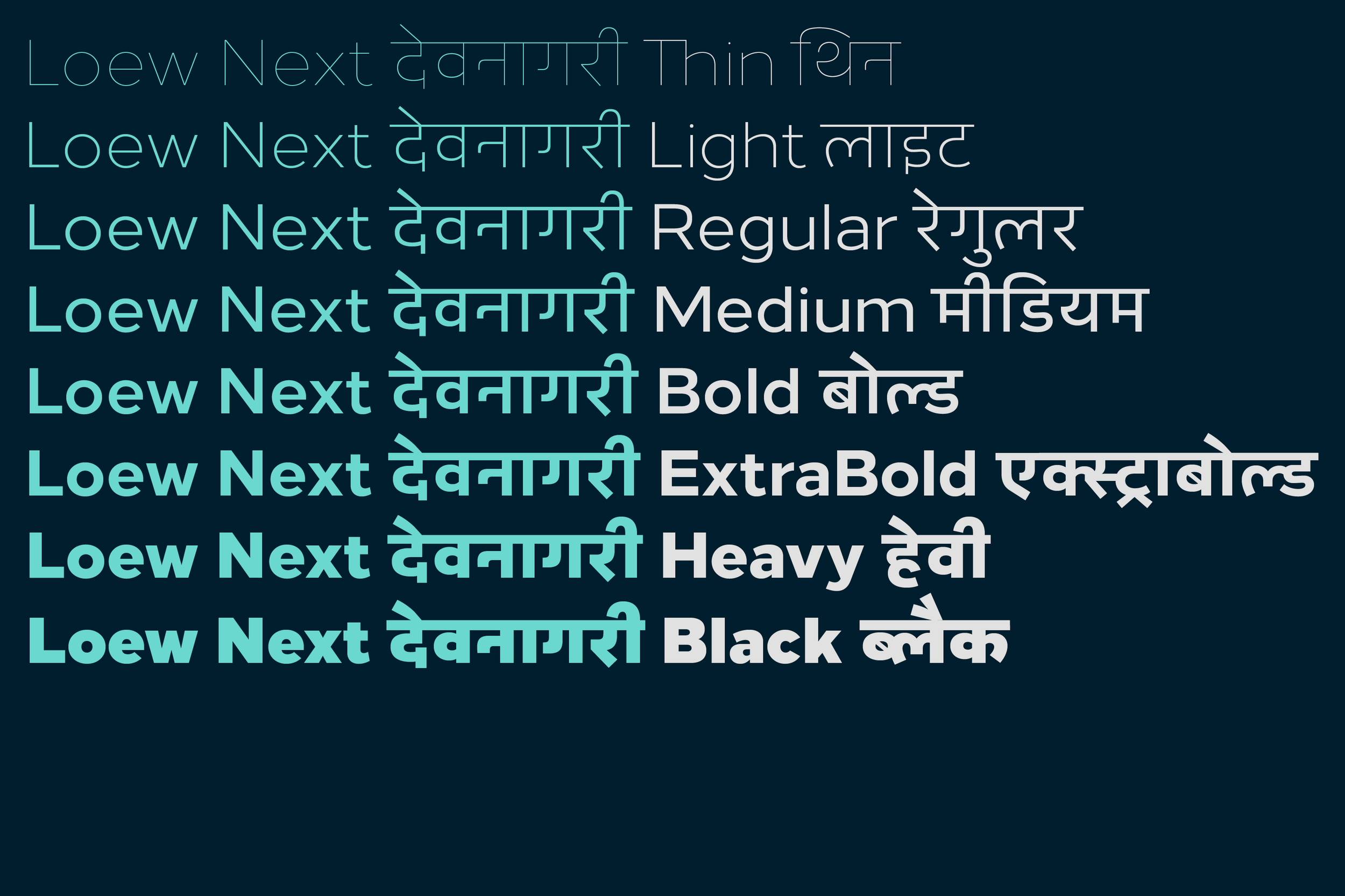
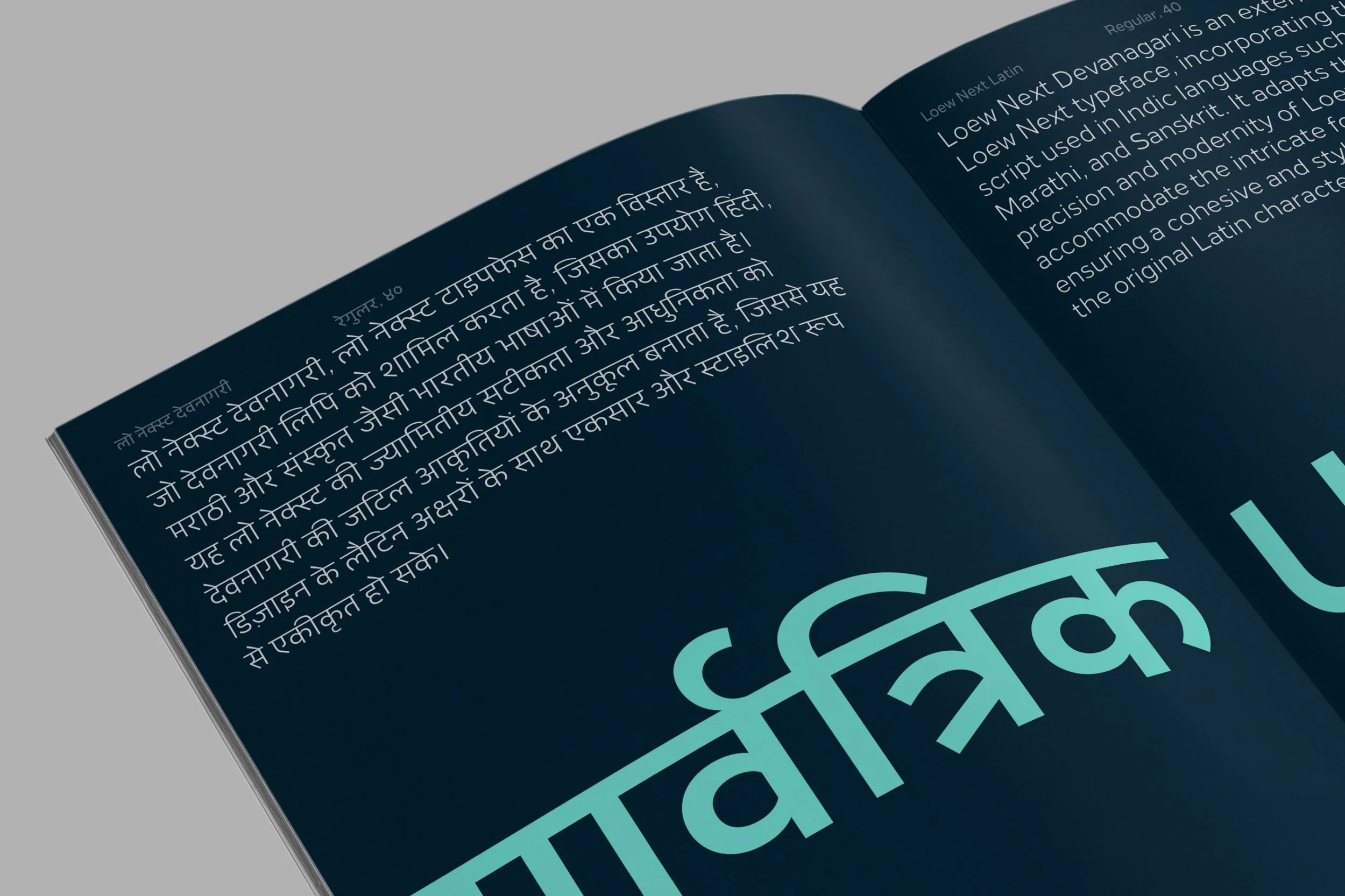
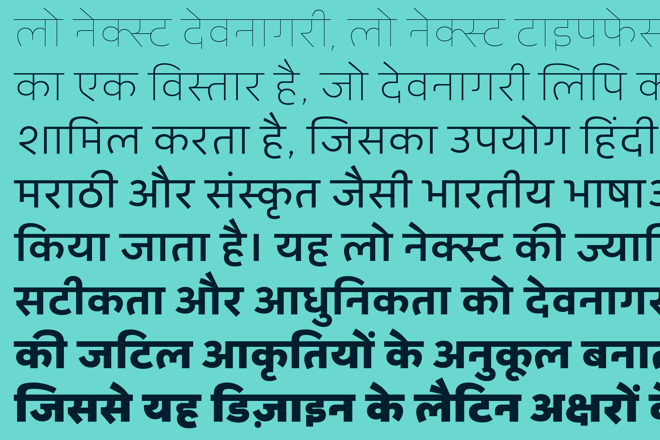
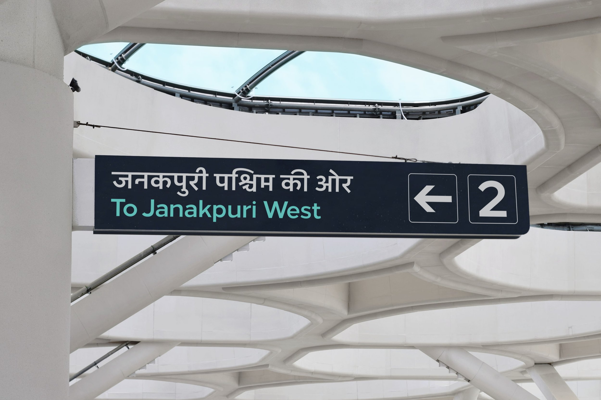
Loew Next Devanagari combines the clarity and functional design of the original Loew typeface, with the specific needs of multi-script text. The Loew Collection now incorporates the Devanagari script, used in languages like Hindi, Marathi, and Sanskrit, broadening its usability for a global audience.
Take a great typeface and make it intuitively flexible across the globe, and across all platforms and mediums. What unifies the Next Series, is the commitment to pushing this approach every time, as a true test of cross-pollination to solve design, communication and translation challenges. This is something that The Northern Block is consistently driven to achieve. Finding a flawless link between cultures and overcoming the barriers between them with simple but hard-won, thoughtful, and well-engineered communication. The result is completely formed typefaces that no longer have an origin point, but still carry their own fingerprint. That’s really something.
“We aren’t in control of that signature. It doesn’t belong to one person.” — Jonathan
The Northern Block continues to grow through a design process rooted in cultural awareness, collaboration, and the drive to build meaningful connections across languages and regions.
Lintel Next has beautiful proportions that can adapt to any scale within a layout. From the narrow system of a mobile device, to the silver screen at movie level, it can make the same seamless impression.
How does the Next Series adapt to new technologies?
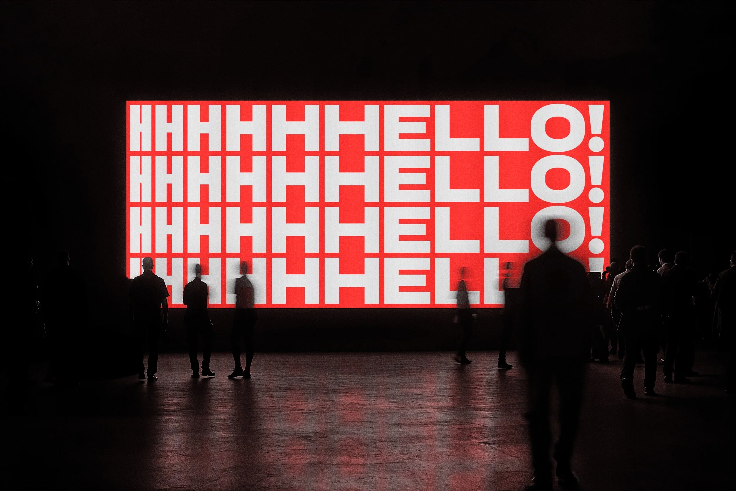
Unique experiences are being characterised by the next generation. Pushing boundaries that historic typefaces have been unable to break through, because of the level of detail needed to pull it off. Apps, websites, the dynamic expression populating social media platforms, and the programming of apps, demand high levels of engineering to work at small point sizes. Diverse structures and developments are needed to ensure legibility and readability in confined, economical spaces, where sub-12-point sizes are deployed.
These demands have landed at the door of the Next Series, where an adaptable weight system is a given. Technically, they are more legible and flexible than their predecessors. Functionally, they can address challenges across all web, mobile, and physical environments. The details come into their own when these typefaces are pushed to their limits. If you pick up any typeface in the Next Series, you’ll find it’s app-adaptable. They have been drawn and developed to adapt, be open to expansion, and support forward compatibility.
“So many advancements have been brought into these typefaces to respond to technology, which has required a huge input of information, adaptation, and work hours.” — Tasos
Top, world-class applications need world-class typefaces, and world-class effort. Lintel Next is a stunning example of technological adaptability, because it has lived through that atmosphere of change and intensity. Its parameters and boundaries have been pushed and redrawn technically and structurally, without losing DNA. As a result, it can solve high-performance problems that aren’t easy on designers or typefaces, without a flinch.
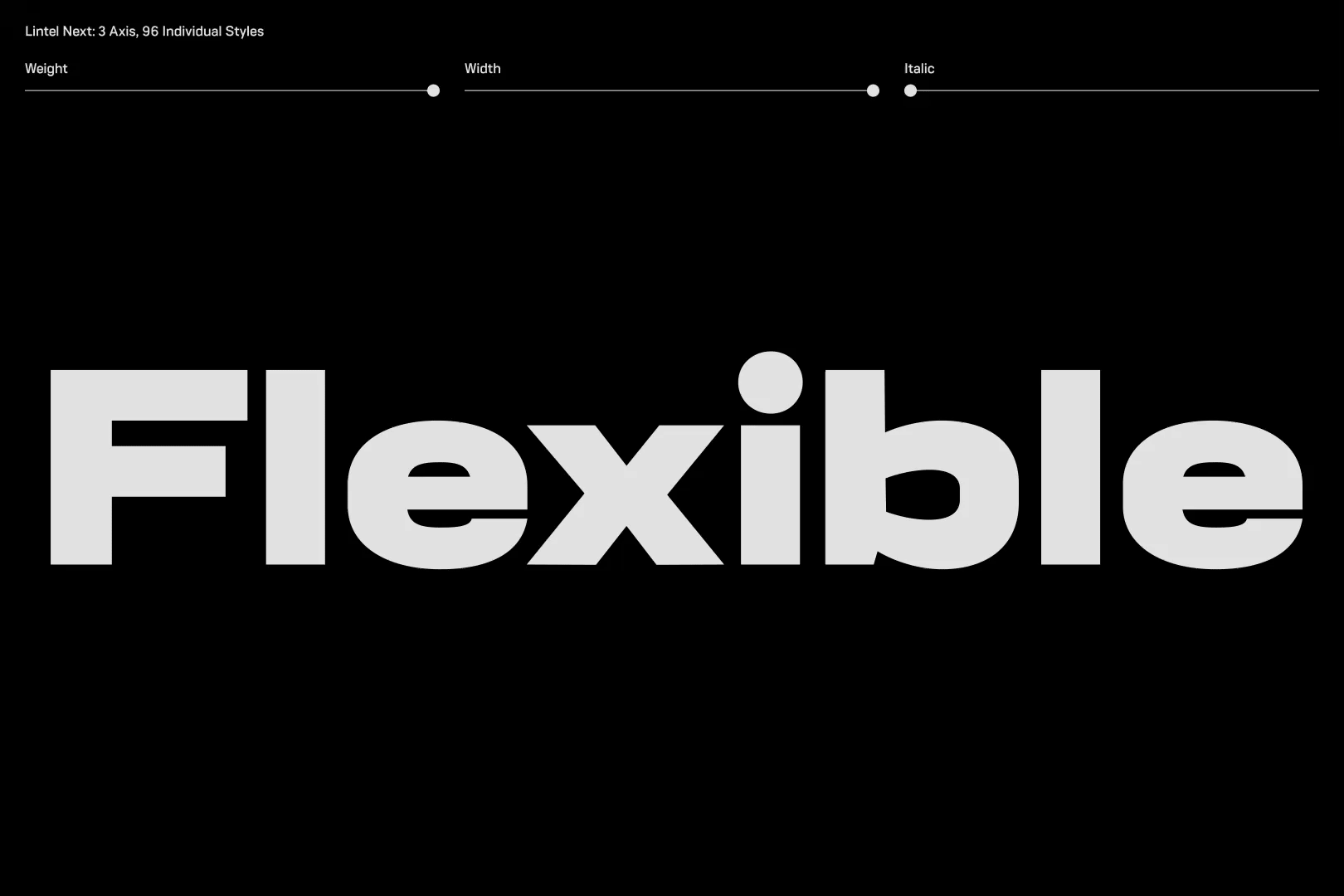
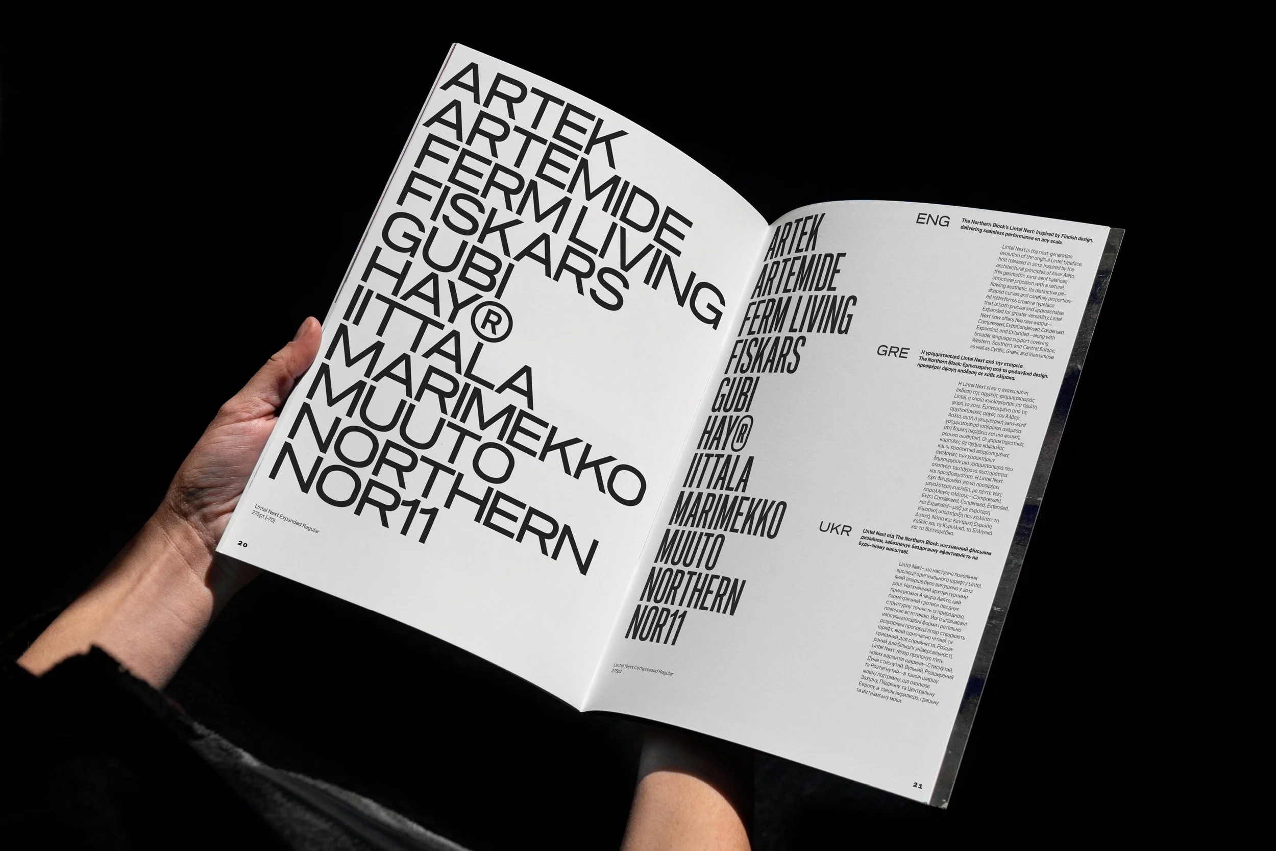
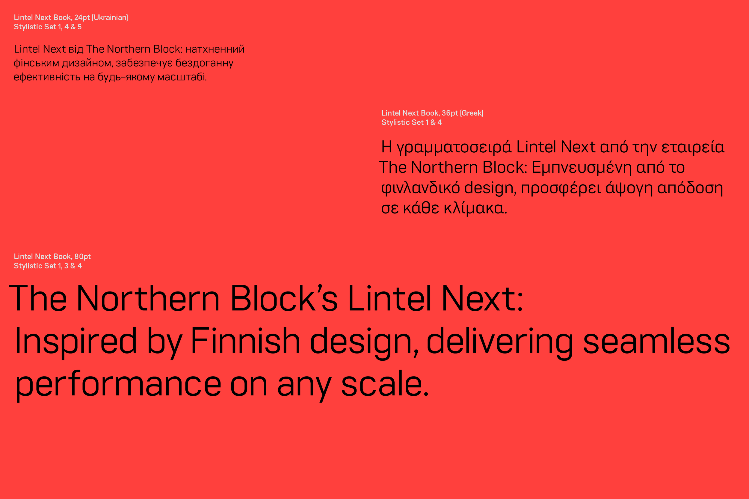
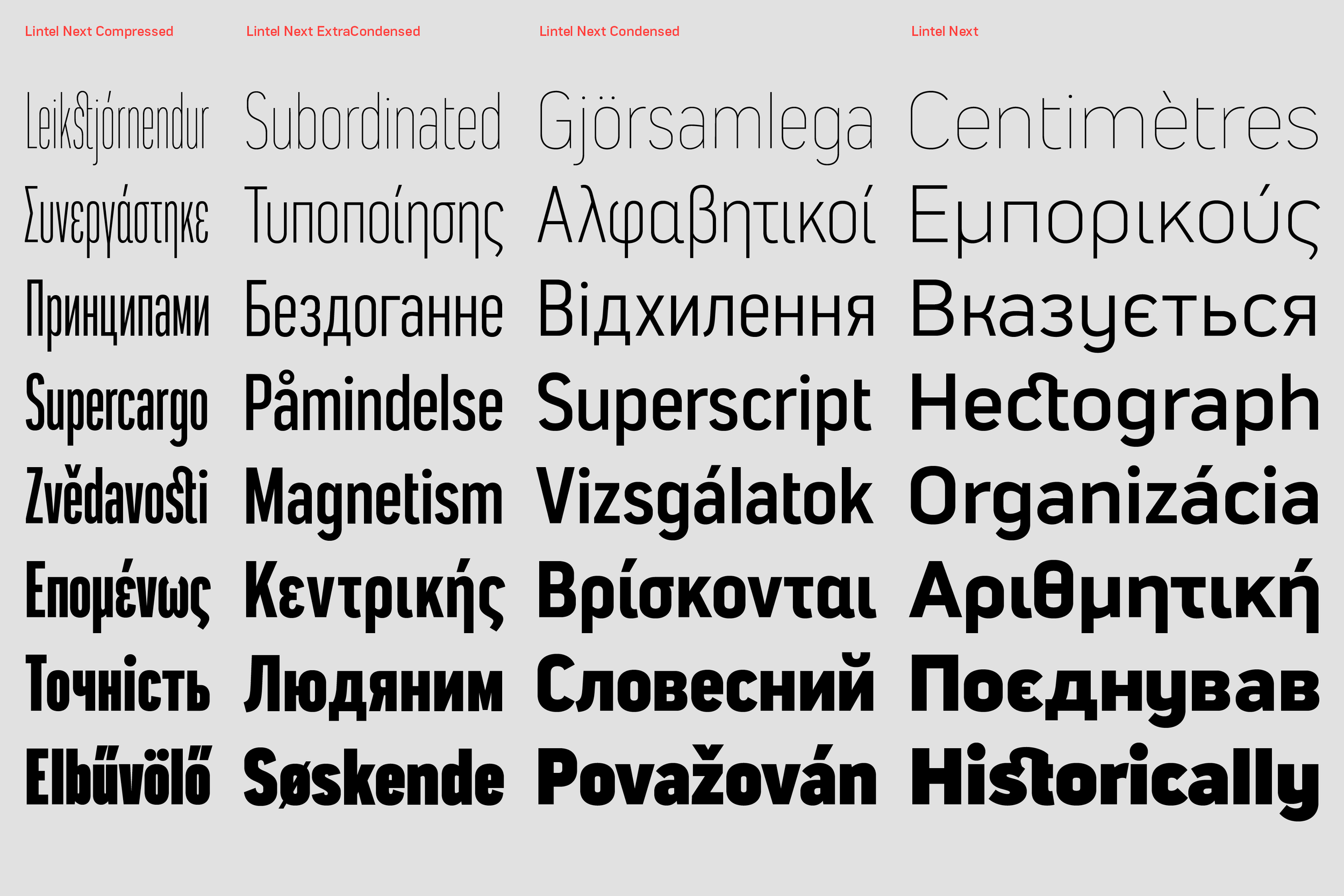
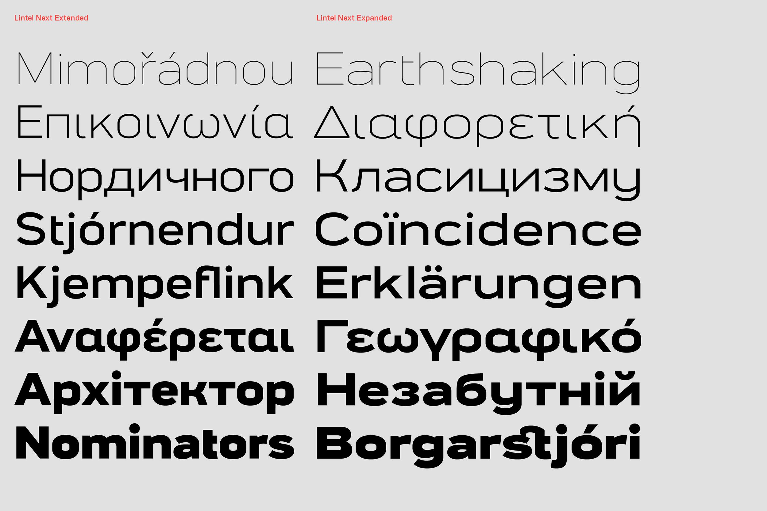
Every character in Lintel Next has been redrawn for consistency and readability. With five new widths—Compressed, Extra Condensed, Condensed, Expanded, and Extended—this 96-style superfamily performs effortlessly at any scale.
So, what’s next?
Continuing The Northern Block’s philosophy of the right designer at the right time, Nurom Next Arabic is now being developed, with specialist Arabic input from type designers Lara Captan and Hasan Abu Afash. Bringing together the vision, talent, and efforts of an international network of collaborators, Nurom Next Arabic reflects The Northern Block’s strength in a multi-skilled global environment. This typeface is the latest statement that they are continuing to elevate what they do. It levels up the foundry’s ability to service the world, and speak across it.
“As people, cultures and societies, we don’t stop evolving. Our typefaces have to be able to do the same.“ — Tasos

Nurom Next Arabic is scheduled for release in 2026. With the addition of Arabic, Nurom Next will become a globally integrated multilingual system supporting Extended Latin, Arabic, Greek, Cyrillic, Hebrew, and Vietnamese scripts.
Reflecting on what has been achieved, and what that means, you don’t have to be a leading scholar of Darwinism to know that evolution doesn’t come easily. Challenge, change, pressure and necessity aren’t easy waves to ride. It’s difficult to understand how evolution works, because it doesn’t always behave the same. The development of typefaces at the level of the Next Series, is physically and mentally exhausting work. It has demanded a lot of resilience.
“All of this has involved shovelling a lot of dirt. It’s tough work, and we’re exhausted!” — Jonathan
We don’t know if we’re in a naive space of being free, expressive and creative, until we ask what people need next. The Northern Block has gone from great ideas and intentions, to asking what clients need, and delivering on it in spectacular fashion. Ego has been slain. Their work is no longer about just inspiring eyes. The Next Series takes their work way beyond aesthetics. Rather than personal plaudits, they are an outfit designing for the common good.
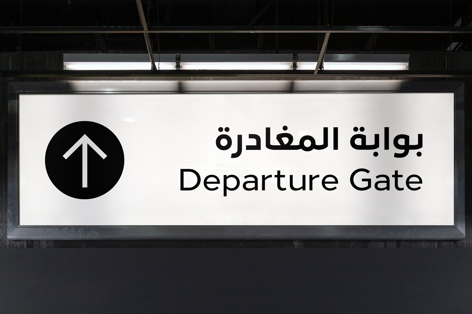
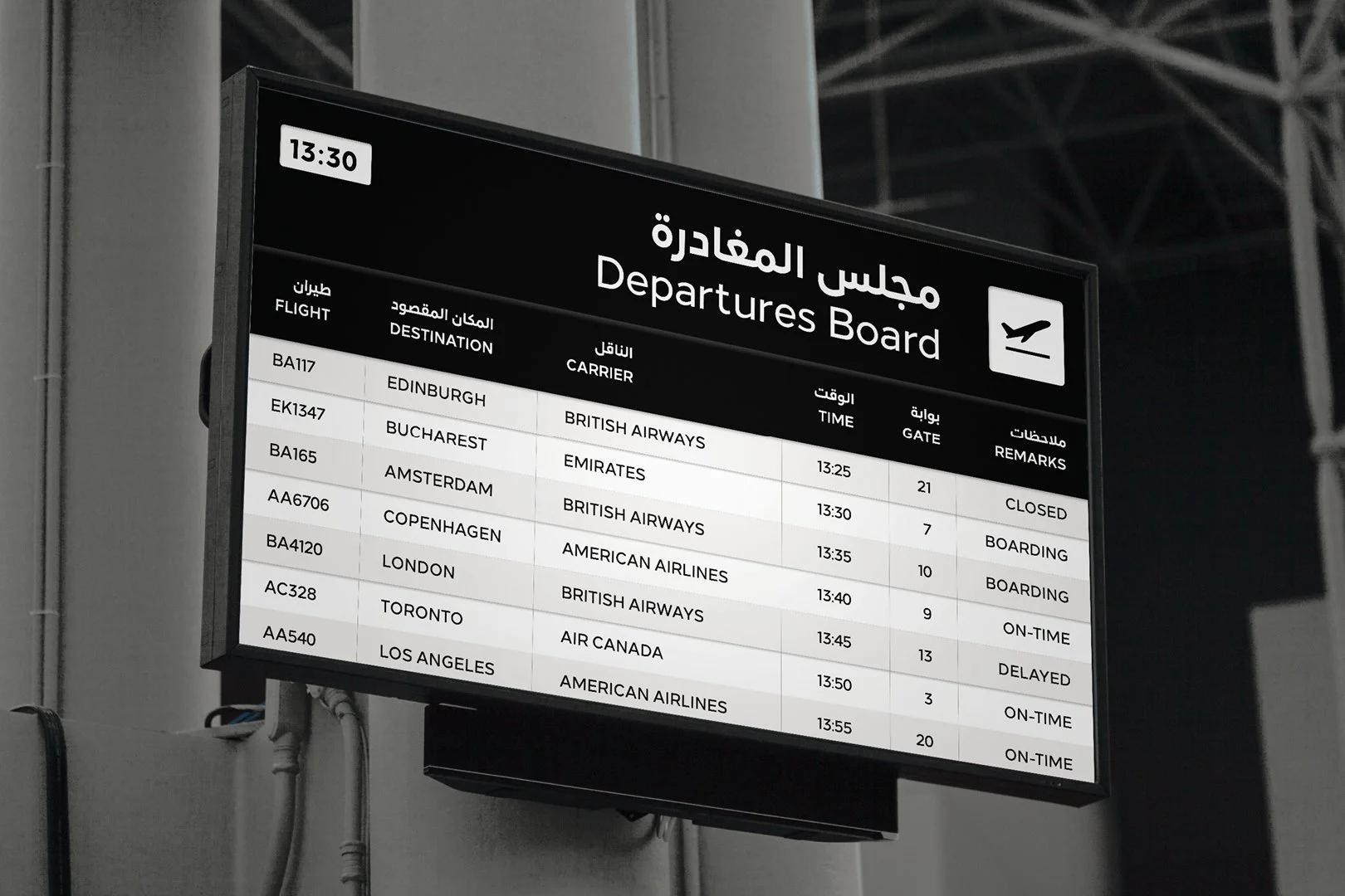
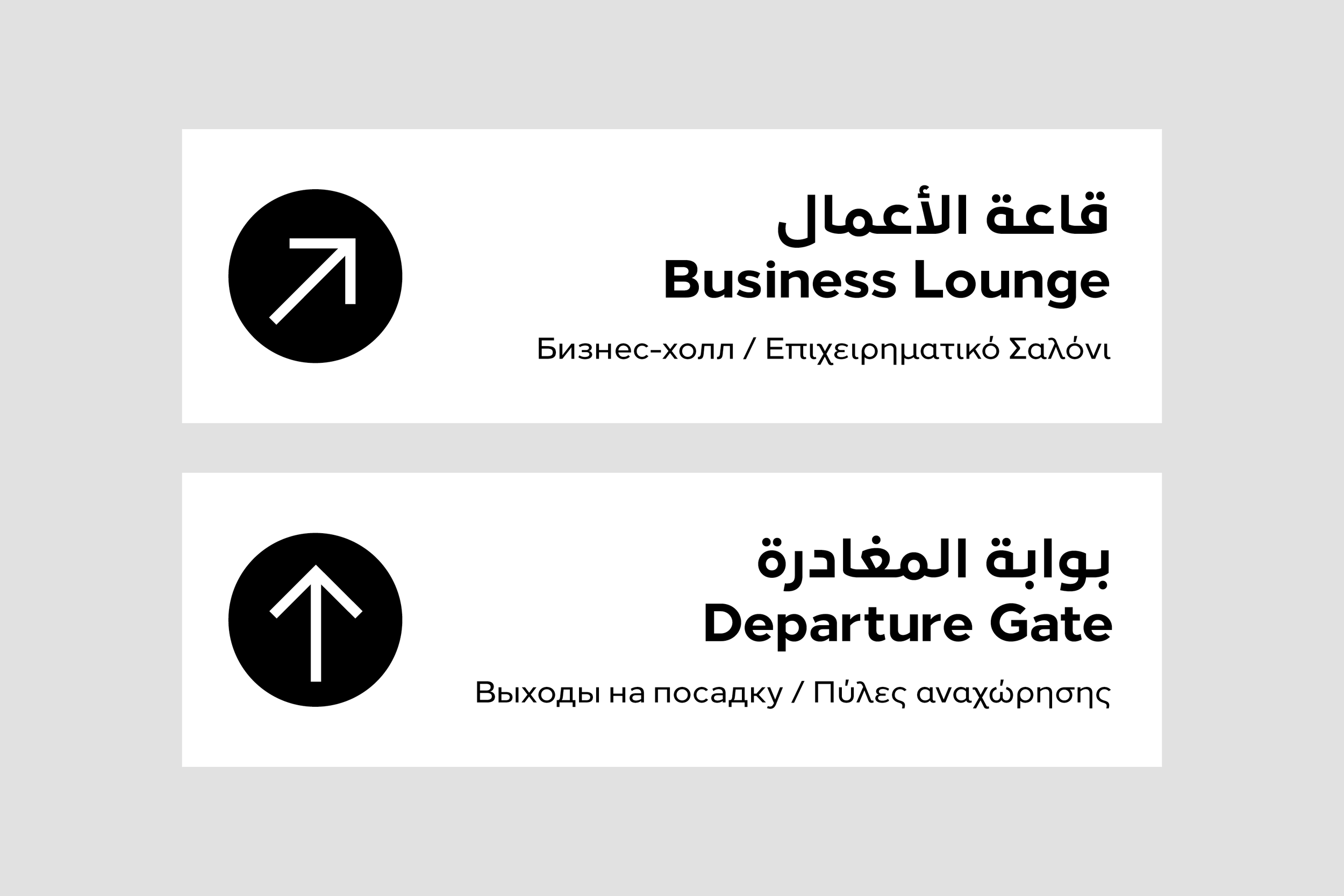
In 2024, The Northern Block created a bespoke Arabic typeface for Saudi Arabia’s national airline, Riyadh Air. Using Loew Next Arabic as a foundation, our team reworked diacritics and condensed proportions, setting a new standard for the brand’s typography.
The Next Series typefaces are already gathering international interest from emerging global airlines, destinations, and heritage brands. There is no doubt they will take off, and be rolled out as an experience.
“Guided by everything we’ve learned from our clients and collaborators, The Next Series takes The Northern Block to a new level. As a small type foundry, we rely on our trusted network of contributors, who each bring something unique to the table. That spirit of collaboration is what drives us forward.” — Donna Wearmouth, Brand and Creative Lead, The Northern Block.
Commercialism, technology and communication continue to present new opportunities in an era where there is pressure to diversify and adapt economically. These are typefaces with the grade and aptitude to support that imperative move to evolve before you dissolve. The Next Series is a major leap forward in the evolution of The Northern Block.
Will these typefaces still work when The Northern Block is long extinct? Definitely.
Our Core Team