When typefaces take on a life of their own—exploring the creative marriage between type designer and typographer.

Eund type family by The Northern Block — in use for Star Wars ‘Black Series’ merchandise.
Typefaces can lie in wait for years before they reach their full potential. Once released into the hands of a graphic designer or typographer, it’s all but impossible to dictate how they will be interpreted and used.
What happens when a typographer re-imagines a type designer’s work in such an artistic way that it creates a whole new form to the meaning of a typeface, often moving on from the original purpose intended by the type designer. We talk to our founder, Jonathan Hill, in a discussion surrounding the relationship between type designers and typographers.
Jonathan explains,
“It’s fascinating to see how the creative relationship between type designer and typographer works. Most type designers will create a typeface with a specific vision and purpose in mind; however, a typographer will more than likely interpret a typeface differently from how the type designer intended. This relationship opens a whole new opportunity for the type designer to revisit, reinvent and evolve that typeface to suit its true purpose.”
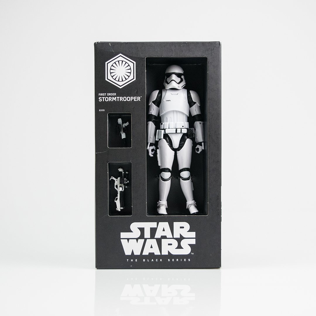
For Jonathan, this has happened on a few occasions. The Northern Block’s geometric sans-serif font Eund, born from the bleak modernism of Nordic Noir, originated as a typeface with an unchartered path. Inspired by the crime genre’s dark, understated visuals and clinical typography, Disney interpreted Eund as the perfect fit for the Star Wars ‘Black Series’ merchandise. Surprise is palpable when Jonathan reflects:
“Disney discovered Eund’s true purpose before I ever did. As type designers, we have no control over how typographers interpret our designs. They make the decision about styling, hierarchy and visual composition. Our skills are quite different in many ways from those of a typographer, but both are equally as important as each other, particularly in the role of evolving and adapting type for the future.”
However, sometimes type designers and typographers share the same vision for a typeface, as was the case of the stylish retro flare and calligraphic curved lettering of The Northern Block’s Moret, designed by Jamie Chang. Moret lends itself perfectly to capturing nostalgia present in 20th-century continental street signage and develops something compact, tenacious, and evocative, making it a typeface that is fit for modern display on posters, books, and websites. The Northern Block’s team were astounded to see Moret placed in the industry limelight when it featured on a Squarespace advert shown at the US Superbowl final in 2020. Jonathan says, “When I watched it, everything made total sense.”
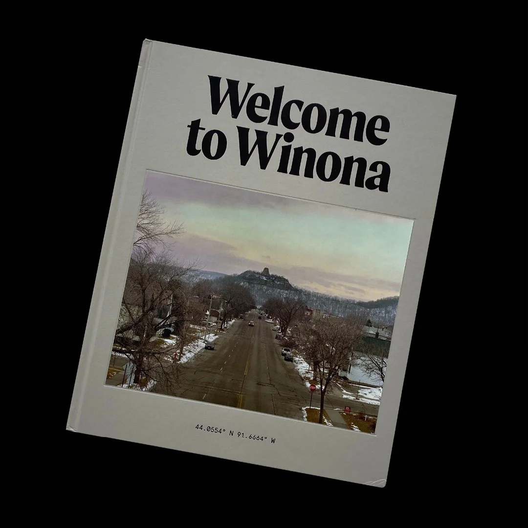
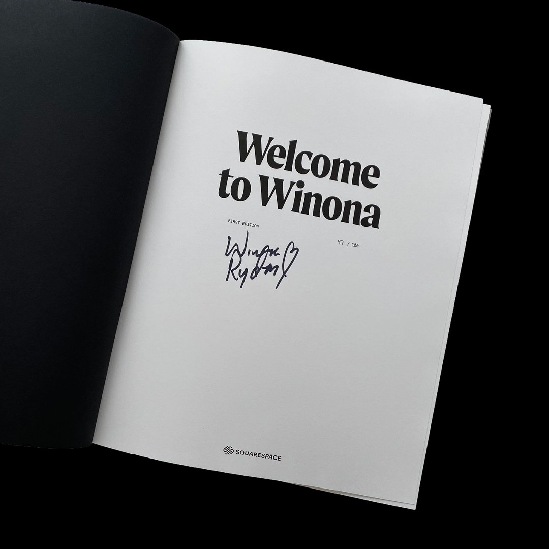
The advert featured Stranger Things actress Winona Ryder as she embarks on a journey of self-discovery to her namesake of Winona, Minnesota. In addition to the ‘Welcome to Winona’ campaign, Squarespace also created a supporting website and limited edition book.
“The best thing about The Northern Block’s feature in this Squarespace campaign was not so much about Moret’s commercial potential; it was the fact Moret had become effortlessly immersed within the exact world for which it was designed.”
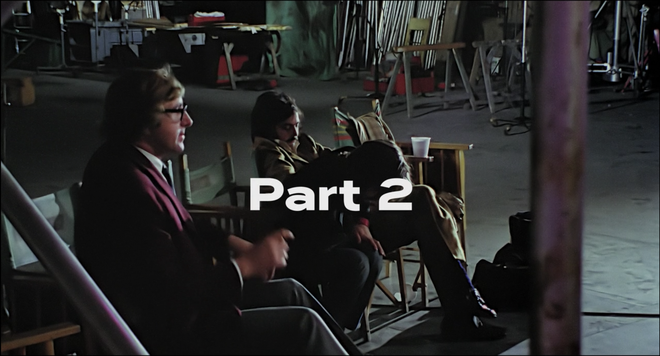
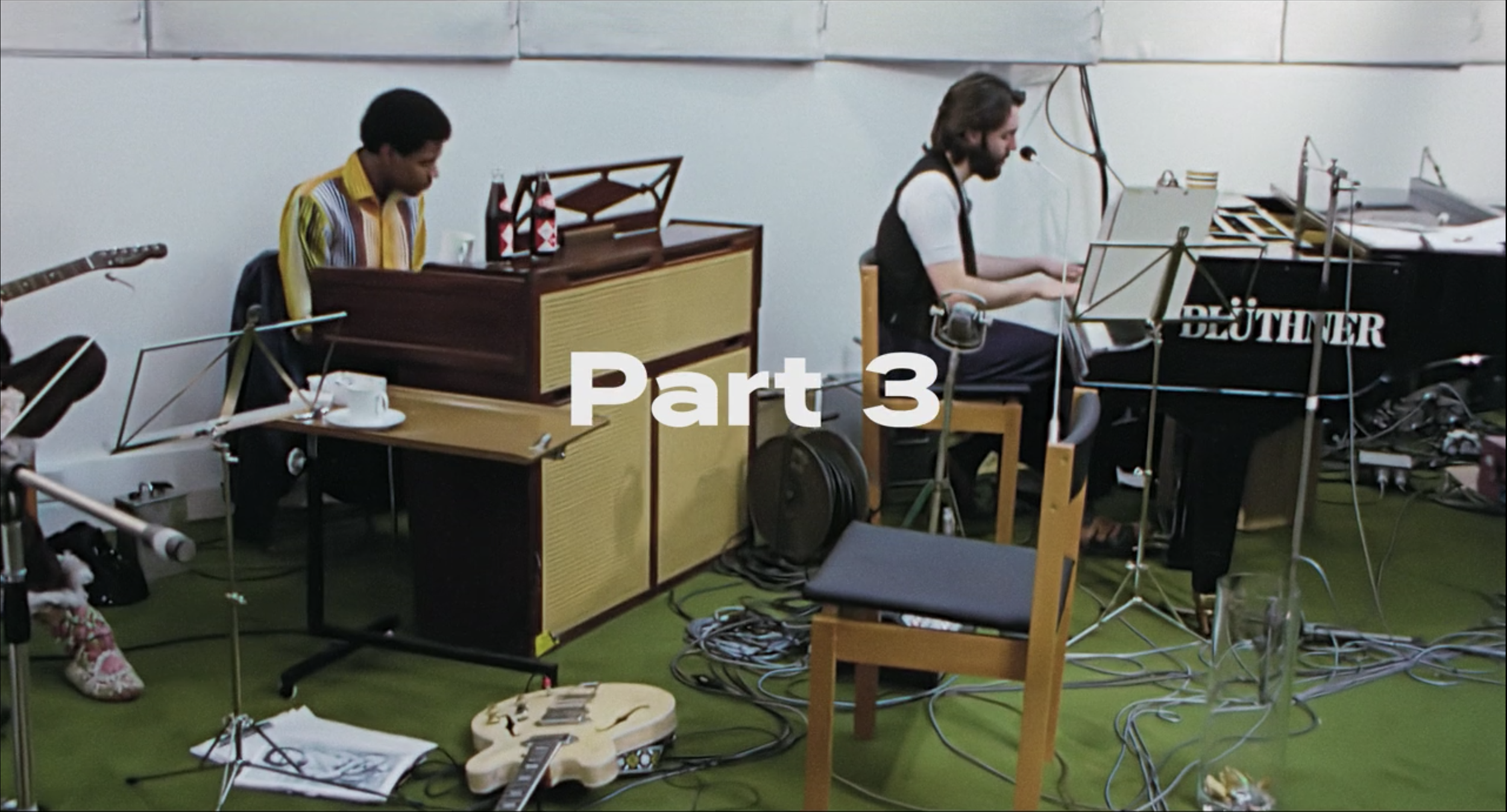
Another example lies with The Northern Block’s typeface Corbert Wide, featured in Oscar-winning filmmaker Peter Jackson’s three-part docuseries ‘The Beatles: Get Back’. Corbert is a regular, self-evident design that works well across various applications, making it ideal for the big screen. However, after seeing it displayed where Jonathan believed it belonged, this gave new reason to revisit Corbert’s design for reinvention, on the basis that a font is never truly finished; the industry is forever evolving, and so must the tools and fonts within it.

Corbert Wide by The Northern Block — used in the titles for ‘The Beatles: Get Back’ docuseries.
Julian Hills, the title designer behind ‘The Beatles: Get Back’ explained what he loved most about Corbert Wide, which holds a very German seriousness and simplicity in its uppercase while adding the charm and playfulness of Edward Johnston and Eric Gill (1920s Englishness) in its lowercase. “The numerals are beautiful and a perfect balance of 1969 and 2021, which was exactly what we were looking to achieve in this piece of work.”
For Julian, Corbert Wide had offered in equal parts—timelessness, confidence, familiarity and wit.
“It is a typeface one cannot imagine ever not being part of the visual landscape. It makes its case firmly while easing the conversation here and there with some very jocular lowercase glyphs and with one of the most elegant set of numerals I have ever seen. The Northern Block do phenomenal work which every typographer, designer and creative should see. Their work clearly shows all the love and obsession it takes to make brilliant type.”
The technical and artistic challenges of the work we do as type designers brings rewards. Rules govern type design, and we enjoy mastering the discipline and technical challenges; it’s like finding your way in the dark. It is hugely satisfying to see how a typographer interprets and turns our technical drawing skills into a more emotional and apparent piece of art.
After many years of The Northern Block collaborating with creatives and typographers, we appreciate that when you bring the skills and creative eye of a type designer and typographer together, true success can be achieved. Whether this is through the typeface being used for its intended purpose or for us to evolve it to better fit its new purpose. With this mindset, we always consider how we can give typographers more creative freedom with our fonts, and as such, we have recently upgraded our library and added variable support to ten fonts, including our last two releases, Angusta and Leida.