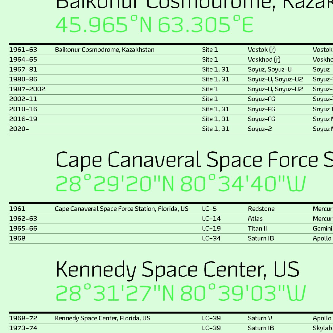
Nostalgia and art history drive Jonathan Hill’s latest experimental typeface—Hubsch.
Hubsch, a new experimental typeface coming soon from The Northern Block, goes against the grain and follows its own rules. Built on the principles of modernist fonts that are fit for use with new technology, Hubsch pushes experimental boundaries with an organic hand-drawn aesthetic.
Inspired by type designer Jonathan Hill’s urge to experiment with unexploited techniques, along with a rich melting pot of ideas from historical references and fascination with artists who draw with marker pens, Hubsch neither fits into the traditional blackletter style nor graffiti bracket. It’s created its own classification, and here we delve into the mind behind the lines to discover what Hubsch is.
How did you first start experimenting with Hubsch?
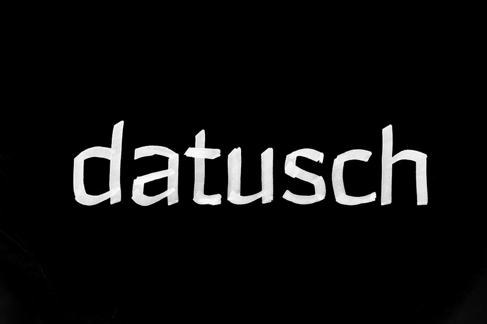
The original idea for Hubsch started with my memory of watching Tony Hart (from the children’s BBC show ‘Take Hart’) drawing with a chisel tip marker. The smell and sound of the marker pen moving across the surface took me back to my childhood, and just as Hart embraced the pen’s movement and accepted its destination, this was the same for Hubsch.
I regard this experimental typeface as a nod to the evolution of the marker pen that took on new guises through street art and graffiti, particularly the work of Keith Haring, and then later with the rise of Banksy. The marks made from a chisel tip marker are unapologetic. There is nowhere to hide; you have to accept its path and embrace the mistakes.
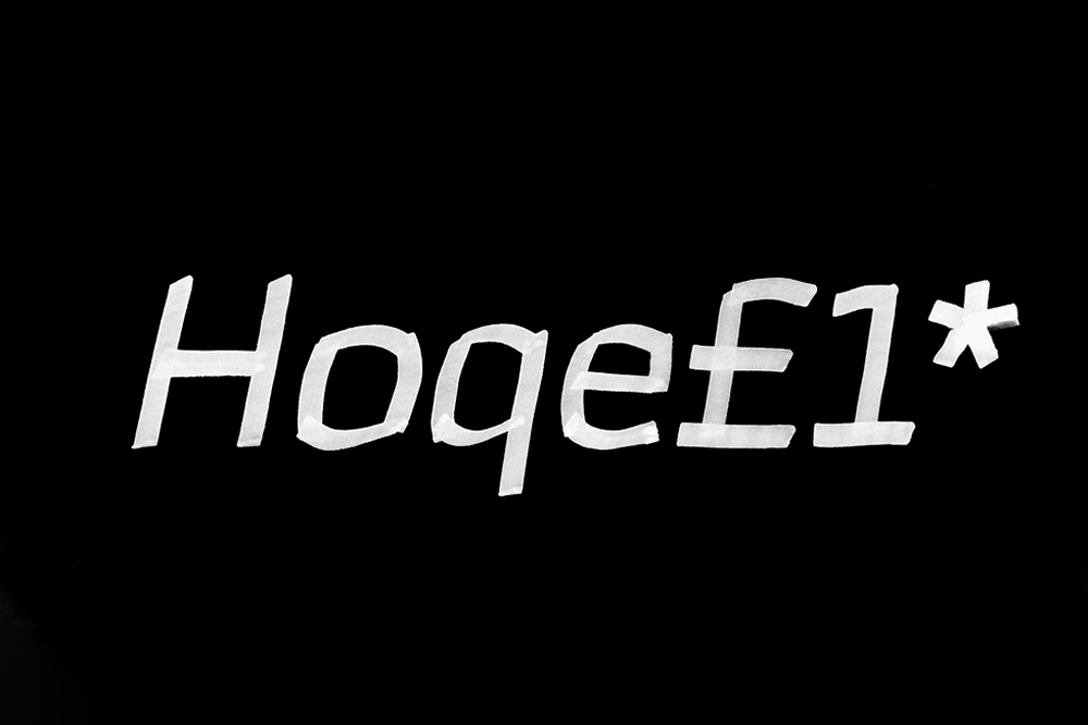
Jonathan’s initial sketches for Hubsch’s heavier weight
How would you classify Hubsch?
Hubsch isn’t purely about nostalgia. It refers to joy and bringing the fundamentals of handwriting to the current typeface market and introduces this style to new markets. Whilst Hubsch is experimental, it has an underlying construction based on simple optical rules.
It merges bold, unapologetic marks of the pen with digital precision to create a balance that grounds the letters to the grid. Neither hand-drawn nor digital components dominate; they occupy the same space as piano keys.
Hubsch, for one thing, is not Blackletter. It follows its own set of rules, but these rules have logic, organised with absolute values to make the aesthetic utterly modern and fit for purpose. On a small scale, Hubsch is a reading pleasure, yet on a large scale, it shouts out in a visually pleasing way.
It will be easy to judge and pigeonhole Hubsch into one specific category or classification, but it’s more complicated for us as type designers. The simplification of its letter forms from free-flowing marker nib to square angles makes this typeface a mixed-use category, where it sits just as comfortably at home in a video-game interface as it would in concrete in a piece of public architecture.
How do you make a typeface work for mixed formats?
Making a typeface work in large and small formats and for use in different contexts is one thing, but starting from experimental origins is a challenge on a different level.
Hubsch’s detail is experimental with a higher artistic value. Still, it considers how a chisel tip pen works on paper to make the contrasting lines of thick and thin that are the essential ingredient for readable text. It’s a classic case of knowing how much to bend the rules.
What makes Hubsch distinctive?
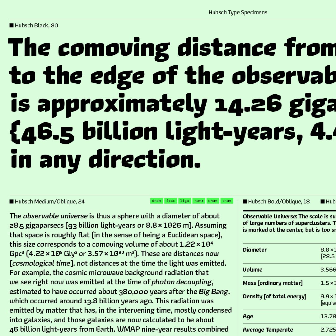
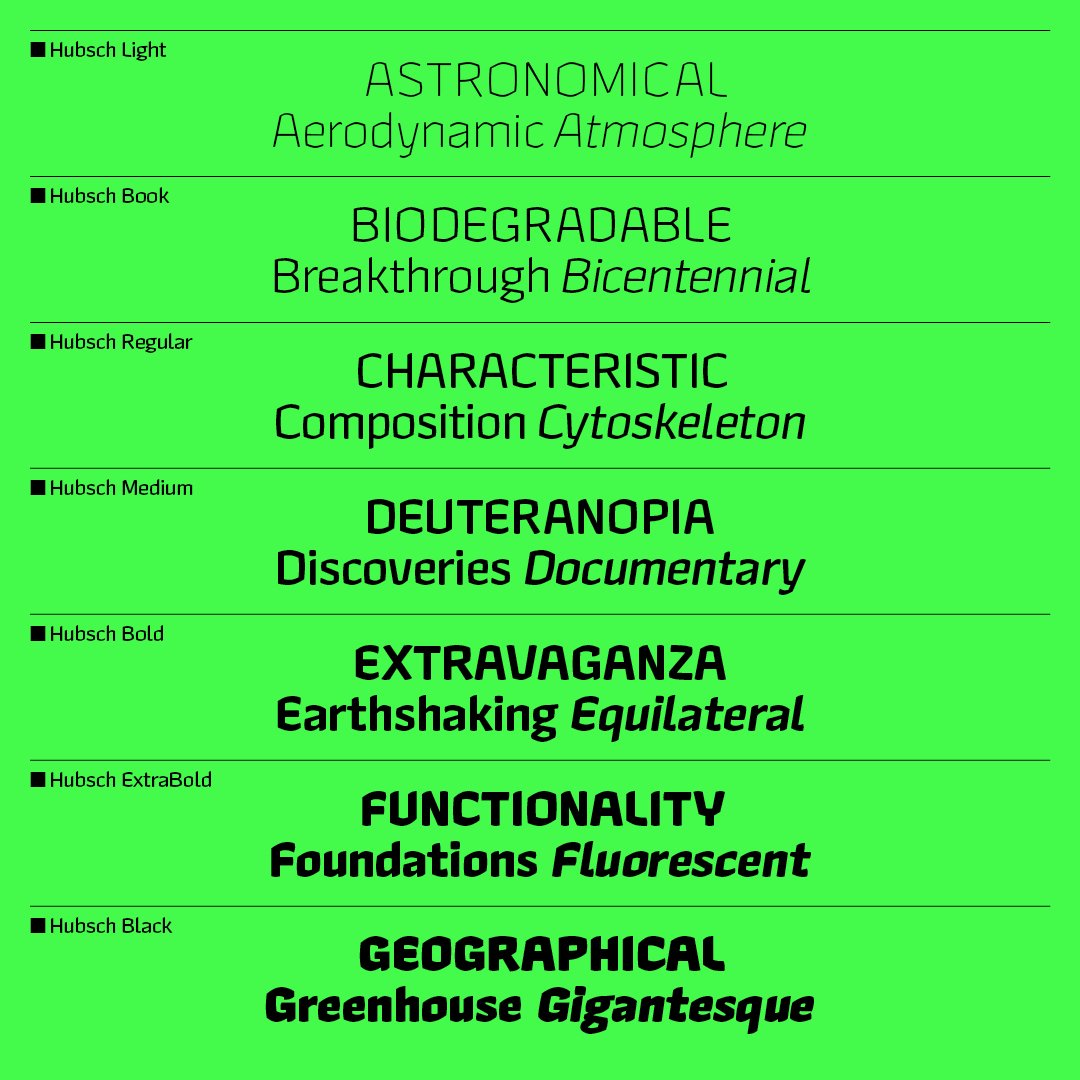
Hubsch covers a lot of bases. You can zoom into the detail at the extremes in light and heavy. While the book and regular are text workhorses, where long lines of text are essential. It’s such an unusual design that it’s hard to say if it is a star of the show. The lighter weights are technical and suit a modern application, while the heavy weights are brutal and make a visual statement.
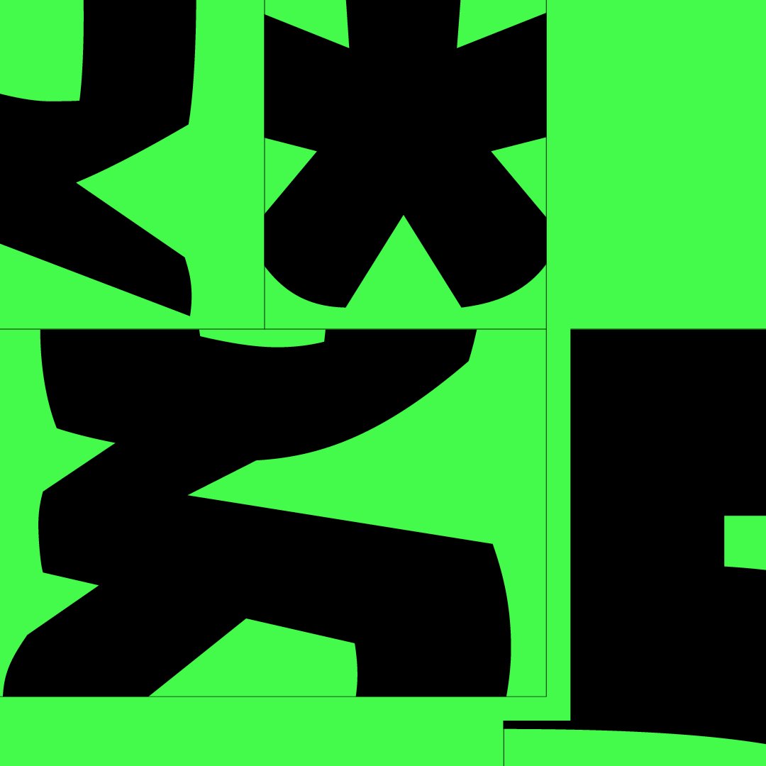
Hubsch is a square gridlike typeface with subtle convex vertical and horizontal stems. The letter shapes follow the path of a chisel-tipped maker pen, so the terminals are soft cushions that look as though the pen’s ink has been absorbed into the paper. Ascenders and descenders have moderate values to help with linespace settings in small body text.
It finds its mark of distinction in the balance between the marker pen’s handwritten forms and the constraints of a pixel grid. Convex curves flow in a subtle direction but are not allowed to become utterly rounded, so the aesthetic feels both technical and hand-crafted in the same measure.
Where did the name Hubsch come from?
The name comes from a 14th-century printmaker called Martin Schongauer, whose nickname was “Hubsch”. His contemporaries nicknamed him Hübsch Martin (“pretty Martin”). The name is a nod to how well the letters visually fit together with their straight and curved sides.
It’s been quite a creative flurry recently at The Northern Block. Does Hubsch offer greater freedom to push outside the box into experimental territory that you’ve not entered for a while?
A typeface design project is like a signature. No two projects for me are alike. You start a new project on the back of the last one. You take all that you learnt and apply it to the next one.
The previous project was Leida, a serif, so I could only carry so much forward into Hubsch, but I knew Hubsch would have a different approach, so the vision was clear from the start. The only thing in doubt was my ability to draw by hand. Once I was satisfied with the drawings, I could make Hubsch with greater clarity.
Hubsch includes seven weights with obliques and over 600 characters per style. Language support covers Western, Southern, and Central Europe.


