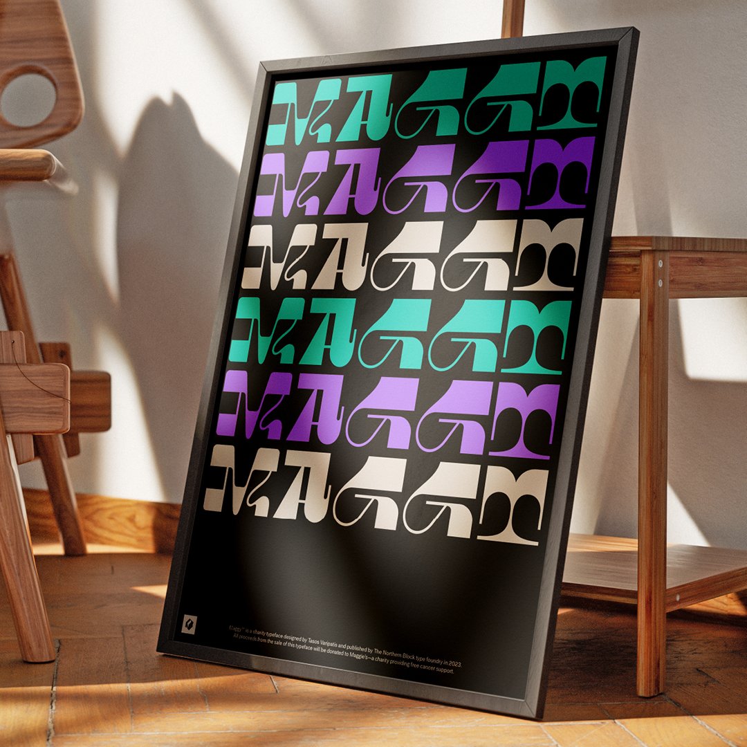
From Maggy to Maggie’s. The Northern Block designs an eclectic typeface encouraging creatives to type for a cause.

Brave, boundary-pushing and beyond imagination regarding typographic design, our senior type designer Tasos Varipatis has produced the latest experimental typeface for The Northern Block.
Maggy is a versatile and captivating display typeface with an underlying cause for good. Sparked by our participation in the renowned ‘36 Days of Type’ challenge, we chose to develop Maggy to aid the cancer charity Maggie’s. The Northern Block has committed to donating all proceeds from the sale of the Maggy typeface to support this incredibly good cause, thanks to the initiative of our Head of Brand, Donna Wearmouth.
Type For A Cause
What started as an exciting 36-day challenge has flourished into a remarkable typeface designed with purpose. This typeface is just as much about letters as it is about making a difference.
Maggy represents a fusion of creativity and compassion. Beyond its spirited identity, it gains depth from its association with the charitable cause Maggie’s, infusing the font with purpose and significance. Maggy is more than a collection of characters; it’s a tribute to the unconventional, an arena for experimental design, and a testament to using typography for positive impact.

How Maggy’s eclectic fusion of influences challenge traditional typography rules
The essence of freedom in design that was encouraged through our participation in the ‘36 Days of Type’ challenge spearheaded Tasos to push typographic norms with this experimental typeface.
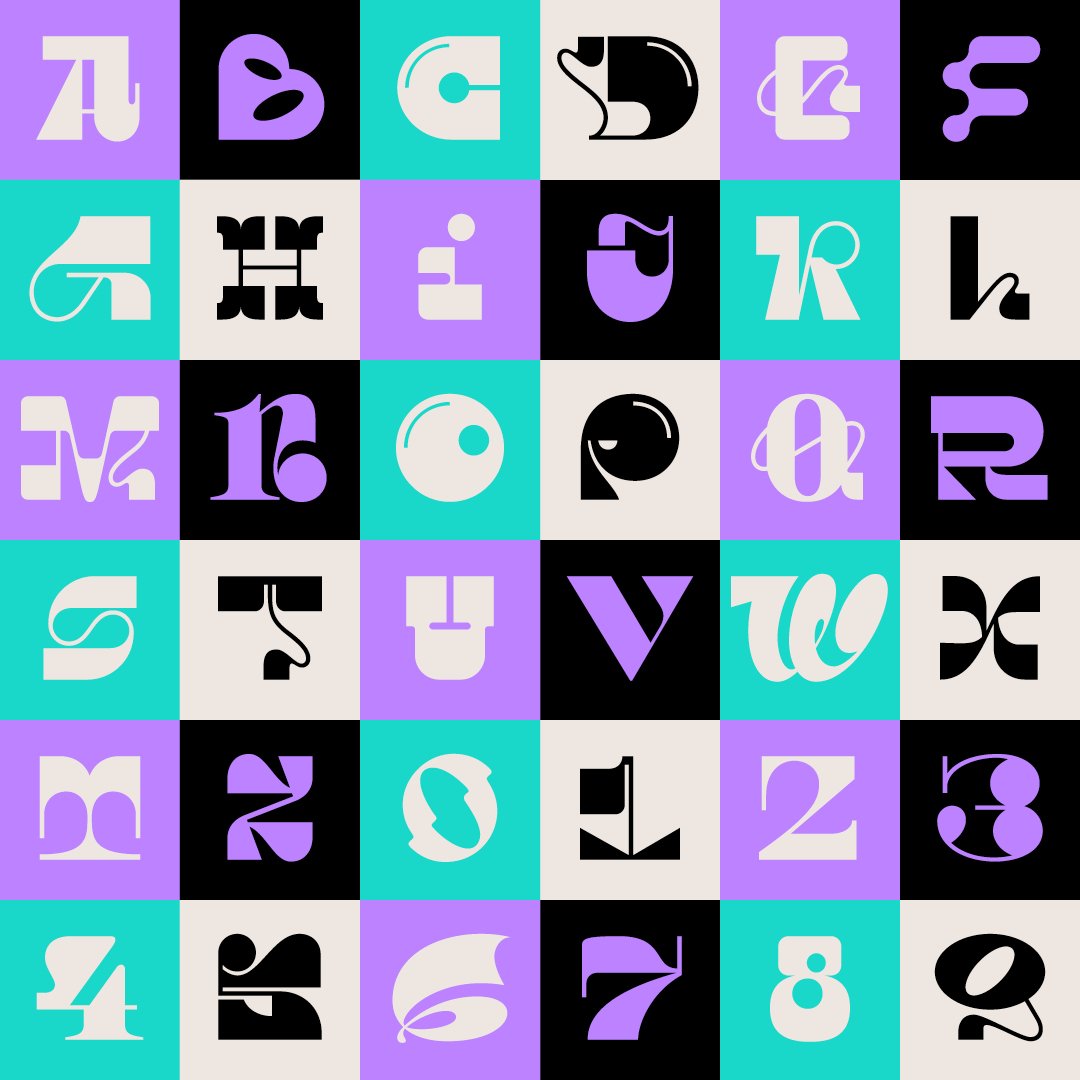
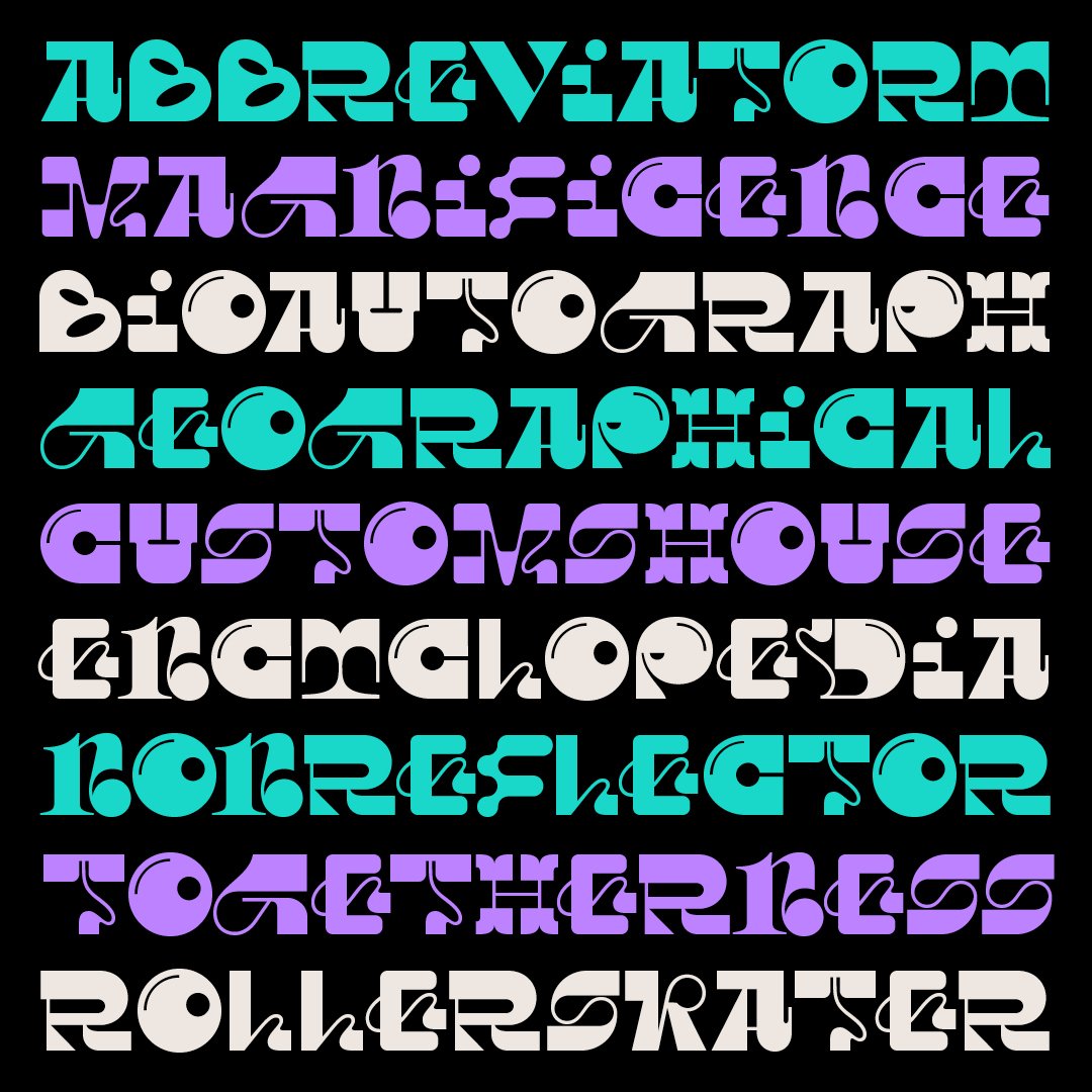
Maggy defies traditional typography rules by seamlessly transitioning between different styles while maintaining a harmonious balance. Influenced by three main themes—Dadaism, Deconstructivist architecture, and Wabi-Sabi—Maggy’s design is a bold exploration of the boundaries of type design.
The font’s individuality comes from its distinctive edge, whilst the playful manipulation of traditional forms is an example of the ever-evolving landscape of type design, which challenges conventional typography and blurs boundaries.
Dadaism’s Spirit of Rebellion
Maggy allows for an eclectic fusion of historical and contemporary influences without boundaries and embraces a spirit reminiscent of Dadaism, a 20th-century artistic movement that championed irrationality and spontaneity. This connection to Dadaism can be seen in Maggy’s inclination towards nonconformity and embracing design elements that go against convention.
Deconstructivist Architecture’s Disruption
Maggy’s lively spirit explores new frontiers with boldness in the way it joyfully manipulates traditional forms echoed in the tenets of Deconstructivist architecture—which sought to disassemble and reconstruct established architectural conventions—Maggy deconstructs the formal typographic framework that results in an experimental yet captivating visual narrative.
Wabi-Sabi’s Embrace of Imperfection
Maggy finds resonance in the artistic philosophy of ‘Wabi-Sabi,’ an ancient Japanese worldview with a perspective centred on accepting imperfection and transience. Aesthetically, Maggy’s minimalism style values simplicity, humility and transience to find harmony and serenity in its uncomplicated, unassuming and mysterious design.

Tasos explains,
“During Maggy’s conceptualisation, I considered this typeface as a canvas, where letters move between different styles and forms, yet come together in a beautiful dance. I ventured into uncharted territory with the design of Maggy by intentionally eschewing the conventional need for cohesive relationships between its characters. The philosophy of ‘Wabi-Sabi’ is indirectly behind Maggy’s fragmented yet harmonious typographic design.”
Maggy for Maggie’s
Through the Maggy typeface, we aim to harness the power of typography to drive change and make a meaningful impact on Maggie’s Centres. Maggie’s mission is to provide free cancer support and information in centres across the UK and online, and one which lies very close to the hearts of the team at The Northern Block.
The charitable idea was born from the experiences of our Head of Brand, Donna Wearmouth, who shares,
“Design can be a powerful tool. Using our creative skills to support Maggie’s and the families that use their centres is a real honour.
Having experienced Maggie’s Newcastle during my dad’s treatment, it really opened my eyes to how important breakout spaces are for families dealing with cancer. It was a welcoming and calm environment, away from the sights and sounds of a hospital ward. We could be a typical family having a cuppa and a catch-up.
Working alongside Tasos has been a pleasure. He has elevated this typeface to another level, and through great teamwork, we’ve produced an outstanding piece of charitable work!”
The Northern Block founder, Jonathan Hill, adds,
“Collaboration is deeply rooted within our culture; we believe in bringing people together for a sense of purpose and to give greater meaning to a typeface. In this instance, Maggy has been designed to serve a greater good, and we hope the power of typography can help support Maggie’s, one letter at a time.”
Maggy’s Distinguishing Features
Experimental Design
Maggy’s character set challenges traditional typographic norms with its unique and dynamic design.
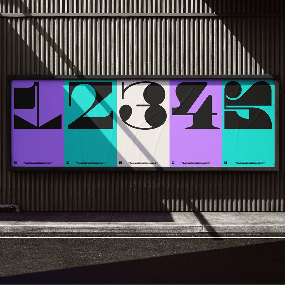
Stylistic Alternates
Six stylistic sets contribute to the font’s versatility, allowing users to explore different visual expressions.
Extended Language Support
Maggy supports a wide range of languages across Western, Southern, and Central Europe, making it a practical choice for diverse projects.
Maggy is available to purchase exclusively from our website, with all proceeds going to Maggie’s in Newcastle upon Tyne.
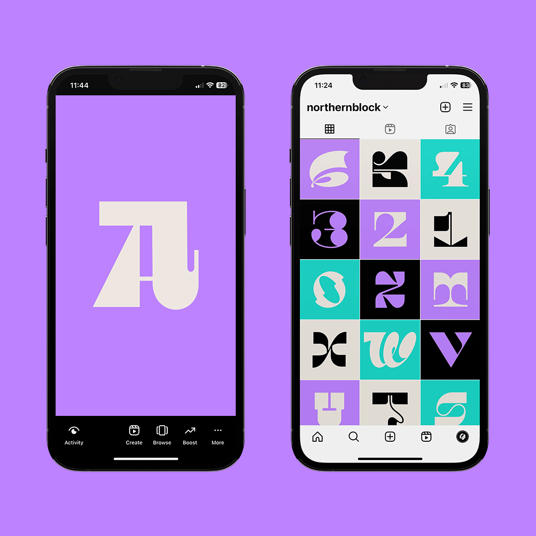
Follow the story on Instagram: @northernblock #typeforacause