 Image 1 of 3

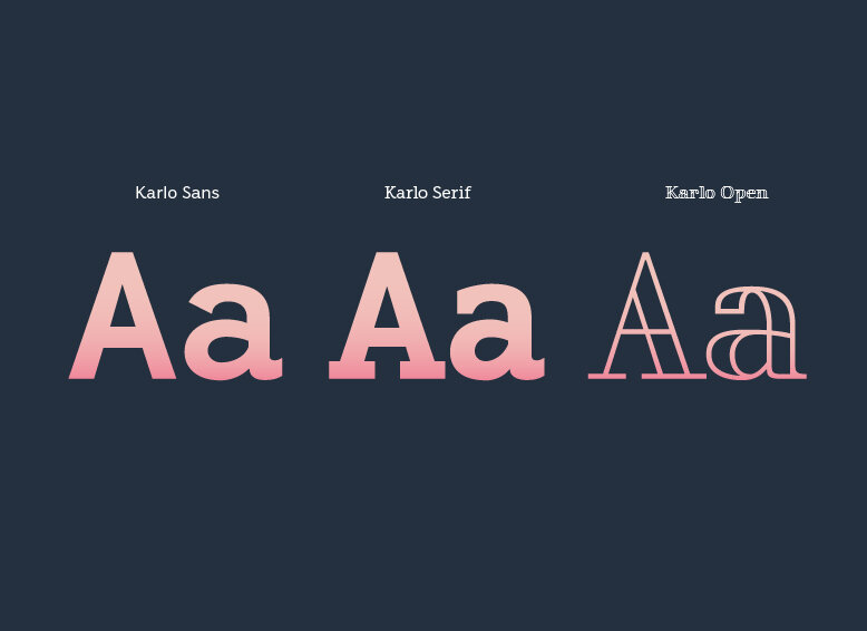 Image 2 of 3

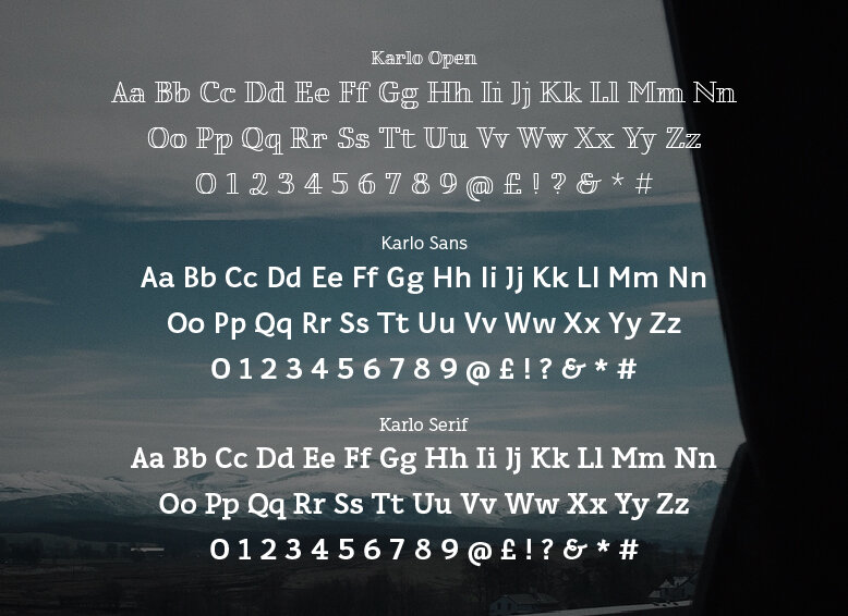 Image 3 of 3


Karlo
Complete Family (22 Fonts)
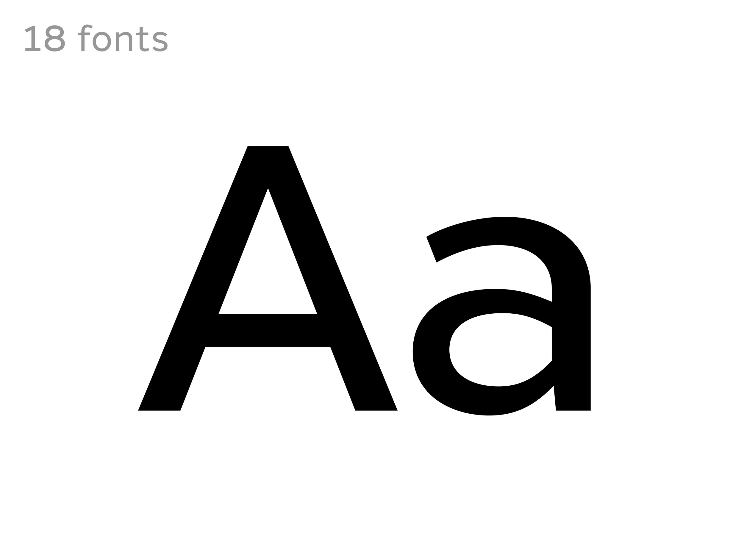
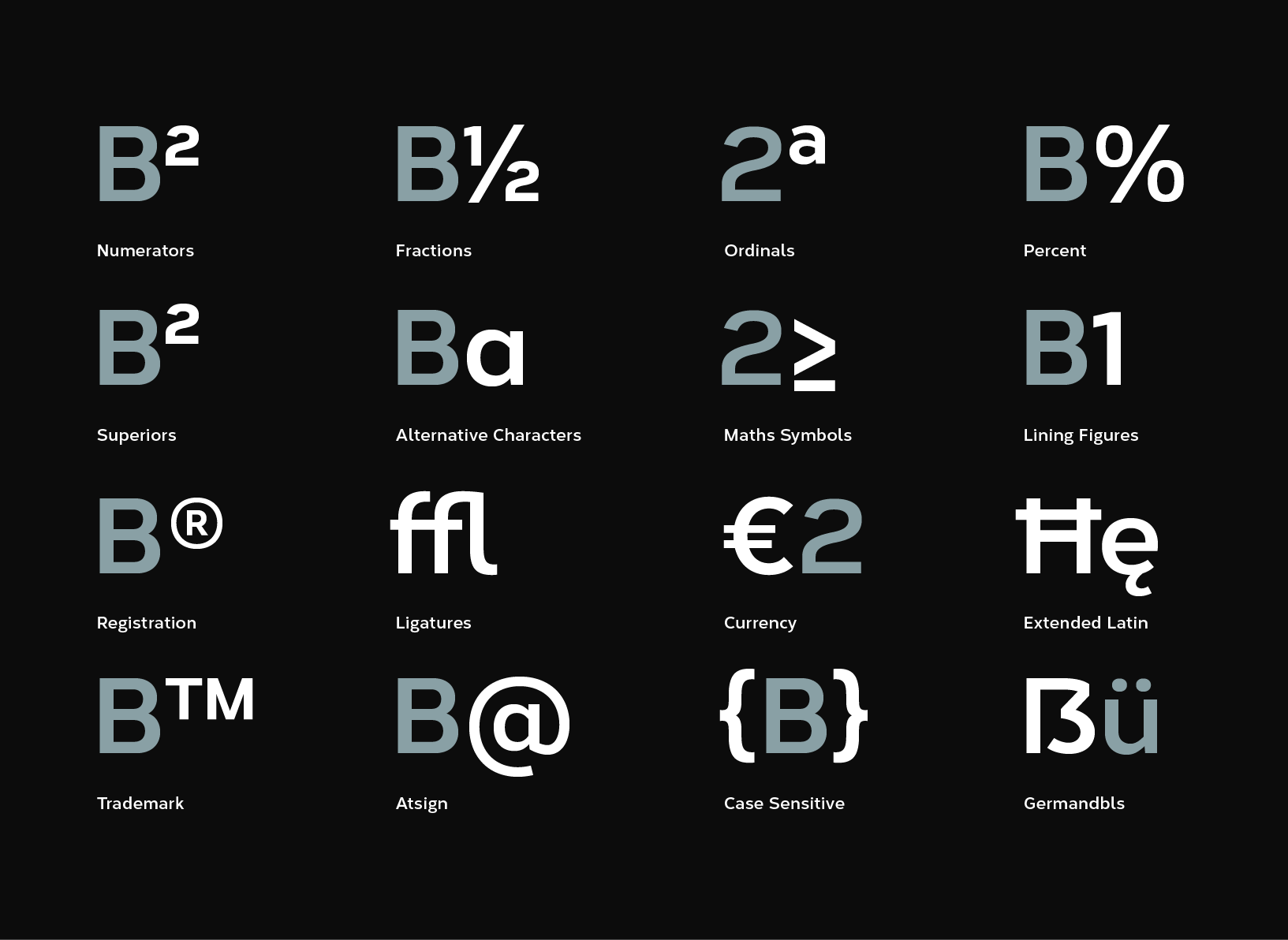
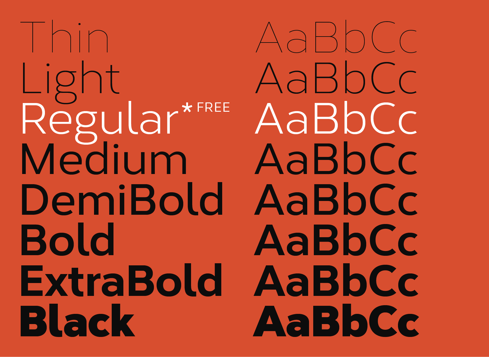
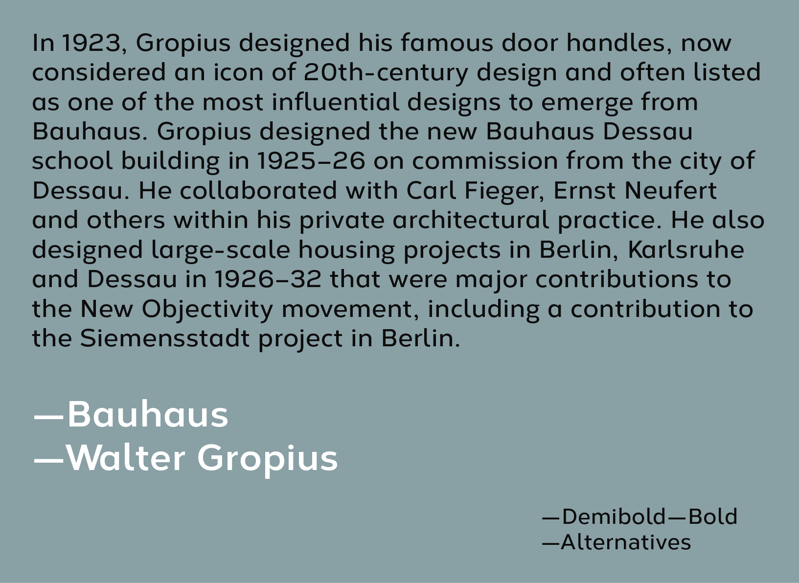
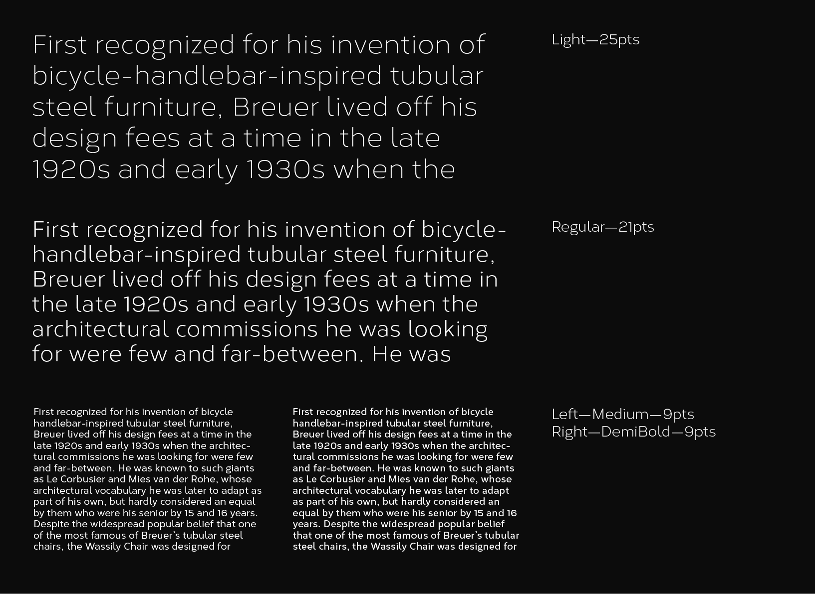
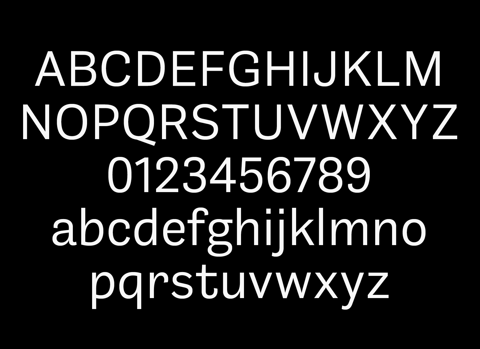
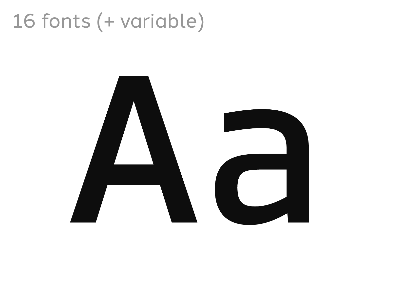
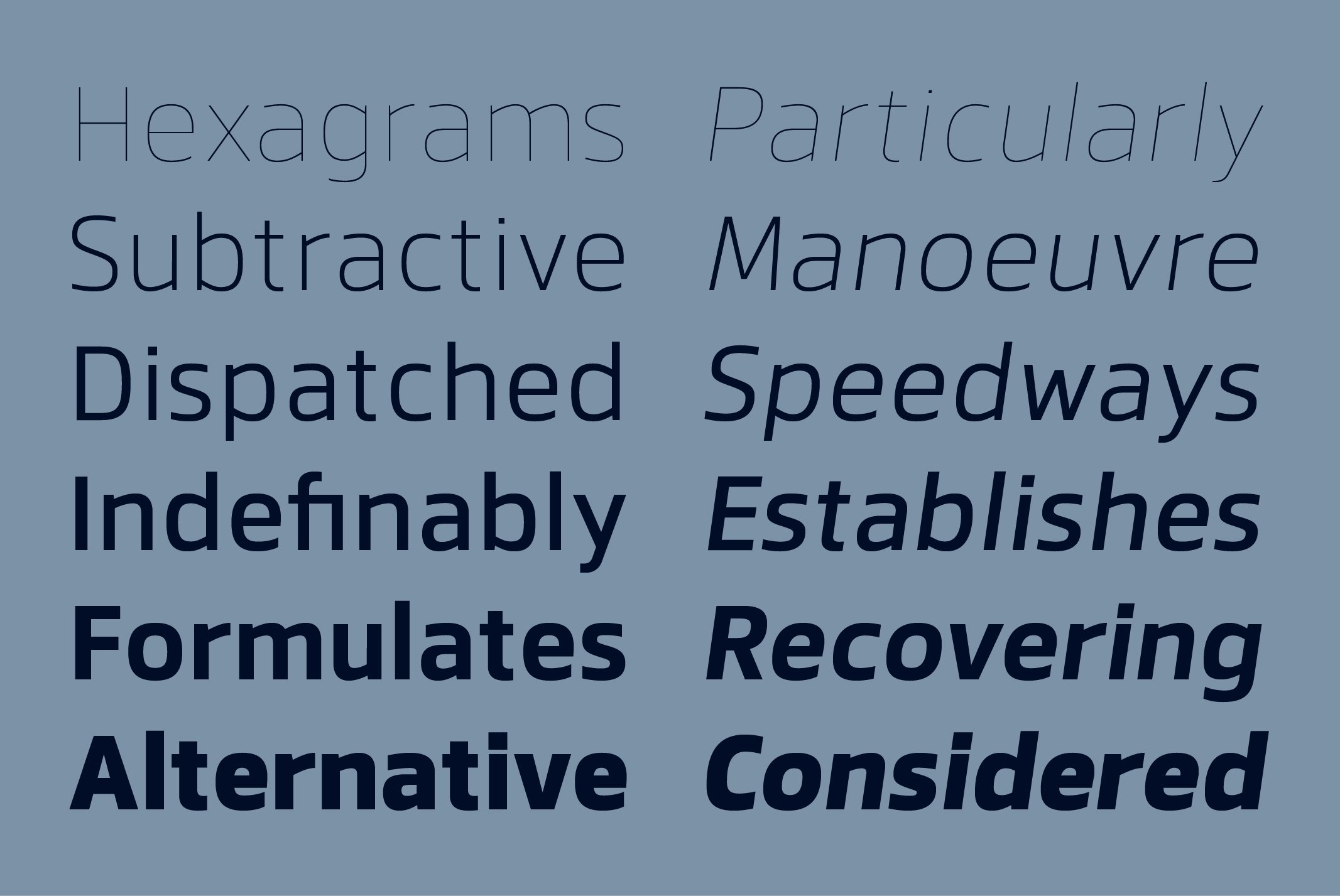
Karlo is a superfamily of several branches originating in the same lightweight skeleton. Inspired by the writings of calligrapher Edward Johnston, the family moves on in two directions in the heavier weights. Johnston demonstrated that the broad nib pen can produce different writing styles. Following this, one heavyweight has a humanistic low stroke contrast (KarloSerifBold and KarloSansBold), and another has a high stroke contrast of vertical axis with references to the 19th century jobbing typefaces (KarloOpen). The latter is inspired by Johnston’s demonstration of the broad nib pen, where he suggested fastening two pencils together. With each pencil representing an edge of the pen, it becomes more evident how the pen works in writing. The friendly, informal look makes KarloSans and KarloSerif usable for both running text and display sizes. KarloOpen, on the other hand, is solely designed for display purposes showing few words at a time.
PDF Specimen | Download Test Fonts | Buy Single Weights
