Complete Family (2 Fonts)
Desktop License - Up to 5 users
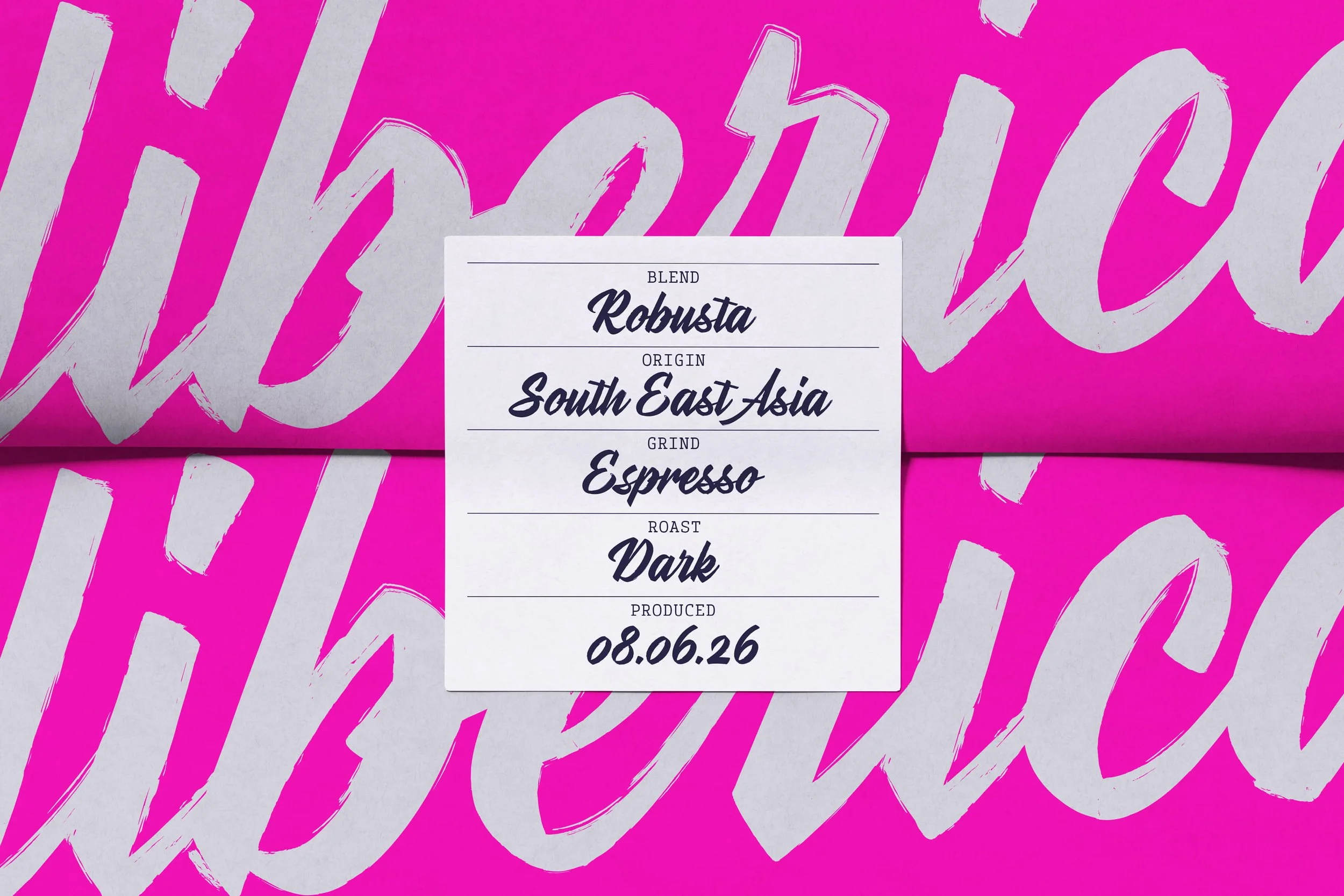
Stylenoir Script is a contemporary display script inspired by hand-painted signage, brush lettering, and urban graffiti culture. Rather than drawing on nostalgia, it reflects the ongoing evolution of lettering by combining traditional craftsmanship with the vibrant energy of street graffiti.
The type family includes two versions: Smooth and Rough. Smooth offers a refined, polished look with clean lines while maintaining expressive movement and handwritten rhythm. Rough emphasises the raw quality of brush lettering through textured edges, subtle imperfections, and organic irregularities, recreating the appearance of lettering made with a dry brush or marker. Together, these styles allow the typeface to adapt to both contemporary layouts and more tactile, character-driven applications.
Spacing, letter connections, and visual rhythm were carefully considered to ensure a strong visual impact. Contextual and stylistic alternates, discretionary ligatures, and alternate connecting forms allow the script to capture the organic unpredictability of real brush lettering while maintaining consistency across modern print and digital environments.
PDF Specimen | Download Test Fonts | Single Weights
Complete Family (2 Fonts)
Desktop License - Up to 5 users
Stylenoir Script is a contemporary display script inspired by hand-painted signage, brush lettering, and urban graffiti culture. Rather than drawing on nostalgia, it reflects the ongoing evolution of lettering by combining traditional craftsmanship with the vibrant energy of street graffiti.
The type family includes two versions: Smooth and Rough. Smooth offers a refined, polished look with clean lines while maintaining expressive movement and handwritten rhythm. Rough emphasises the raw quality of brush lettering through textured edges, subtle imperfections, and organic irregularities, recreating the appearance of lettering made with a dry brush or marker. Together, these styles allow the typeface to adapt to both contemporary layouts and more tactile, character-driven applications.
Spacing, letter connections, and visual rhythm were carefully considered to ensure a strong visual impact. Contextual and stylistic alternates, discretionary ligatures, and alternate connecting forms allow the script to capture the organic unpredictability of real brush lettering while maintaining consistency across modern print and digital environments.
PDF Specimen | Download Test Fonts | Single Weights
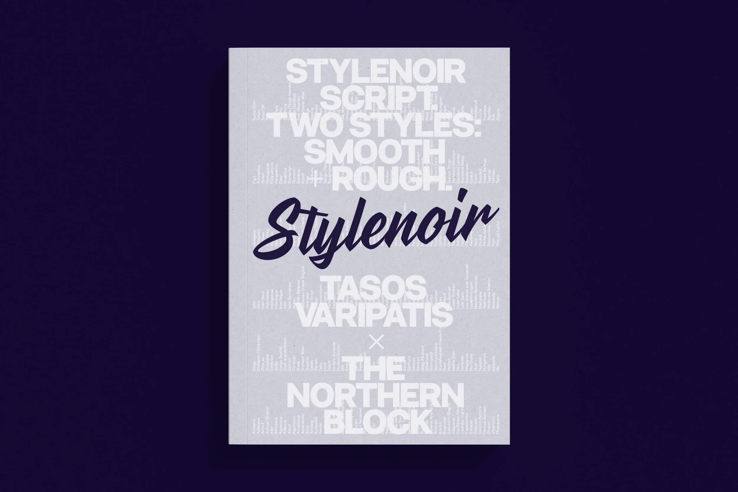 Image 1 of 8
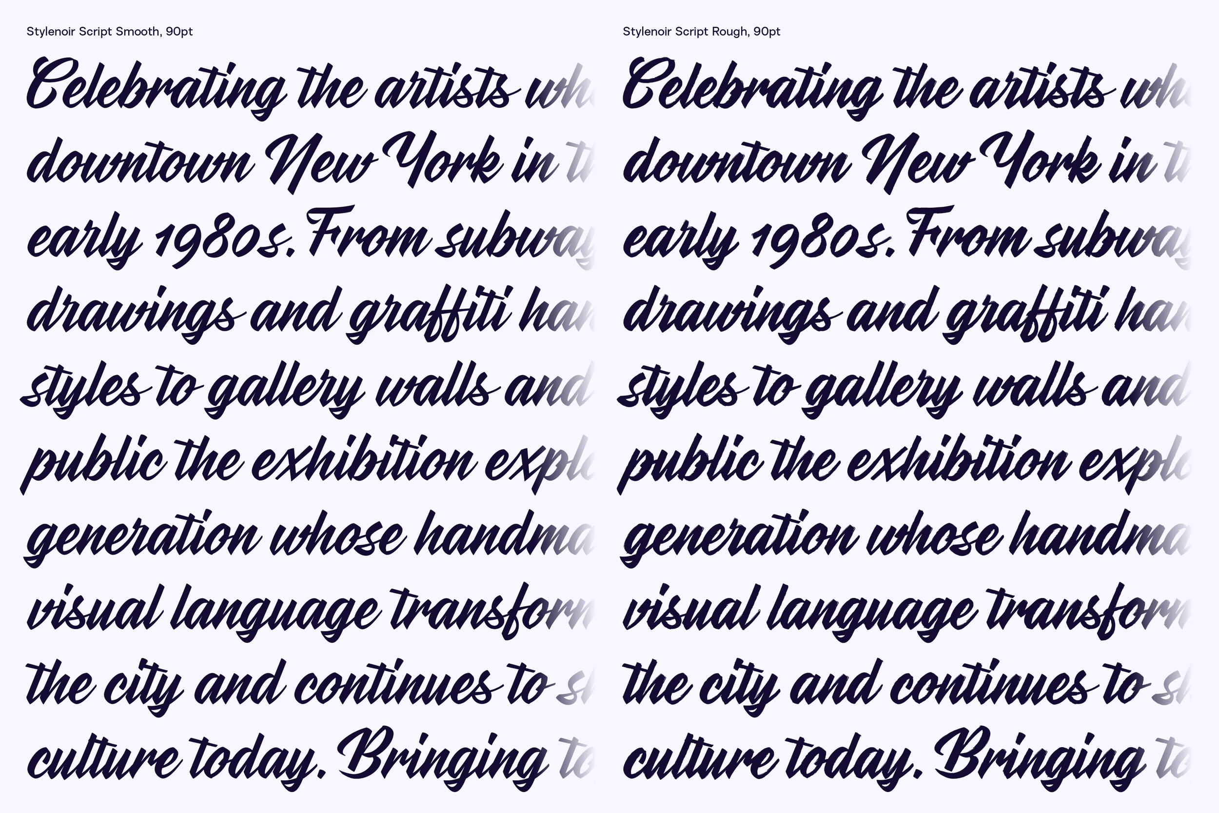 Image 2 of 8
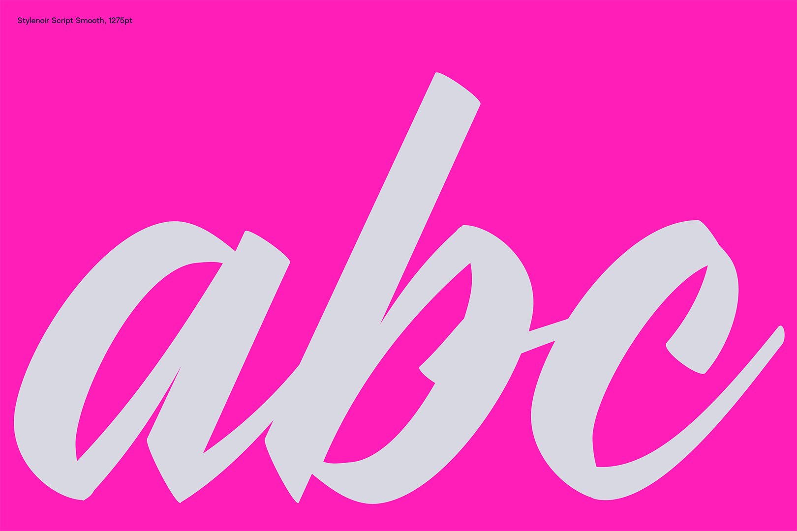 Image 3 of 8
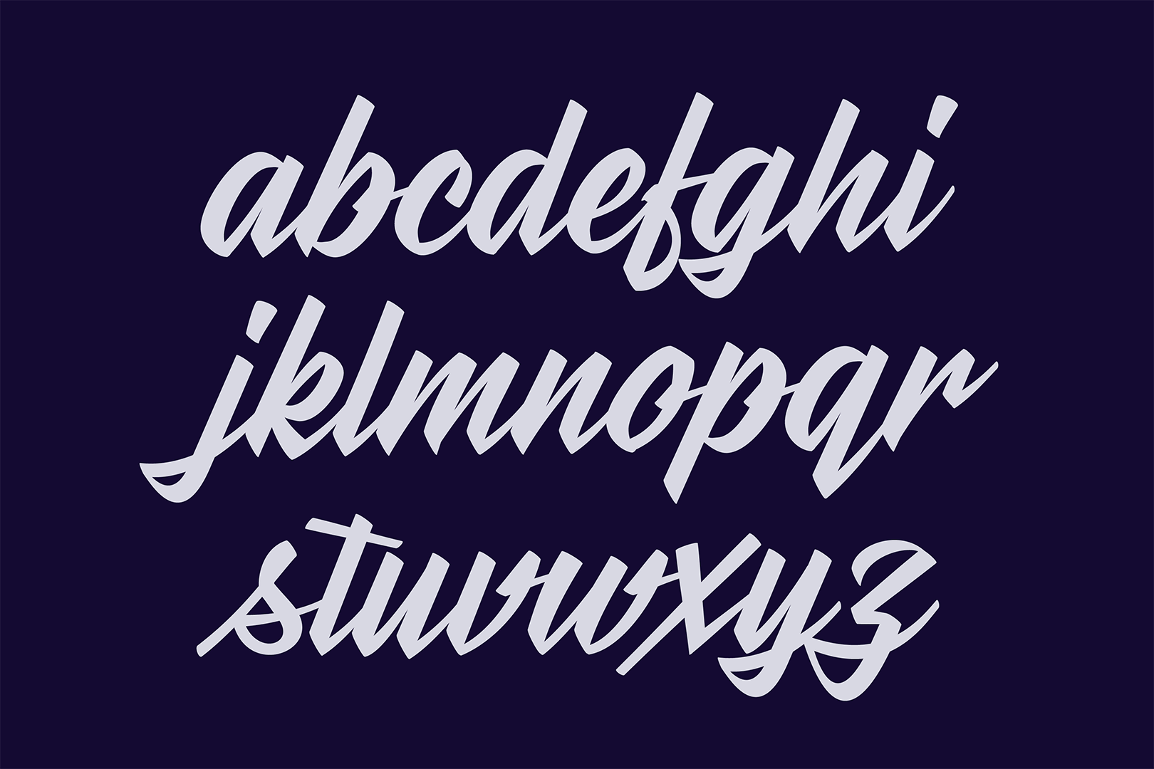 Image 4 of 8
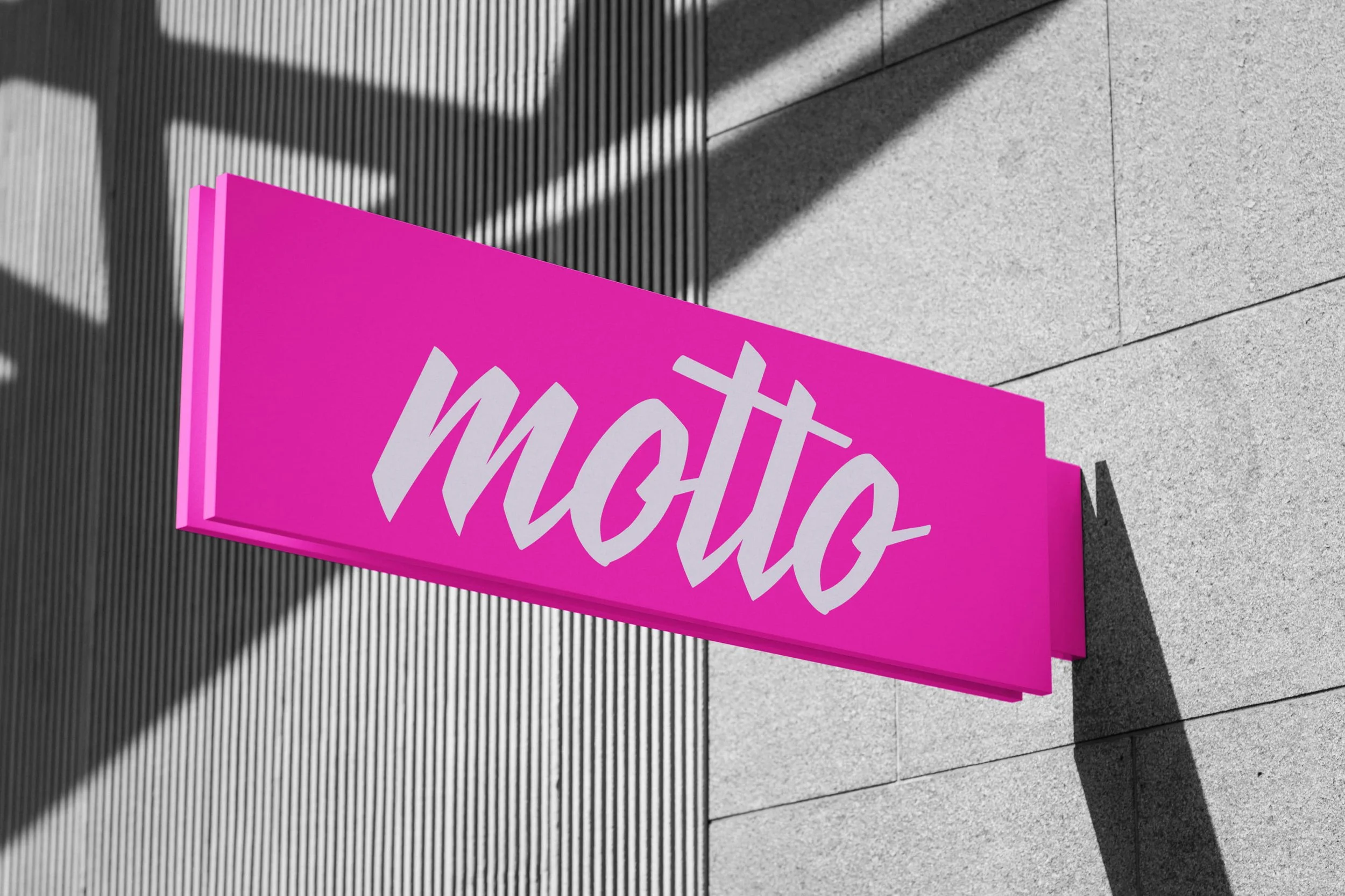 Image 5 of 8
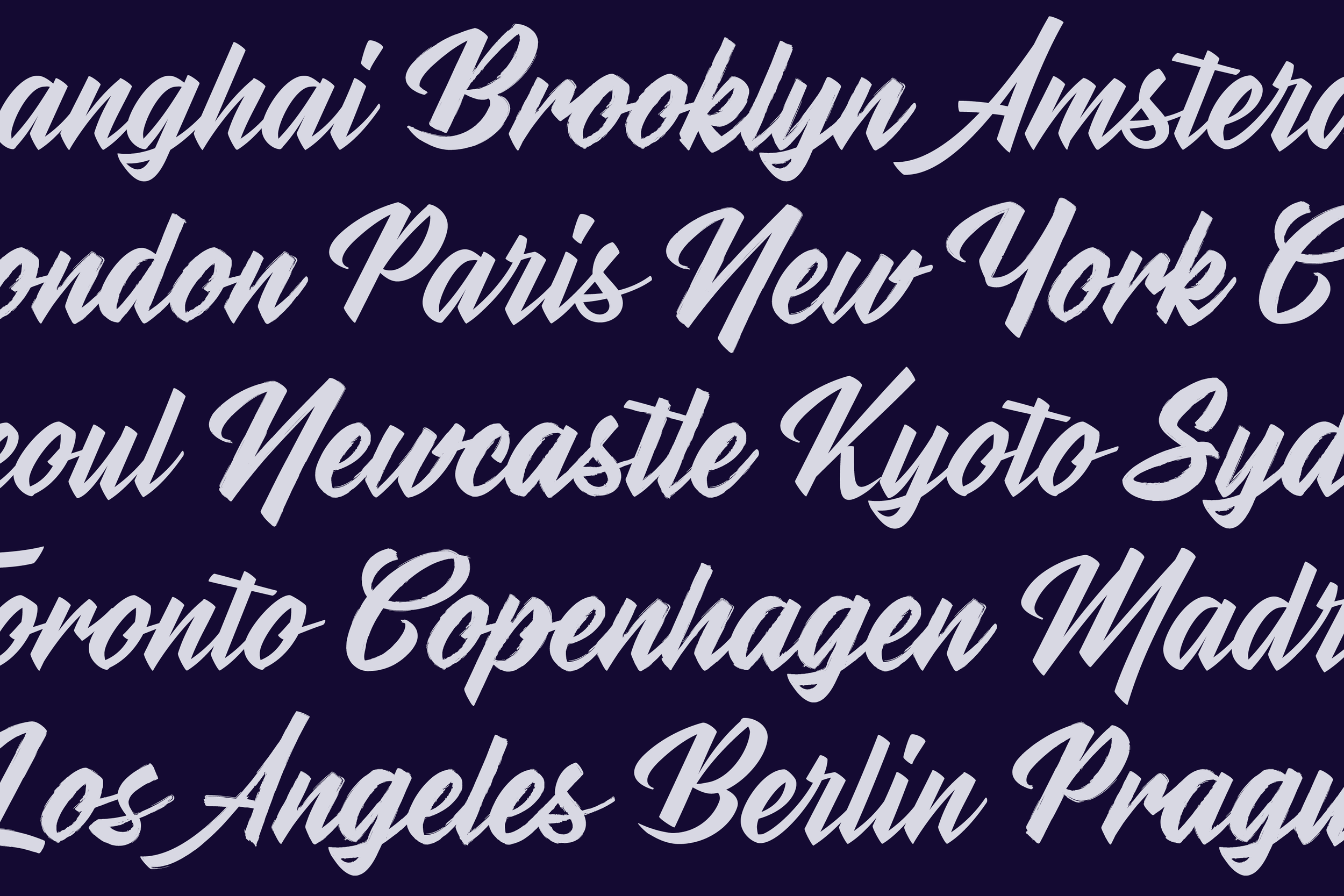 Image 6 of 8
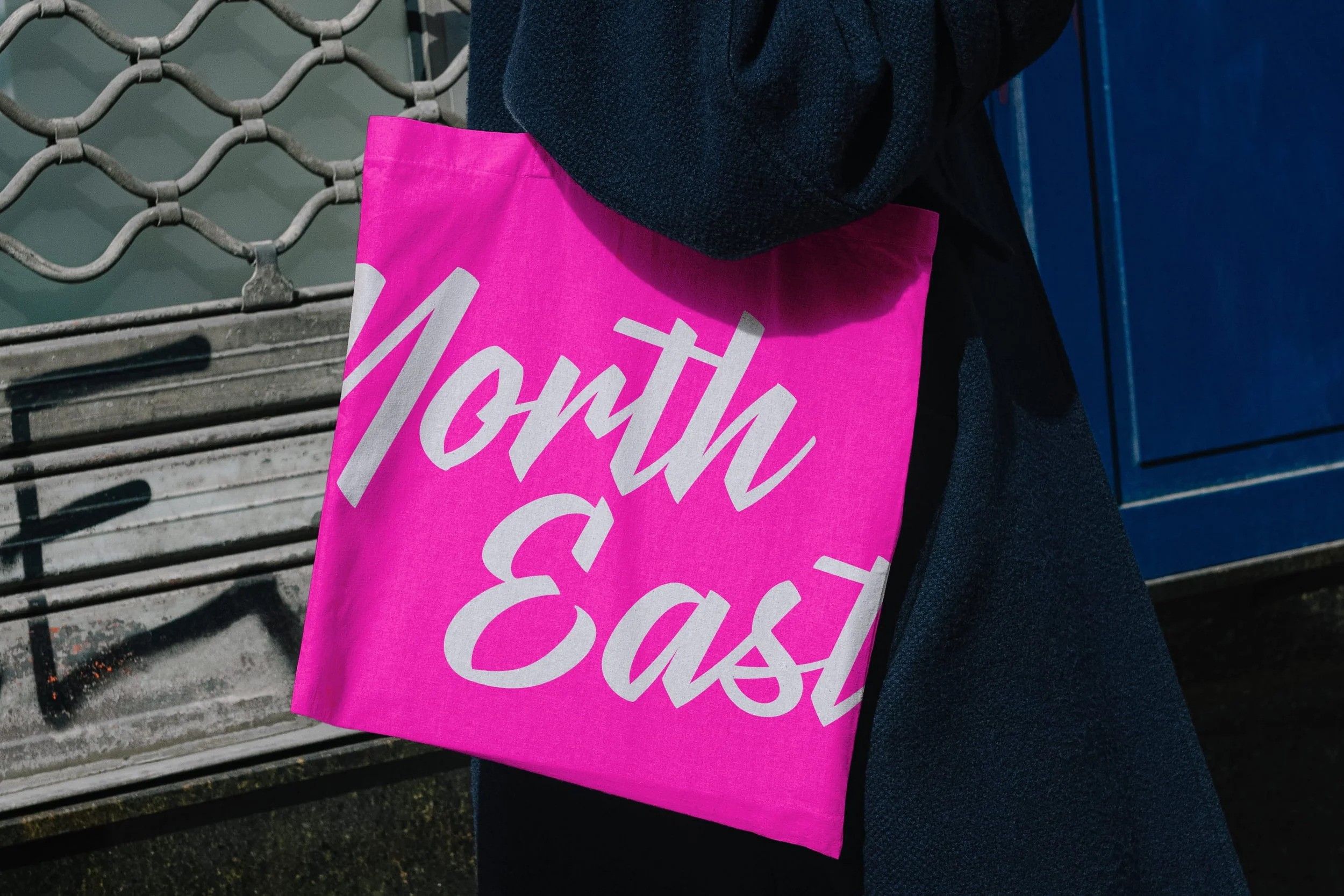 Image 7 of 8
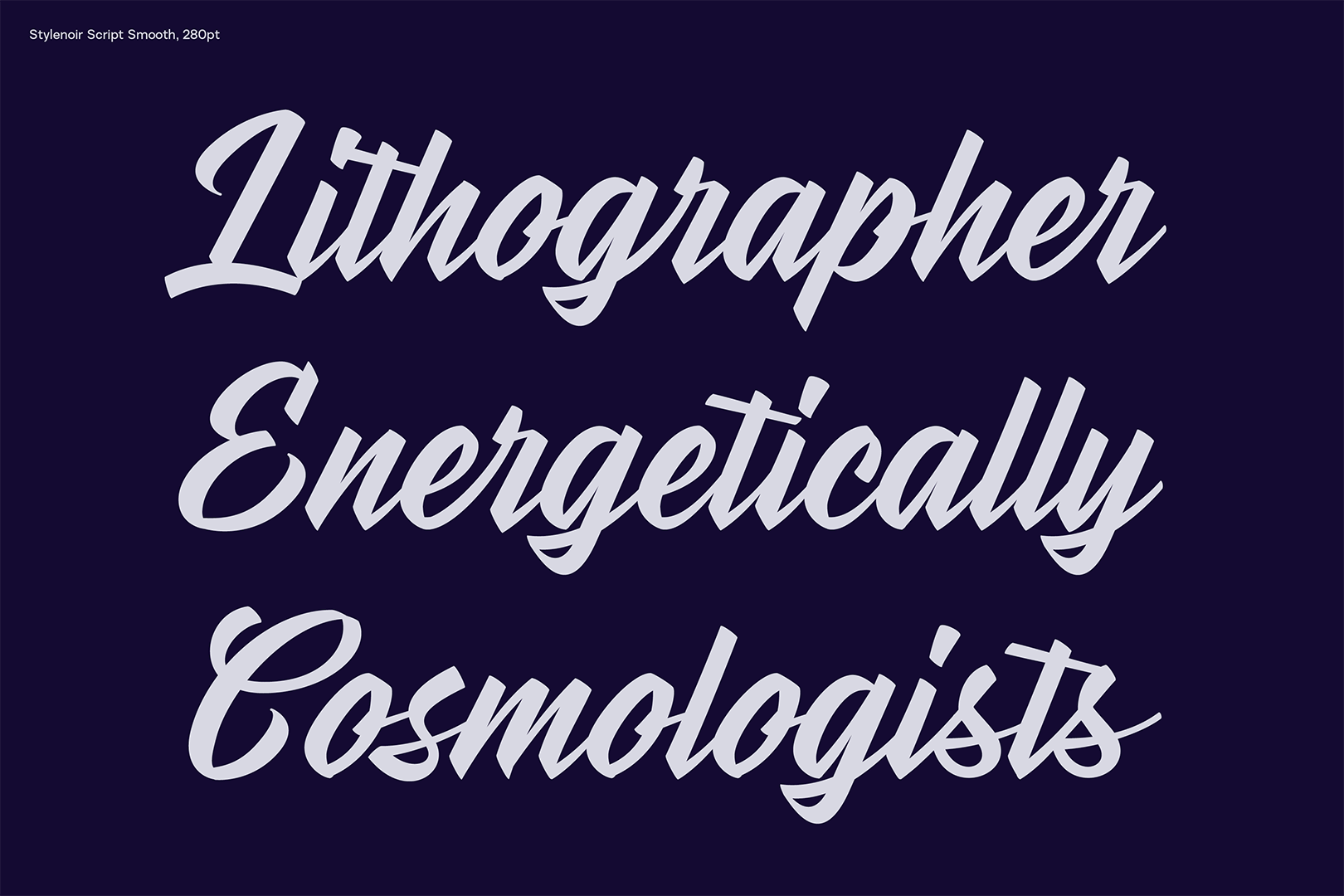 Image 8 of 8