Bro-king new ground
Case study of the typeface Brokman which put family matters firsts.
As one of The Northern Block’s first geometric typefaces, Brokman was initially handcrafted only at the extremes, in light and heavy-weight formats; while the ‘missing’ medium-ranges were computer generated. Jonathan Hill – Northern Block founder – admits that ‘Brokman was the first project in which the importance of hand-crafting a full font-family became apparent.’
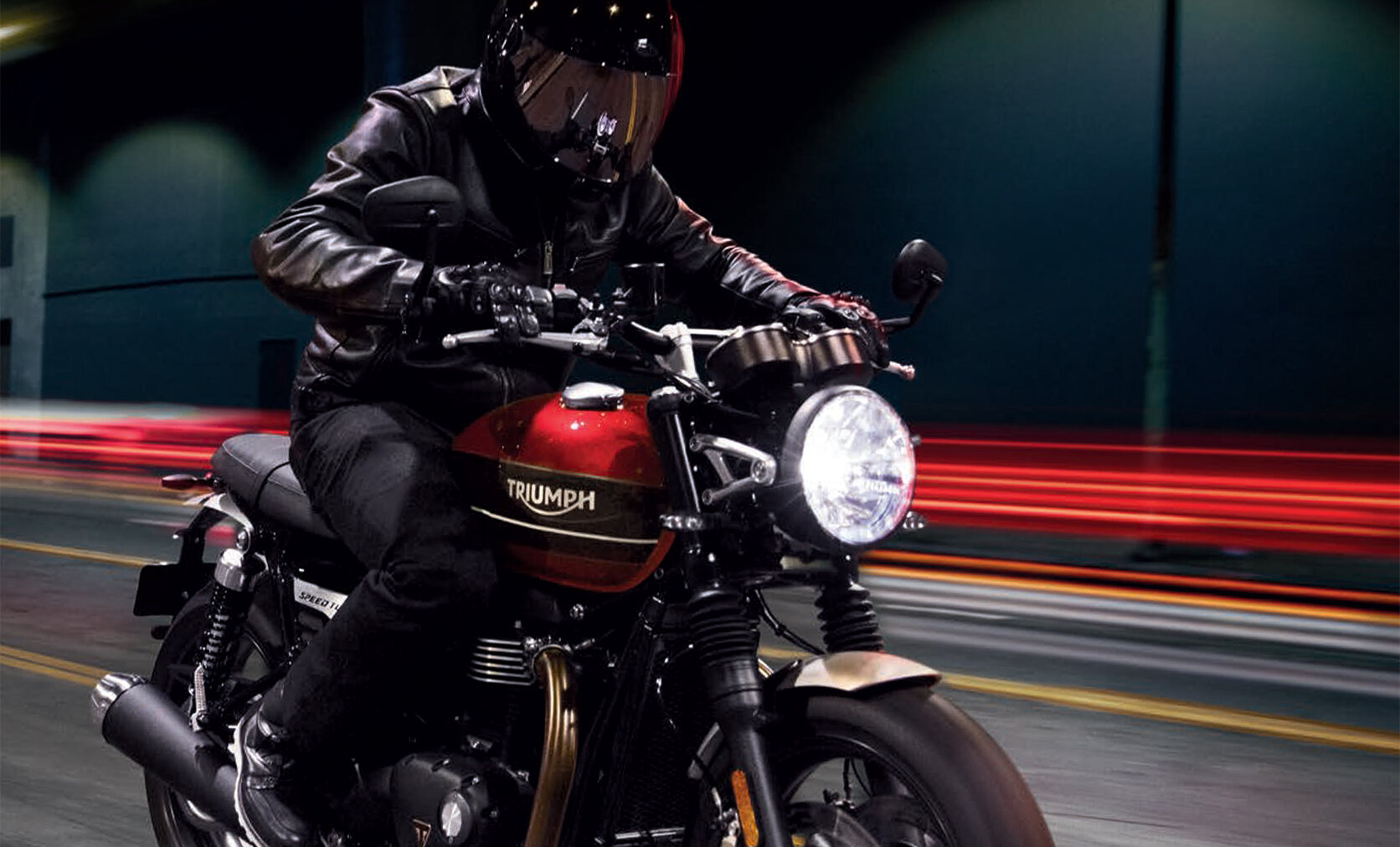
The typeface’s distinct charm attracted Triumph Motorcycles and Channel 4, and while one of the deals since wavered, the foundry’s devotion to creating products capable of multi-user experiences and full-family compatibility never has.
‘Brokman was the first project in which the importance of hand-crafting a full font-family became apparent.’

In the world of type-design, hindsight is a privilege rather than source of regret. Behance, in fact, promotes dialogue between user and developer, and applauds experimentation. ‘Modulation’ is the technical term for making sure the balance of each weight within a typeface is harmonious, and ‘to be taken seriously as a designer’, Jonathan tells me, ‘you have to get it right.’ Taking constructive criticism from typefaces such as Knul and Lintel on Behance, where users observed that their regular weights lacked precision, Jonathan confesses that the result was Brokman’s strikingly consistent proportions.
Loew, he tells me, is ‘the inevitable conclusion to the strategic changes prompted by Brokman.’ With Loew’s individual and extensive weights branded almost as whole new fonts within themselves, Jonathan believes that ‘this is where The Northern Block is going as a type-foundry’ – and all because of the evolutionary process begun by Brokman’s fulsome, meticulous design.
“The fact that it will for many years to come reminded me just how right we were to treat every weight within a typeface with the exact same attentiveness.”
Having said this, Brokman itself is no stranger to success. Triumph Motorcycles is Britain’s biggest motorcycle manufacturer, with a history beginning late 19th century. Family-owned, it is perhaps no surprise that Triumph wanted a customised version of Brokman as their own corporate typeface on a long-term licence, given that this is the first font where Jonathan, too, began paying close attention to family. Not only does Brokman feature on the website – and in brochures and show-rooms – but also among travelling exhibition material: making use of every weight, variation and modulation that this font-family has to offer.
A couple of years ago, Jonathan attended the Goodwood Festival of Speed, an annual event showcasing historic motor vehicles, and one which often draws crowds of over 100,000. ‘The Triumph stand’, Jonathan reveals, ‘included information about bike, model, philosophy and cost – all in Brokman. The fact that it will for many years to come reminded me just how right we were to treat every weight within a typeface with the exact same attentiveness – and to continue doing that into the future.’

A contemporary typeface, designed to bring clarity and originality to branding.
On the other hand, Brokman by no means constituted the end of the Northern Block’s learning processes. Losing out to Neville Brody’s bespoke ‘Horseferry’ and ‘new British Gothic’ typefaces for Channel 4’s rebranded identity is no mean feat; perhaps just to have been considered by the broadcaster is tantamount to a certain kind of victory. Brody’s modern-day fame throughout the world of typography and graphic design is, of course, unparalleled. But while Brokman’s charming, asymmetrical curves are as stylish as Brody’s customised designs, Jonathan believes that it was The Northern Block’s inexperience with licensing, pricing and software engineering which assuaged the broadcaster’s interest.
‘Unlike Triumph’, Jonathan tells me, ‘who were very instructive, Channel 4 seemed unwilling to provide feedback. Nevertheless, we’ve learned a lot since then. We know now that it’s all about mastering multi-user experiences and perfecting the performance of the typeface as software. A huge American brand company in New York bought Brokman user–licences in the hundreds through ‘MyFonts’. If Channel 4 ever got back in touch, we’d have that infrastructure ready to get them on board.’

“The Northern Block, like no other type-foundry, revels in its connection with an industrial heartland.”
Despite logistical knockbacks, then, Brokman’s distinct formulations remain loaded with potential. Intended for application across varied media applications such as gaming, branding and broadcast, Brokman boasts its own kind of true grit. The Northern Block, like no other type-foundry, revels in its connection with an industrial heartland recognised for that practical, straight-forward and heavy-duty charm, channelled through Brokman’s blunt, readable features.
Clearly, that’s what Triumph saw in it too. Jonathan wonders, perhaps, if Channel 4 might reinitiate contact now that their headquarters have moved to Leeds: for what font encapsulates that quintessential Northern adaptability better than this one?