Eund: The Font Strikes Back
Case study of the Eund typeface, uncovering how an unknown font gains hours into an exclusive club.
Born from the bleak modernism of Nordic Noir, Eund was a typeface with an unchartered path. Inspired by the crime genre’s dark, understated visuals and clinical typography, Northern Block founder Jonathan Hill never anticipated that Eund might one day be found on the title and copy of Star Wars’ ‘Black Series’ merchandise figures. Surprise is palpable in his voice as reflects that ‘Disney discovered Eund’s true purpose before we did.’
‘Surprise is palpable in his voice as reflects that ‘Disney discovered Eund’s true purpose before we did.’

Speaking from The Northern Block’s Head Office, Jonathan begins our conversation humbly. ‘I wasn’t trained as a type-designer’, he reveals. ‘My craft is self-taught and evolved through mistake-making; Eund is a perfect example of that process in action.’ Both subjective and random, the inspiration behind this typeface is credit to Jonathan’s early experimental methods.
Then fascinated with The Killing – a Danish investigative psycho-drama – he had in mind a broad rendering of Nordic Noir’s minimalist style as he fashioned Eund’s tight geometric forms. But, crucially, this was never prescriptive. ‘This font’, he tells me, ‘was simply an investigation of sorts: an attempt to refine my skills and try out different styles. I never expected it to become this important. Its foundations were never that concrete.’
Purposefully elusive, Jonathan concedes that Eund eventually took on its own dynamic. Traversing far beyond its original parameters and inspirations, he describes this typeface as gaining ‘an aesthetic personality unto itself.’ Naturally, as artworks, typefaces are painstaking demonstrations of their designer’s skill: they often have precise origins, and desired effects. But when they don’t – and instead the impression is one of curious fluidity – their meaning is likely to be dictated by an outside force: one who has a better idea of a specific design’s capabilities and impact. Rarely, though, is this a corporation as big as Disney.
“Naturally, as artworks, typefaces are painstaking demonstrations of their designer’s skill.”
A modern geometric-sans with minimal contrast.
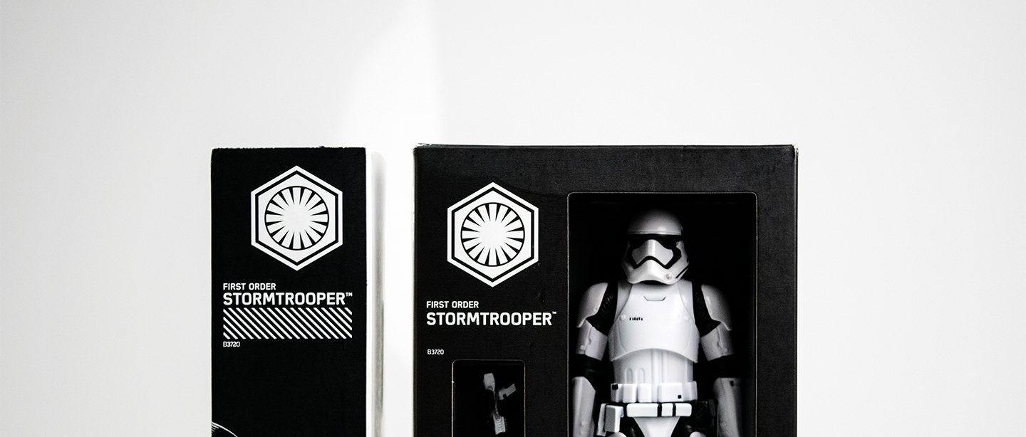
‘I think it was the beauty of the four letters alongside one another that made this font so visually impressive and so fitting for the Black Series’, Jonathan explains, adding that in white-uppercase format, the letters became almost monoline. Only afterwards did he register that ‘Eund’ – the word in which the smoothing-out of shallow curves in rectangular forms had the most impact – wasn’t far off Lund, the name of lead character Detective Sarah Lund throughout The Killing’s five-year-run. ‘The L’, Jonathan reveals in retrospect, ‘possessed far too much negative space. Supplanting it with an E rectified this imbalance.’ Perhaps this was telling of Eund’s real efficiency and true calling: communicating through condensed, bold and quirky forms rather than strict and understated minimalism.
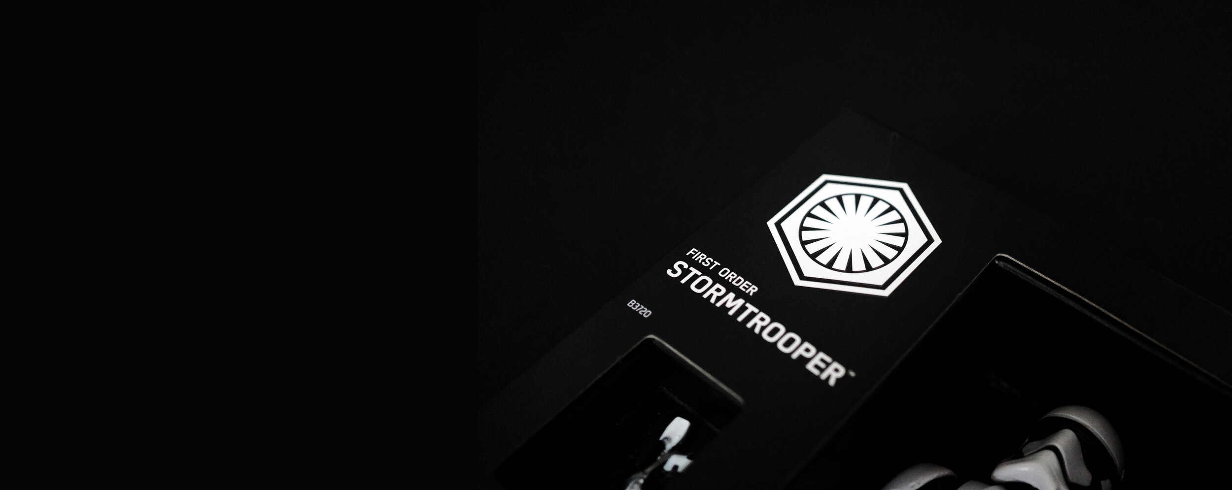
Recalling the day in which he first came across Eund’s commercial debut on The Black Series’ ‘Stormtrooper’ figurine, Jonathan, true to form, tells me that his initial reaction was one of shock. After holding the silky, matte-black box in his hands and inspecting it closely, he soon realised that yes – this was his very own creation! He remains unequivocal to this day: ‘without Star Wars, Eund would surely have disappeared into oblivion. It was surreal to think I’d had no idea they were using it until I visited my nephews on Christmas Day.’

“I’m not sure whether it was my Northern upbringing’, he wonders, ‘but I assumed type-designers already out there were better than I’d ever be.”
But, as with all of Jonathan’s typefaces, Eund says something important about his own personal story. When working in design in his 20s, Jonathan remembers taking criticism in an overly-sensitive way. ‘I’m not sure whether it was my Northern upbringing’, he wonders, ‘but I assumed type-designers already out there were better than I’d ever be. I was just starting out, and it took me a long time to develop that thick-skin and resilience necessary for advancement in this competitive field.’ Eund’s journey of self-discovery, in many ways, epitomises Jonathan’s own uncertain progression into that competitive typographic world.
Exhuming a powerful humility, Eund went from receiving little commercial traction upon its release in June 2013 to becoming a vital part of The Force Awakens just two years later. ‘Just as I was accepting the fact that not every typeface will bring forth the same kind of influence’, Jonathan admits, ‘sales started to build out of nowhere. They were a welcome reminder of the fact that hard work sometimes really pays off, even when you don’t expect it.’