
Ditch Helvetica and apply Knul.
Case study of a pivotal typeface that became the inspiration for growth.
“Ditch Helvetica”, so claimed a hugely influential article on the well-respected design blog The Fox is Black back in 2012. Described as ‘elegant, modern, simple, and imbued with a subtle monoline appearance’, Knul has since spotlighted on Behance’s featured home page, EA’s FIFA between 2014 and 2016, and Harman International’s audio products. You might know the latter as a subsidiary of its parent company, Samsung.
From an unassuming origin, worked out in the experimental mind of Northern Block founder Jonathan Hill, Knul has attained a global prominence. Provincial in inspiration, international in scope, it stands analogous to The Northern Block itself.
“Provincial in inspiration, international in scope, it stands analogous to The Northern Block itself.”

Knul, Jonathan admits, was an historic undertaking with a clear eye to the future. Born in Sheffield and enamoured with local and continental industrialism, Jonathan had in mind the historic manufacturing towns that dot the landscapes of Northern England and Germany. ‘The aim,’ he says, ‘was to pay homage to the self-preserved engineering hubs that were crucial in global industrial development over the course of the 19th and 20th centuries’ – and the best way to do that was by modernising the Din typeface.
As the essential template for creating unadorned letter shapes for industrial applications, the defining feature of Din remains its versatility. With the font still found on road signage, German railways and number plates in continental Europe, Knul’s modernist and technological dimension is deliberately in dialogue with its predecessor. It’s important we don’t forget that heritage – and Knul won’t let us.
“Jonathan tells us that developing the typeface was a ‘catalyst experience’: one which ‘changed how the studio worked’.
But Knul wasn’t just about design: it was a human project, too. Jonathan tells us that developing the typeface was a ‘catalyst experience’: one which ‘changed how the studio worked’. Unlike mining and engineering towns of old, built as they were on a strong sense of community and collective craftsmanship, type-design at The Northern Block before Knul ‘had been a one-person pursuit’. This, Jonathan says, ‘isn’t the way to develop a typeface of real quality.’

An elegant modern typeface with a subtle mono-line appearance.
If modern type-design is to be anything other than a blithe successor to traditional, impersonal metal typesetting, it must conceive of itself as something more: an aesthetic language, a new way of interacting with the world, an inspiration to create something bigger. ‘To take the work to the next level,’ Jonathan said, ‘you have to ask for help. It’s that simple.’
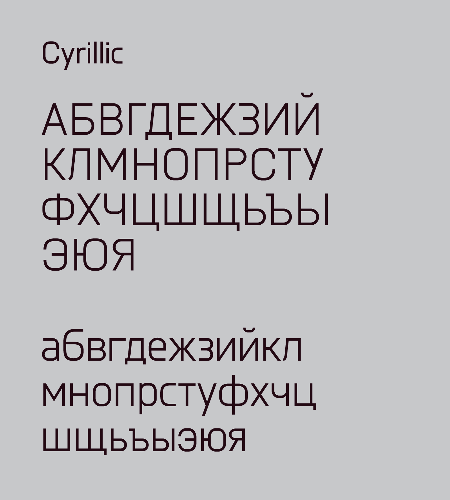
It was this motivation to collaborate, unusual in an industry sustained by solo freelance-design, that led Jonathan to a talented designer who was able to apply their craft to create compatibility of Cyrillic (Slavic) characters with Latin. Knul was taking on a cosmopolitan identity, and The Northern Block was slowly expanding: a clear sign that typography brings people together.
“Like with Din, the immersive, virtual reality of video games is the optimum context for Knul’s powerful, visual effects.”
How then, did Knul end up being used as the homepage feature for Behance? Or by Electronic Arts? The team’s take on it is simple: this mechanical, profoundly modern type-design has just enough human intervention to make it work across a wide range of media.
Like with Din, the immersive, virtual reality of video games is the optimum context for Knul’s powerful, visual effects: feeling at home within futuristic digital environments by offering the user readable information that fits gaming aesthetics but doesn’t detract from the user experience. Knul, as far as it can, basks in the modern, almost monoline structures of technology and its confluence with the human spirit.

Knul, it’s virtually in the game.
‘I was looking for a mechanic-like font’, he says, ‘exactly like this.’
Behance – the world’s leading digital platform in showcasing and discovering creative work – has provided space for engagement with the font among its vast community. ‘Fabulous’, ‘clean’ and ‘supercool’, declare various online voices, while another proffers that Knul satisfied his own brief perfectly: ‘I was looking for a mechanic-like font’, he says, ‘exactly like this.’
But Jonathan and Mariya assure me that there’s more to it than aesthetics. While we can speculate that EA purchased Knul because of the design, or exposure through social media platforms like Behance, it’s the Cyrillic language that is Knul’s truly distinguishing feature.
Through Mariya’s expertise, and after The Northern Block’s experience of selling a licence to EA, both Jonathan and Mariya came to understand the importance of Russia as a market for video-gamers. Suddenly, Mariya’s Belarusian background became an essential aspect of The Northern Block’s vision for growth.
And it doesn’t stop there: Russia’s is an emerging market that’s ripe for exploration. Recent enquiries from Ubisoft and 2K have asked for a Cyrillic adaptation as a mandatory requirement for new typefaces. Maybe without Cyrillic, Jonathan wonders, those deals could have been very different – in fact, they may not have come about at all. Very soon, the Arabic language will join that list of typographic must-haves – and that’s a development for which The Northern Block are more than prepared.
However, Knul’s simplicity, as well as its multiculturalism, is what facilitates its adaptability. With smooth line forms that work across a range of applications, its simple geometric forms offer a clean slate for brand developers. When Kat Earnshaw, Art director of Harman International, happened upon Jonathan’s creation, she instinctively knew where Knul fitted within the company brand. ‘It was a branding project on the fly’, she says, ‘but the font fitted the evolution of the brand at the time’.

“Art director of Harman International, happened upon Jonathan’s creation, she instinctively knew where Knul fitted within the company brand.”
Requiring the making of special numbers in the Knul style called ‘lining figures’, Harman’s intention was to use the font in product coding, identification and packaging. That foundation catapulted Knul to fame across a range of headphones, speakers and microphones, complementing The Fox is Black’s brazen assurance that Knul creates uniquely ‘clean forms best suited to identity, editorial and advertising uses’. It seems then, unsurprisingly, that Knul knows no bounds. Who knows where it will go from here?