
Freedom of Fonts
How trading your best font for free can pay off.
“This understated, geometric free font was incorporated into the blockbuster Mafia III video-game by 2K Games”.
The Northern Block’s stance on free-fonts is no secret. Never of lesser quality, their free typefaces are developed with as much integrity as paid-for equivalents, and often do just as well. Take Lintel. This understated, geometric free font was incorporated into the blockbuster Mafia III video-game by 2K Games. Jonathan Hill, Northern Block founder, suspects that its sleek design and innovative Cyrillic lettering were not the only deciding factors. Due to Lintel’s accessible free-weights, the American video-game publisher was able to test-out the font’s compatibility with gameplay visuals. As a result, Lintel became the user interface text for Mafia’s entire third instalment.
First, a brief word upon Lintel’s etymology and inspirations, which are as intriguing as its aesthetics. A lintel, if you didn’t know, is the indispensable structural support between two vertical blocks - like the top of a window pane, standing parallel with the sill below. Taking inspiration from modernist furniture and architecture, Jonathan reflects that Lintel’s name mirrors its ‘practical, solid characteristics.’ Though, stylistically, modernism has seen something of a backlash in the architectural world (too crude, too minimalist!), type developers continue to thrive off its formalism. In fact, the need for strong legibility within advertising, digital editorials and game development is gaining infallible momentum.
But despite the welcome confluence of these trends, Jonathan found Lintel’s prominence on Mafia III as strange as it was exciting. This is a video-game in which an orphaned African-American Vietnam-War veteran, Lincoln Clay, seeks revenge for the murder of his adopted family by local Italian mobsters. Inspired by the gang-rivalries of the American Deep South in the 1960s - virulent in a nation plagued by race wars, white supremacists and unwinnable overseas conflicts - the game’s themes are outlandishly dark, raw and aggressive; they can seem worlds-away from the understated neutrality which Lintel promises.
“If someone isn’t willing to spend huge amounts of money on Din, Helvetica, or another popular Grotesque design, they’re likely to find a similarly impressive free one elsewhere”.
‘It’s not all about what’s obvious, though’, Jonathan tells me, admitting that strategic marketing and clever typography were perhaps the driving forces behind Lintel’s success. Confident that 2K’s attraction to the typeface had to derive, in part, from its open-source status, Jonathan explains that ‘having free-weights available online gives gaming publishers the freedom to see if a typeface satisfies what they’re looking for.’ He assures me that typeface design is a democratic industry: if someone isn’t willing to spend huge amounts of money on Din, Helvetica, or another popular Grotesque design, they’re likely to find a similarly impressive free one elsewhere. ‘When we got an email from 2K saying they had been testing out our font on Mafia III’, Jonathan admits, ‘we were really surprised. I’m not sure exactly why they thought it would fit, but the fact that they had been testing it, because it was out there for everyone to play with, surely worked in our favour.’

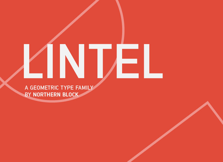
A modern san serif typeface with a pure clean line form.
Another selling-point, Jonathan acknowledges, may have been Lintel’s deep connection with Eastern European cultural traditions. Not only does Lintel boast Cyrillic compatibility, but the font’s sharp, Eastern-inspired line-forms espouse a gritty perseverance in the face of hardship, much like Mafia’s ill-fated protagonist. Of course, we don’t know for certain that Lintel’s distinct formality and technical edge appealed to the world and storyline created for Lincoln Clay: but as Lintel’s Georgian-born Cyrillic-developer Aleksander Sukiasov tells me, ‘it’s without doubt that foundries and developers are becoming more aware of Cyrillic’s importance within type-design - and especially the need for original Cyrillic fonts.’
Jonathan echoes this statement: ‘a lot of video-game deals with typographers emerge because of their understanding of Cyrillic. At the time, there weren’t many free-weight category fonts that incorporated Eastern European languages the way Lintel did.’

“It’s worth pointing out that The Northern Block derives its name from the cultural concept of the Eastern Bloc”.
It’s worth pointing out that The Northern Block derives its name from the cultural concept of the Eastern Bloc, with Jonathan, from the outset, encouraging both collaborators and interns to embrace Cyrillic characters and heritage. Former Northern Block intern, Joseph Gill, redesigned Lintel’s Behance presentation in 2015, centring it around the unifying theme of sport. In reminding people of the talent and creativity which thrived despite the hardships imposed by Soviet rule, Joe reveals that he ‘aimed the presentation towards an Eastern European Audience, drawing upon the 1970 World Cup in Mexico, which was the Soviet Union’s most successful World Cup. [He] used iconic commentary, and glyphs in names and places, generating a visual experience which lends to the scrolling system of Behance.’ Unwittingly, he may also have been appealing to the vast and austere fictional realm of Mafia’s New Bordeaux.
With the next chapter - Mafia IV - rumoured to be in its conceptual infancy, the team can only hope that this multifaceted typeface retains pride of place. And who ever said free-fonts were a bad idea?